- Picture and text skills
As the end of the year approaches, we often need to prepare various charts to show our work data for the year.
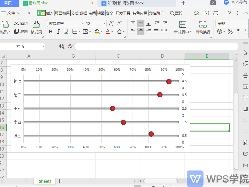
Slider charts can visualize data and make charts more intuitive.
Below I will show you how to make a sliding bead diagram.

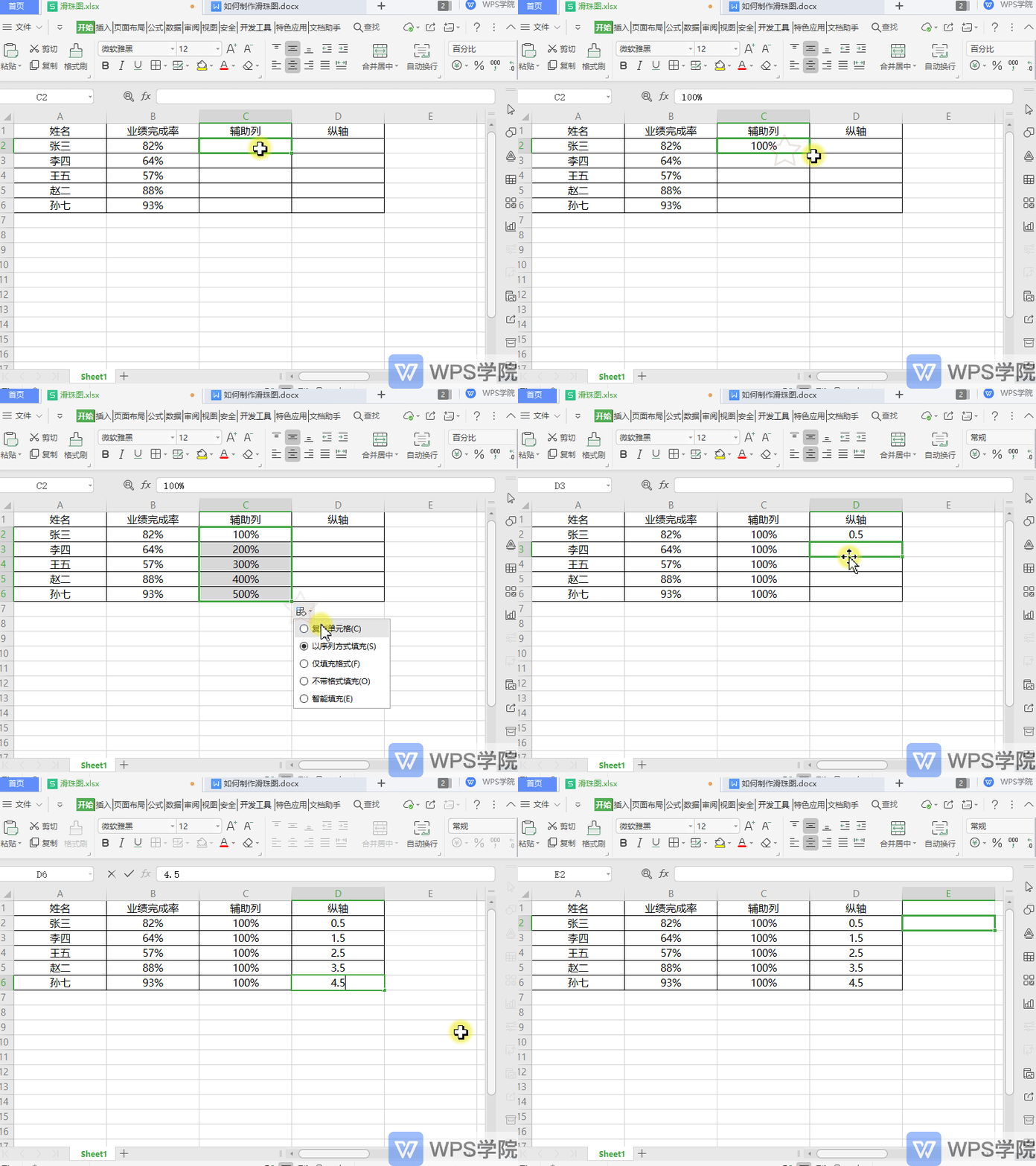
◾The first step is to set up the auxiliary column.
Fill in all the data in column C with 100%, which is used to make the slide rail of the slide ball.
Fill in the data in the first row of column D as 0.5, and add it downwards in steps of 1. Its function is to control the spacing between the Y-axis of the sliding balls.
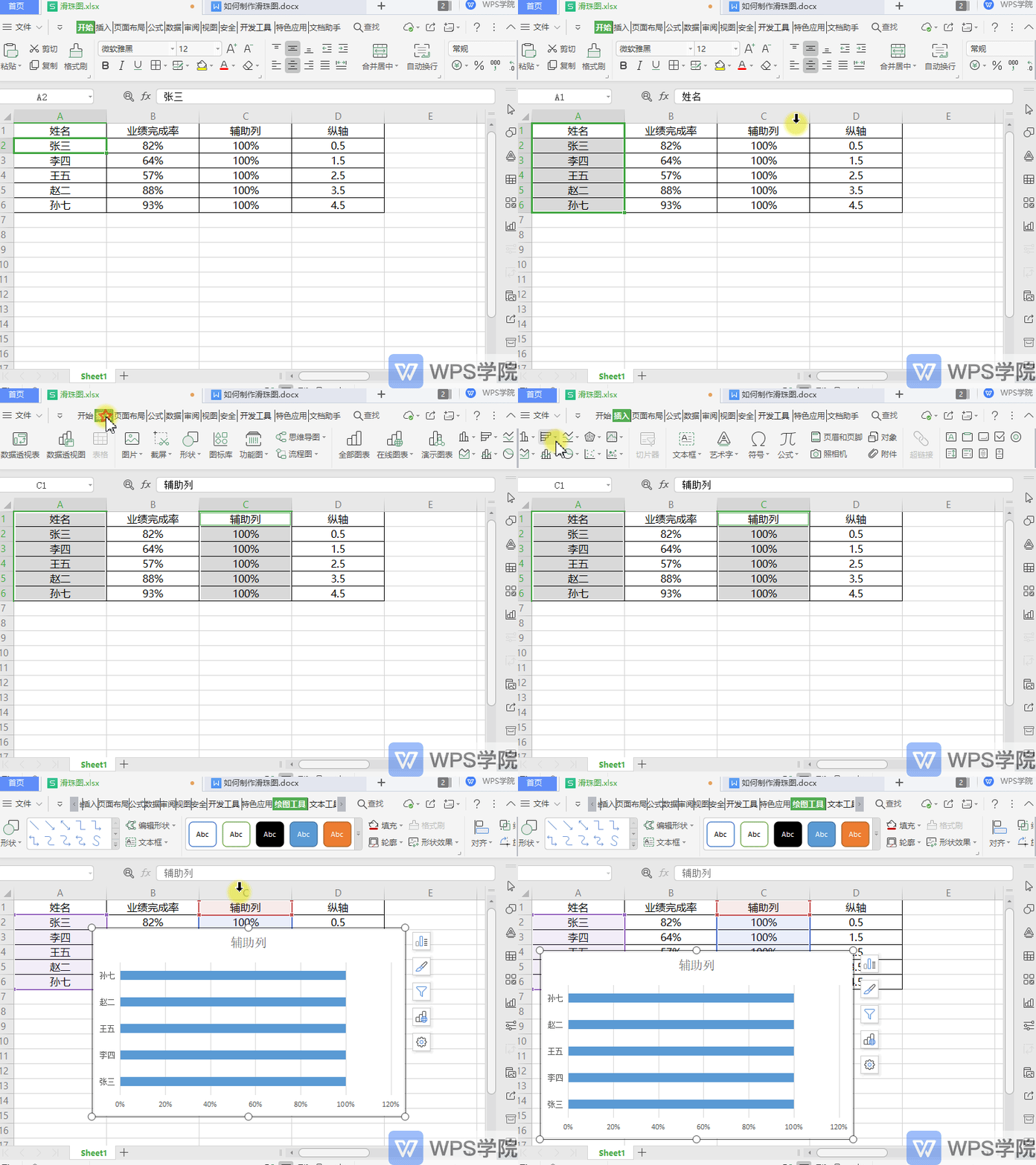
◾The second step is to insert the bar chart.
Use the Ctrl key to select columns A and C, and click Insert - Two-dimensional Bar Chart on the upper menu bar.
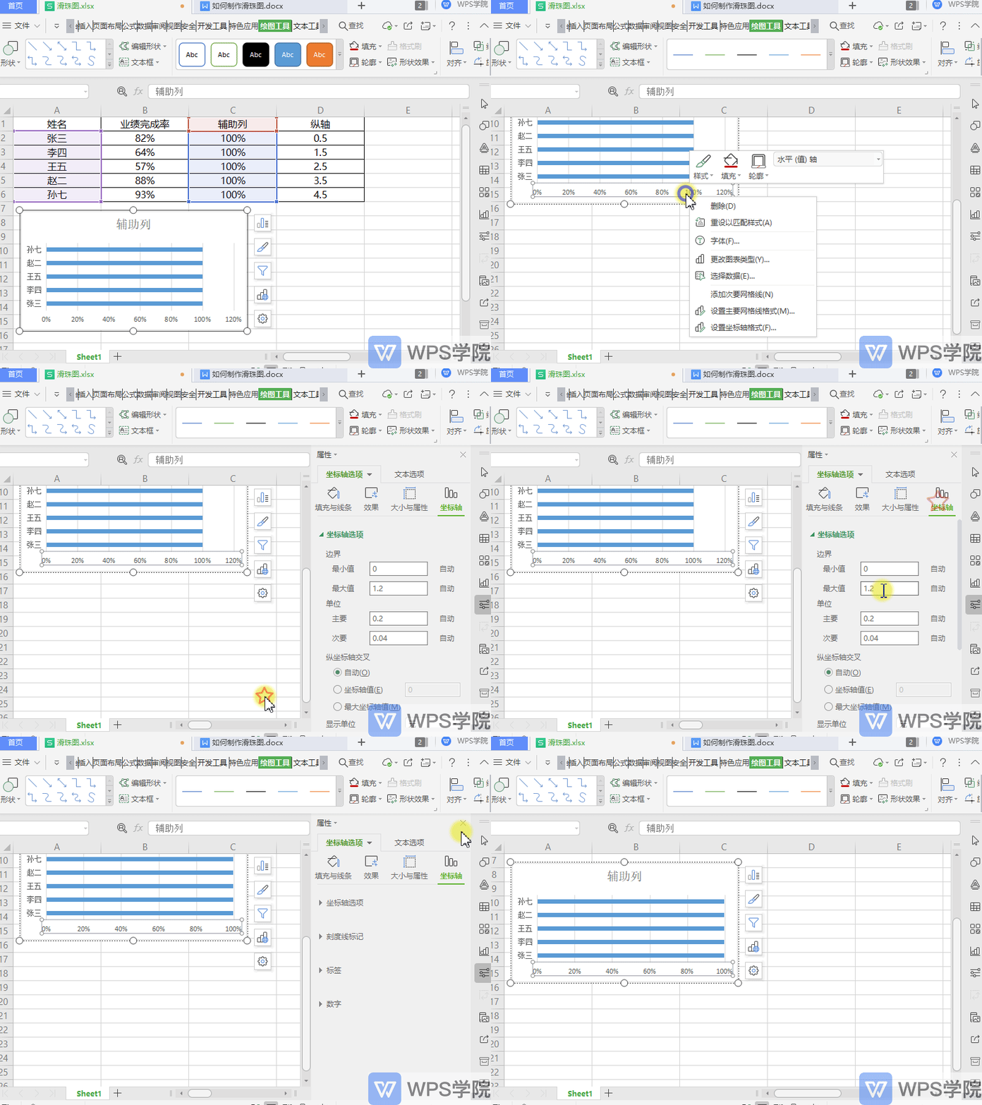
◾The third step is to adjust the bar chart.
Select the horizontal (value) axis of the bar chart and right-click "Format Axis".
The Axis Format Properties sidebar pops up on the right, click Axis Options - Axis, and set Border - Maximum Value to 1.
◾The fourth step is to insert a scatter plot.
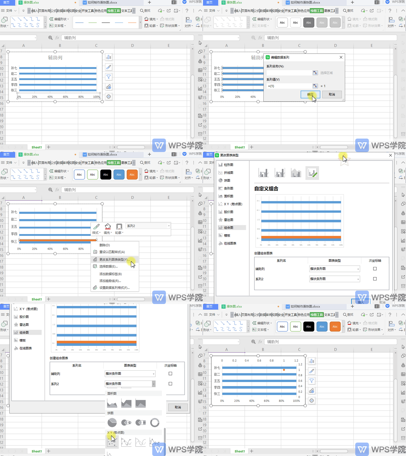
Select the chart data axis area, right-click "Select Data", and click the "Add" button in the pop-up dialog box to add a new series.
At this time, a new data series has been added to the chart. Right-click the chart and "Change Series Chart".
Set the new series chart type to "Scatter Chart" in "Custom Combination".
Click OK and the new series will become a scatter point.
◾The fifth step is to set up scatter data.
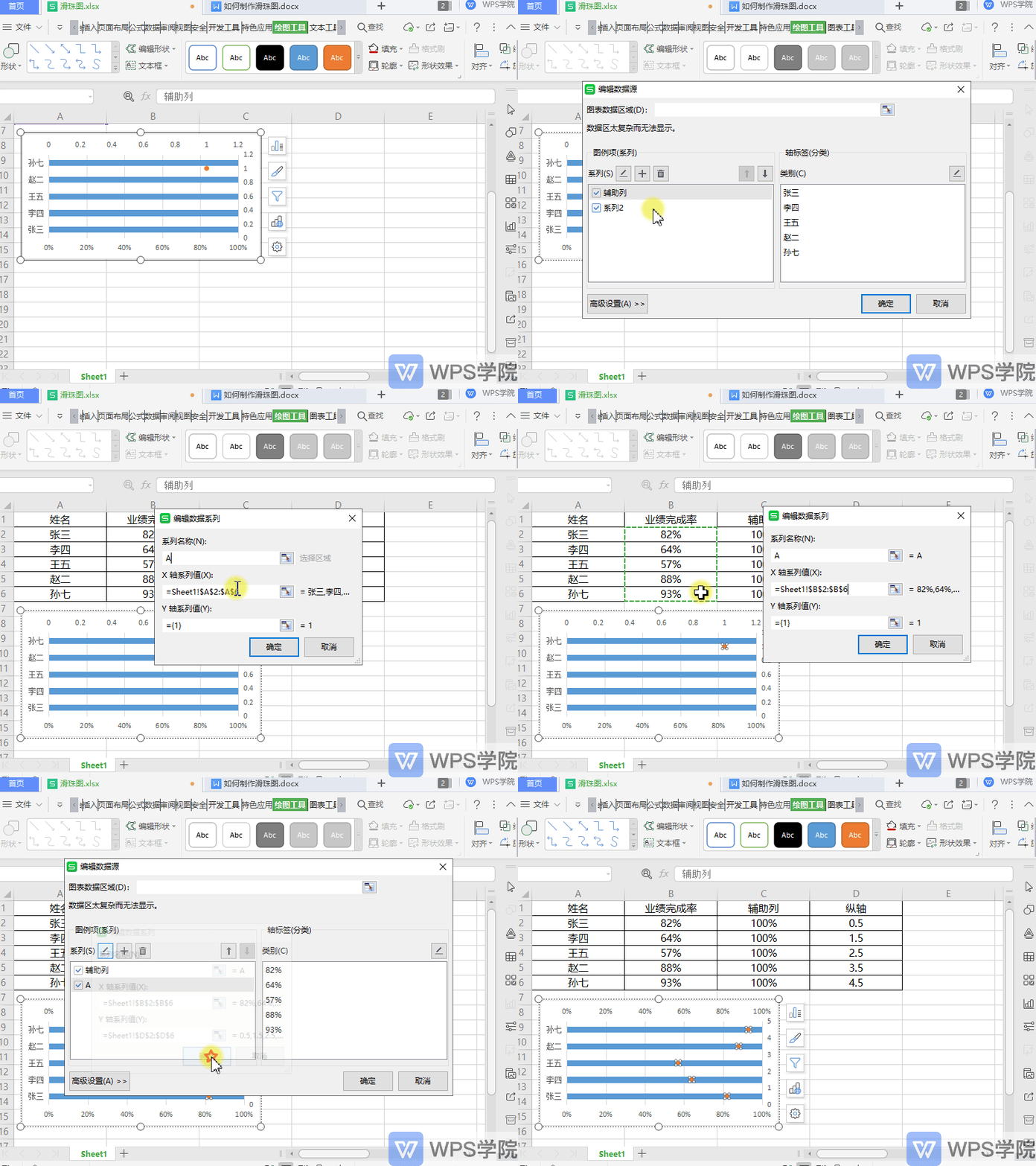
Select the scatter points, right-click and "Select Data".
Select the new series in the pop-up dialog box, click the Edit button, and set the series name in the pop-up "Edit Data Series" dialog box.
Change the X-axis series value to B2:B6, and change the Y-axis series value to D2:D6.
Click OK so that the data scatter will be displayed on the bar chart.
◾The sixth step is to draw the slide rail and slide ball.
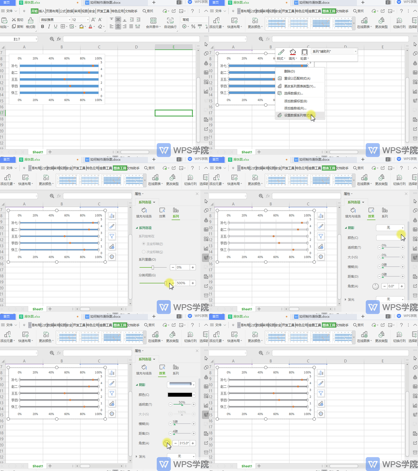
First change the width of the bar chart, select the bar chart, right-click "Format Data Series".
Select "Series Options" - "Series" in the sidebar on the right and adjust the "Category Spacing" to the maximum.
Click "Fill & Line" to change the bar color.
Click "Effect" - "Shadow" to add shadows to achieve a three-dimensional effect.
Next draw the slide bead.
Click Insert-Shape-Ellipse on the upper menu bar to change the color and outline of this shape and add a shadow effect.
Finally, copy and paste the slider graph you made into the scatter chart.
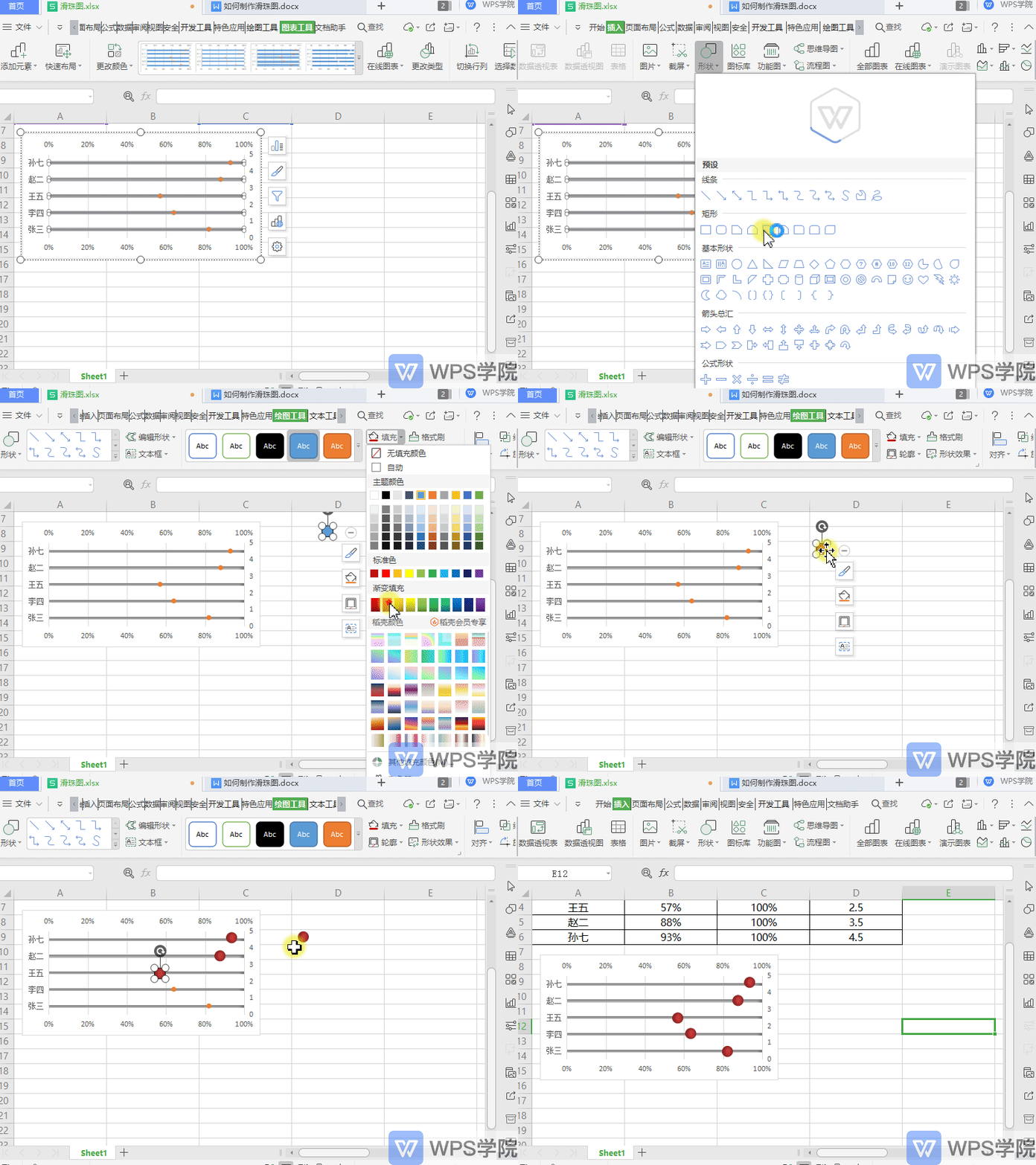
Such a sliding bead diagram is completed.
Articles are uploaded by users and are for non-commercial browsing only. Posted by: Lomu, please indicate the source: https://www.daogebangong.com/en/articles/detail/nian-zhong-hui-bao-ji-qiao-ru-he-zhi-zuo-duo-ren-ye-ji-wan-cheng-lyu-hua-zhu-tu.html

 支付宝扫一扫
评论列表(196条)
测试