- Image and text skills
As we approach the end of the year, we often have to prepare various data reports. When showing data changes, the visual effect of charts is much higher than that of numerical tables.
So how to use profit and loss charts to perform variance analysis?


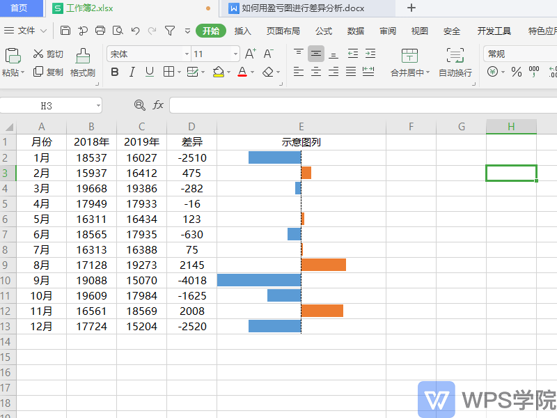
◾Take this sales form as an example.
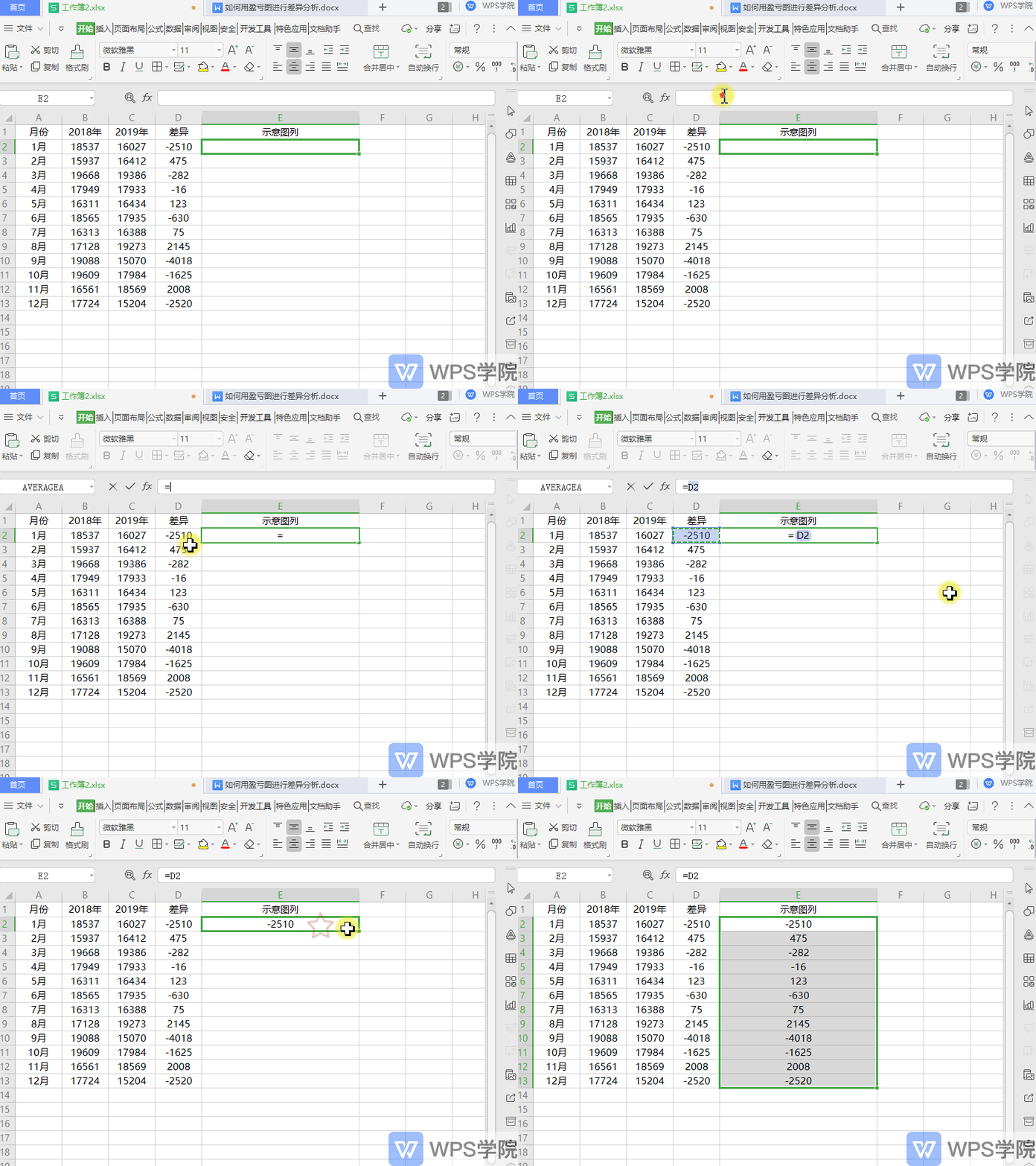
First, create a schematic legend in column E, enter the formula =D2 in E2, and place the cursor in the lower right corner of E2 to form a cross-shaped drop-down menu to fill in the formula.

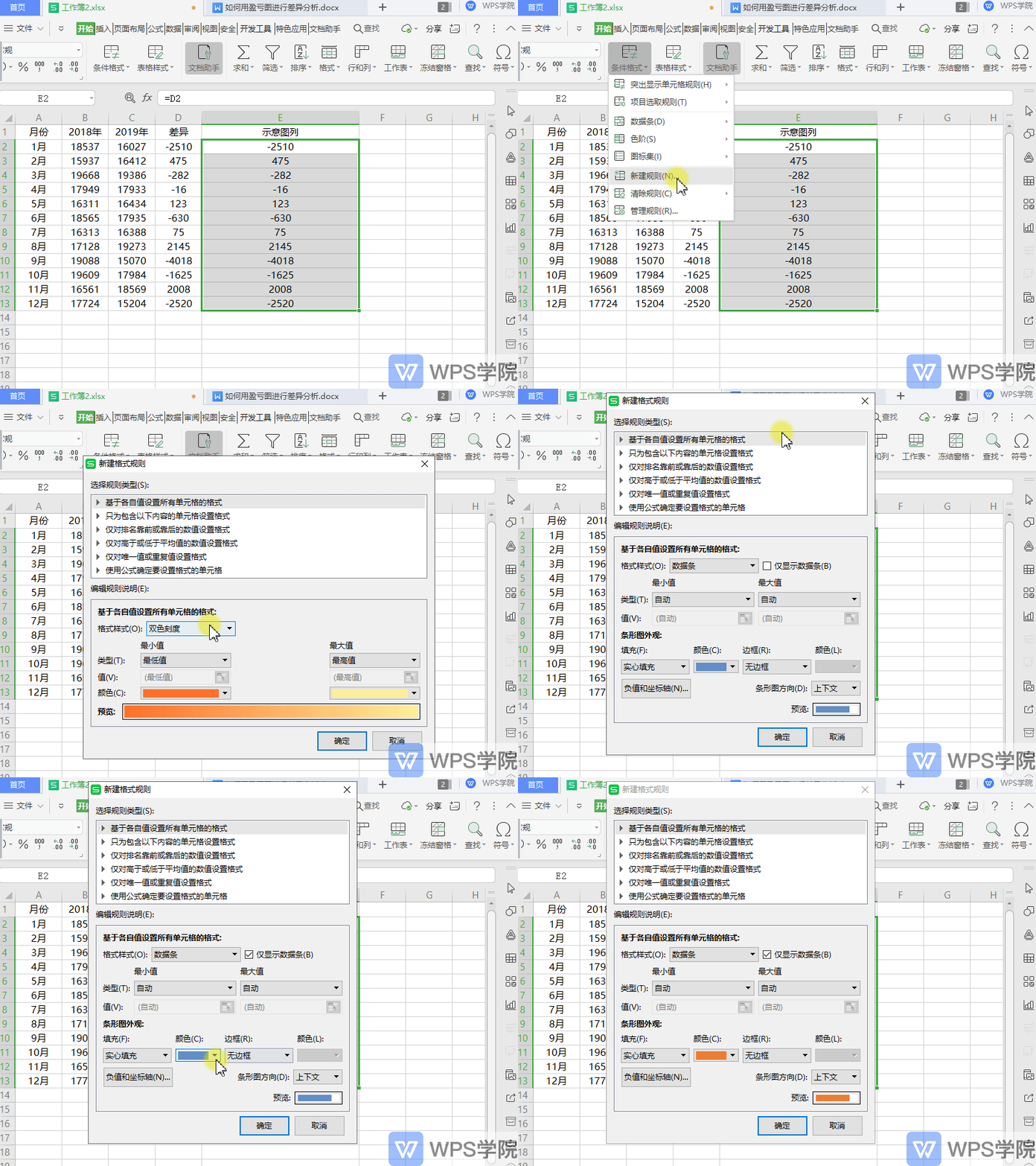
◾Select the data area in column E, click Start - Conditional Formatting - New Rule in the upper menu bar.
Select "Format all cells based on their respective values" in the pop-up dialog box.
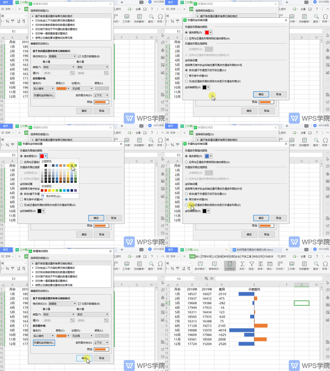
Select "Data Bar" in the edit rule description, check "Only display data bars", and set the fill color of the bar chart appearance.

◾Click "Negative Values and Axis", set the fill color, and select "Cell Midpoint Value" in "Axis Settings".
Click OK, and a clear profit and loss chart is set up.

Articles are uploaded by users and are for non-commercial browsing only. Posted by: Lomu, please indicate the source: https://www.daogebangong.com/en/articles/detail/nian-zhong-hui-bao-ji-qiao-ru-he-yong-ying-kui-tu-jin-xing-cha-yi-fen-xi.html

 支付宝扫一扫
评论列表(196条)
测试