Beautiful charts are essential for year-end reports. The cyclone chart is convenient for comparing two different data and viewing the comparison effect more intuitively. The following will explain how to make a cyclone chart.
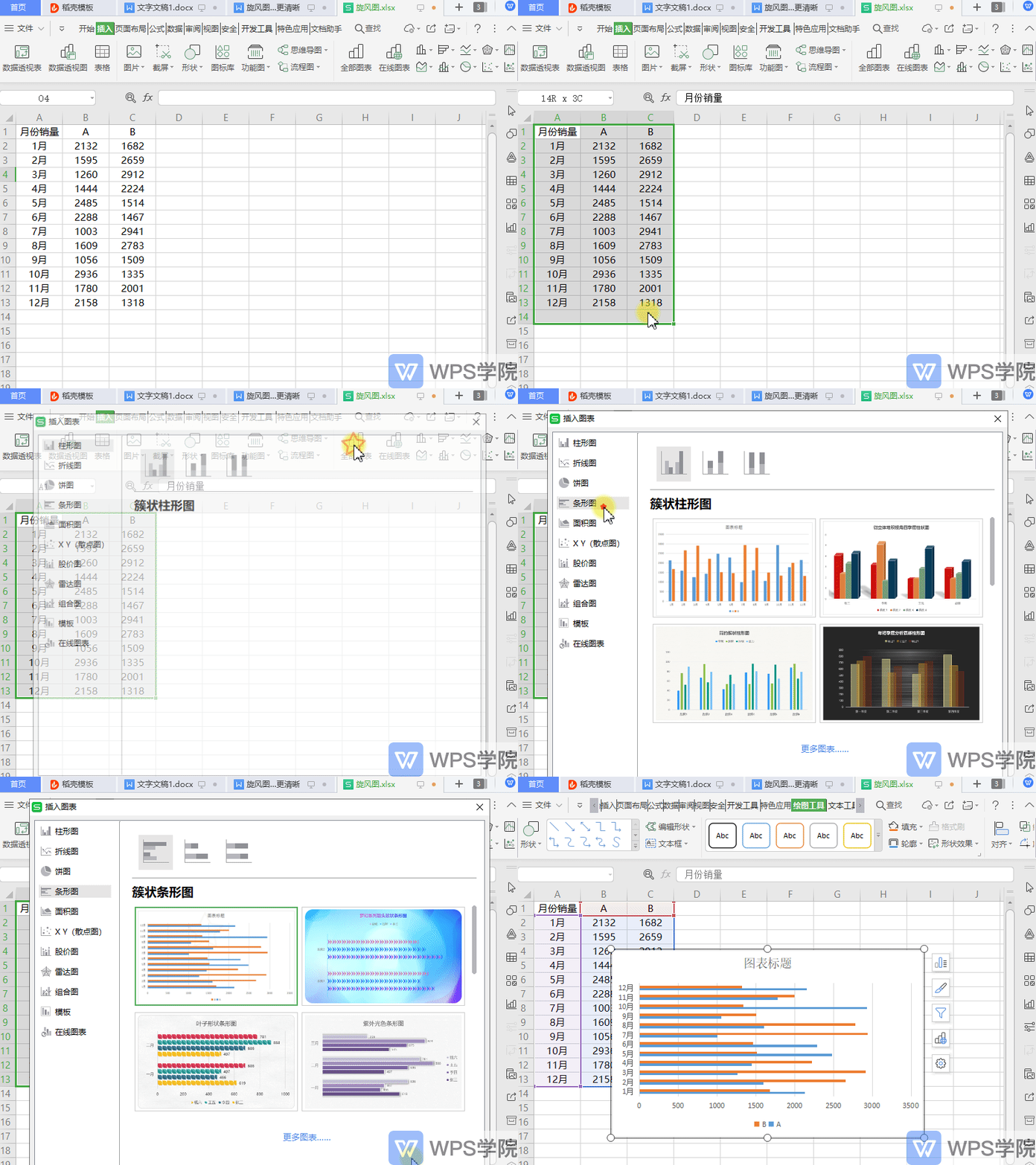
◾The first step is to insert a clustered bar chart.
Taking this data table as an example, select the data and click Insert All Charts-Bar Chart-Clustered Bar Chart.
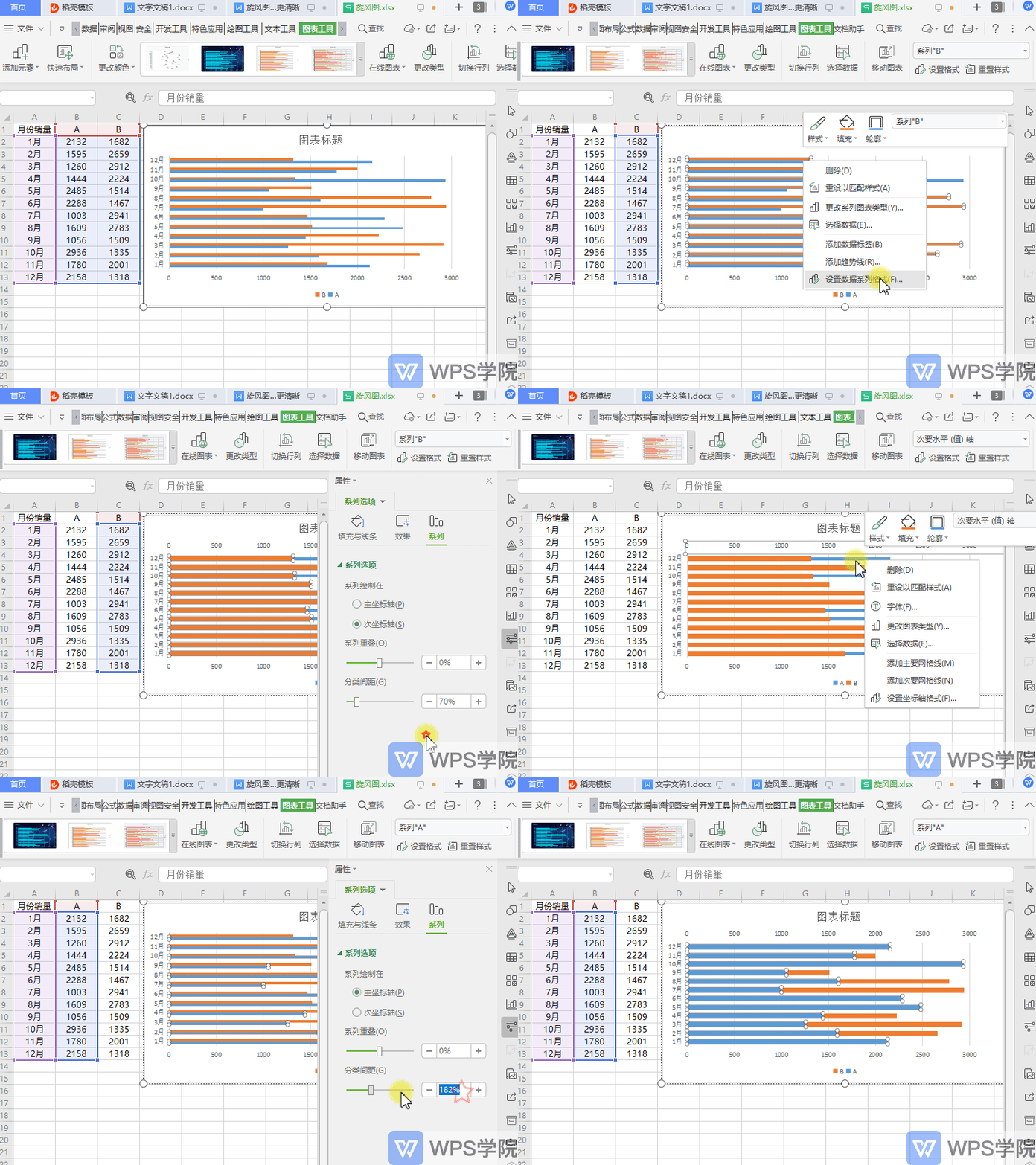
◾The second step is to change the series settings.
First click Chart Tools-Chart Elements-Series B and select the Series B chart area.
Right-click to format the data series, change the series options to "Secondary Axis" in the right sidebar, and then adjust the series spacing.
Same as above for Series A.
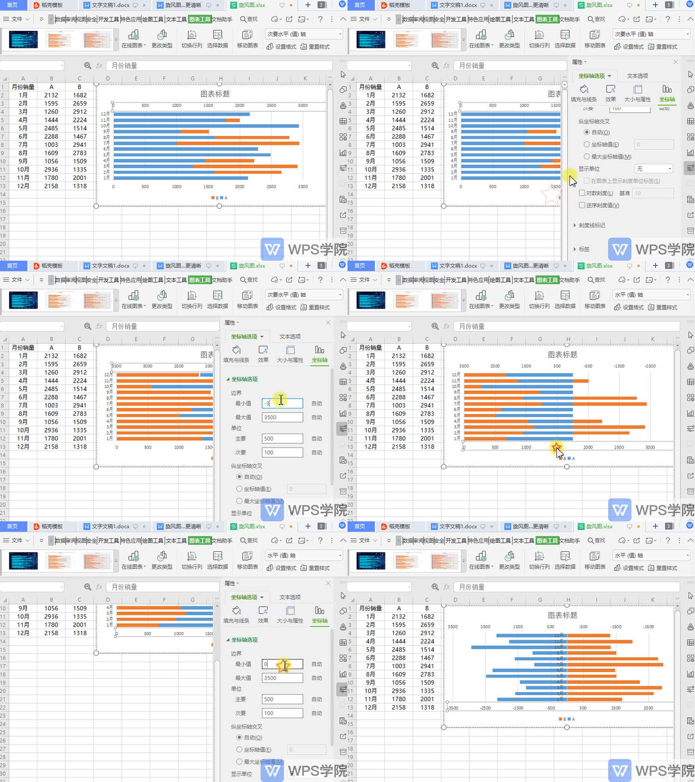
◾The third step is to change the coordinate axis settings.
Then select the horizontal axis at the top of the chart and right-click "Format Axis".
Check "Reverse Scale Values" in "Axis Options".
Change the minimum value of the boundary in the "Axis Options" option and set the minimum value of the boundary to the negative number of the maximum value.
The bottom horizontal axis is the same as above.
◾The fourth step is to set the axis labels.
Select the date axis, right-click "Format Axis" - "Axis Options" - "Label" - "Low".
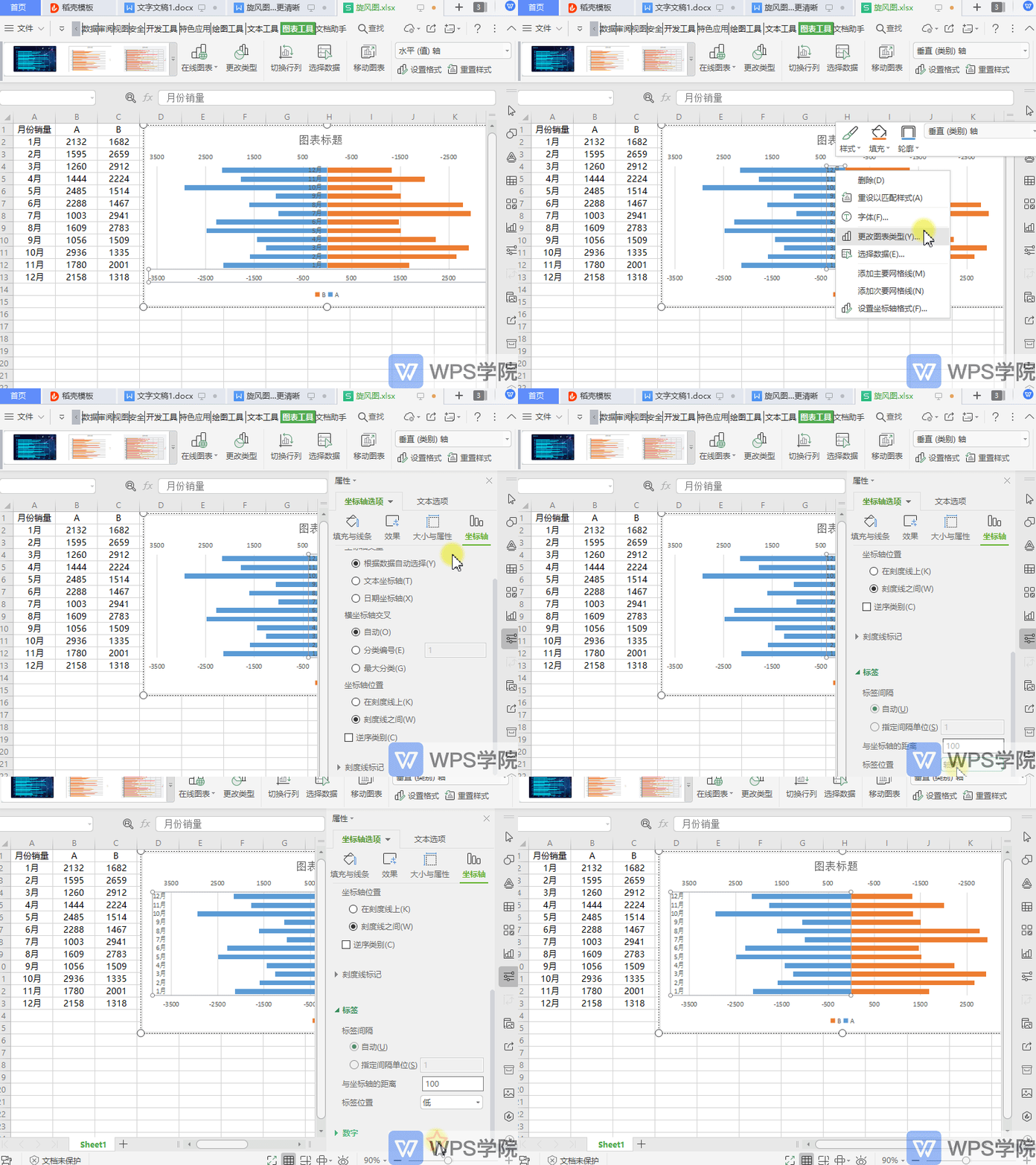
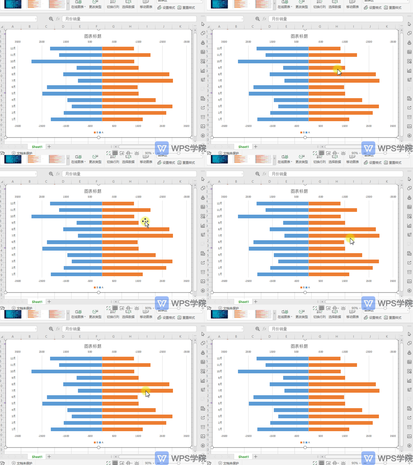
Such a simple tornado chart is completed.
Articles are uploaded by users and are for non-commercial browsing only. Posted by: Lomu, please indicate the source: https://www.daogebangong.com/en/articles/detail/nian-zhong-bao-gao-shu-ju-ke-shi-hua-xuan-feng-tu-zhu-li-qing-xi-dui-bi.html

 支付宝扫一扫
评论列表(196条)
测试