
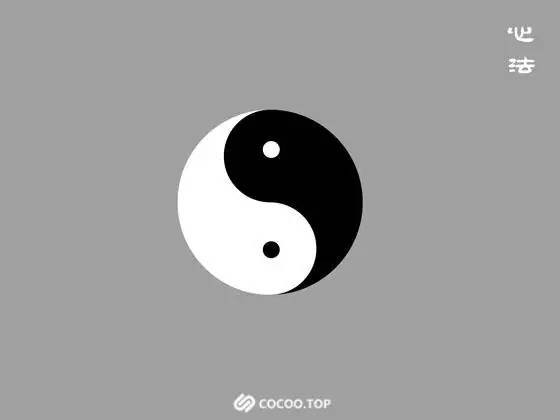
Heart Methods Since it is a martial arts secret book, there must be internal skills and mental methods, so let’s start with the internal skills. Liang Yi Everyone must be familiar with the Tai Chi diagram. Yin and Yang are yin and yang. Where there is Yin, there must be Yang. These are the two Yi of Tai Chi. In other words, everything has two sides, and the same goes for design. Under the same proposition, there must be another completely different design direction behind one design direction. Recommended reading:Chinese subtitles! Title font structure analysis
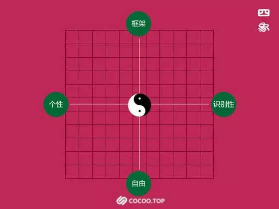
Four Symbols Let’s first look at this tool that evolved from Tai Chi.
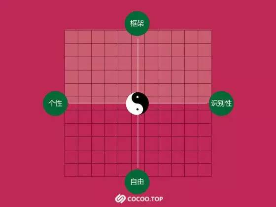
I classify font design into 4 elements: Framework - freedomPersonality - recognition
Frame: Everyone knows that "Chinese characters" are commonly known as square characters, and this square is also a frame.
Freedom: This freedom is relative to the frame, that is, fonts that are not constrained by squares (such as cursive script).
Recognizability: Since it is a word, it must be recognized by everyone. Some words can be easily recognized after being designed, and some words can only be recognized after some thinking after being designed. It’s about whether the recognition is strong or weak.
Personality: This is also relative to recognition. Some designers sacrifice recognition in order to emphasize a certain personality. For example: Graffiti fonts: In the past, the masters who painted dragon and phoenix characters on the streets were masters of personalized font design.
They are relative to each other (it doesn’t matter if you don’t understand it now, you will understand if you continue reading) What is the use of this tool? Let's look at the Bagua deduced from the four images, and you may understand a little bit more.
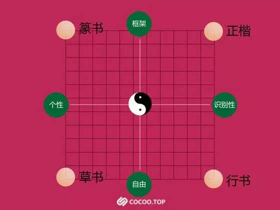
Regular script:Form: It is still a frame structure, which is very easy to identify, so it is in the upper right corner of this coordinate tool. Relatively speaking, it has less personality and is stable.
Cursive script: Form: no frame, placed as you like, difficult to identify (look for calligraphy from past dynasties and see how many you can completely recognize), but the personality is very It’s so strong. If you read it a lot, you’ll know it’s the calligrapher’s work without even looking at the signature.
Ring script:Form: no frame, easier to identify, with both personality and recognition.
I mainly use this coordinate tool as a tool to analyze other people’s font designs and as a guide when designing my own fonts. Having said all that, do you know how to use this tool? Not yet? ! ! ! It doesn’t matter~~I will continue to explain!
Frame type font design
Let me first talk about the frame font method: From the coordinate tool point of view, frame font design,
Articles are uploaded by users and are for non-commercial browsing only. Posted by: Lomu, please indicate the source: https://www.daogebangong.com/en/articles/detail/miao-zai-zhong-wen-zi-ti-she-ji-zhi-dao.html
 支付宝扫一扫


评论列表(196条)
测试