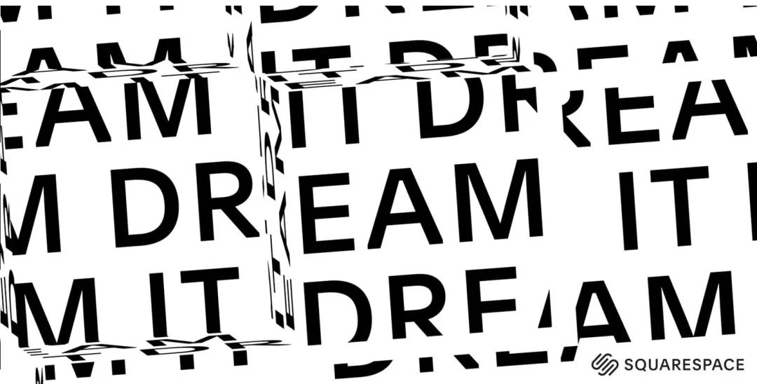
The winners are here!
The day before yesterday, Monotype announced the first winners of the newly established Type Champions Award. China's Alibaba was the only winner from Asia.
Monotype is a company that provides glyph construction, licensing and design for numerous brands. According to Monotype’s official website, the Type Champions Award aims to recognize brands that pursue excellence in design and fonts. These brands create and use innovative and impressive font designs while extending and maintaining their brand image.
Award winner
In recent years, many mainstream consumer brands have regarded brand custom fonts as an important part of their marketing efforts. It can be seen from this year's winners that the common characteristics of those award-winning brands include: attaching importance to sincerely conveying brand/creative information; Bring customers an experience that is consistent with the brand's tone, make the brand stand the test of time through the choice of font design, carry out creative strategies in marketing and advertising (use of emerging channels, unique strategies to attract new/existing customers, A series of creative fonts), as well as making key efforts in font design and creativity.
During the Type Champions Award nomination process, Monotype also invited a number of creative professionals and expert panels to analyze and identify the most popular trends that will drive design now and in the future, and launched a new online handbook on type design trends. , which is often an important indicator of a broad shift in brand strategy. (You can register and download on the official website, link: https://hello.monotype.com/5-Type-Trends-for-Brands-2020.html)
According to this downloadable report, the “Top 5 Type Design Trends of 2020” are as follows:
1. The necessity of global language coverage
2. The rise of variable fonts
3. Emphasis on symmetry of sans serif fonts
4. Fonts as logos: the resurgence of decorative elements
5. Always rebranding
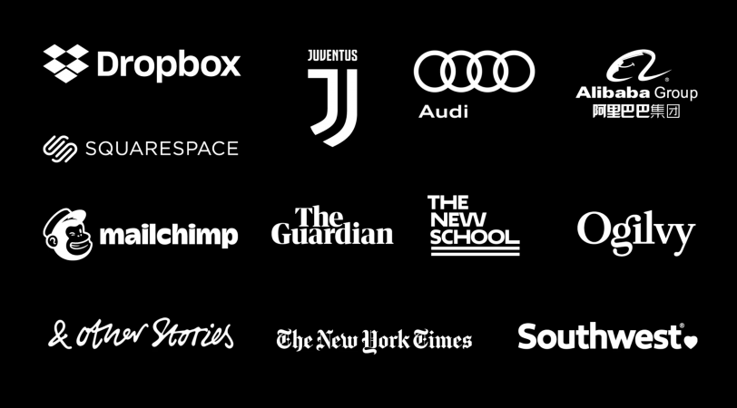
Design360° has sorted out the 12 brands that won this year’s Type Champions Award, and let’s take a look at their visual identity and font design.
Alibaba Group
"Fit for a passionate, powerful and future-forward brand."
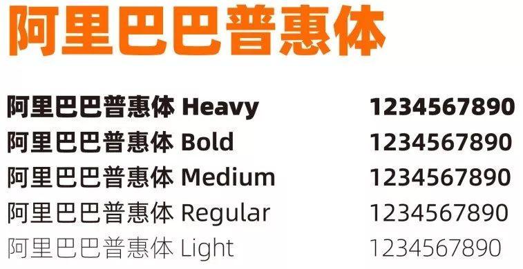
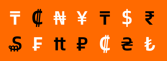
Alibaba released a new font "Alibaba Puhui Style" in April this year. This is the first free commercial text font released by a Chinese company that can be used in all scenarios. The Spanish part was designed by Mona's Akira Kobayashi, and contains a total of 116,895 full-width Chinese characters (including 5 weights), and a total of 7205 Latin letters (2 styles, 11 weights) for Spanish Alibaba Sans, covering 172 Languages can meet the multiple application scenario needs of Alibaba Group and its economic companies in global business.


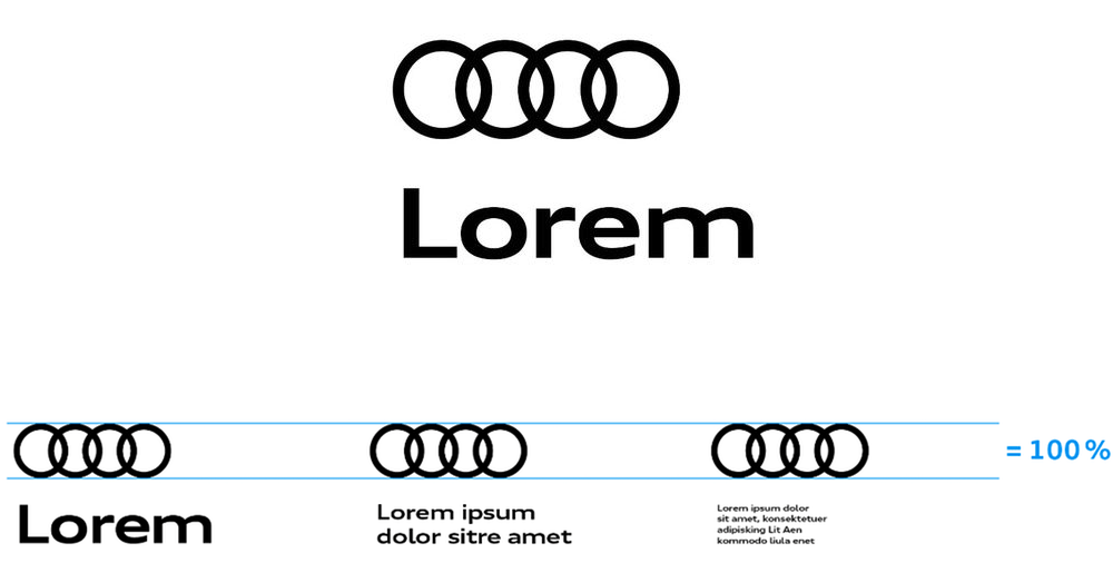
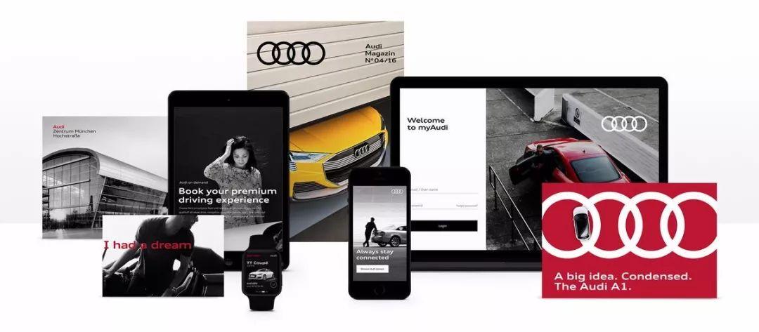
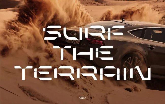
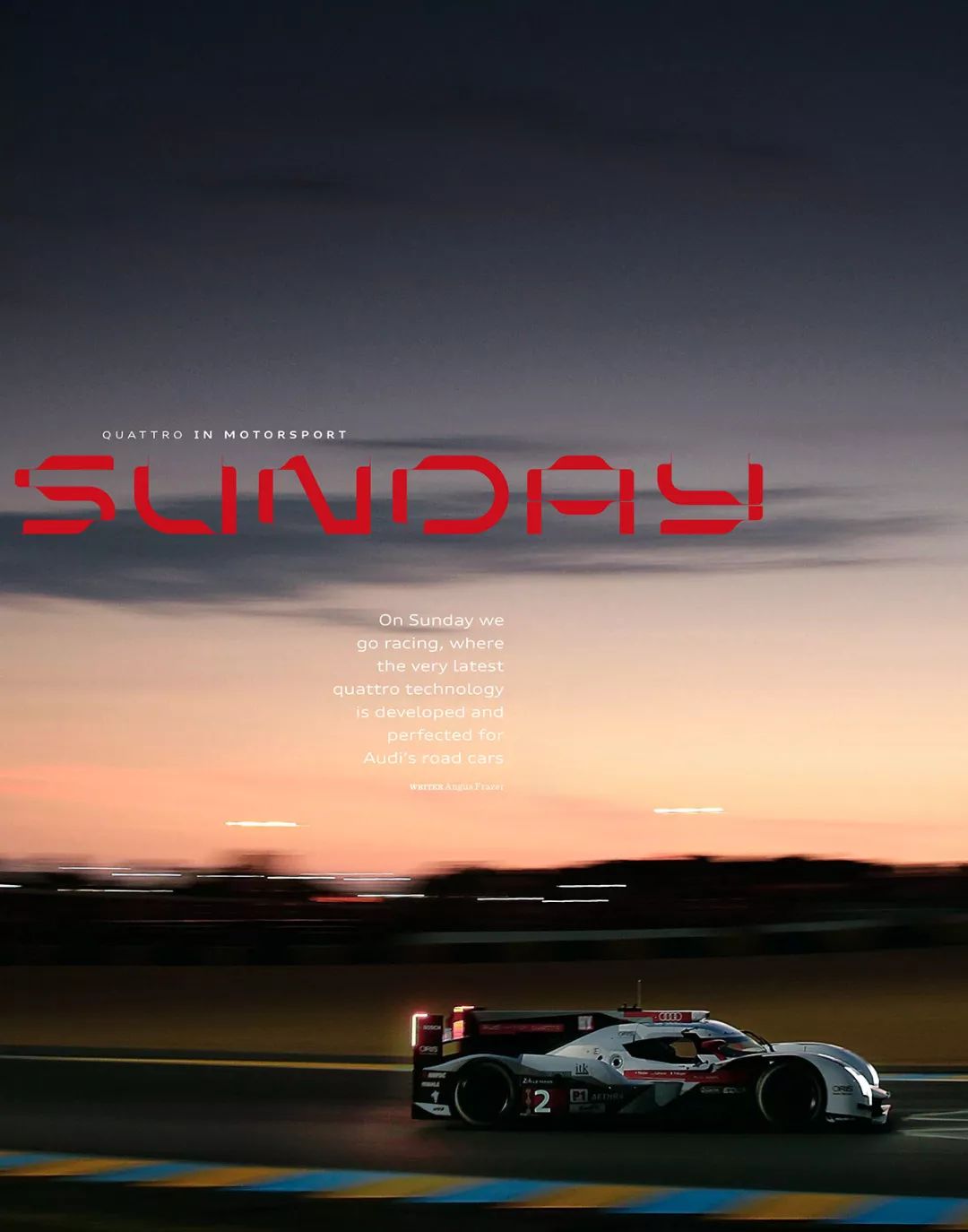
Audi Audi
"A flexible type system is at the heart of the Audi brand identity."
In 2017, the German car brand Audi launched the most substantial new flat logo since 2009 and a new brand custom fontLorem.London’s Sawdust design studio also specially designed an exclusive logo for Audi. The magazine designed a series of special display fonts. Audi is one of Germany's oldest car manufacturers. Audi has been using the four-ring logo since 1932. This move to flatten the trademark not only echoes the way the Internet will operate in the future, but also shows that the brand will move towards the future with a more simple aesthetic.


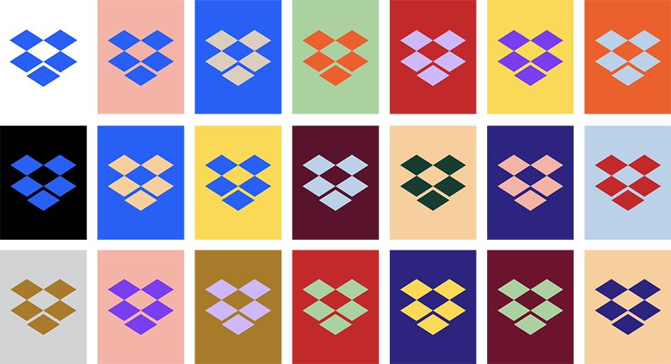
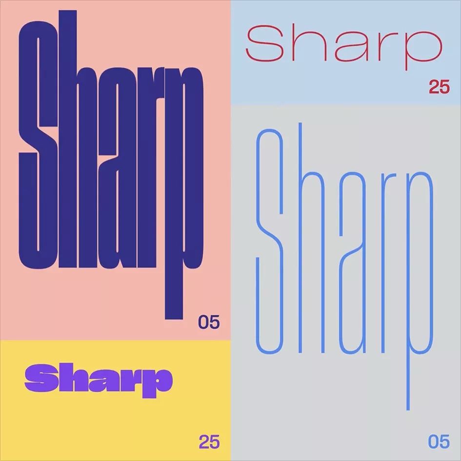
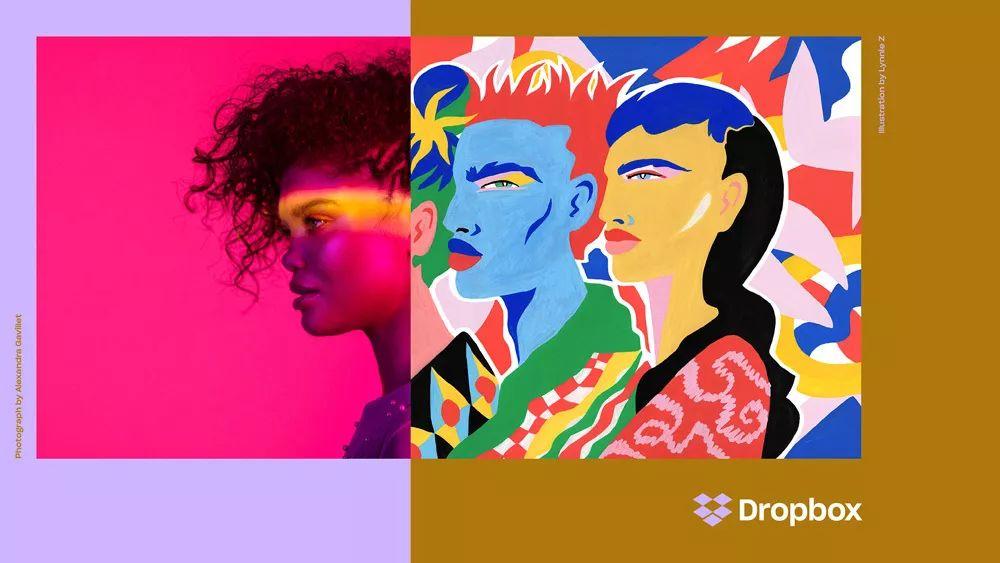
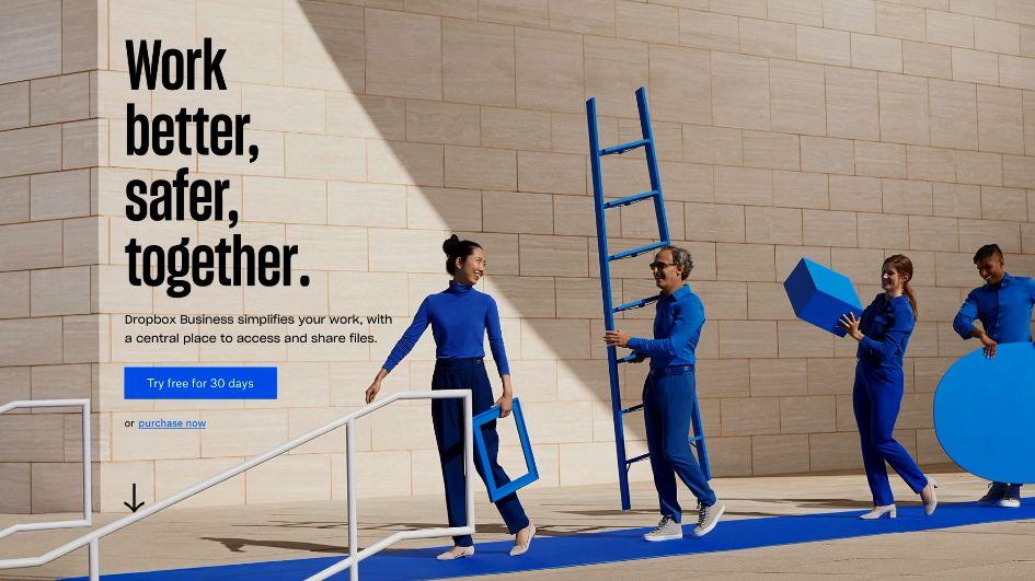
Dropbox
"A new identity that embodies the brand's playfulness at every touchpoint."
Since its founding in 2007, cloud storage service provider Dropbox updated its brand image for the first time in 2017, including a new logo, a set of color combinations, and a set of Sharp Grotesk including 259 different characters. fonts and a series of illustrations.


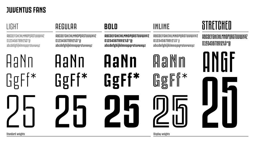
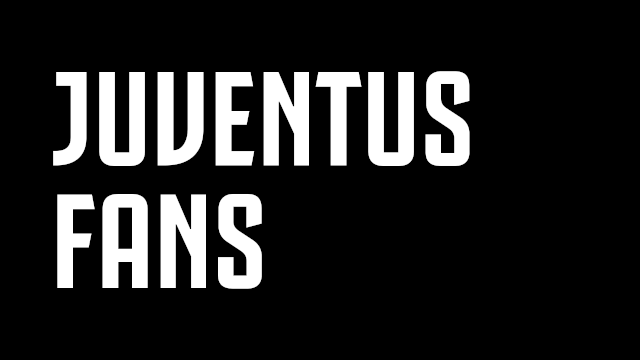
Juventus
"A universal symbol of perseverance, ambition, and premium Italian style."
Juventus Football Club S.P.A., founded in 1897, also ushered in a huge visual image change in 2017, with a new brand logo and font designed by Milan design studio Interbrand. Juventus Football Club is one of the oldest football clubs in Italy and the team that has won the most Italian Serie A championships. Although the club intends to usher in a new era with the new logo, when the team logo was released, many die-hard Juventus fans criticized the new team logo for losing the team's tradition.


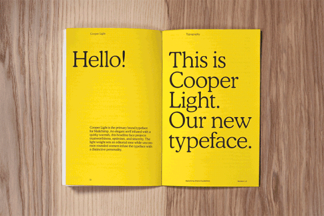
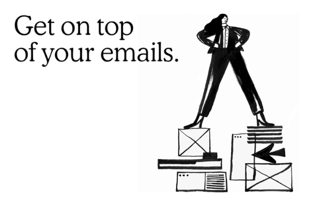
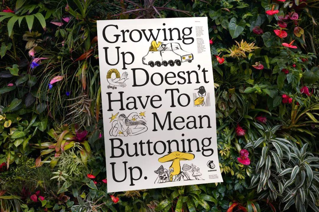
Chimp Mail Mailchimp
"Consistent and grounded, yet playful and expressive."
In 2018, Mailchimp, a well-known email marketing service platform, invited Collins Design to help them rebrand to reflect and drive their ongoing business transformation. This design simplifies the brand’s logo, Freddie the gorilla, and launches a new brand font Cooper. Cooper is a very personal and open font. Founded in 2001, Chimp Mail is one of the world's largest marketing platforms, providing not only email services but also powerful and advanced marketing tools for businesses of all sizes.


Ogilvy
"Oglivy has renewed its emphasis on craft across the full brand identity, with type at the forefront."
In 2018, Ogilvy collaborated with Collins Design Company to create a new look and font system for Ogilvy to help reshape and launch the brand. The new Ogilvy logo represents the agility, collaboration and connectivity the brand is able to deliver to its clients. The Ogilvy fonts have been redesigned as Ogilvy Serif and Ogilvy Sans, with the new logo typeface referencing founder David Ogilvy's favorite font, Baskerville. Ogilvy is a multinational advertising, marketing and public relations company originating from the United States. It is currently a subsidiary of WPP Group and is headquartered in New York.


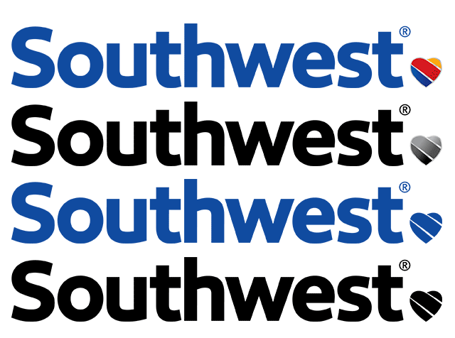
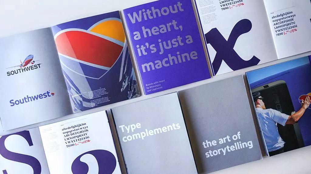
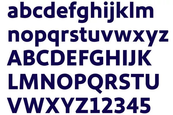
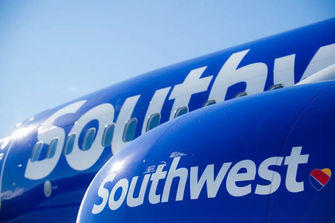
Southwest Airlines
"A contemporary brand persona, across the full customer experience."
In 2014, Southwest Airlines launched a new livery "Heart", a new LOGO and a new font system Ubuntu. This is the first time the airline has launched a new livery since 2001. system. In this visual identity upgrade, Southwest Airlines no longer uses the all-caps Helvetica font, instead using a font with thicker strokes that can be changed according to customer requirements. At the same time, it also converts some letters to lowercase to convey a gentler, friendlier feeling.


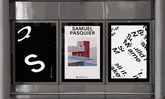
Squarespace
"A Squarespace is uniquely positioned to expand the value of type to millions of creator sites worldwide."
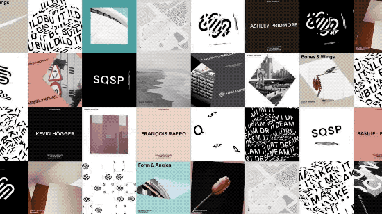
Squarespace is one of New York City’s tech companies. Studio DIA collaborated with type designer Francois Rappo and Optimo type factory to create a new typeface for the brand, Clarkson, which is a reference to the Grotesk and Neo-Grotesk typefaces that appear in New York City's urban transportation system. Mix and match, and change the focus of the font by cutting the glyphs to reflect your uniqueness. Squarespace is an online content management system consisting of website creation tools, web hosting services and blogging platforms, and operates on a software-as-a-service model. The service allows individuals or companies to create and modify websites and blogs.


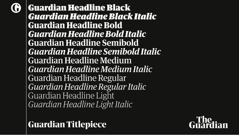
The Guardian
"An eye-catching, purposeful, and type-driven visual identity."
The Guardian revamped its layout in 2018, changing its printing size to tabloid size, and launching a new web page, front page and headline font along with the newspaper size change. The new font Guardian Headline was created by the in-house design team in collaboration with Commercial Type studio. This simple, confident and impactful headline font is paired with color and imagery to support and enhance the delivery of The Guardian’s journalism. The Guardian was founded in 1821. This British newspaper has a circulation of approximately 146,000 copies and is visited by 152 million online users each year.


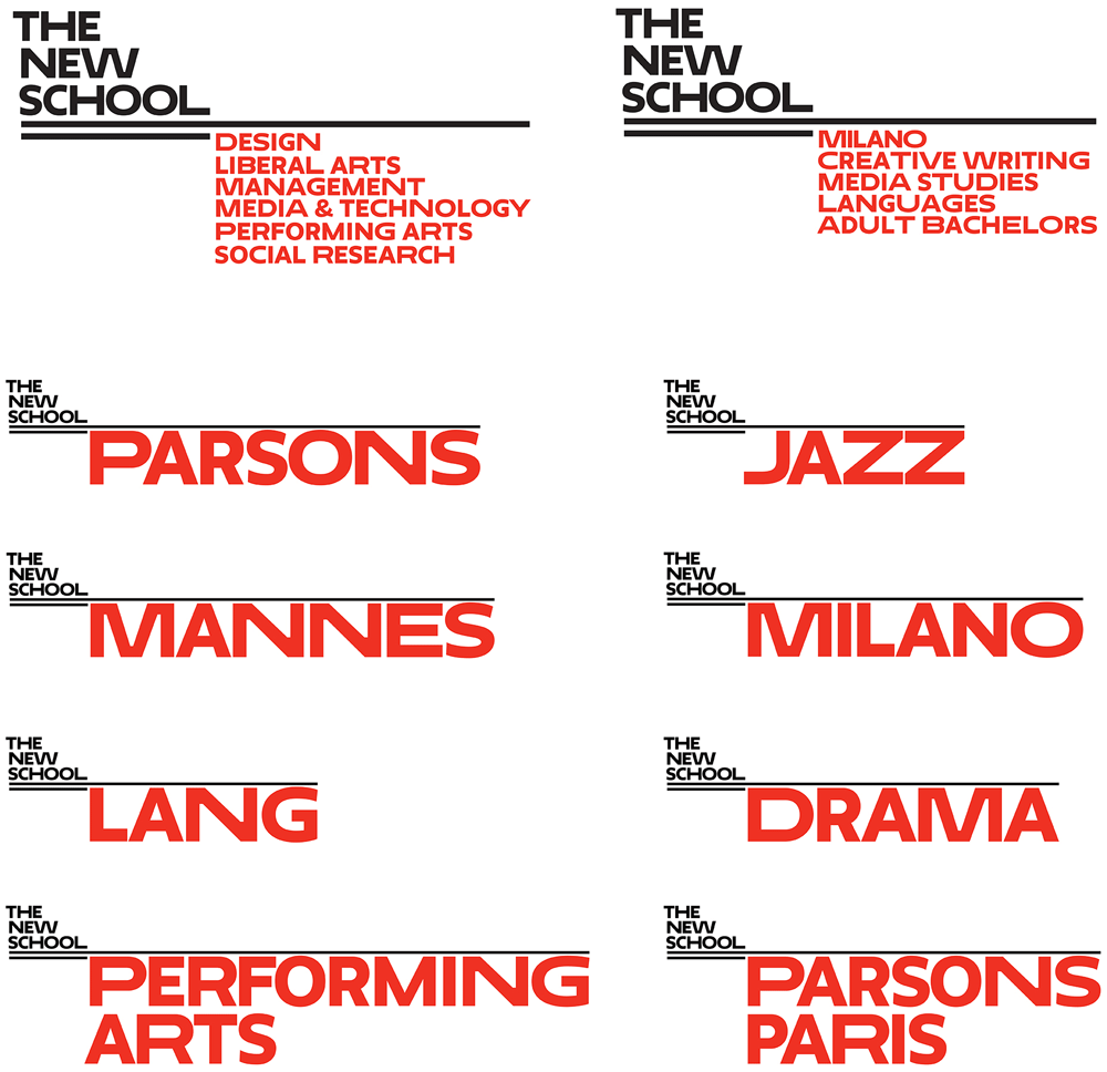
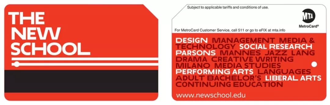
The New School
"An identity grounded in a technologically-sophisticated typeface: Neue."
In 2015, Pentagram Design Company updated the overall visual image of The New School and produced a brand-specific font Neue. The new logo and typeface design echo the stylistic characteristics of the college's architecture and New York City, and the typeface system can not only express the independent image of the college itself, but also connect with other colleges. The New School was founded in 1919. It is an American higher education institution located in New York City. The famous New York School of Visual Arts is one of the schools under the New School.


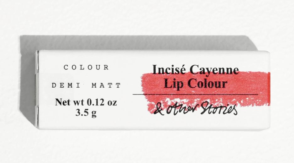
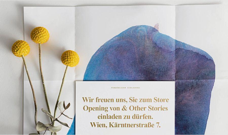
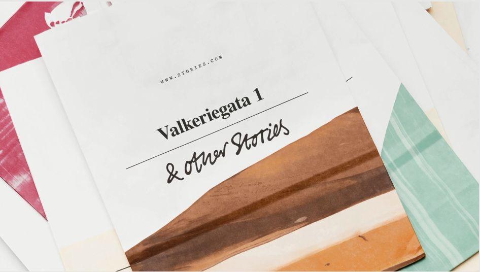
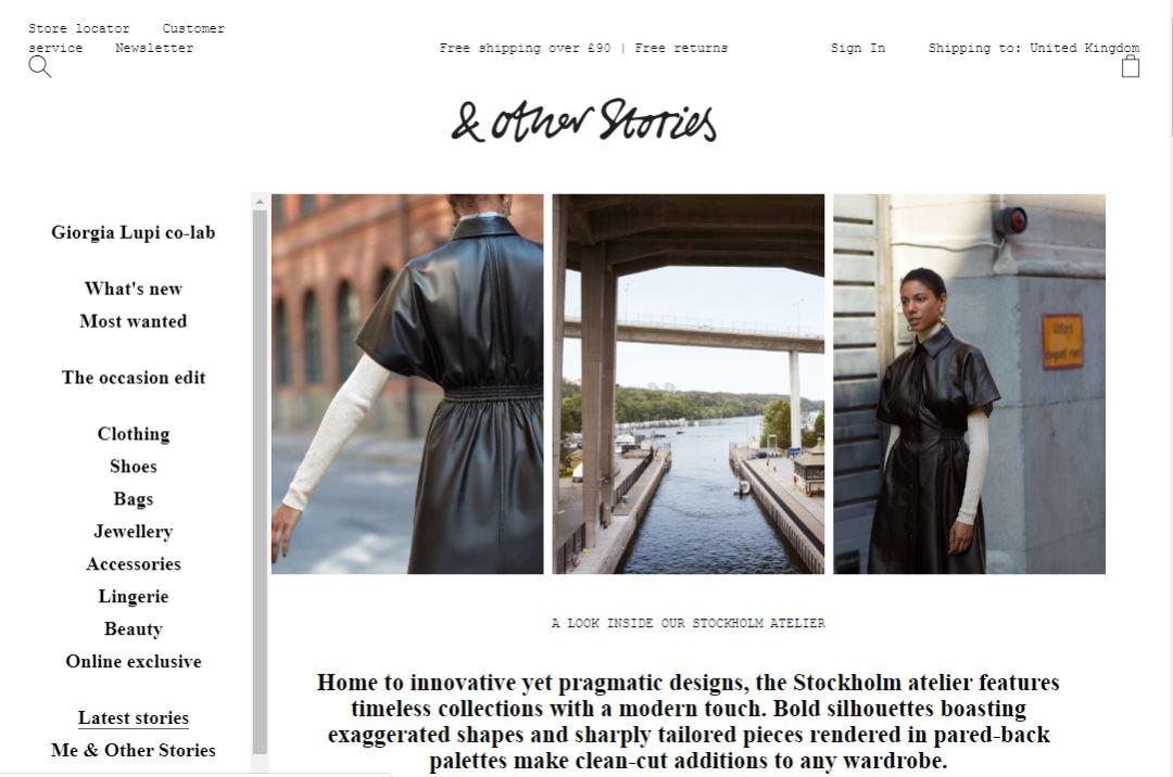
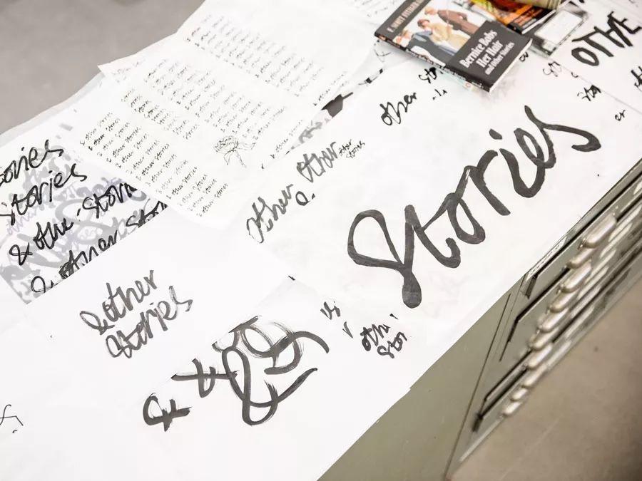
& Other Stories
"A refreshing paired back and honest approach to fast fashion."
& Other Stories is a high-end women's clothing brand owned by Hennes & Mauritz AB, the parent company of H&M. It was founded in 2012. & Other Stories’ name and visual identity were inspired by a phrase that often appears on the covers of story collections.

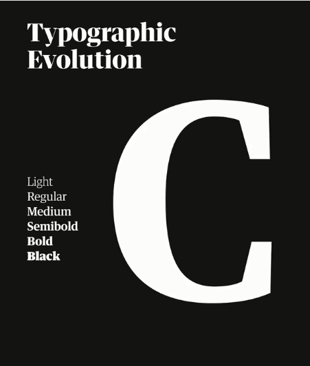
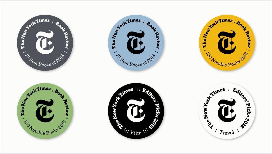
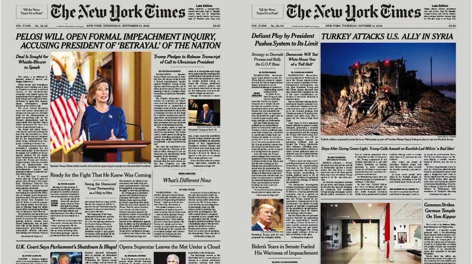
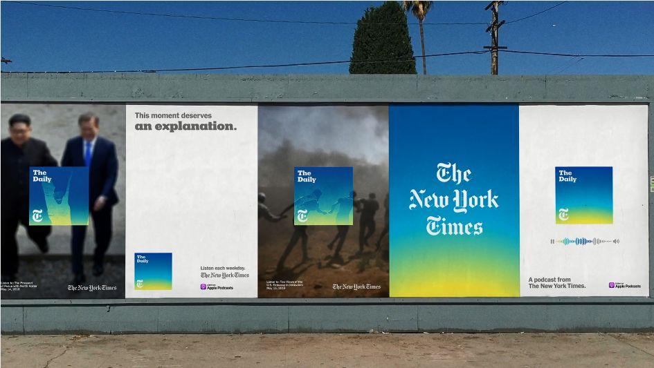
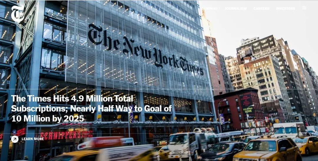
The New York Times
"A legacy of relevance, sophistication, and a future-forward brand identity."
In 2015, The New York Times announced its latest brand logo design. Type designer Matthew Carter said that the new LOGO design was intended to express a "more modern and elegant sense of space." The entire set of publishing fonts was designed by Henrik Kubel, a designer at A2-TYPE. The entire font design revision process was jointly directed by design director Gail Bichler and art director Matt Willey, and executed by designer Anton Ioukhnovets. The New York Times is an American daily newspaper founded and continuously published by the New York Times Company in New York, USA on September 18, 1851.

An article about brand fonts published by The New York Times in 2018 wrote: "Fonts are becoming more and more important to company marketing. They are a new way of communication. The style, size, shape, thickness, color and Depth speaks and conveys tone. The right use of fonts can help brands stand out in a competitive market. Brands need to know who their target audience is and what they need to express.”
What is certain is that the Type Champions Award founded by Mona will continue to witness and encourage more brands to join the camp that values font design in creative strategies.
Translation & Editing | ChipsandYogurt
Proofreading | Yeeman
Articles are uploaded by users and are for non-commercial browsing only. Posted by: Lomu, please indicate the source: https://www.daogebangong.com/en/articles/detail/meng-na-shou-jie-TCA-zi-ti-da-sai-jie-guo-gong-bu-a-li-ba-ba-cheng-ya-zhou-qu-wei-yi-huo-jiang-zhe.html
 支付宝扫一扫
评论列表(196条)
测试