The 2021 Font Trend Report is here
The article is reproduced from: Design360
ID: design360magazine
Editor: dada
Recently, Monotype Font Company released the 2021 Font Trend Report, analyzing how brands and creative agencies used typography to interpret common cross-cultural themes in the past year. Monotype is a company that provides glyph construction, licensing and design for numerous brands. They launched the Type Champions Award in 2019 to recognize brands that pursue excellence in design and fonts, and also invited a number of creative professionals and expert panels to analyze and confirm the most popular trends that will drive design now and in the future. , and launched a font trend manual.
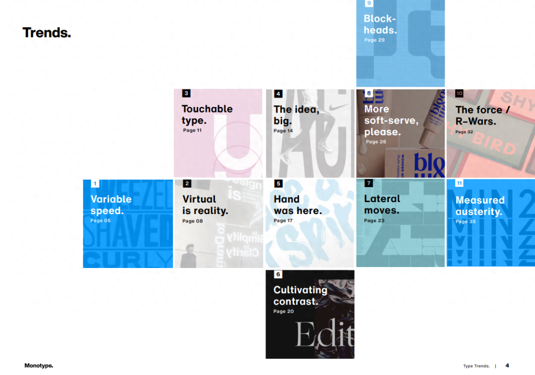
Monotype 2021 Font Trend Report
As consumer expectations and technology change, type design is constantly changing and evolving. For those brands and creative people who want to keep up with the trend, after reading this report, you may be able to know more about everything about fonts nowadays. A total of 11 topics are listed in the entire report, and Design360° will display the key points of the report in this article.
01
Variable speed.
Variable speed
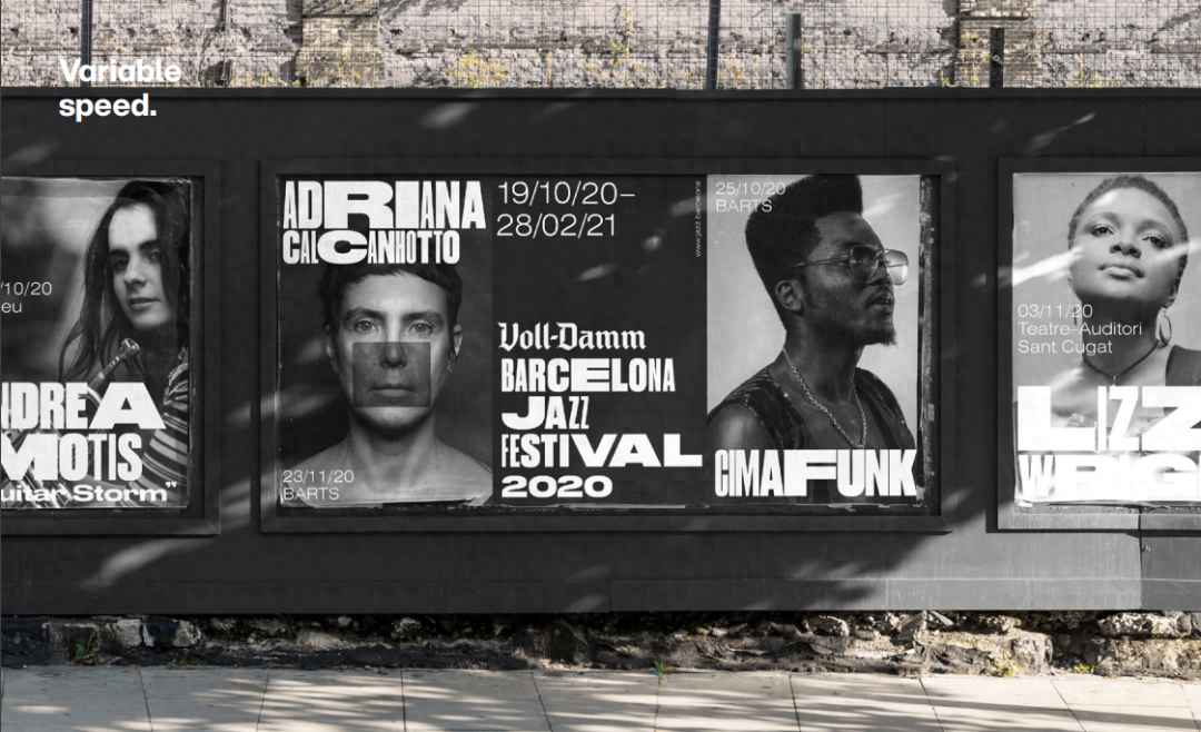
Barcelona Jazz FestivalAgency: Summa
Variable fonts have been a hot trend in recent years, with designers experimenting with this new language, recombining appropriate widths and creating letters that can stretch, speed up and slow down. At the same time, variable fonts bring an unprecedented dimension of change and vitality. They can deform and move in space, opening up unprecedented expansion space for fonts and promoting a new era of experimentation and expression.
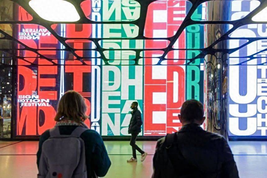
Design in Motion Festival, Studio Dumbar
Like many trends, this one has historical roots. A long time ago, avant-garde typographers would throw boxes of type modules on the table and create modular typography mixed with sans-serif styles. Paula Scher created a series of iconic works for New York City's Public Theater in the early 1990s and brought this approach back to the forefront.
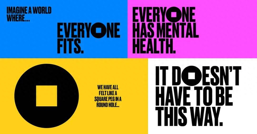
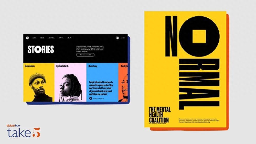
The Mental Health Coalition, PentagramTypeface Design: Commercial Type
Today, designers are starting to think of typefaces as living things. This is a completely new way of thinking about fonts, and designers will need to learn new techniques to implement it, but the potential behind it is huge. With the popularization of open source tools and the development of programming technology, font families will cross-integrate with digital technology and animation forms, bringing more surprises to designers and brands, and pushing the power of typography to the limit.
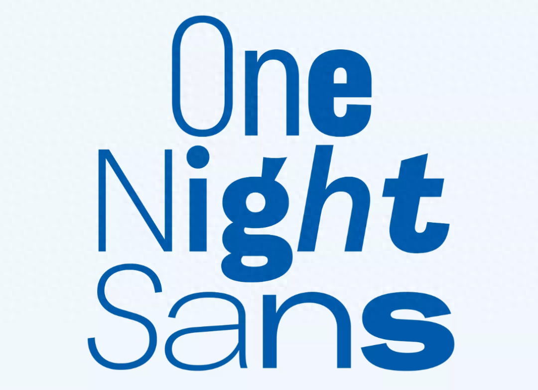
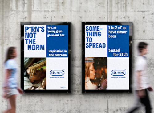
Durex, Havas LondonTypeface design: Colophon
02
Virtual is reality.
Virtual is reality
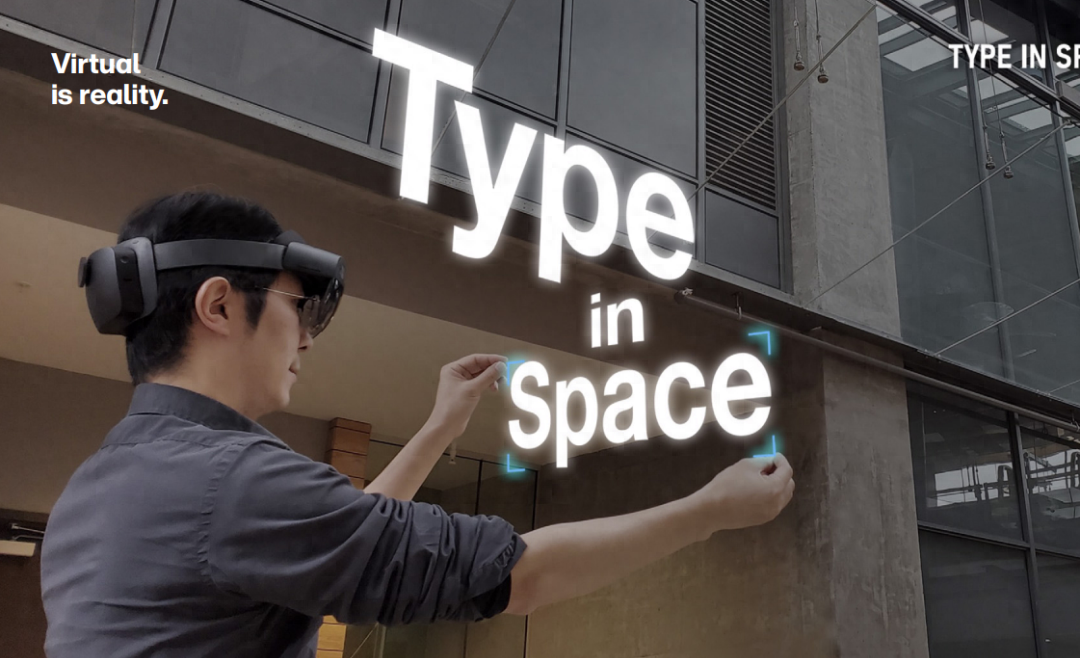
Type In Space, Yoon Park
If 2020 has taught us anything, it’s that the virtual world and the real world are becoming the same world. Everything happens through a screen, including our meetings, interactions with clients, and even holiday celebrations. In typography, this shift is reflected in the use of interactive fonts, mostly in AR or VR, that can adapt and react to the environment in real time.
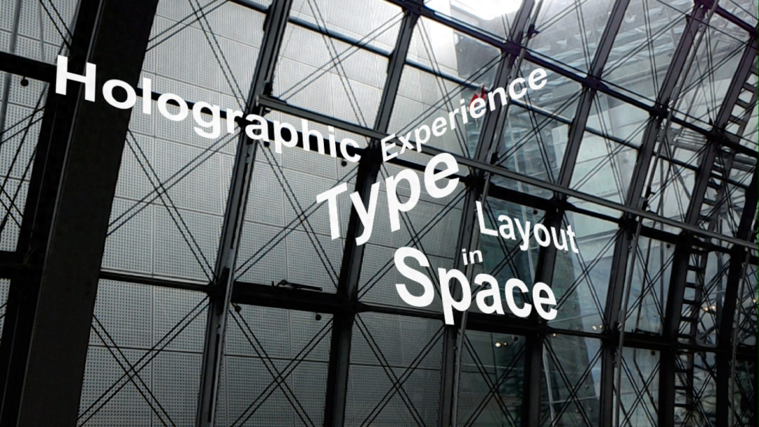
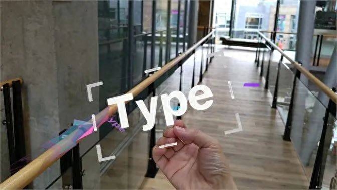
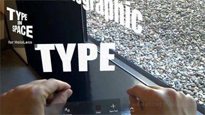
Hololens 2—Type in Space, BRDY Studios LLC for Microsoft
Brands have been talking and thinking about VR technology for years, and Monotype has seen more brands inquiring about VR and interactive capabilities. Advertising agencies are also eager to innovate in this space, whether by creating immersive releases. activities, or developing gaming experiences for navigating environments. Fashion, furniture and experiential brands are already demonstrating how VR technology can add a new layer to their customers’ user experience. In 2020, many brands and companies are exploring and promoting the application scenarios of this technology, and fonts are one of the key factors in these experiences. There are infinite possibilities for innovation.
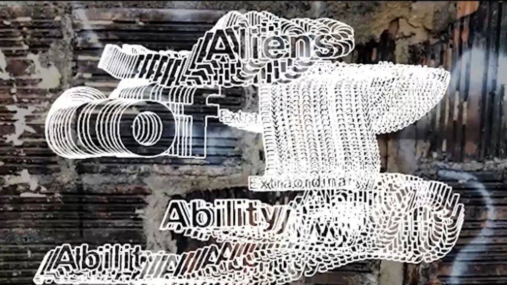

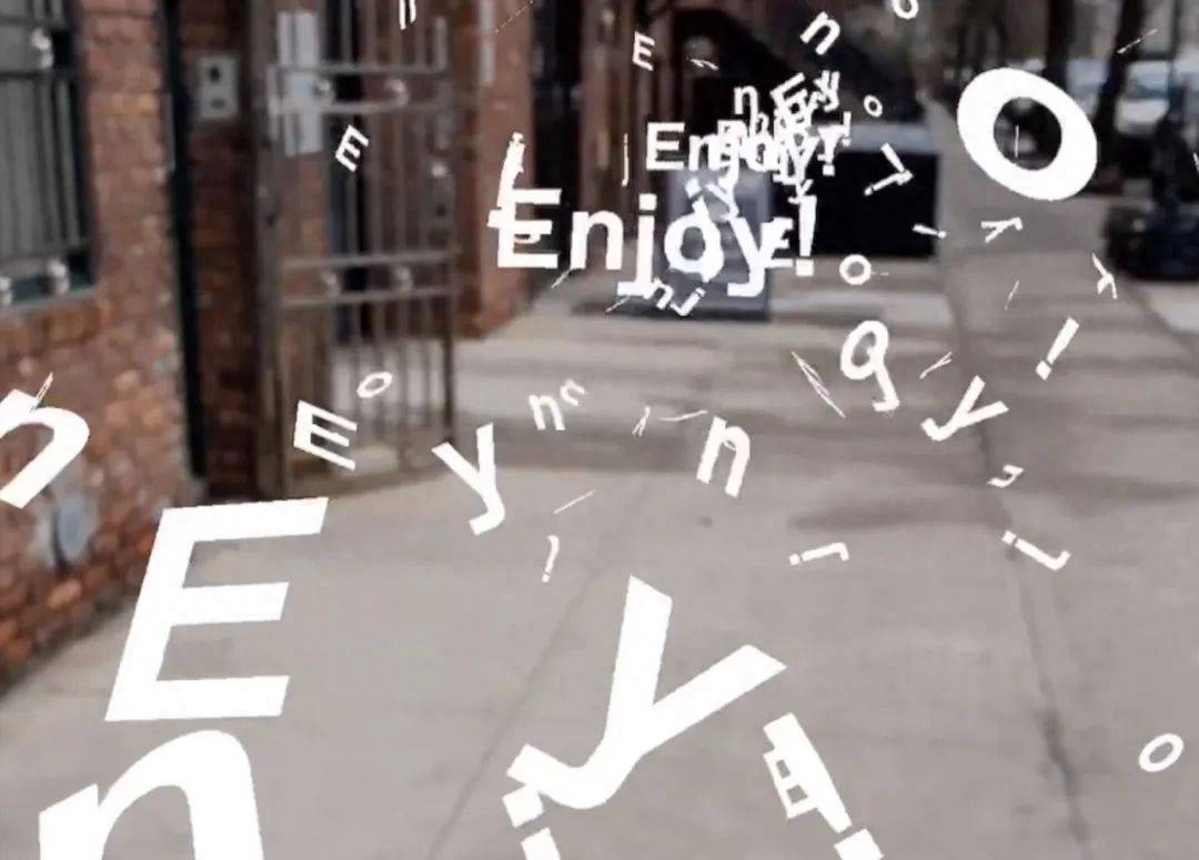
Weird Type AR App, Zach Lieberman
03
Touchable Type.
Touchable font
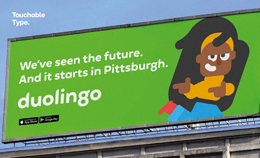
Duolingo, Johnson Banks
For the first two decades of the 21st century, the design world has been dominated by three basic sans-serif styles—geometric, humanistic, and a hybrid of the two, known as “geometric humanism.” In this age of digital acceleration, designers and developers are mostly attracted to a fixed element of continuity. Using fonts such as Avenir, Gotham and Proxima Nova has become an unstoppable trend in typography and branding that never seems to be broken. But the warm-feeling style is quietly making a comeback with a softer side in a geometric typeface that Monotype calls a "tactile typeface."
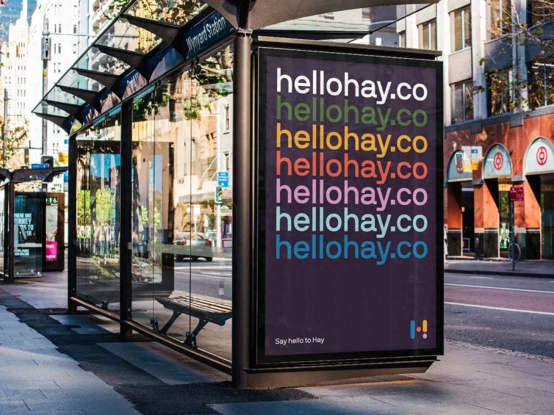
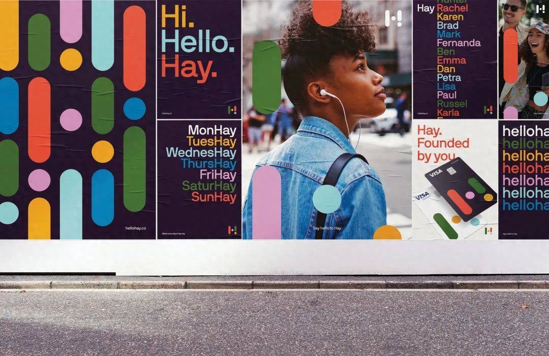
Hay, Christopher Doyle and Co
Touchable fonts start with a geometric structure and add artificial imprints, rounded corners, and imperfect calligraphic strokes to soften the impression it makes. Many brands are also moving away from purely geometric font structures and towards these softer and more organic forms, perhaps acknowledging that geometric fonts don’t suit every brand identity, especially when every business is doing the same thing.
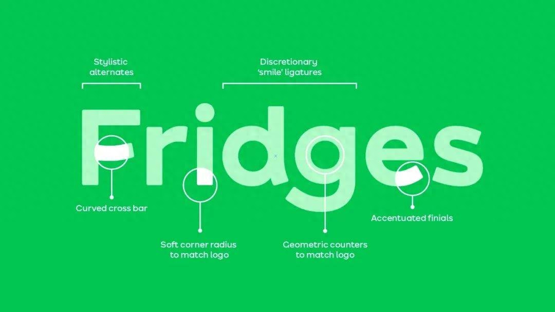
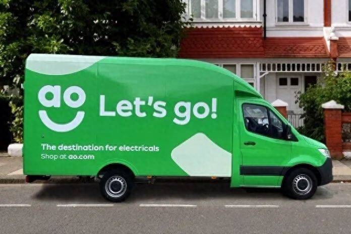
AO.com, DesignStudio & F37 Foundry Ltd.
Overall, “digital” shouldn’t mean “lack of personality.” Human connections are important, as is a brand’s ability to listen and empathize with its customers, and tactile fonts are exactly that in this day and age. at this point. While the purity of geometric typefaces and their place in our digital world will undoubtedly continue to exist, it’s clear that the tide is now turning.
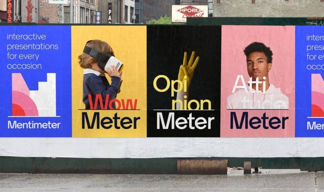
Mentimeter, Bold Scandinavia
04
The idea, big.
The word is big and loud
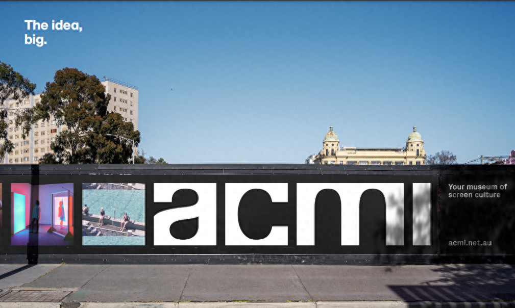
ACMI, North
"The idea, big" represents a tendency to be loud, arrogant, confident, and commanding. It increases the font size to 11. No matter what the original boundaries are, these fonts are not limited by boundaries and are suitable for representing brands that require extreme attention.

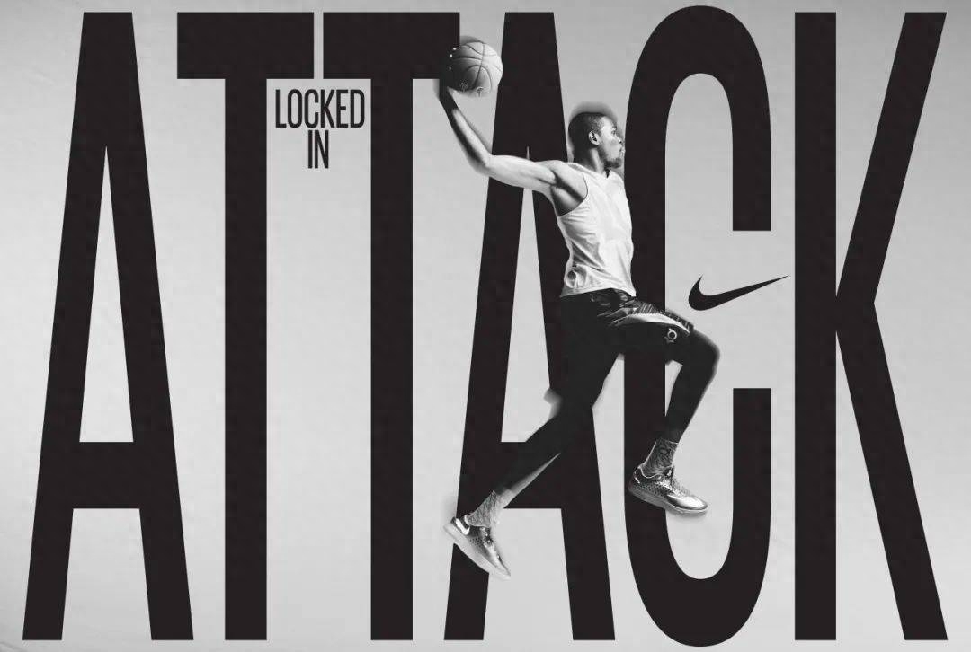
Nike, HORT
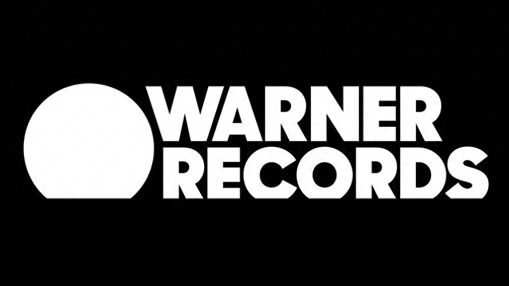
Warner Records, Pentagram
This trend is a celebration of shape, where shapes in negative space become the focal point, inviting one into the crafty world of letter design. Displaying them at a massive scale demonstrates how these letter shapes can tell a brand's story in the same way that film or photography can. It gives the font a cinematic and stunning quality, filling your field of vision by taking up all the corners. These giant fonts are designed to build strong confidence in the brand while embodying an attitude that celebrates everything about display typography.
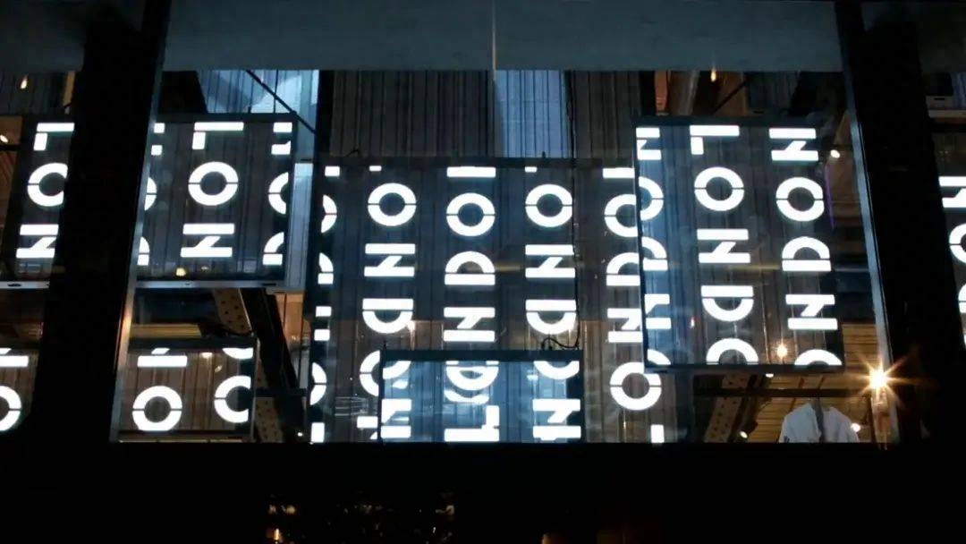
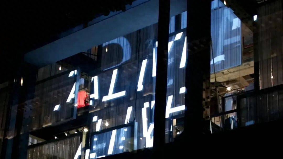
Hay, Christopher Doyle and Co
05
Hand was here.
Handwriting Revival

Mindful Chef, Ragged Edge & Rob Clarke
In the mid-2000s, a large number of brands began to seek a hand-made feeling, a material sense of high-quality craftsmanship, and an experience of making something from scratch. Since then, the trend has come and gone. And in today's digital world, it's not surprising that people are beginning to look for this kind of warm and familiar things again.
This trend is all about hand-painted lettering and woodcut textures, fonts that may evoke the nostalgia of a lunchtime stroll to a food market, or hand-painted street food signs and mom-and-pop storefronts, a reminder of a desire to be human. experience. It also ties into themes of sustainability, such as local sourcing and DIY, or a sense of belonging to a community.
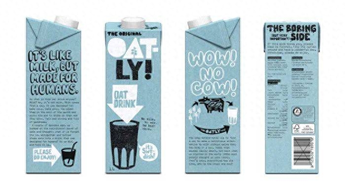
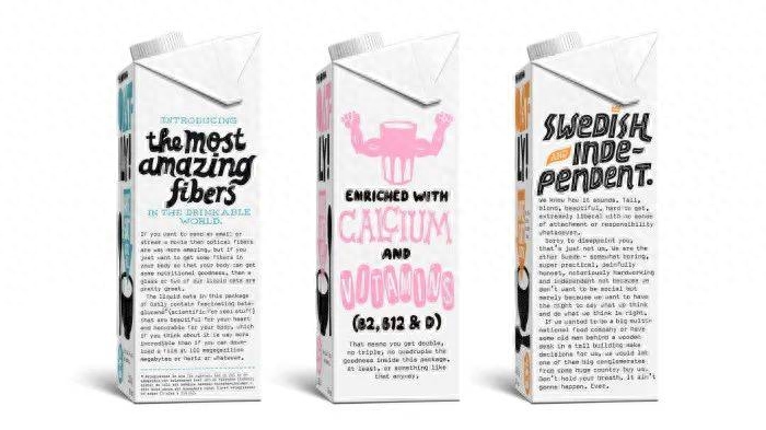
Oat-ly, Forsman & Bofendors
From a purely typographic perspective, this trend relies on innovation in how typefaces are created and used. Because OpenType technology allows people to inject the idiosyncrasies, inconsistencies, and imperfections of handwriting into typefaces, script fonts no longer need to feel mechanical. These typeface designers give them soul and, in turn, a healthy, caring feel and the impression of a permanent commitment to creating something truly unique.
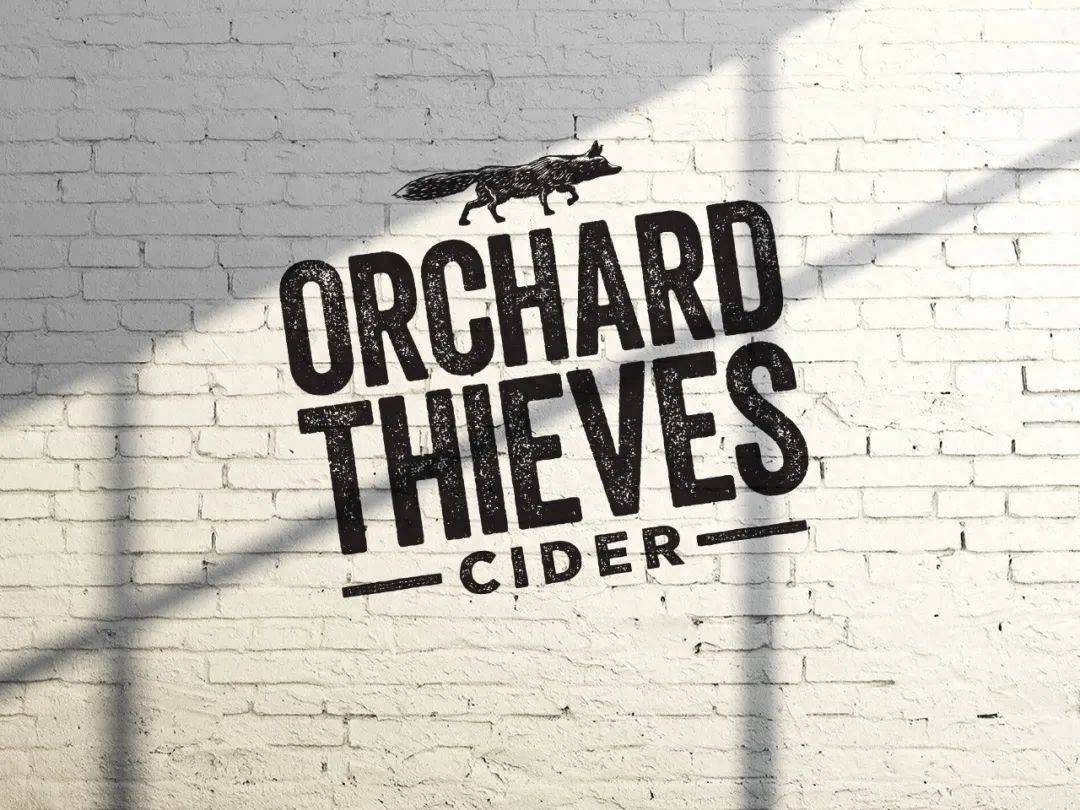
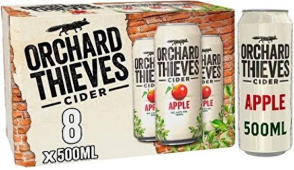
Orchard Thieves Cider, Dynamo Ireland
06
Cultivating contrast.
Creating contrast
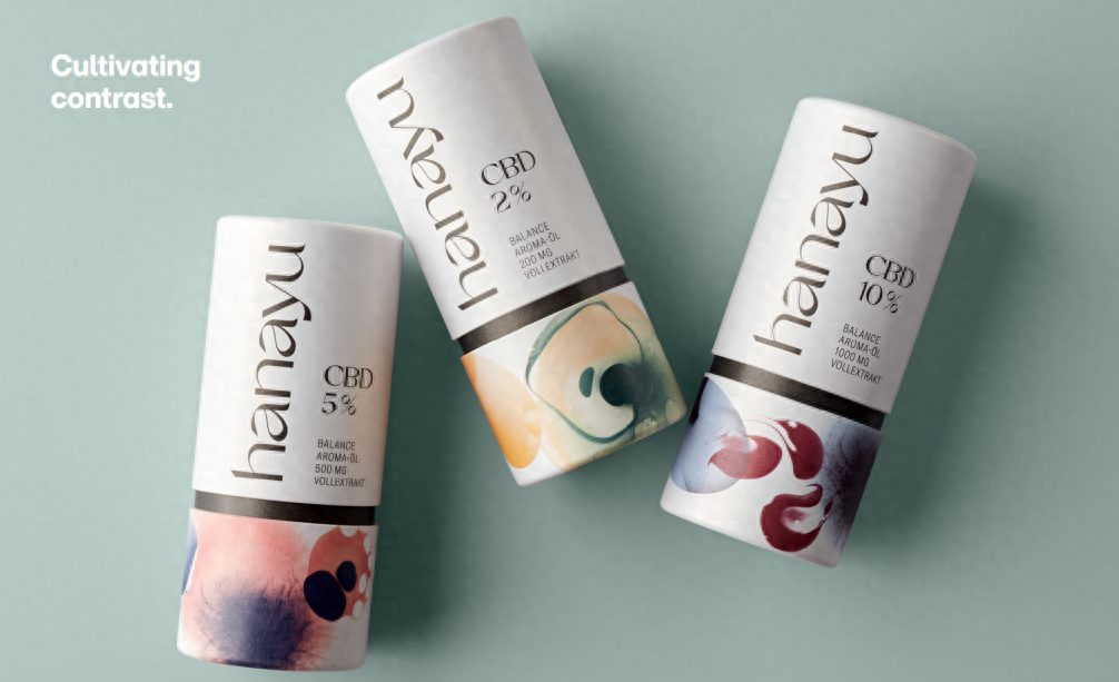
Hanayu, EIGA
Just like the trend for touchable fonts, a seemingly tiny touch, such as a tap on a vertical or horizontal stroke, can transform an ordinary font into a font full of personality, taking brands from where people have come in the past 20 years. Among those seen, processed or over-polished geometric fonts and humanistic sans-serifs stand out. This trend is mainly manifested in two aspects. They both use contrast to increase the "dress-up" texture of the design, making it look gorgeous and also have a sense of grandeur. They both represent a departure from the clean, geometric sans serif typeface.
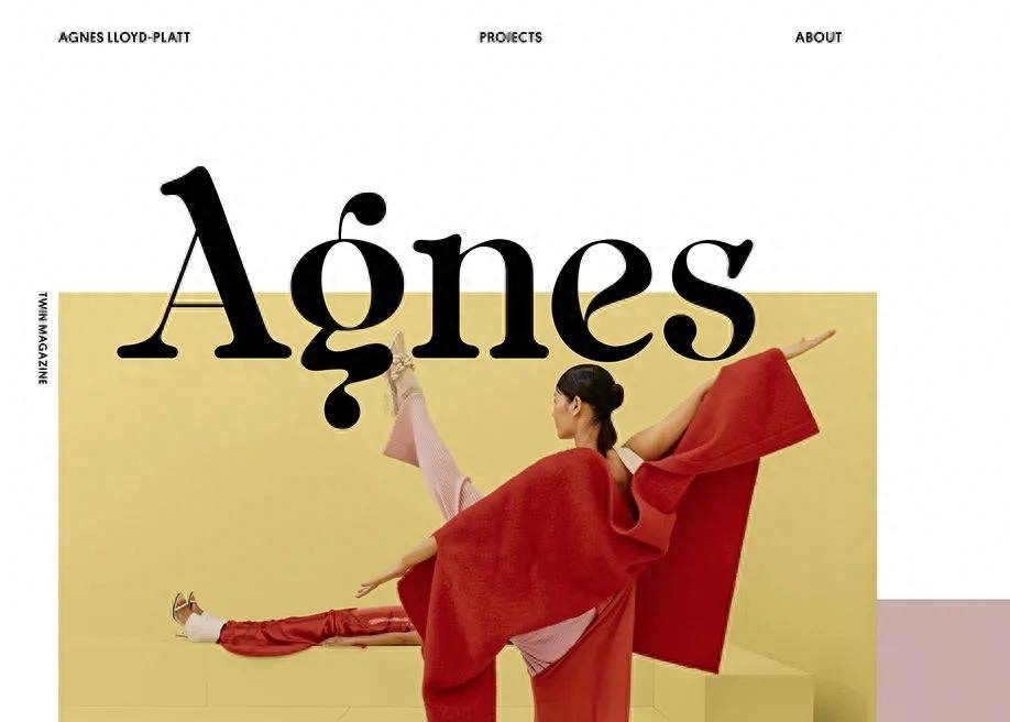
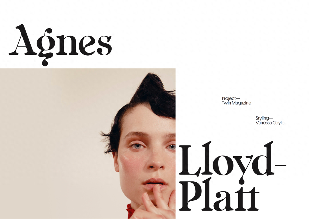
Agnes, Agnes Lloyd Platt
For example, Opulent Sans adds a temperament and class usually associated with serif fonts to the underlying sans-serif font structure. The more the designers increase the contrast between its thickness and thickness, the more it amplifies the sense of drama and elegance it carries, resulting in a striking letter shape. For years, brands have been tapping into the drama this typeface can create between thick and thin, especially in the fashion world, reinventing serifs and sans-serifs through contrasting thicknesses.
Languid Serif breaks people's expectations and is full of fashionable atmosphere and leisurely tone. This trend expanded typographic concepts and styles, pushing historical italics into unexpected new directions.
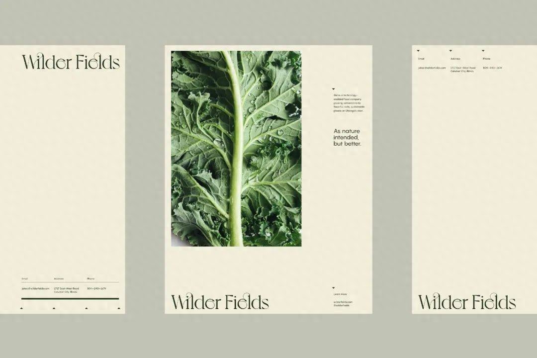
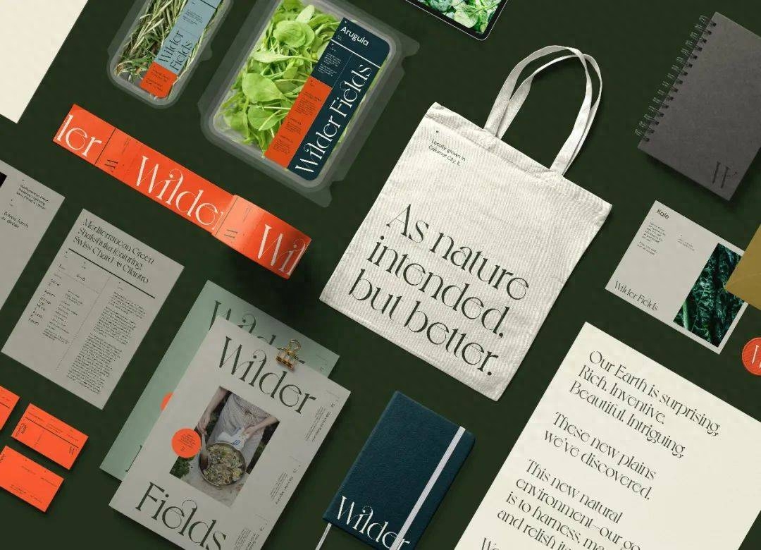
Wilder Fields, One Design Company
07
Lateral moves.
Lateral moves

The Avett Brothers, The Office of Ordinary Things
What happens when you invert the contrast on a high-contrast font? What you get is a groundbreaking typography aesthetic that’s strange and alluring, looking both familiar and dreamlike. The underlying intent of this counter-contrast trend is very different, so while the trend is creeping into more "creative" verticals like non-mainstream digital ventures, music, organic candy, or something more expressive of progress The market for sexual opinions is no surprise.
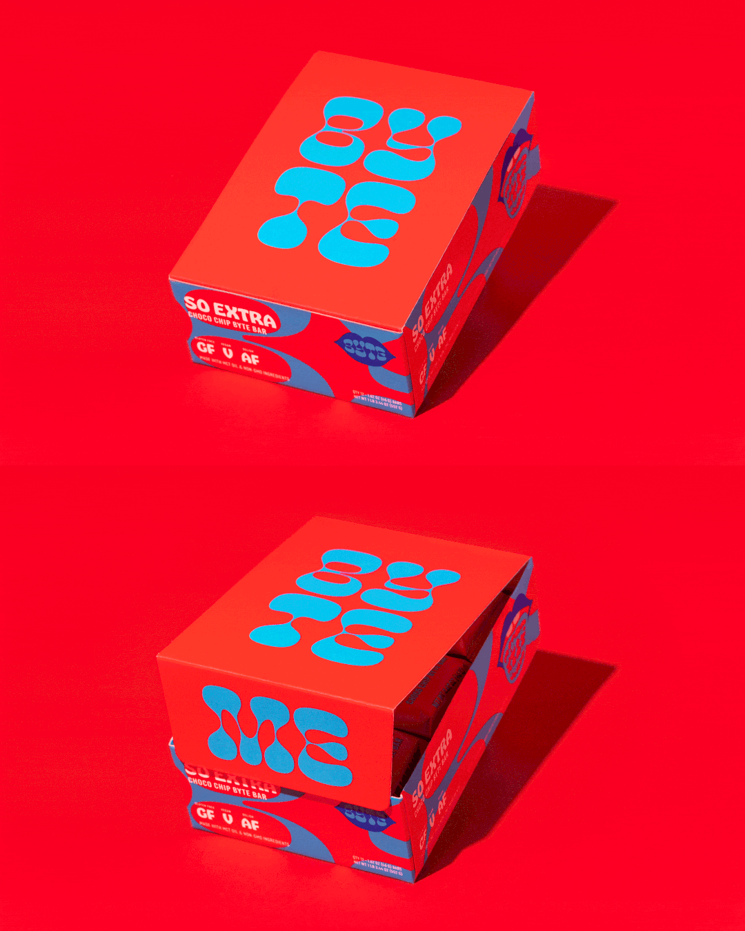
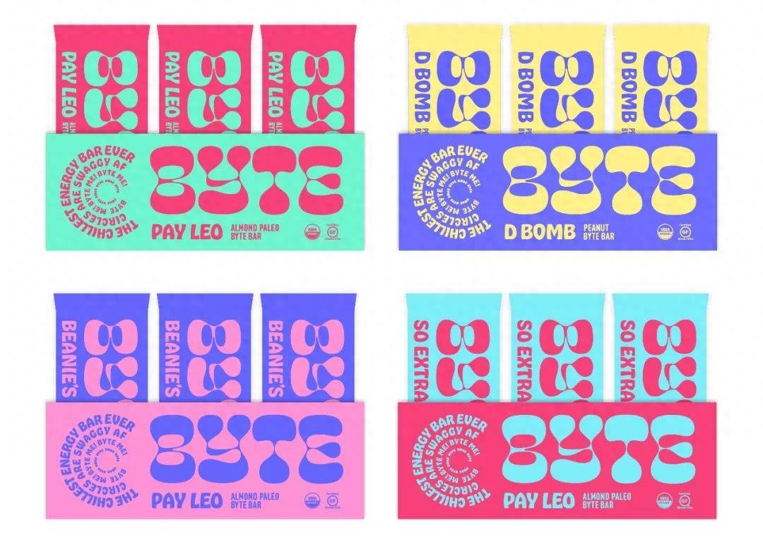
Byte Bars, The Office of Ordinary Things
In both cases, these creative explorations in emphasizing changes in angles and features have led to some interesting developments in typographic design as a whole, as well as some unique brand identities, with more to come in the coming years.
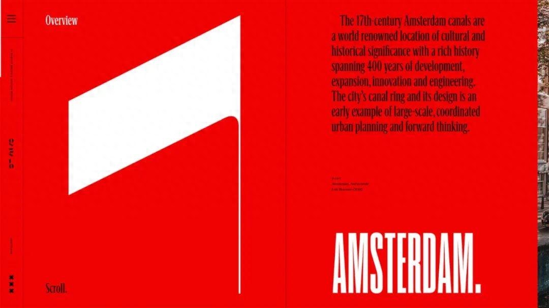
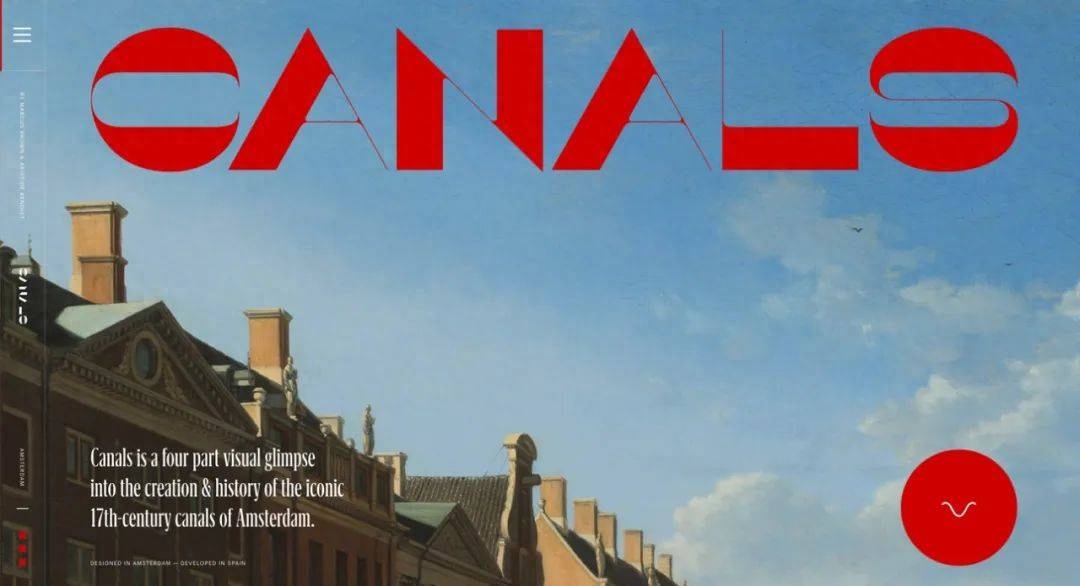
CANALS, Marcus BrownWebsite development: Aristide
08
More Soft–Serve, Please.
More ice cream
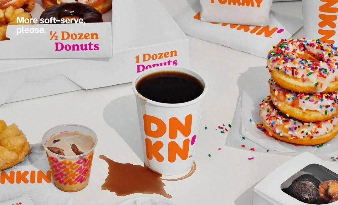
Dunkin’ Design, Jones Knowles Ritchie
This trend is all about classic, statement-making serif fonts like Cooper Light and Cooper Black. They are full of curves and weight, which easily catch people's eyes and create an atmosphere where people can sit down and relax. However, as these typeface elements have become intrinsic components of graphic design, many designers have begun to innovate with this serif typeface in order to explore creating deeper and more meaningful connections with consumers. This behavior has also A design aesthetic gradually formed.
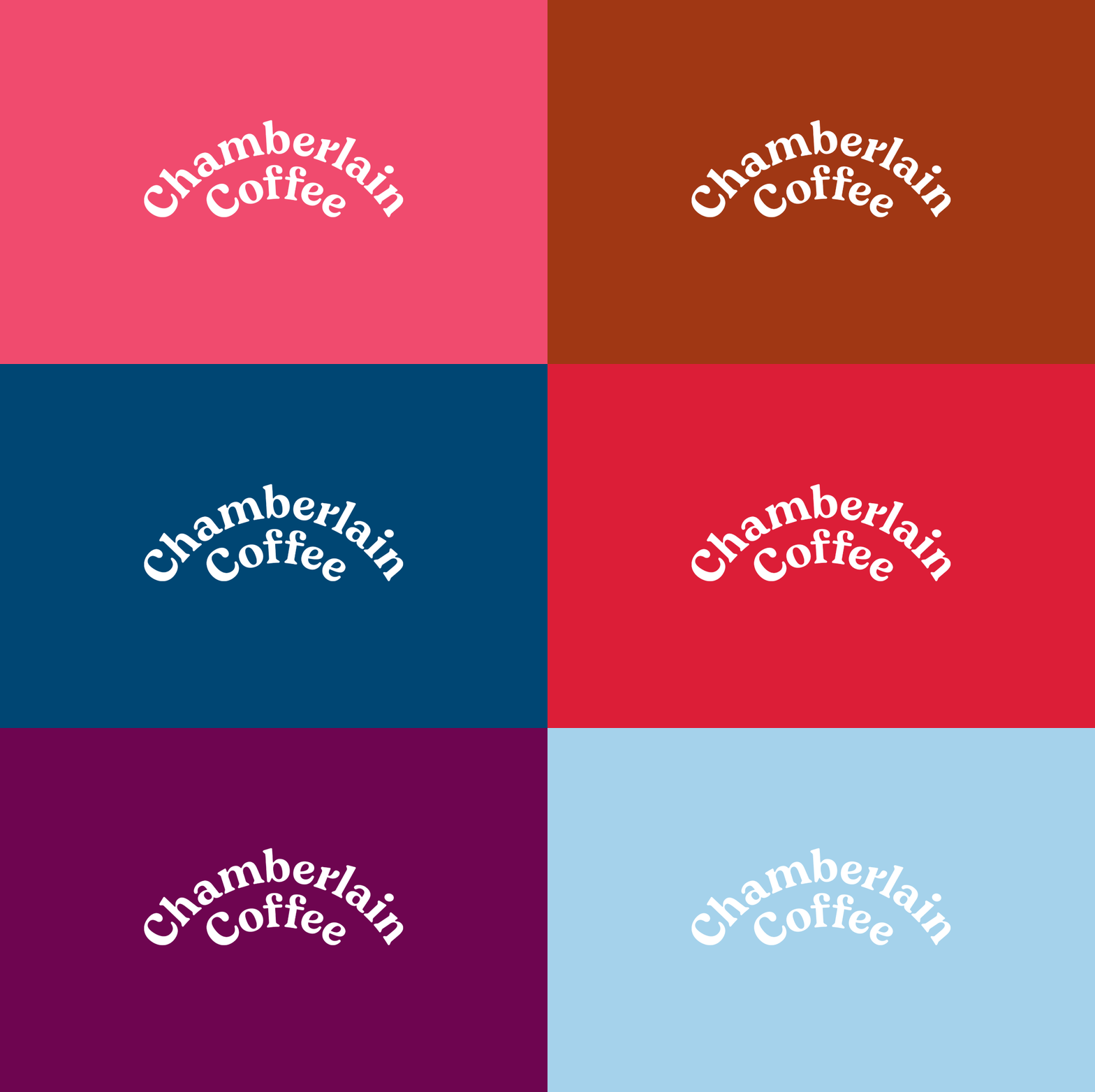
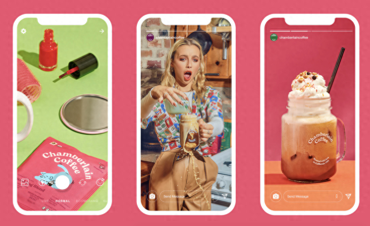
Chamberlain Coffee, Kontrapunkt
This design trend originally spread only in areas such as food and household items, but it began to make inroads into other business areas in 2020. In the past few years, rebranding projects such as MailChimp, run by Collins, Dunkin, run by JKR, and Chobani, run by InHouse, have led this trend. Since then, this design trend has grown like a rocket. The latest brand to join the ranks is Burger King. Officials have said: "Should our voice be more human, more accessible, more empathetic?" Now it is doing so with its own soft font with a retro aesthetic. Answered in the affirmative.
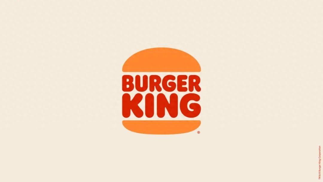
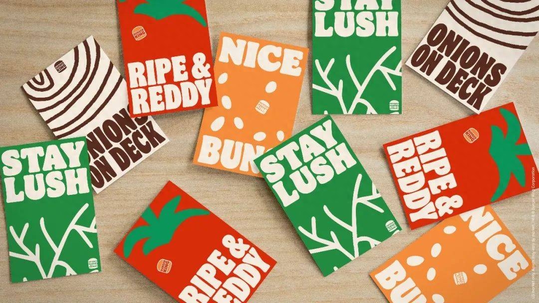
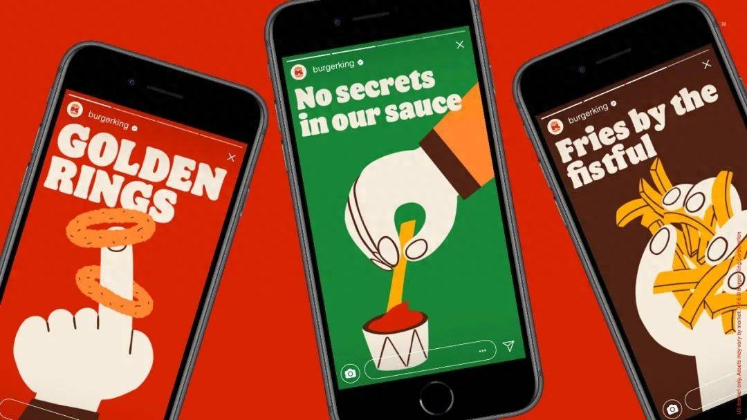
Burger King, Jones Knowles Ritchie
"Nostalgia" as a theme cannot be a driver of change, but it can serve as a vehicle for empathy when the world is in difficult times and people are trying to find a sense of familiarity. These letters with warm and soft shapes are paying tribute to the retro era with playful slashes, fat serifs, quirky letter shapes, and lively colors.
At the same time, brand fonts also have their own interesting names. For example, the name of Burger King’s brand font is “Flame Serif”, Fisher Price’s is “Let’s Be Glyphs”, and Dunkin’s is “Dunkin Serif”. These commemorative fonts are trying to remind people to enjoy their lives.
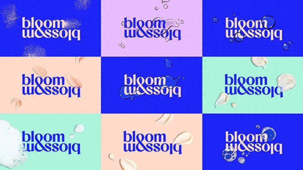
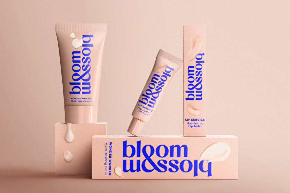
Bloom & Blossom, Jones Knowles Ritchie
09
Block Head
Block Head
Tweag, Brand Brothers
This trend is not simply about reviving classic advertising fonts like Cooper Black, but more about the 8-bit minimalism of the 1980s. The cleverness of this trend lies in its ability to both point to futurism and evoke nostalgia. In memory, the 1980s are defined by home computers and video game technology, the early flourishing state of our current technology-centric culture. But now, that pixelated world seems old-fashioned.
Twitch, COLLINS
These fonts, inspired by that era, are taking the public back to a time when technology was new, before people were overwhelmed by digital screens, notifications and noise, when people were not so tired of technology. There’s something nostalgic about the flatness, gridding, and pixelated feel of this font. Institutions such as Collins, JKR, Superunion, etc. have all seen this, and some brands engaged in cutting-edge work in technology, games, finance, etc. have also seen this and applied it in their products.
Elliptic, Superunion
10
The force/R-Wars
The Force
Lucky Lager, Hatch
For a certain group of people, when they see a special capital letter "R", it often reminds them of one thing, and that is "Star Wars." Suzy Rice designed the Star Wars logo for George Lucas' film franchise in 1977. Star Wars Logo Design is also an enlightening read.
Shy Bird, Perky Bros
But that “R” started seeping into everything from there, and brands loved it. It emulates the influence of calligraphy strokes by moving that solid diagonal stroke forward a little, creating a little foot that says "I'm weird" "I'm unique" "I don't play by those rules" look like. This is a great typography device, a way to fill space. Depending on how you use it, it can make things feel more bouncy or grounded, and just small changes can have a big impact, showing off the power of typography.
Disrepute, Two Times Elliott
11
Measured Austerity
Original DNA comes from Helvetica
Offices, Office of Demande Speciale
The final trend is less about design and could be called “Helvetica-not-Helvetica.” This emerging font design trend has much of its DNA from Helvetica, but is a little different. “Measured Austerity” is one such example. It is also an acknowledgment of systemic identity. This sameness was an aspect of the 20th century's "International Style," but above all it was an attitude, it was punk, it was a blank stare.
Rekki
There is no Helvetica here, but it is everywhere. From pizza to publishing, there’s no industry that’s not following this trend. Whether it’s chef and restaurant supplies or promotional backgrounds for Zoom meetings, “Measured Austerity” is everywhere. There are hundreds of examples, including many high-end fashion brand LOGO transformation cases, where this font can be seen.
MMAATTCCHH
Phil Garnham, creative director at Monotype, concludes: “Brands and agencies are using typefaces with new confidence and curiosity, while development and design creatives are exploring and innovating, taking the old and reinventing it. It twists into something new.”
Articles are uploaded by users and are for non-commercial browsing only. Posted by: Lomu, please indicate the source: https://www.daogebangong.com/en/articles/detail/meng-na-fa-bu-2021-nian-du-zi-ti-qu-shi-bao-gao-xiao-fei-pin-pai-he-chuang-yi-ji-gou-dou-zai-yong-zen-yang-de-zi-ti.html

 支付宝扫一扫
评论列表(196条)
测试