“Fonts are like forks (Schriftistwiee in Löffel)”, this is the famous metaphor of Swiss designer Adrian Frutiger, who created countless classic fonts such as Avenir and Univers. “If in the afternoon I still remember the shape of the spoon that I had eaten at lunch, then A spoon is not a good spoon."
If the spoon is the carrier of food, then the font is the carrier of content. How to choose the right font? The first thing to pay attention to is different situations, so that the font can support the content behind it cleverly and without leaving any trace. In the following Chinese font design, we will introduce several common Chinese Song fonts, Hei fonts, and art fonts, as well as the occasions when they are suitable for use.
1. Song style, Ming style, Ming Dynasty style

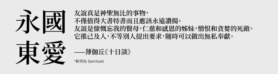
Song style must start with its ancient history and complicated name. It originated from the engraving printing of the Song Dynasty, so it is called "Song style" in mainland China. It matured and became popular in the Ming Dynasty and was introduced to Japan, so Japan It is called "Ming Dynasty Style". In Taiwan and Hong Kong, some people call it "Song style" or "Ming style"; but in fact they all refer to the same font type. Song style is characterized by vertically thick and horizontal strokes, and decorative lines at the ends. It also retains the structure of calligraphy and engraving, so Song style always gives people a literary, elegant and formal feeling. Compared with Helvetica, Song Dynasty has more white space, which makes the paper look "brighter" after printing. In addition, its characteristics of uniform thickness will prevent our eyes from feeling the pain quickly when reading a large amount of text. Tired, so it is widely loved by newspapers, magazines and novels.
1-1Siyuan Songti
The Song font suitable for screen display, say goodbye to missing characters (⊠) from now on!
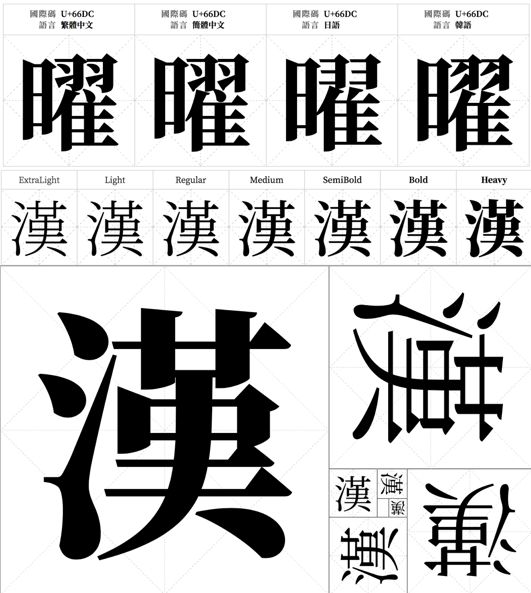
Siyuan Songti is a free and open source font project jointly developed by Adobe and Google. It is modified based on the design of the Japanese "Ozuka Mingchao". The details of the font, such as dots, strokes, and the triangular barb at the end of the horizontal stroke, have a strong sense of sculpture just like the Japanese Mingchao; the slightly thicker horizontal lines lines, giving it a very good screen display effect. What’s even more rare is that Siyuan Song Ti has 7 character weights, which is enough to be used in various situations. It also supports different Chinese character standards from Taiwan, Hong Kong, China, Japan, Korea, etc., so that we no longer have to worry about missing characters (⊠ ) and troubled.

1-2 Hua Kangli Song Style
Multi-purpose Song font for printing with both Chinese and Japanese aesthetics

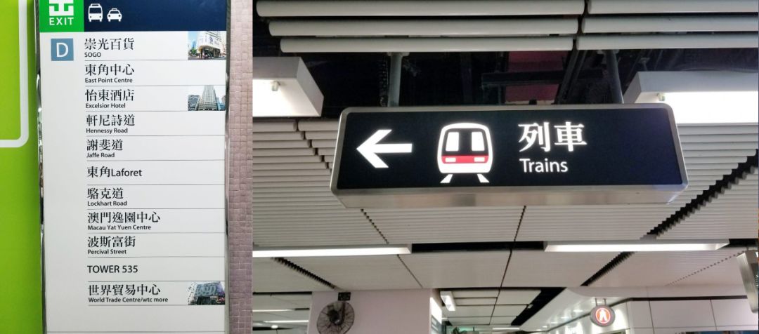
Li Songti was originally designed to adjust small-size printing, and is very suitable for typesetting a large amount of content. It has a slightly flaring frame similar to the Japanese Ming Dynasty style, and the large white space in the character cavity makes it very comfortable to read for a long time. In terms of details, the prominent bell mouth and rounded corners incorporate the common features of Chinese Song Dynasty design. Now it has three font weights: thin, medium and thick, which can be extended to use in more situations. Apple computers have built-in Li Song font with a thin font weight as early as the 2000s. At present, its Zhongsong version is also used in the MTR's spatial guidance system.
Articles are uploaded by users and are for non-commercial browsing only. Posted by: Lomu, please indicate the source: https://www.daogebangong.com/en/articles/detail/mei-li-she-ji-bao-dian-jing-xuan-3-kuan-shi-yong-mei-guan-zhong-wen-zi-ti-tui-jian.html
 支付宝扫一扫

评论列表(196条)
测试