
The first page of all PPT courseware is the cover. The image of the cover directly determines the audience's desire to continue watching. Therefore, the cover is one of the most important "face projects" of PPT. If you want to leave people with the first impression, you have to put effort into the design of the cover to come up with new ideas.
But novelty does not mean fancy and cool. What I personally prefer is the "less is more" style, which is to use the fewest elements to design the simplest and most appropriate cover. Of courseSimplicity does not mean simplicity. Simplicity often represents grandeur, high-end, temperament, and personality. To achieve simplicity, it requires thought.
The author has sorted out 25 classic and simple layouts of common PPT covers for the readers' pleasure and as a reference for everyone to design PPT covers. You can directly apply one of the layouts according to different styles of PPT.
1. Wording below the picture above
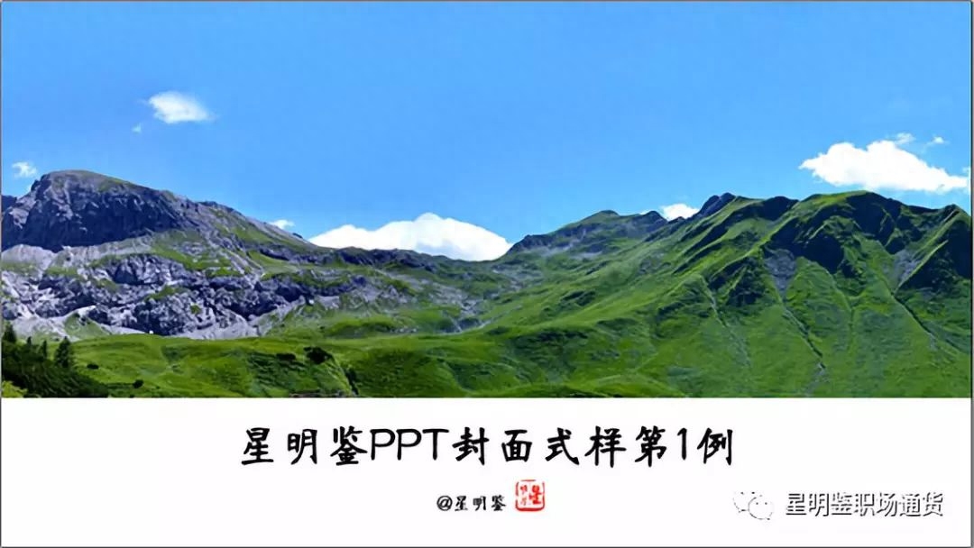
The picture is at the top, taking up 2/3 of the space, and the PPT title is at the bottom.
Use a large picture as the main background of the PPT cover. The picture must be high-definition. The text title should be slightly larger and placed in the center below the picture.
Difficulty level: ★
2. Contrast type
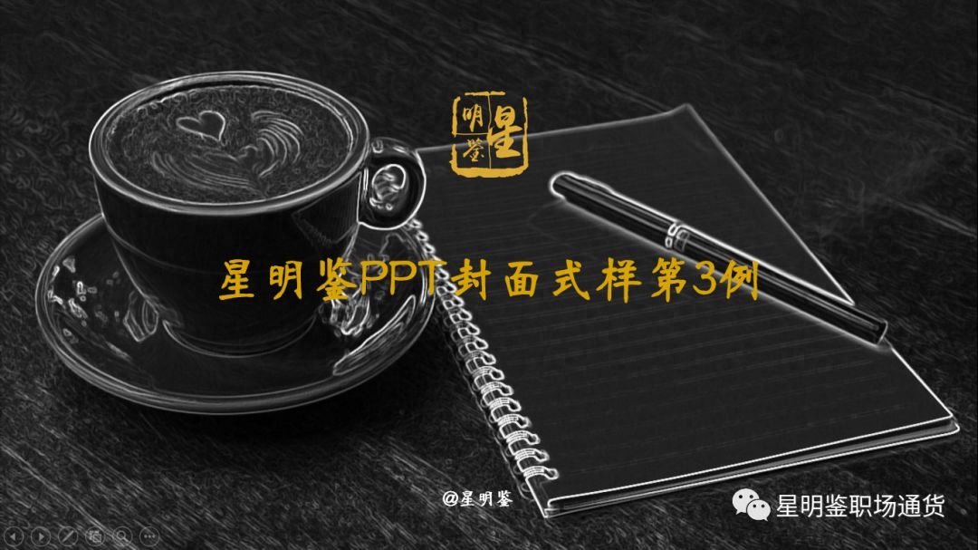
Use the strong contrast between the color of the background image and the text title to form a background that highlights the title.
In order to better form the background, we can change the color of the picture at will. After selecting the picture, click: Format—Color. This color change changes the background color of the entire picture.
The design point of this kind of cover is that there must be a certain contrast between the color of the picture and the color of the text.
Difficulty level: ★★
3. Shape arrangement
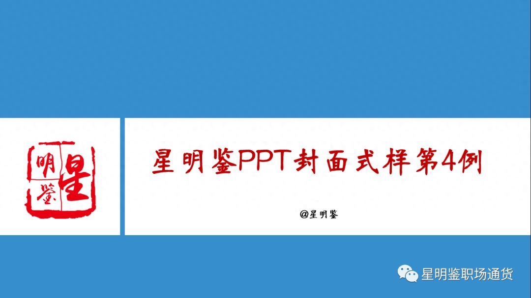
The background color of the entire cover is single, and two shapes are used as masks. A small shape on the left and right can be replaced by a picture, or a logo can be placed as in the above example. The bar on the right is used as the direct background of the title, divided under the large monochrome background. Create a visual focus center and place the title in this central position to better highlight the theme.
Difficulty level: ★★
4. Center-focused style
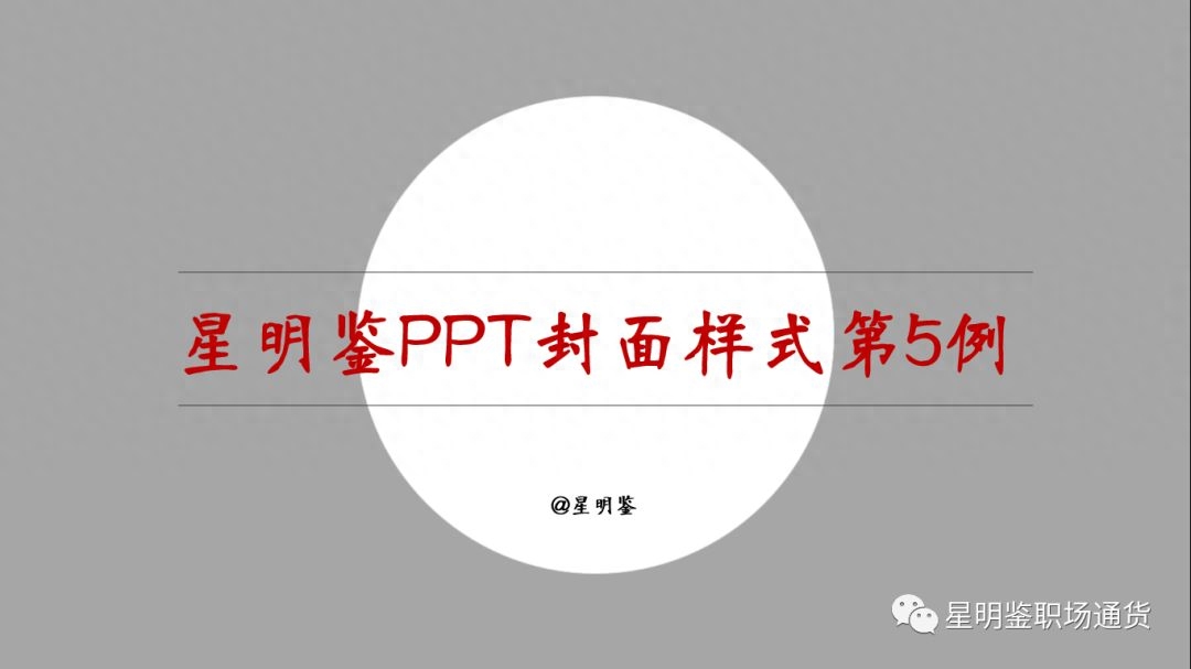
Set a single color as the main background, place a circle in the center as the focus center, and place the title text centered on the circle. In order to make the picture more harmonious, draw two lines above and below the title text so that The title appears more naturally, and the author's name is placed in a smaller font at the bottom of the circle.
Difficulty level: ★
5. Forced coverage

"Forced coverage" is exactly what the name suggests.
Use a high-definition picture as the main background of the cover, and forcefully mark out an area at the bottom of the picture as a space for the PPT title. The biggest difference between the forced overlay type and the above picture and subtitle type is that the title space below the forced overlay type is. It is more rounded and natural, because the lines where the lower title area and the upper picture area meet are more smooth, natural and harmonious. Therefore, although it is "forced", the transition is natural and appropriate.
The title area below is drawn on a rectangle using the "Edit Vertices" function. Regarding the "Edit Vertex" operation steps, there will be a special article to share later.
Difficulty level: ★★★★
6. Picture on the left and text on the right

The picture is on the left, the title is on the right, and the left and right are symmetrically distributed.
The red mask in the upper right corner is used to fill the blank space in the title area and is for decoration.
Regarding the PPT design thinking tutorial, there is the concept of "left-right symmetry". Recommended reading:
[Read it before doing it] Basic principles of PPT design and aesthetics
Difficulty level: ★★★
7. Large picture highlighting style
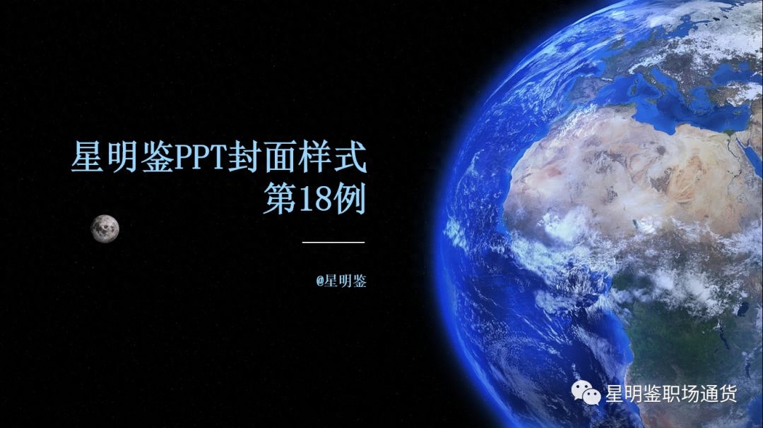
The key point of this design is that the background image must be a picture with enlarged details, preferably occupying nearly half of the cover space, and place the title text on the other side of the image. It can be the picture on the left with the words on the right, or the picture on the left with the words on the right. .
For this design, the key lies in image selection.
Difficulty level: ★
8. Shape picture decoration type
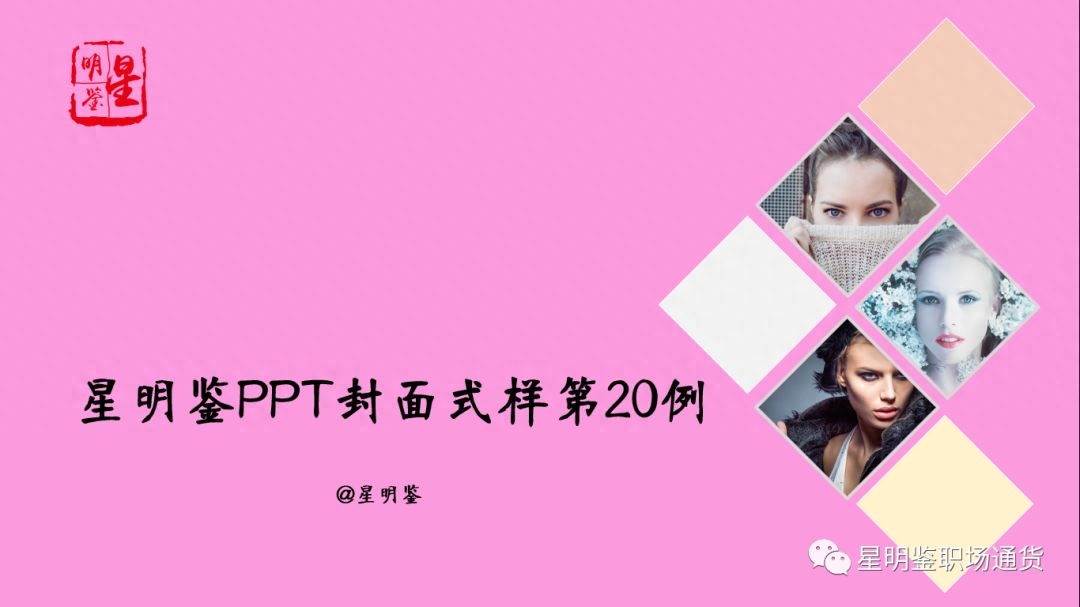
The key point of this design is to decorate the entire cover with a combination of pictures and shapes, and place the text title on the blank side. Place the logo in the upper left corner and fill the huge gap on the left to make the entire cover look well-organized and balanced.
Difficulty level: ★★
9. Single word mask style
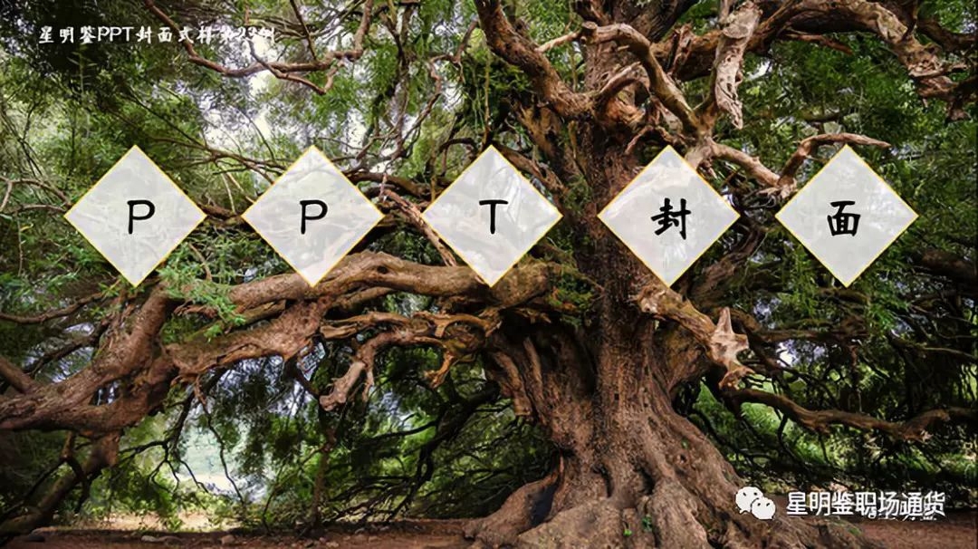
Choose a picture with a dark background as the main background of the cover. Place each word of the title text on the mask. Set the mask to white and transparent. The transparency is about 25%, and the blur can be seen. The background image at the bottom should not be too transparent, otherwise the color of the text and the background image will be similar and difficult to identify.
Difficulty level: ★★
10. Seal-engraved seal style
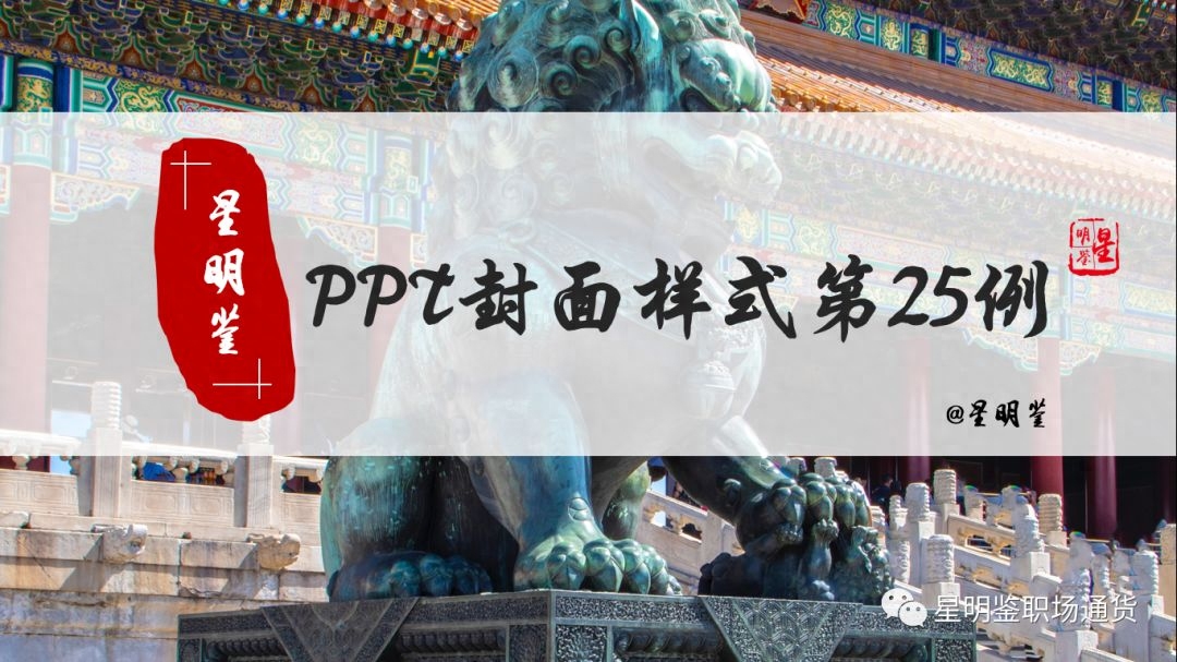
Seal cutting is often associated with cultural traditions, so this design style is suitable for ancient style, culture, history, etc.
Choose a high-definition picture related to traditional culture as the main background, and use a 25% transparent mask as the direct background of the cover content, mainly to provide an intermediary for the comparison between the content and the background.
Use the "Arbitrary Polygon" inside the shape to draw a seal shape, set the brand name text to a calligraphy style font, and place the words on top of the seal. The seal is usually dark red, and the words are generally White.
Set the font of the PPT title text to a calligraphy-style font and place it on one side of the seal.
Difficulty level: ★★
Due to space limitations, the remaining 15 cases will not be shown here one by one. Interested friends can reply "Xing Mingjian PPT Cover" at the front desk of this official account to directly obtain all the articles shared in this article for free. 25 case covers full version PPT.

Difficulty level: ★★★★★
— END —

More useful information, all in the "Xingmingjian Workplace Currency" official account
Articles are uploaded by users and are for non-commercial browsing only. Posted by: Lomu, please indicate the source: https://www.daogebangong.com/en/articles/detail/lyu-yong-bu-shuang-jing-dian-PPT-feng-mian-25-li.html

 支付宝扫一扫
评论列表(196条)
测试