This issue will explain the basic skills of font matching through three major principles of font matching: limiting the number of fonts, establishing visual hierarchy, and unifying style and temperament. I hope this article can inspire you all!
Limit the number of fonts
It is not easy to change too many fonts in one layout. No matter how much information there is, the choice of two or three fonts is enough to meet the needs of the screen. Even if the font remains unchanged, by changing the size, thickness, color or decorative techniques of the font, the purpose of distinguishing priority and guiding readers can be achieved. The fewer font types, the easier it is to control the layout of text information on the screen.
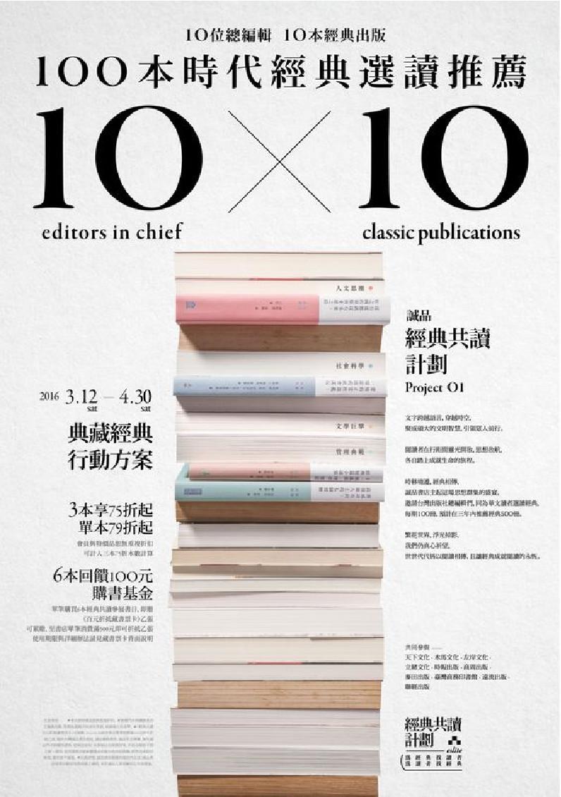
The amount of information is very large, but only one font is used. The visual hierarchy is well created through font size, thickness contrast, and clever arrangement.
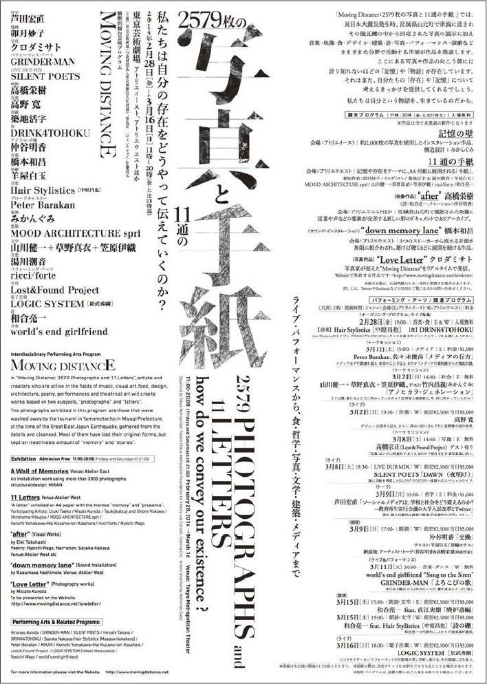
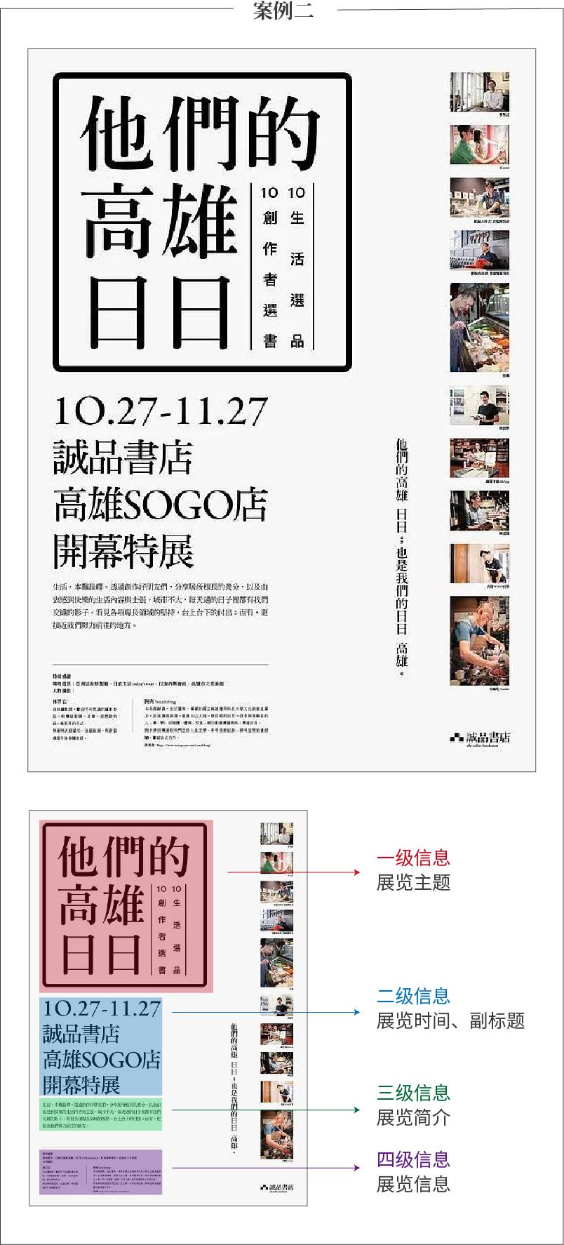
Only two sets of fonts are used in the entire layout: English information uses a thick sans-serif font and is enlarged and emphasized; Japanese information uses a thinner serif font so that the information level can be well distinguished.
Some projects need to present a lively and lively atmosphere, or require a very decorative design, and must use complex font combinations. Please keep the overall effect coordinated and avoid conflict and confusion.
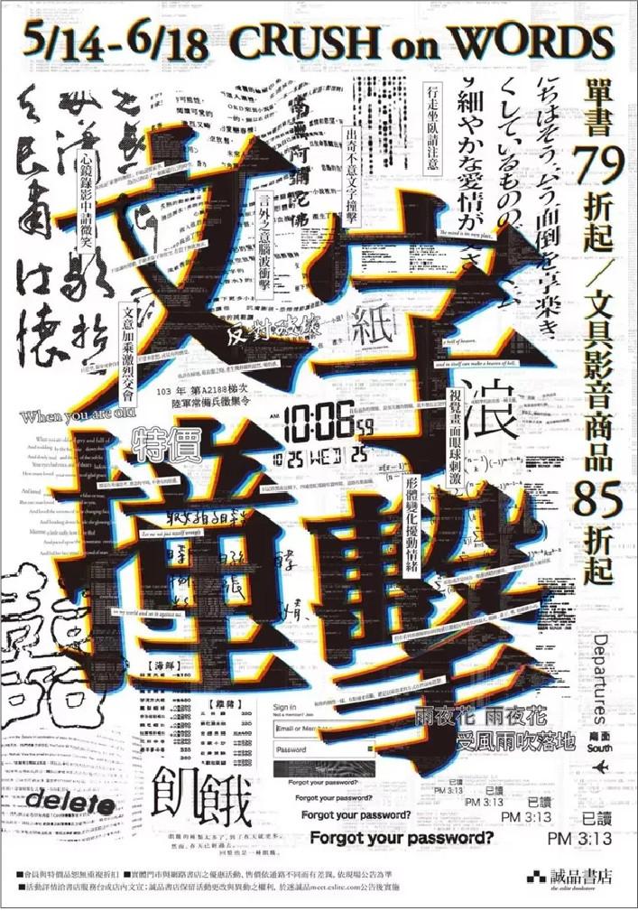
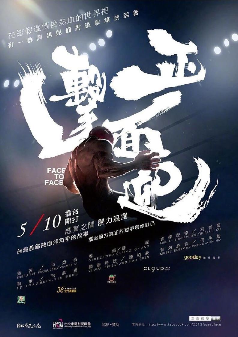
In order to create a lively and rich picture, this poster uses a lot of fonts, with a rich sense of form and strong visual impact. However, for most designers who do not have strong control over the layout, it is often difficult to achieve both richness and coordination. Therefore, limiting the number of fonts is a good way to achieve coordination and unity on the screen.
2. Establish visual hierarchy
Why font matching? One is for aesthetics, and the other is to establish visual hierarchy. A layout contains different levels of information content, which need to be distinguished by priority, such as titles, subtitles, and text. Each information level will also have key information and non-key information.
When matching fonts, it is necessary to coordinate the display through the size, thickness, color, etc. of the fonts to help readers avoid visual confusion and at the same time bring a sense of layering to the layout.
Although only one font is used in these two cases, the primary and secondary levels can be clearly divided. Generally speaking, you can choose thicker and larger fonts for the main information, and use thinner and smaller fonts for the secondary information to form a contrast, create a visual flow, guide the audience to read the information, and make the layout richer.
3. Unification of style and temperament
A basic principle to coordinate font matching is to choose fonts with similar temperaments. Different modeling features form fonts with various style features, and the emotions they convey are also different. Some fonts have a solemn temperament, some exude a classical atmosphere, some give people a sense of modern fashion, some focus on information transmission, and some focus on spiritual symbolism.
Using fonts from the same font family is the simplest and safest way to match them. The so-called font family refers to a font family, multiple sub-fonts under one font, such as Siyuan Black and Siyuan Song. There are seven fonts from thin to thick, with coordinated styles.
Using fonts in the same word group complies with the principle of "limiting the number of fonts"; when arranging, you need to follow the principle of "forming visual hierarchy". When matching fonts, you need to use the size, thickness, color, etc. of the fonts to bring flavor to the layout. Come to read the layered sense.
When matching different fonts, you should pay attention to the inclusiveness between them, which should be different but also unified and harmonious.
The mix and match of boldface and Arial font is a very common way of matching. When the emotional Arial font meets the rational Helvetica, it can form a good contrasting effect. What needs to be paid attention to here is the grasp of scale. Appropriate contrast can bring a rich visual impression to the layout, but excessive contrast can also create a sense of clutter.
For the cosmetics advertisement in the picture below, a thinner Song font and a thinner bold font are chosen. The fonts are similar and form a subtle contrast. Moreover, both have an elegant and refined temperament and complement each other when used in cosmetics designs with feminine characteristics.

When matching different fonts, generally choose a wider, thicker and decorative font for the main information to quickly attract the audience's attention; while for the explanatory text, it is suitable to choose a font with a clear structure and concise strokes to facilitate reading. As shown in the picture below, "Huakang Poster Style" is selected as the main title, which is eye-catching, lively and vivid, and can attract the audience to watch; the simple and cute "Fangzheng Lanting Round Style" is used as the explanatory text, which is both easy to read and in line with the title. Unified style.

The visual tension of calligraphy glyphs is great, the strokes are rich in changes and very visually impactful. It is very suitable as a display title, but it is not suitable for small-sized explanatory text. The stroke details will become particularly complicated due to the reduction in size. In order to solve this problem, we usually pair it with Song font which also has a strong sense of culture and history and a strong humanistic atmosphere.
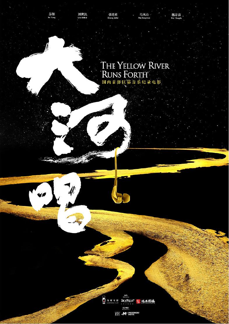
Calligraphy fonts paired with boldface, strong boldface and soft handwriting can produce a strong contrasting effect, which is very suitable for text combinations in titles and is often used in modern pictures.
Chinese and English collocation suggestions
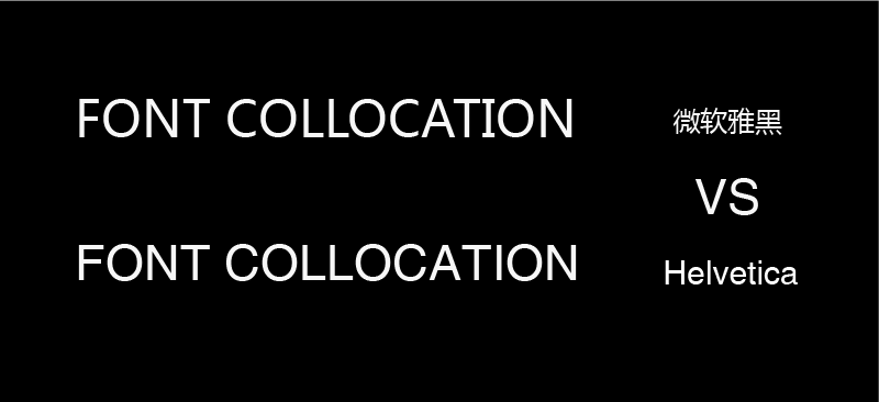
When using a combination of Chinese and English typesetting, try not to use the fonts that come with Chinese in English, because the English part of some Chinese fonts is not designed perfectly, so try to use classic English fonts for a much better effect.
The upper part is the Chinese and English combination of "Microsoft Yahei", and the lower part replaces the English with the classic English font "Helvetica". You can see that the lower combination is more refined and beautiful.
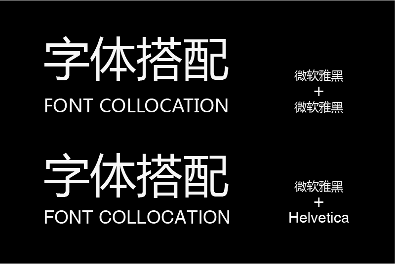
Now compare the English letters separately. Pay attention to the letters "F", "C", "L", "I" and other letters. You will clearly see that the English design of "Microsoft Yahei" is relatively rough, while "Helvetica" is more refined.
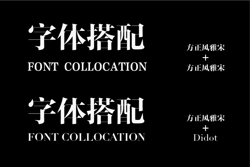
Above is the Chinese and English combination of "Founder Feng Ya Song". You can see that the Chinese and English styles are quite different; changing the English to the classic English fashion font "Didot" is obviously more unified in style and more suitable for matching.
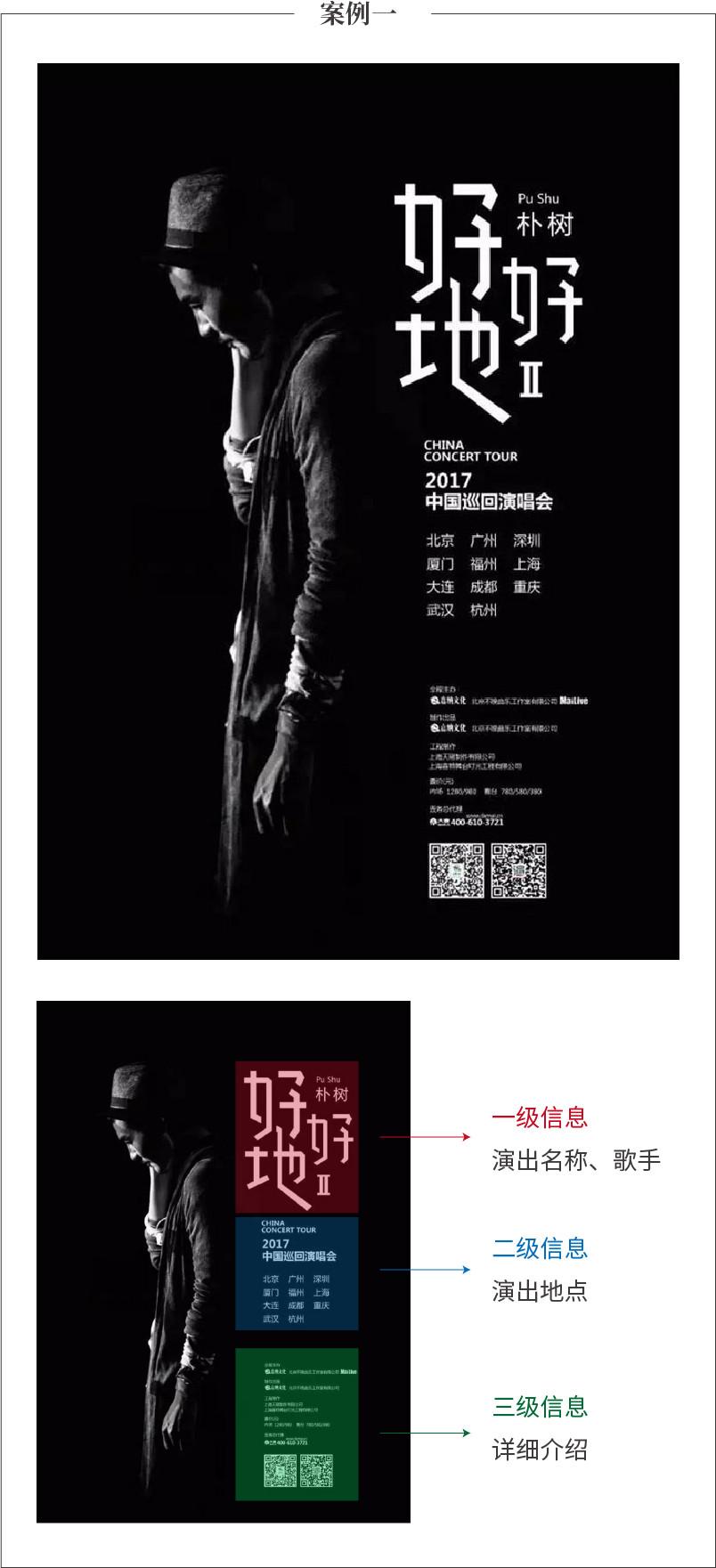
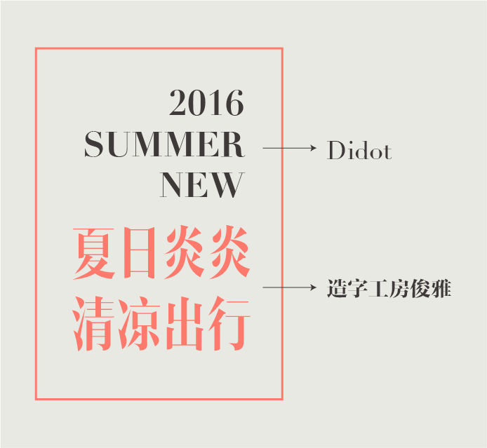
Case Analysis
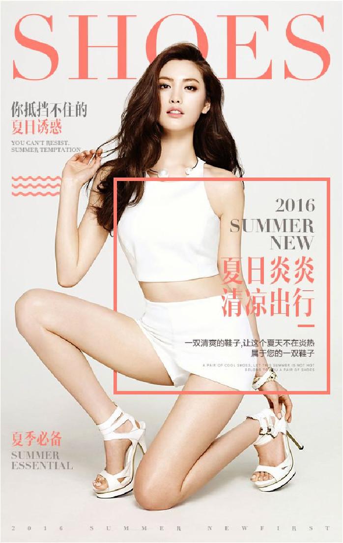
In this case, "Zuozi Gongfang Junya" was selected for Chinese. Instead of choosing the Western font that comes with the font, the English font "Didot" was chosen as a more classic fashionable English font, which can create a fashionable atmosphere.
In the matching of Chinese and English, we usually choose to arrange English serif fonts and Song fonts correspondingly, and arrange English sans serif fonts and Chinese bold fonts correspondingly. This matching method is the simplest and safest method. Better to form a unity of style.
However, each type of font also has subtle differences in temperament. For example, Song fonts can be divided into classical fonts with a heavy writing feel and modern fonts with strong geometric characteristics.
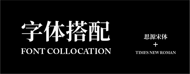
"Siyuan Song", which prefers printing and screen display, will be more unified when paired with the calm and restrained English font "Times New Roman". In terms of details, the contrast between the two is closer, and the transition and contrast between thicknesses are also similar.
Therefore, when designing, whether it is a combination of Chinese and Chinese or Chinese and English, careful analysis and continuous practice are required to achieve a harmonious, unified, clear-layered and beautiful effect.
Summary
Three major principles should be followed in font matching:
1. Limit the number of fonts. Regardless of the amount of information, choosing two to three fonts is enough to meet the needs of the screen;
2. Establish visual hierarchy. When matching fonts, it is necessary to coordinate the display through the size, thickness, color, etc. of the fonts to help readers avoid visual confusion and at the same time bring a sense of layering to the layout;
3. Unification of style and temperament. When matching different fonts, you should pay attention to the inclusiveness between them, which should be different but also unified and harmonious.
When using a combination of Chinese and English for typesetting, try not to use the fonts that come with Chinese in English. You should also follow the above three principles when matching Chinese and English.
Author: Deng Haibei
Articles are uploaded by users and are for non-commercial browsing only. Posted by: Lomu, please indicate the source: https://www.daogebangong.com/en/articles/detail/kuai-su-zhang-wo-zi-ti-da-pei-si-lu.html
 支付宝扫一扫
评论列表(196条)
测试