The spring recruitment season for gold, three, silver and four is here, and the recruitment war among major companies has gradually begun.But some companies’ recruitment posters are really social.
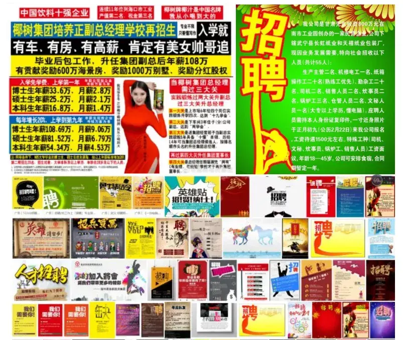
☝Recruitment posters that dazzle candidates
Why don’t these posters look good? In fact, there are two main issues:
One is the element There is too much accumulation, and I want to add all the information and elements to the poster.
The second is color matching , the layout is messy, the vision is not focused, and there is no key point at all. These two points are problems that we must avoid in recruitment poster design!
Recruitment poster, It is an eternal pain in HR’s heart. As job fairs begin one after another, how do you make a recruitment poster? After reading this tweet, you will get a set of excellent recruitment poster production ideas (Xiaobai You can also get started quickly). Next, let’s get into the design ideas and case demonstrations of our recruitment posters.

As the saying goes, Before we start making posters, we need to understand the positioning of the posters.
Easy to understand Simple, from the perspective of positioning, the content of campus recruitment and social recruitment are different. The color style of the poster can also be slightly adjusted according to the application scenario or industry.
Choose serious Business style or young and fresh style can be determined according to the usage scenario. Once the style is determined, the design of the recruitment poster will also have a general direction.
The editor has sorted out several common styles and applicable scenarios for you:
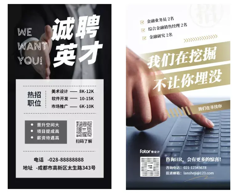
[Business style】
Business style recruitment The poster will apply some commercial elements and look high-end. Suitable for real estate furniture, financial management, hotel and tourism.
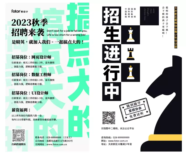
[Flat style】
Flat style too A very popular style nowadays, this style of recruitment posters believes in minimalism, large space, without any excessive decorative elements. The overall feeling is transparent, highlighting the information, and removing redundant decorations. Design elements are abstract, often composed of blocks of color and geometric shapes. Suitable for education and design fields.
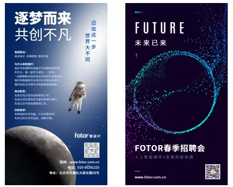
【Technology Style】
Technological style Posters are suitable for technology research and development, big data, intelligent hardware, digital media, information technology and other industries.
[Illustration Style]
Relatively young now The personalized illustration style is also very popular and is suitable for Internet industries such as education and training, catering and food, campus spring recruitment, animation and games.
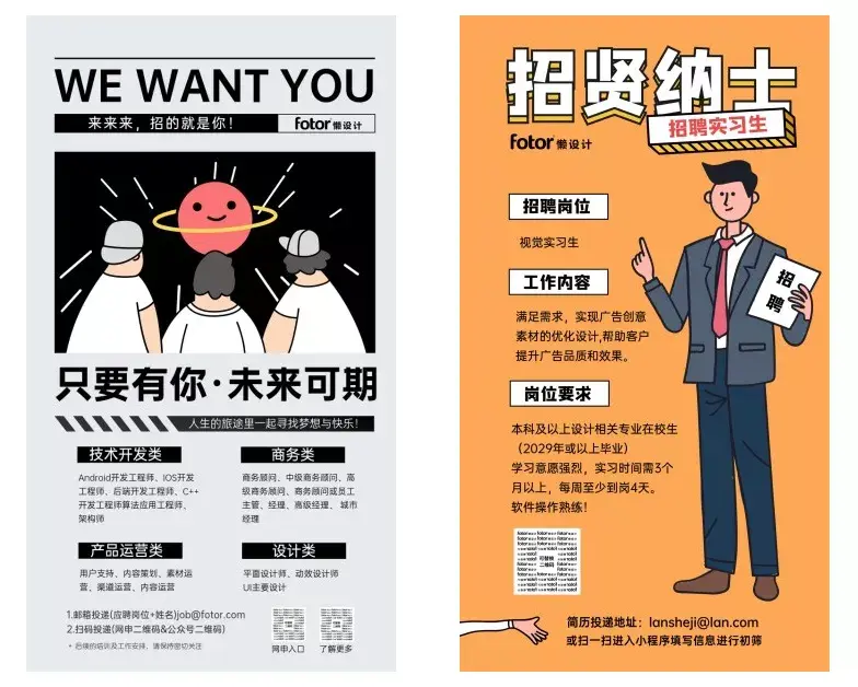
[Chinese style]
Chinese style It is relatively versatile and can be used for recruitment in basically all walks of life. The artistic Chinese style can also make the poster look more advanced.
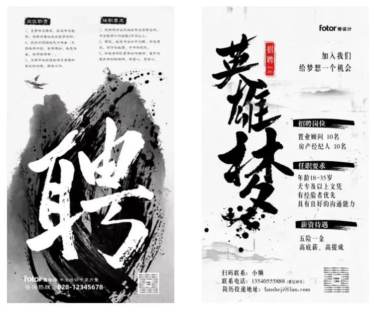
[The above templates can be found in Fotor lazy design search "recruitment"]

Defined style It is equivalent to setting the general direction. Next, we need to solve the second key point in poster design, the choice of copywriting. The copywriting of the recruitment poster should be precise but not excessive. According to the above positioning, the copywriting can be made Some options.
Take advantage of recruitment As a visual accent, it’s a nice plus.
For large companies , with just one LOGO, applicants can flock to you. For small companies, you may need some eye-catching introductions or company prospect descriptions to impress outstanding talents.
Some powerful HR masters even use "scheming copywriting" to create unforgettable content. Recruitment posters. Creative copywriting can attract candidates' attention. Here are some excellent cases for you to learn from and refer to.

☝Connotative copywriting adds interest, and the use of copywriting corresponding to different professional characteristics makes the entire set of posters more creative.
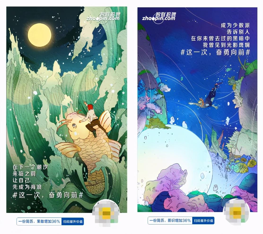
☝Careful copywriting arouses empathy, and for applicants, Zhaopin Recruitment’s LOGO can also attract many applicants.
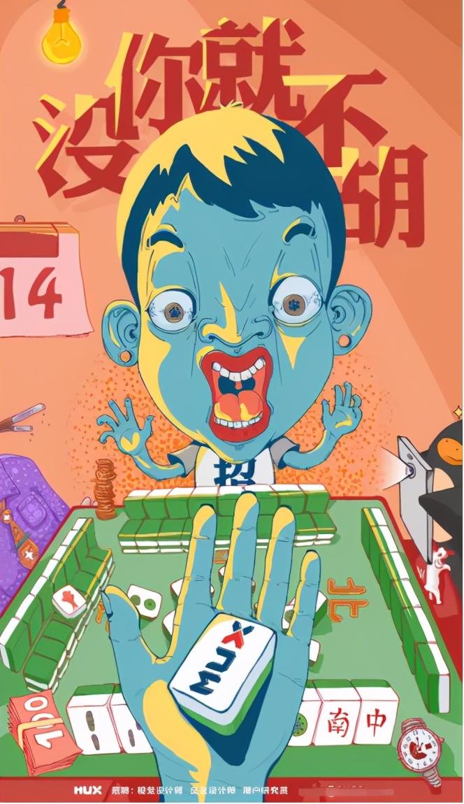
☝Mahjong elements + homophonic memes make the poster infinitely creative. The copywriting and the visual content of the poster are also very consistent, which together add points to the entire design.

Copywriting determined and style, and then you can look for some suitable picture materials. Make associations based on the industry or poster style, and first find elements suitable for the poster.
"Blue sky and white clouds Paper airplanes, suits and leather collars, Apple machines." These are elements that appear frequently in recruitment posters. It is also a very good idea to present "outstanding new employees" in posters and use the image of white-collar workers in the workplace to impress applicants.

☝The vehicle and masculine elements make it clear at a glance what position is being recruited.
From the nature of the company For consideration, you can choose elements that can reflect the attributes of the company, such as the financial industry, white-collar offices; civil construction, grand projects; scientific research laboratories, high-precision instruments... These elements can allow applicants to understand the recruitment industry at a glance.
Where to get it Find these elements? The material bar on the side of Fotor's lazy design may meet your needs. You only need a simple search and you can find the material you want in 3 seconds.
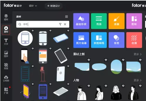
☝Look for the elements you think of in the material library first
If the material library What should I do if I don’t have the element I want? Teach you a super easy-to-use FotorUse a little trick:Portrait cutout and material cutout functions.
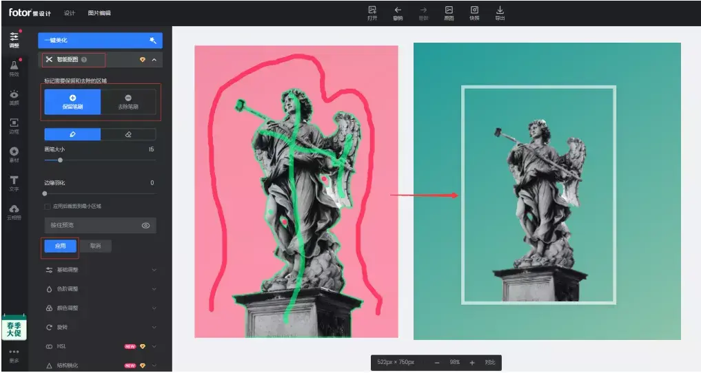
☝Use smart cutout in image editing to obtain elements
Instructions for use: Upload the picture that needs to be cut out, click Smart Cutout-Select the reserved area and Remove areas - click Apply and you'll get the elements you want!

The last step is to All prepared materials are typeset. Typesetting is to adjust the position and size of text, pictures, graphics and other visual information elements on the layout to achieve beautiful visual effects.
Newbie Xiaobai There is no need to pursue very creative layout techniques at the beginning. Remember these basic principles and you will never go wrong:
01 Alignment Principle
Related content It should be aligned so that users can quickly move their eyes and see the most important information at a glance.
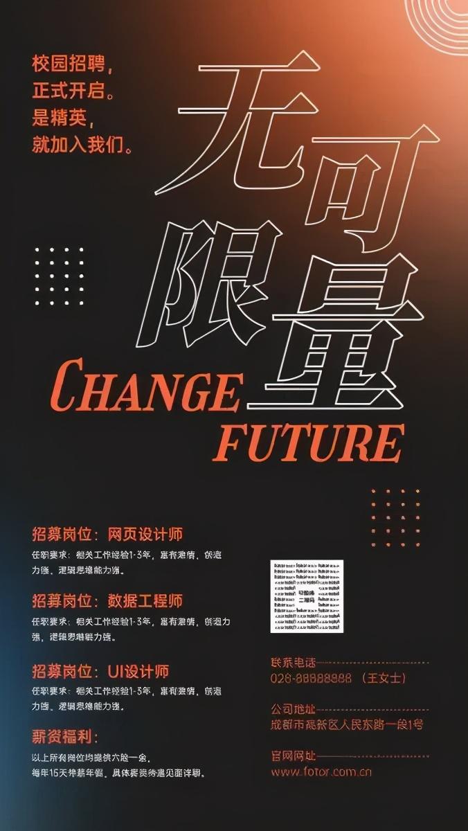
☝Alignment facilitates information acquisition
02 Gathering Principle
Split content into Several areas, related content are gathered in one area.
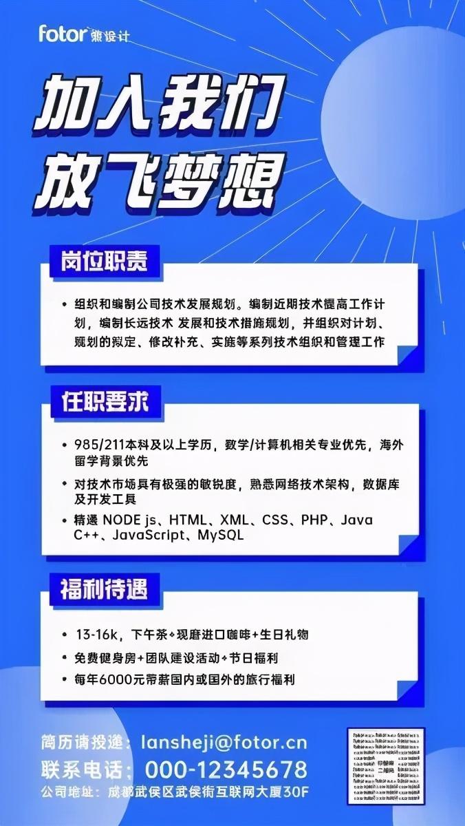
☝Gathering the same information is more organized
03 White Space Principle
Don’t Photograph the posters densely and leave a certain amount of space. This will not only reduce the oppressive feeling of the posters, but also guide the readers' eyes and highlight the key content.
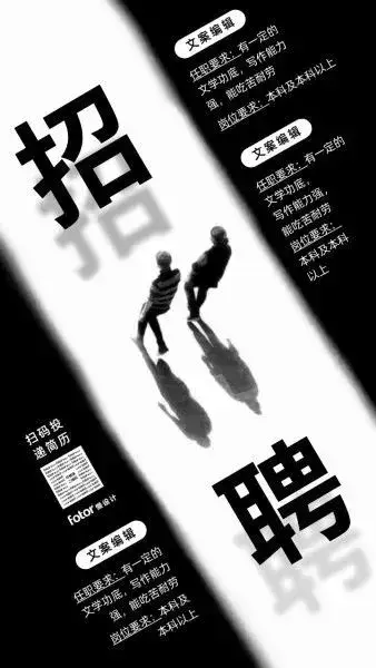
☝Leave appropriate space to highlight the key points of the screen
04 Repeat Principle
When typesetting, Pay attention to consistency and coherence throughout the design and avoid different types of visual elements.

☝Unified material style makes the overall effect better
Master these The basic principle can make the theme of the poster stand out, have a visual focusing effect, and allow candidates to read it clearly.
After mastering the above basic knowledge, let’s officially enter the actual combat phase. Use four simple steps to complete a flat business-style poster design.
01. Determine the style
We design A futuristic technology style poster. In order to highlight the sense of mystery, we chose black as the background color of the poster to create a sense of high-end. Later, we paired it with an eye-catching red, using graphics and color to highlight the visual focus.
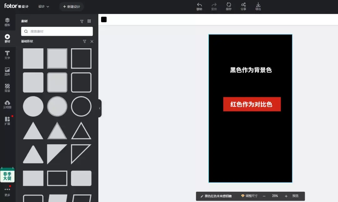
02 Confirm copy information
To avoid posters The content is too complex, the copy of our poster shows: hot job positions and our advantages. Give a big theme "foresight" and choose: "The world is very different, take this step." As a creative copywriter, guide the candidates.
Let’s first The copywriting is arranged in groups on the poster. First, it is necessary to analyze what is the main information and secondary information, and first to arrange and describe the main title.
First put the main The visual font is placed in a prominent position on the screen, and the appropriate position is determined by adjusting the size and proportion according to the clustering principle. After processing the copy, start processing other information.
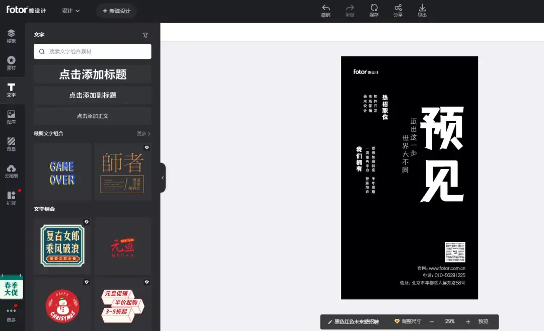
03 Select element
Open a new The background, according to the style association required elements. Here we want to express a "foreseen" sense of the future, so we chose the element of an astronaut, and then selected a round eye-catching element to represent the earth. Finally, choose a less obvious star pattern to make the pure black background less monotonous and not overpowering the focus.
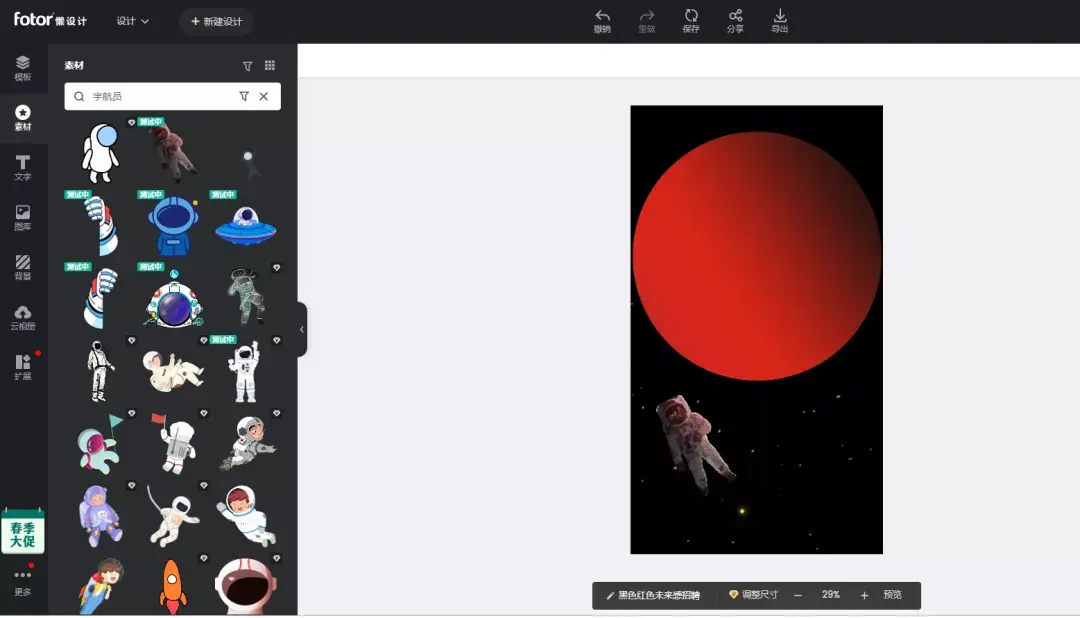
04 Information Arrangement
Integrate the text Copy it to the graphic element and start adjusting the position. The graphics and text are overlaid to make the picture more layered and the information level of the picture clear. The decoration uses circular fonts as the main visual font, and the star shading background is not particularly dull.

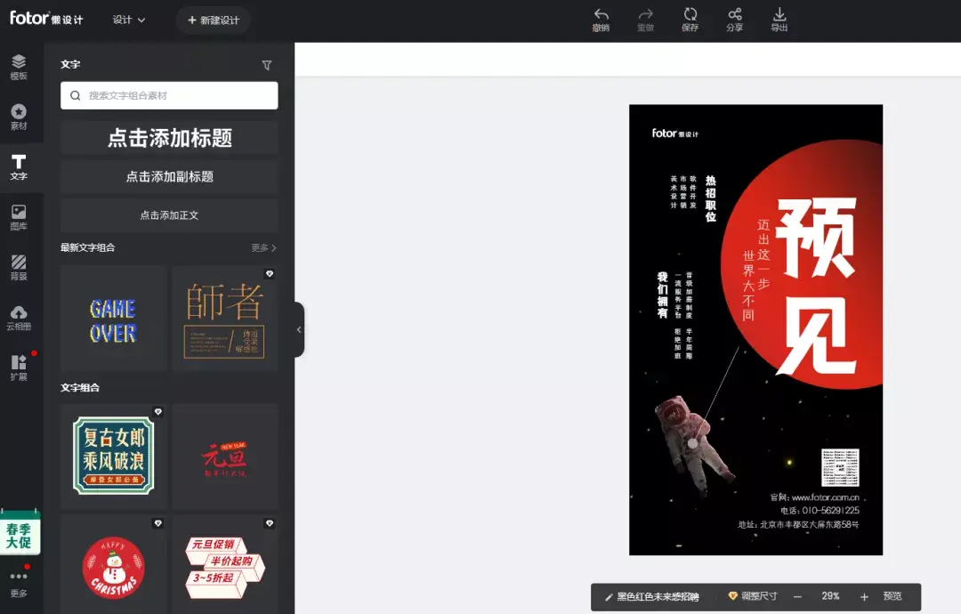
In fact, the idea is very Simple, place the associated main title and main elements in the picture, and use left and right space division to maximize the proportion of the main title and main visual in the picture.
The shape of the graphic The association extracted from the round earth makes the main visual picture richer in level. The astronauts also connected with the copywriter "The world is very different, take this step."
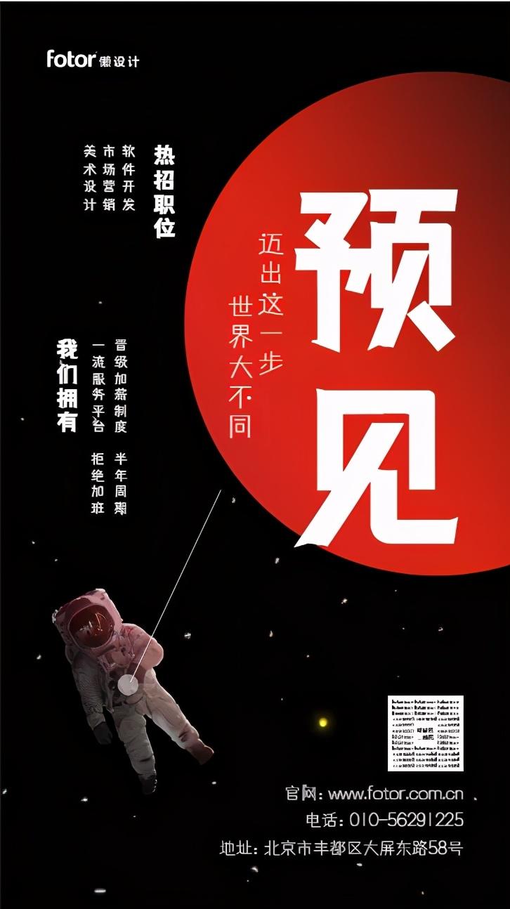
In this way, A poster full of style is completed! Is not it simple?
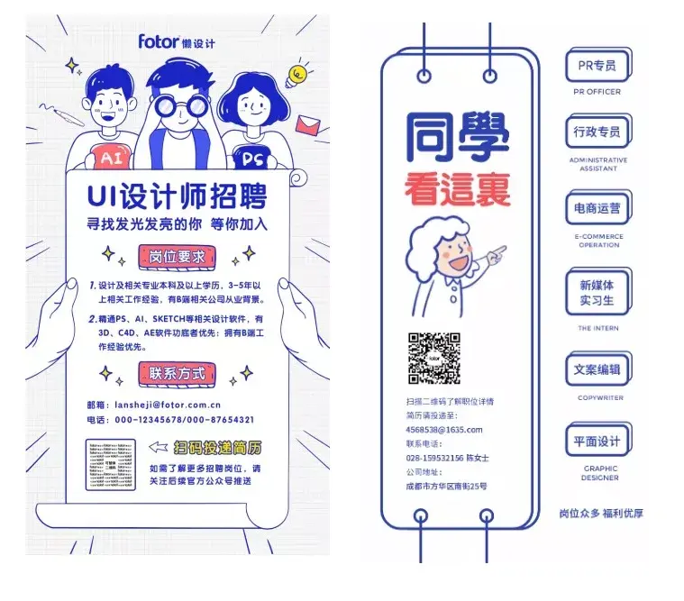
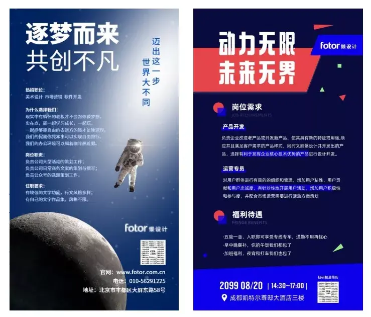
In fact, if you If you are afraid that the independent design is not beautiful enough, you can refer to some excellent cases and start imitating it directly. If you want to quickly produce and improve your work efficiency, you can use Fotor lazy design and production, which is very convenient Simple and easy to use, you can complete it in five minutes~
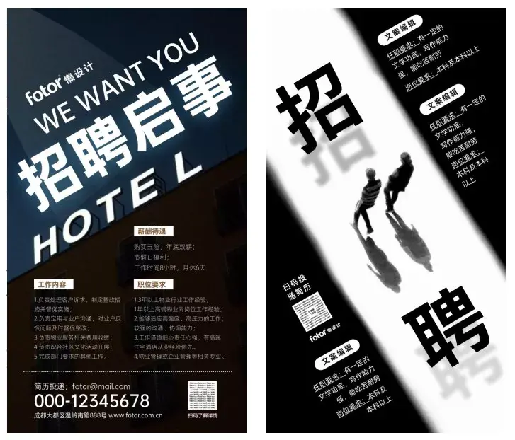
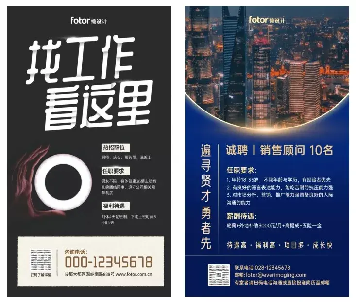
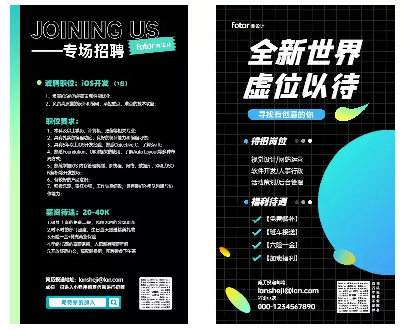
For example, the following Posters can be completed quickly and used for free by simply modifying the text message!
The above tips for you Got it all? Hurry up and open Fotor lazy design and try to make a high-quality recruitment poster~
Fotor is an online rapid graphic design platform with 450 million users worldwide. Fotor pioneered the concept of "lazy design" to help workers with design needs easily complete graphic design. Users only need to drag and drop the design template or use the versatile editing tools to quickly complete the design.
Fotor lazy design has always wanted to help everyone create better designs and ensure the safety of the use and dissemination of design works.
This article is written and organized by the editor of Fotor. If you need to reprint, please send me a private message.
Articles are uploaded by users and are for non-commercial browsing only. Posted by: Lomu, please indicate the source: https://www.daogebangong.com/en/articles/detail/kan-wan-100-zhang-zhao-pin-hai-bao-wo-zong-jie-chu-zhe-yi-tiao-wan-neng-ji-qiao.html

 支付宝扫一扫
评论列表(196条)
测试