The white background may be the most commonly used by most people, because when creating a new PPT, the default background color is white.
Many people think that using white is boring, uncreative or old-fashioned, but white is a color that is not easy to make mistakes. Other colors can stand out well on a white background. White is a versatile color.


The most critical point is that the rational use of white background can make the entire PPT page look neat and elegant. Display pages for technology products often use a white background to highlight the details of the product.

Picture from Xiaomi official website

The picture comes from Apple’s official website
Similar to the situation of white, there is another color that will not make a big difference no matter how we choose it. This color is black. The black background is often used in product launches of major technology companies:

The picture comes from Xiaomi press conference PPT

The picture comes from the Meizu conference PPT
Red, orange, yellow, green, blue, and purple—we can memorize these colors by heart when we were young, but even if we choose colors with the same names as slide backgrounds, everyone ends up choosing different ones. Some are too bright, and live demonstrations will look dazzling. Some are too dim and lifeless.

So how should we choose colors that make people look comfortable in this situation?
Before introducing how to adjust colors, we need to understand the powerful custom color function of PPT.
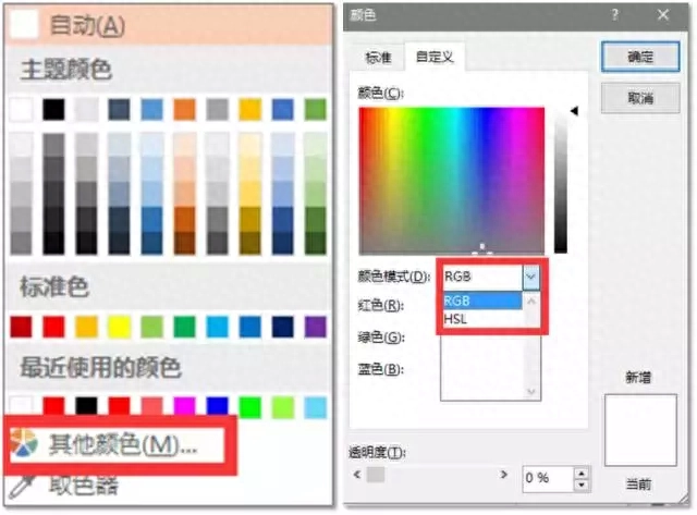
In PPT, open the color selection window, select [Other Colors], and select [Custom] in the pop-up window. There are two color modes:

One is the RGB mode, which is what we often call the industrial three primary color mixing. By adjusting the purity of the three colors of red (R), green (G), and blue (B) (adjustable range of 0~255), then The three are superimposed to obtain a variety of colors, but the RGB mode is a color mode friendly to electronic displays, and we cannot intuitively understand how it works.


The other is the HSL mode, which is the three elements of color - hue (Hue), saturation (Saturation), and brightness (Lightness). By adjusting the values of these three elements (0~255), the color can be modified. .
Hue (different categories of colors) adjustment: from 0 to 255, the color hue changes from "red → yellow → green → cyan → blue → magenta → red".

Saturation (brightness of color) adjustment: from 0 to 255, the purity of the color becomes higher and higher.

Brightness adjustment: from 0 to 255, the brightness of the color becomes higher and higher.

We can intuitively feel the color change by measuring the vividness of the color and the brightness. Here, taking standard red (H:0; S:255; L:128) as an example, we increase the brightness of the color to 168 to get The following effect:

Compared with the previous dazzling pure red, this background that has been diluted by increasing the brightness makes people's senses more comfortable.

So for other colors, how do we determine whether we have adjusted to the appropriate color value?
Okay, I know you are already impatient, so I will tell you some of the adjusted solid color backgrounds and parameters.

If you feel that the above colors still cannot satisfy your pursuit of color, then I recommend a website to you: colorhunt.co Color Hunter!

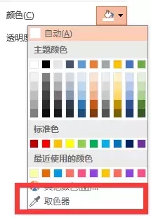
This website collects and publishes beautiful color schemes every day. If you are a user of Microsoft Office 2013 or 2016, you can use the color picker that comes with the software to steal your favorite colors from the website.

Finally, let’s review. Today we introduce to you the most common solid color background in PPT:
❶ Usage scenarios with black and white backgrounds;
❷ Two color modes in PPT and how to use "HSL mode" to adjust colors;
❸ Recommend some suitable color backgrounds and some usage scenarios of color backgrounds.
Articles are uploaded by users and are for non-commercial browsing only. Posted by: Lomu, please indicate the source: https://www.daogebangong.com/en/articles/detail/jiu-jie-PPT-bei-jing-xuan-qu-shen-me-yan-se-na-shi-yin-wei-ni-bu-dong-chun-se-bei-jing.html

 支付宝扫一扫
评论列表(196条)
测试