
Have you ever been indecisive for a long time before choosing the right font for your work? Have you started thinking about which font you will use before starting a design project? Have you ever been dissatisfied because you received important information in Comic Sans font? Or irritated by an irrelevant message in all caps? Don’t worry, you are not alone.
Architects and designers often use flat graphics as a means of expression in the illustrations of their works. This is a common way of presenting in different methods, styles and styles. But among the elements that connect exhibition boards and graphics, technology and models, there is one special part that can improve typography and performance: fonts.
©St+artIndia
Font is one of the cornerstones of graphic design and can be defined as a series of systematic glyph displays. A glyph is a set of letter designs in a specific style. In this group, there are many different ways of expressing fonts, including the letters themselves (thin, italic, bold), font boxes (uppercase and lowercase), and source classifications, such as Sans-Serif (sans serif), Serif (serif), Script (handwritten) and Dingbat (decorative font). In addition, there are more special categories.
It is worth mentioning that for designers, especially architects, the importance of fonts is the basis for non-traditional text understanding in their graphic design solutions. Appropriate fonts can allow readers to understand certain graphic content (whether it is drawings, texts or overall plans) through logical thinking, becoming an effective means of connecting reality and imagination.
©José Moscardi
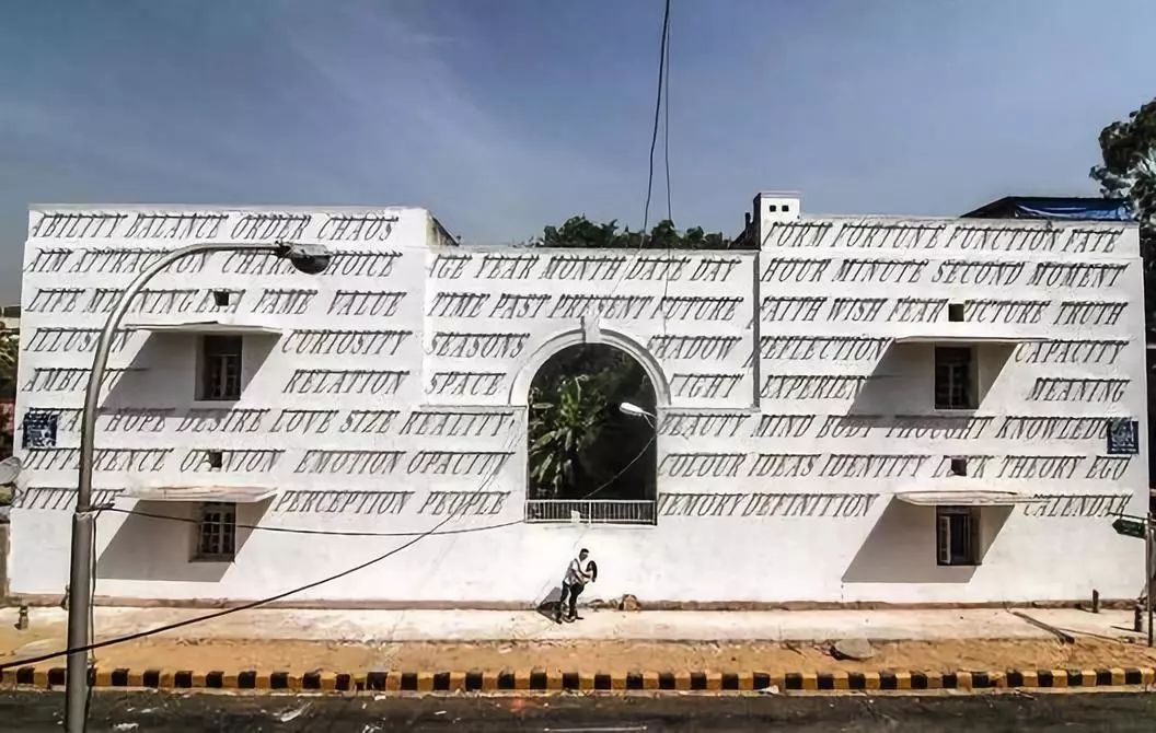
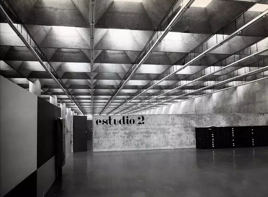
In the field of architecture, the use of typefaces is not limited to architects' writing and graphic design, but is also displayed on building facades, visual representation schemes of buildings, and as a means of connecting with contemporary pop culture. These reveal the need for diverse expressions at different levels.
We have selected several font models used by architects in professional drawings and icons. Many of them are paid fonts, but there are some excellent free fonts available. Here are our ten selected fonts:
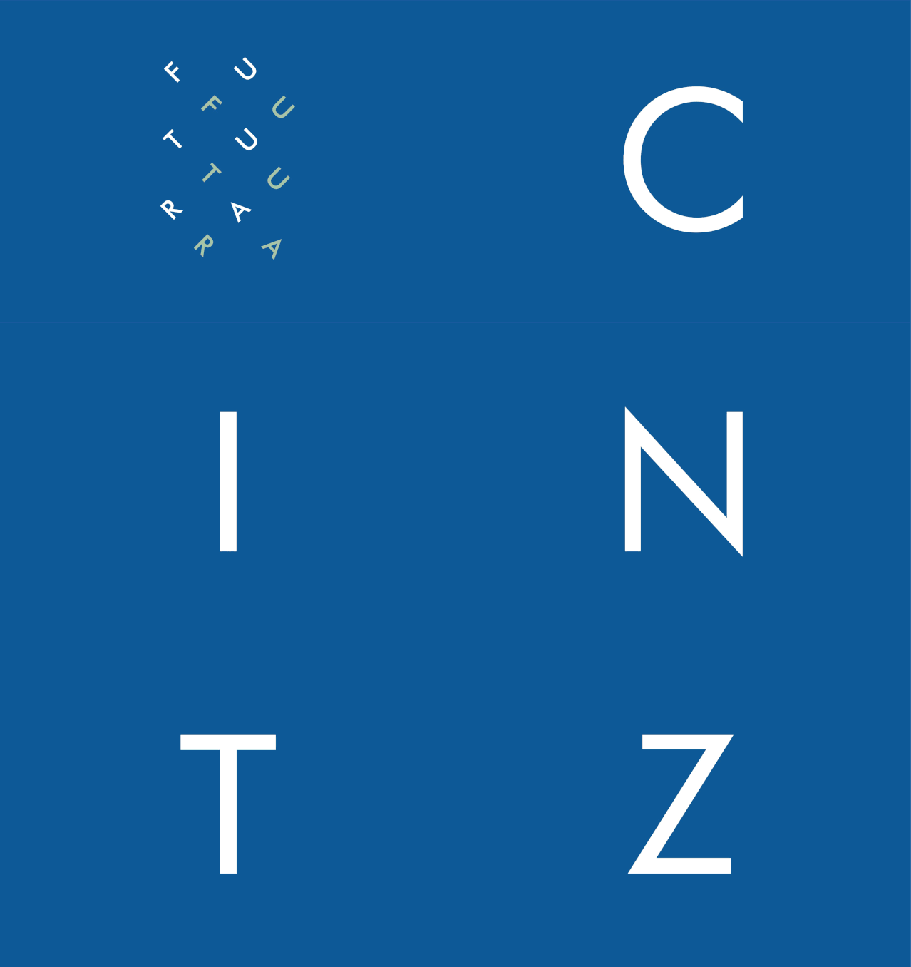
Futura
This font was created by Paul Renner in the 1920s and is an example of classic modern graphic design. Inspired by Bauhaus ideas, it harmoniously combines straight lines and curves to bring balance to the text. Although visually clear, it is not recommended for use in long texts due to the potential for visual fatigue. Its visual impact in titles and subtitles of corporate buildings is highly regarded.
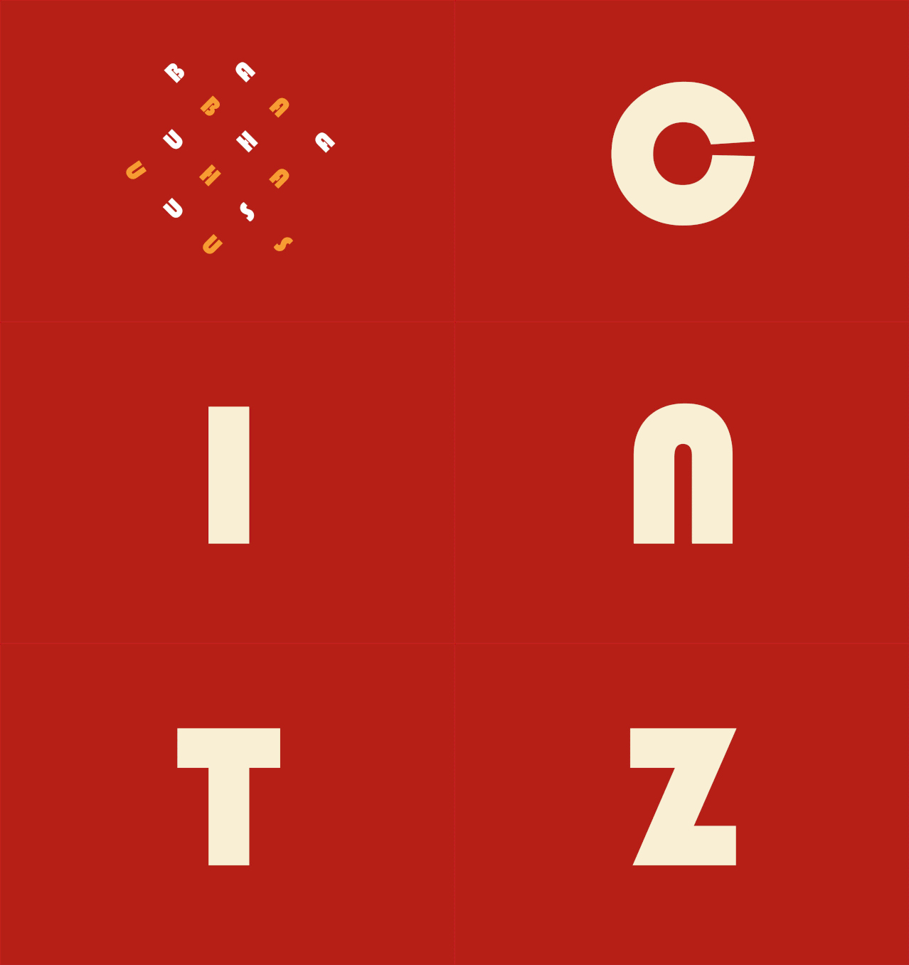
Bauhaus
This font was designed by graphic designer Herbert Bayer in 1925. Its ideas are considered timeless. Bayer studied at the Bauhaus from 1921 to 1923 under Kandinsky and Moholy-Nagy. To this day, it is still mainly used for titles and subtitles on display boards.
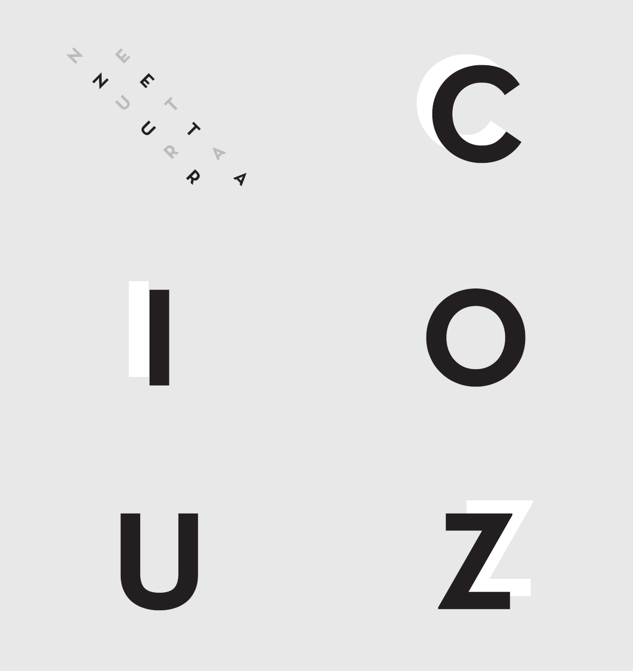
Neutra
Articles are uploaded by users and are for non-commercial browsing only. Posted by: Lomu, please indicate the source: https://www.daogebangong.com/en/articles/detail/jing-xuan-ying-wen-zi-ti-da-zao-du-te-ge-xing-zuo-pin-ji.html

 支付宝扫一扫
评论列表(196条)
测试