
The beauty of Chinese font design lies in its changeable shapes and rich expressiveness. The character of the font is colorful, which is mainly reflected in the thickness of the strokes, the straightness of the lines, and the density of the structure.
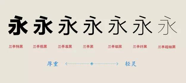 Different thicknesses of strokes give people different feelings: thick strokes appear strong and powerful, while thin strokes appear light and delicate.
Thick stroke fonts will form high-density text blocks during typesetting. This is because thickening the strokes reduces the negative space of the font and increases the visual area, thus creating a sense of oppression and visual focus. It is often used in titles and slogans. Highlight.
In contrast, thin-stroke fonts are visually lighter, the negative space of the strokes is increased, and the structure appears sparse and clear. It is suitable for main text and texts that require long-term reading.
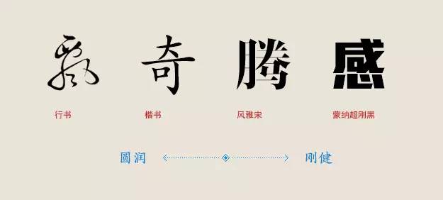
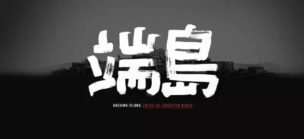
The straight strokes of the font give the font strength and flexibility. Straight lines represent magnanimity and boldness, while curves represent tolerance and gentleness.
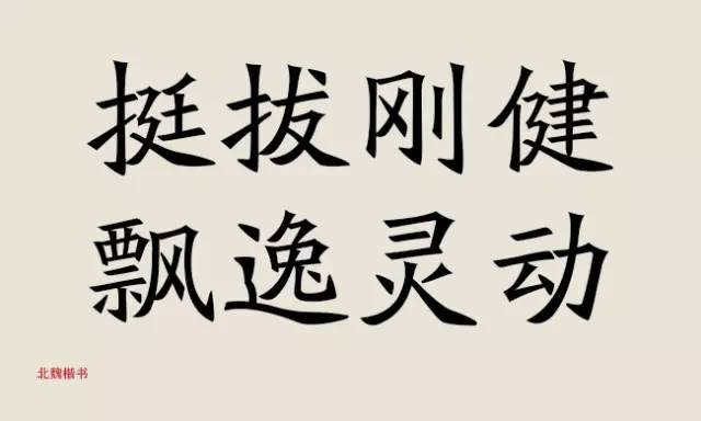
Most fonts are not simply composed of straight lines or curves, but are both strong and soft, such as the regular script of the Northern Wei Dynasty, which is straight, strong and flexible.
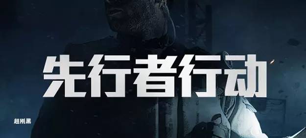
Chaoganghei is a typical pure linear font, with thick strokes and sharp lines that make it appear resolute and powerful.
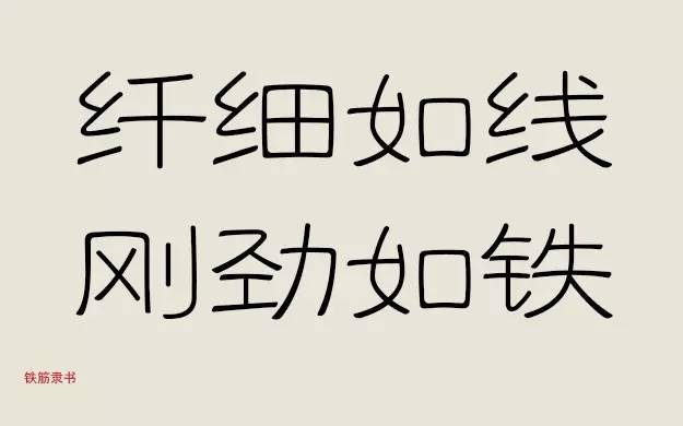
However, although Tiejin official script is dominated by curves, it still reveals a sense of strength. This is because its arc is elastic and adds a rebound force.

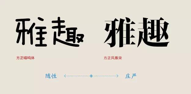 The words written in daily life appear relaxed and lively, while the words used in formal occasions appear rigorous and dignified. This mainly depends on the looseness and rigor of the font structure.
The childish and lively children's fonts are in sharp contrast to the square and elegant regular scripts. The former is often used for children's themes, while the latter is used for solemn occasions.
Articles are uploaded by users and are for non-commercial browsing only. Posted by: Lomu, please indicate the source: https://www.daogebangong.com/en/articles/detail/jie-mi-zhong-wen-zi-ti-de-6-ge-guan-jian-yao-dian.html
 支付宝扫一扫
评论列表(196条)
测试