Here I would like to share with you an article about how to make calligraphy characters. Many people are confused about how those beautiful calligraphy characters on the Internet are made. Here I will analyze it for you. Is it difficult to learn? The key lies in you. Whether you want to learn well or not, you must endure hardship if you want to learn well.
This calligraphy font production tutorial is simple and easy to learn. It only uses AI and PS software to cooperate with each other to complete the production of domineering calligraphy fonts. Even some calligraphy strokes used in the production process are AI's own strokes and are not used at all. Unique secret weapon! Suitable for font designers to learn and master.
If the font designer has limited ability to write calligraphy fonts by hand, you can also create on ready-made calligraphy fonts.
Calligraphy font conversion: http://www.epinv.com/shufa/
Online calligraphy font: http://www.epinv.com/online/
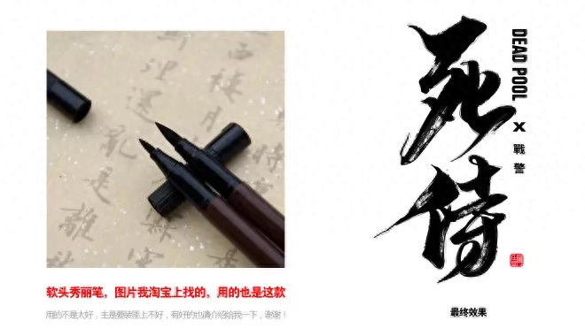
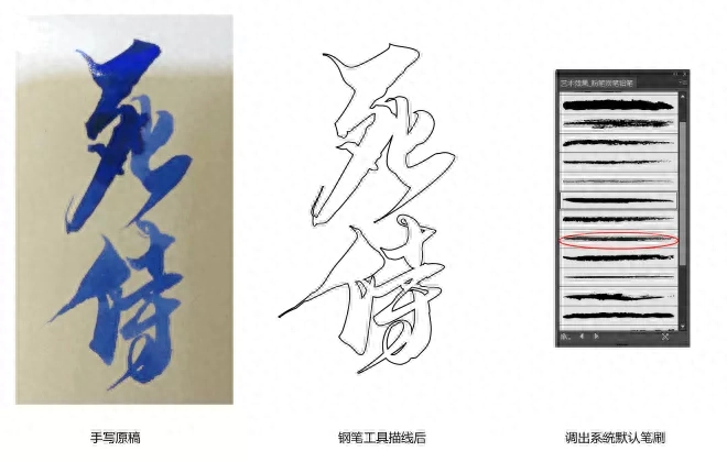
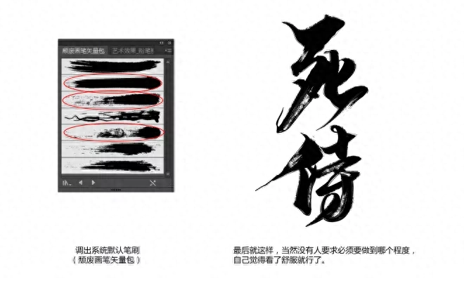
Here I will first share with you a method of making brush fonts. The method is to use a pen called a beauty pen to write the characters, then take pictures and import them into the AI software and then process the details. Many people say that my writing is not good-looking. So what should I do? In fact, there is no good shortcut for this. The only way is to practice writing more. You can buy some copybooks online, and then practice writing with other pens. Over time, you will naturally have a style that is your own. writing style, and then you can try using other pens to write artistic glyphs.
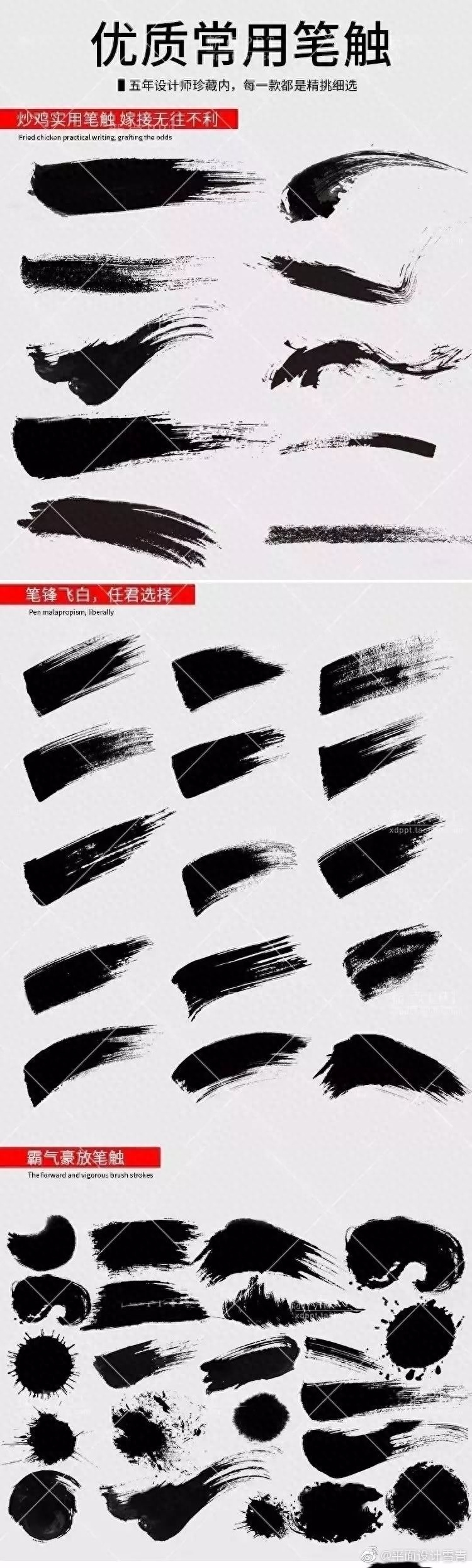
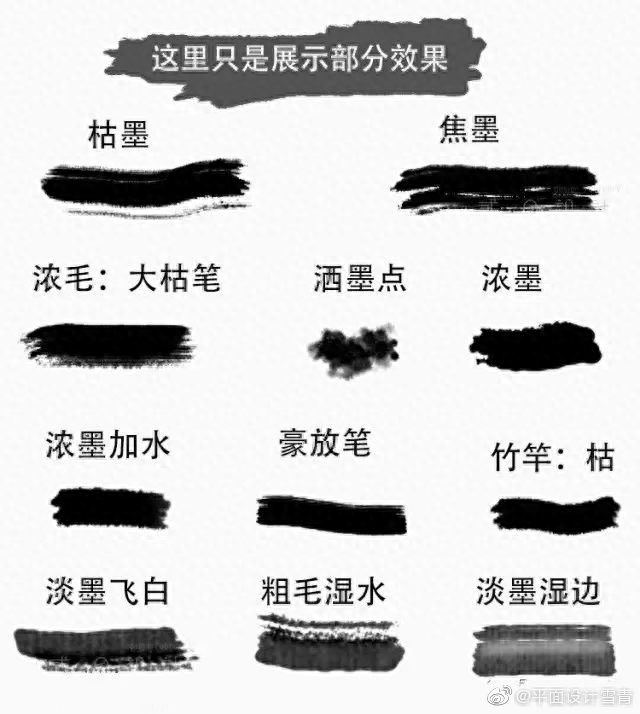
Of course, if you have strong design skills, you can put your written words into computer software and process them, adding some strokes or some decorative elements to make the glyphs more vivid and energetic.
Tools: beauty pens, and design software (AI CDR PS are both acceptable)
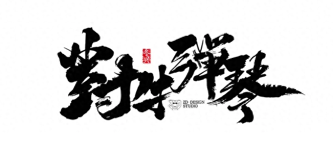
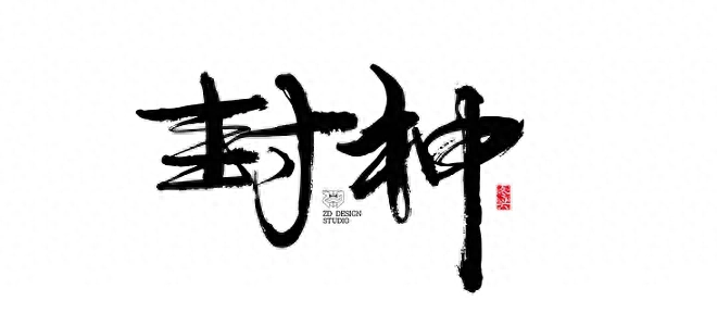
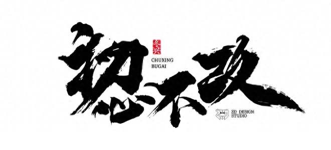
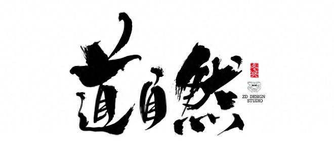
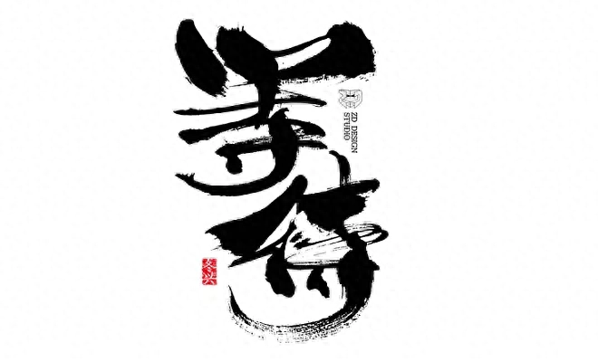
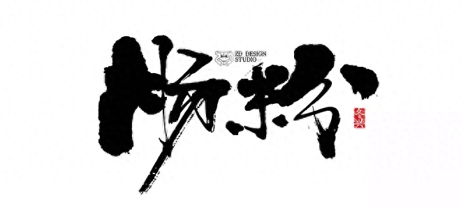
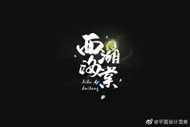
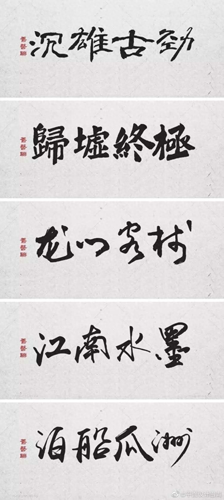
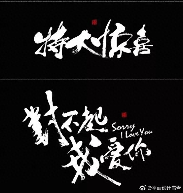
Appreciation of calligraphy font design
Tools: calligraphy website/and design software (AI CDR PS are both acceptable)
Usage and expression
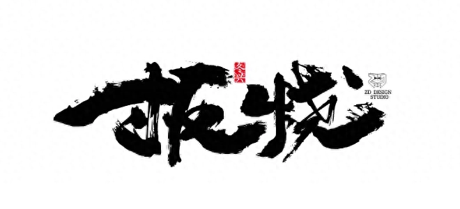
The creation method of font library calligraphy fonts or calligraphy online generation should be said to be the most commonly used calligraphy font design method by most designers today. Basically, it can be completely processed on the computer, without having to think too much about calligraphy skills and skills. Just use calligraphy to express elements and realize design requirements. Generally speaking, such calligraphy font design has a certain sense of design and form, but lacks some of the charm and feeling of calligraphy itself. If we want to use this method to design calligraphy fonts in a deeper level, this requires us not to blindly use calligraphy elements, but to better understand the theoretical connotation and writing techniques of calligraphy, even if we don't use a brush to When creating and writing, you can also know which fonts are more suitable for the product when choosing fonts, what problems to pay attention to when deforming and typesetting fonts, and what problems to avoid, etc. As far as the expression form of fonts is concerned, the fonts in this method, whether they are fonts from a font library or generated fonts during writing, are modified from other people's fonts, so the general structure and fonts are borrowed from others. Of course, we use our own experience of calligraphy. You can also make some detailed modifications to the font structure and glyphs based on your feelings and understanding of the service objects. What we have the greatest control over in this method is the overall layout and style of the font, such as changes in font size and layout, as well as the addition and size changes of strokes. When adding strokes, we add a beginning and a tail or replace the strokes on the basis of the calligraphy glyphs, which not only maintains the original structural form, but also highlights the style and personality.
The styles suitable for this method are mainly steady, comfortable, and unrestrained. This is related to the fonts chosen, because most fonts are basically written by famous calligraphers. According to the rules of calligraphy, the general fonts are mainly beautiful in shape and smooth in style. It won't highlight your personality and style too much. Of course, special calligraphy fonts are not excluded. Especially in the online calligraphy generator, there are some highly personalized fonts. If the application combination is good, sometimes the effect will be unexpected.
Word meaning analysis
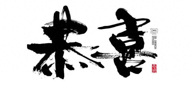
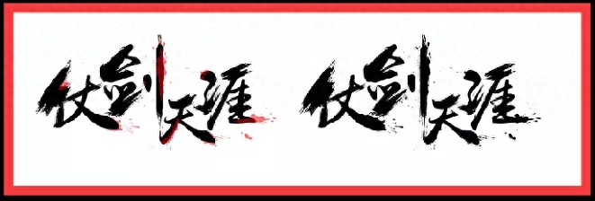
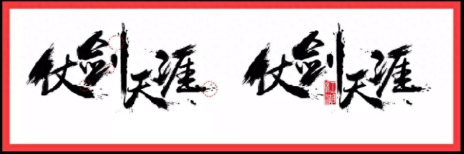
Going to the end of the world with a sword is a desirable way of life. Whenever I hear the sentence in Xu Wei's "My Past You", "I once dreamed of traveling to the end of the world with a sword and seeing the prosperity of the world. My young heart was always a little frivolous. Nowadays, when you are surrounded by the world, you often have bursts of fantasies and touches in your heart. It is a kind of abandonment of the world's distractions. Relying on the sword in your hand, you are fearless, go to the ends of the world, follow your heart, and be happy in the world. Romantic feelings are also a pursuit of dreams. When "Sword to the End of the World" touches us, it means that we are still chasing our dreams.
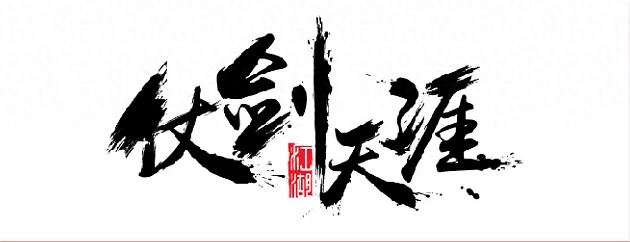
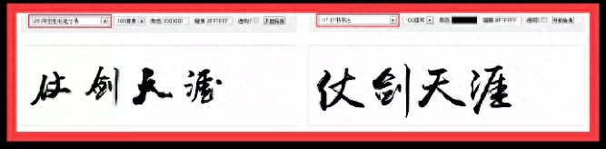
Choose a font
Combined with the feeling of "Zhang Jian Tianya" giving people a free and easy movement, we can find suitable fonts in the online calligraphy font library. The selected font style is preferably open, balanced structure, and elegant shape. At the same time, to ensure For recognition, we choose running script as the most suitable. When choosing, you can choose 2-3 fonts based on these requirements, select and compare them, select the most suitable font, and transform the font design. For "Zhang Jian Tian Ya" I chose two fonts, "Xiang Jia Hong Brush Running Script" and "Xing Script Calligraphy". Comparing the two fonts, you will find that although the former is more personalized, the stroke structure is not stretchy enough and is limited during transformation. The style will be more distinctive, while the latter has less stroke changes, an open shape, and is easy to add strokes, so the latter was chosen for design modification.
Layout renovation
In terms of layout, I chose a horizontal layout structure, and arranged and adjusted the fonts in different sizes and patterns to create a certain sense of rhythm and rhythm. Remember that the layout must be even when adjusting, and there must be a certain amount of space between words and strokes to facilitate changes in strokes and addition of strokes.
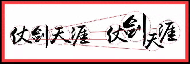
Overall adjustments
1
The "running script font" chosen by Zhanjian Tianya itself is relatively balanced in stroke size and lacks contrast, so we adjust some strokes in the font according to the overall layout structure. First, we use the eraser tool to combine the strokes that need to be adjusted with them. The main glyphs are separated, and then the strokes are enlarged. Finally, the uneven joints are repaired and processed to make them natural and harmonious. In this case, I enlarged the upper and lower sides of the character "Zhan", the lifting of the word "Jian", the upper and lower sides of the character "天", and the three dots of water and the upper horizontal of the character "Ya" in the font. Adjustment.
2
After adjustment, add strokes to the font. This is the most important step in the entire font design transformation. The addition of strokes should be added or replaced appropriately according to the strokes of the original font and the stroke proportions we have adjusted to create an atmosphere and Feeling is the main thing. Remember not to think that the more strokes, the better. This will mess up the overall layout. If it is not used well, it will not be able to talk about the organization and rhythm.
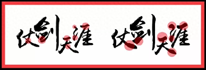
Detailed adjustments
1
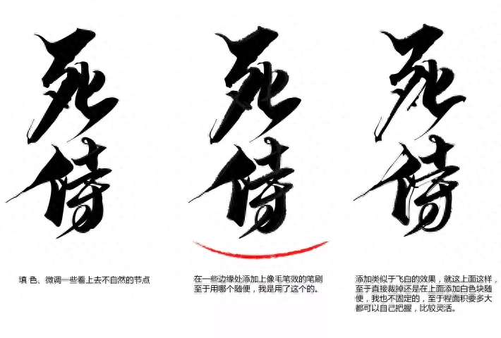
After shaping the atmosphere of the overall font, you will find that the beginning and end of some strokes are a bit inconsistent and too smooth in the whole. So add some ink dots in these locations to maintain the unity of the overall style and the richness of the changes. At the same time, it can also make the fearless and arbitrary atmosphere in the meaning of the word more prominent.
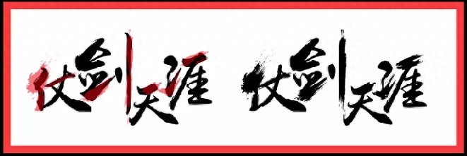
2
Next we are doing some subtraction. Since there will be some conflicts and contradictions between the white brush strokes and the ink dots, we can reduce some brush strokes and ink dots while ensuring the overall atmosphere to make the overall design cleaner and rhythmic. Stronger. In fact, "The End of the World" is a kind of Jianghu sentiment. Finally, I added the word "Jianghu" to the font in the form of a seal, so this case is completed.
Case presentation
I hope that this article can solve everyone's problems in making calligraphy characters and help you. Of course, through continuous practice, the structural changes between strokes can be unified, which is the most important thing to master in calligraphy characters. Yes.
MeiCry 300 brush fonts + strokes, packaged and given to you
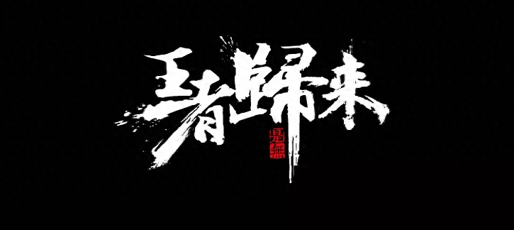
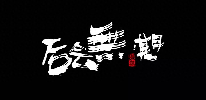
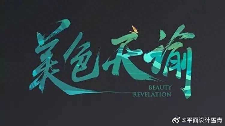
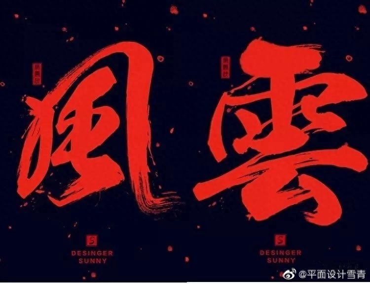
Let’s see the effect

Receive brush fonts and brush methods
First: Pay attention to Tutu
Second: Like + any comment + retweet
Third: Follow Tutu and reply via private message: Brush font
Please help by moving your fingers and forwarding it so that more people can learn from it.


Finally, Tangtang brought Easter eggs to the friends
Follow Tangtang and reply via private message: "Learn Design" will help you learn graphic design and take orders to make money. It's OK even for beginners.
Articles are uploaded by users and are for non-commercial browsing only. Posted by: Lomu, please indicate the source: https://www.daogebangong.com/en/articles/detail/jiao-ni-zuo-chu-hao-kan-de-shu-fa-zi.html
 支付宝扫一扫
评论列表(196条)
测试