Last week's article [I changed a PPT report in seconds, and then he showed his love to me...], as a result, I received messages from many friends, wanting to know how the design process in the middle was realized.

Today, I will fulfill the promise made last week to everyone.
Xiaoai also consulted the designer of this report, MM, and the experts in the iSlide team who have ten years of experience in PPT design,
Share how to present the PPT report more professionally in a short time.
Global thinking makes PPT design more efficient!
Don't worry about how to make the PPT more "beautiful".
Although there are too many articles on the Internet, teaching everyone how to design an "effect",
But PPT does not rely on a page to convey information!
It's like a lone hero can't win a war,
When alien evil forces threaten the earth, we still have to rely on the "Reunion".
Multi-page design needs to have a unified standard to avoid clutter.
These standards include fonts, colors, layouts, etc.
The previous article explained everything in detail, and students who make up classes click here [How is the professional PPT report of the consulting company made? 】
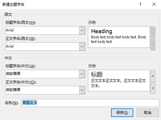
Font settings:
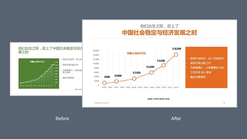
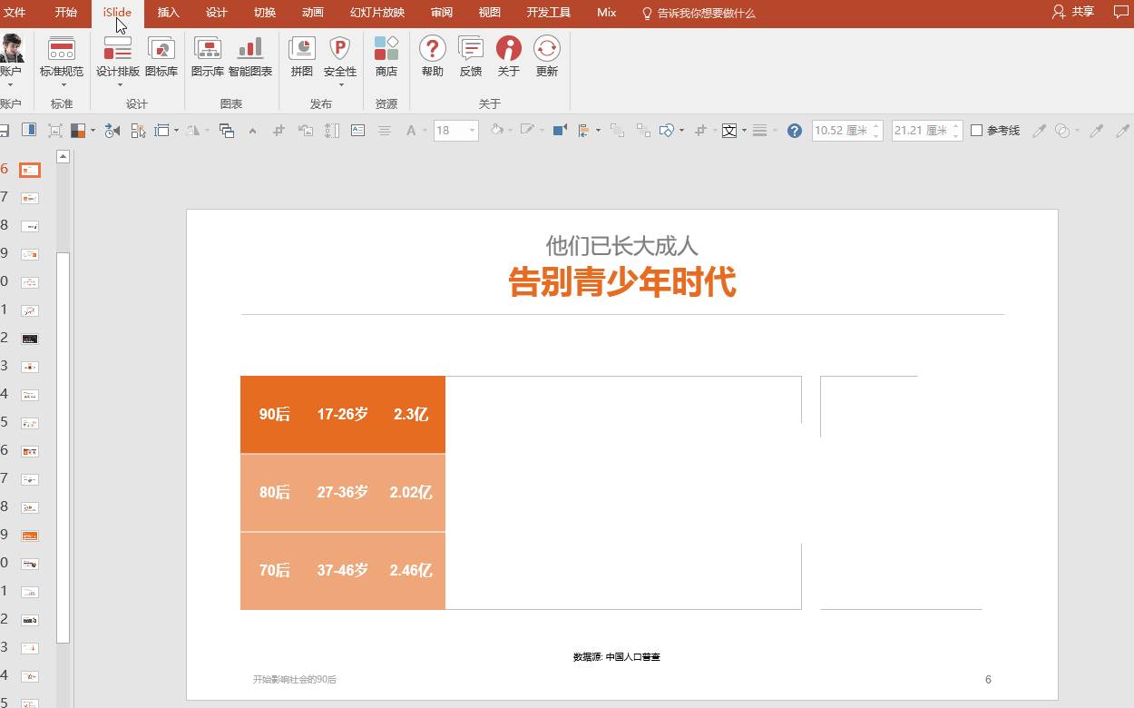
Globalization presets for Chinese and English fonts. (Improvement numbers in the charts are in a more prominent impact font)
Unified fonts throughout the document.
Color Settings:
If you know how to change the theme color, you must have seen this menu:
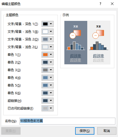
The benefit of color schemes is "change it all"
For example, you can change "Orange" back to "Green" in an instant, it's that simple!
PPT color look at me seventy-two changes

The little secret of the color scheme is here [It’s all about the color—how to save your PPT color scheme], [How much does color affect the appearance of PPT? 】
Layout settings:
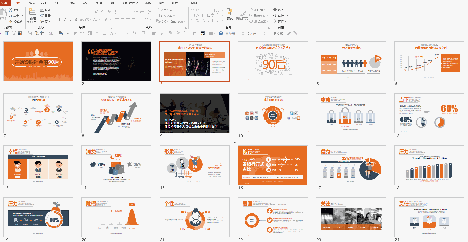
Here, the 11 default built-in layouts of PPT have been deleted.
5 required layouts are preserved. As for why those redundant typography were removed? Take a look at this article to understand [God, there are 16115 layouts "hidden" in this PPT! ! 】
A few details of layout design:
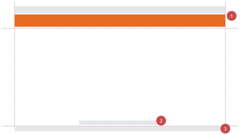
Make good use of the reference line to set the content range of each area on the page. Students who operate the reference line for supplementary courses come here: [Reference Line - Make PowerPoint more professional and standardized]
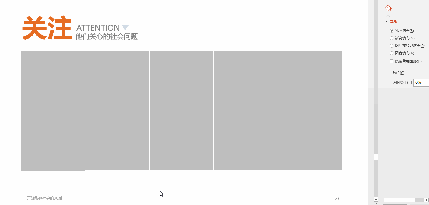
Set the fixed content on the page as a placeholder (1-title, 2-data source, 3-footer and page number in the mark in the figure below) Students who are confused about the footer and page number look here: [Header and footer in PPT Those things] [Why can't I add page numbers to my PPT? 】
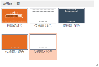
Title layout only
OnlyHeader Layout applies effects
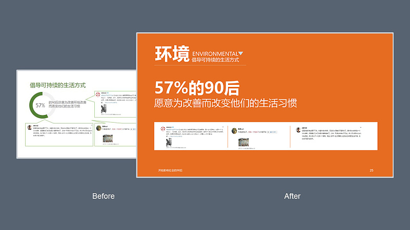
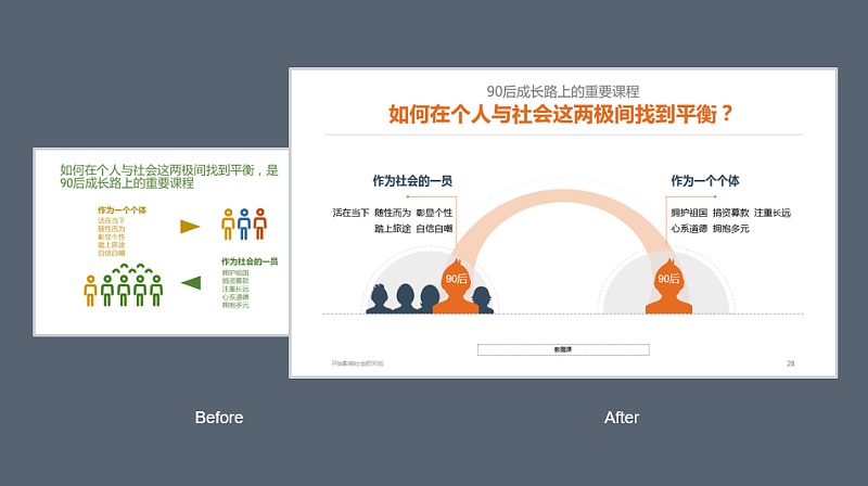
Tips: Don’t just use a light-colored background, and make some differentiated adjustments through the layout appropriately to avoid poverty. for example:
Master editing skills to make PPT more professional!
After the global setting, the PPT as a whole will have a unified design standard,
You no longer have to worry about what font to use, the alignment of the titles on the front and back pages, whether sky blue or lake blue looks better.
Then the next step is to change page by page!
And here are more about the editing skills of PPT:
What you can think of, at least it must be expressed in method design, and it must be fast!
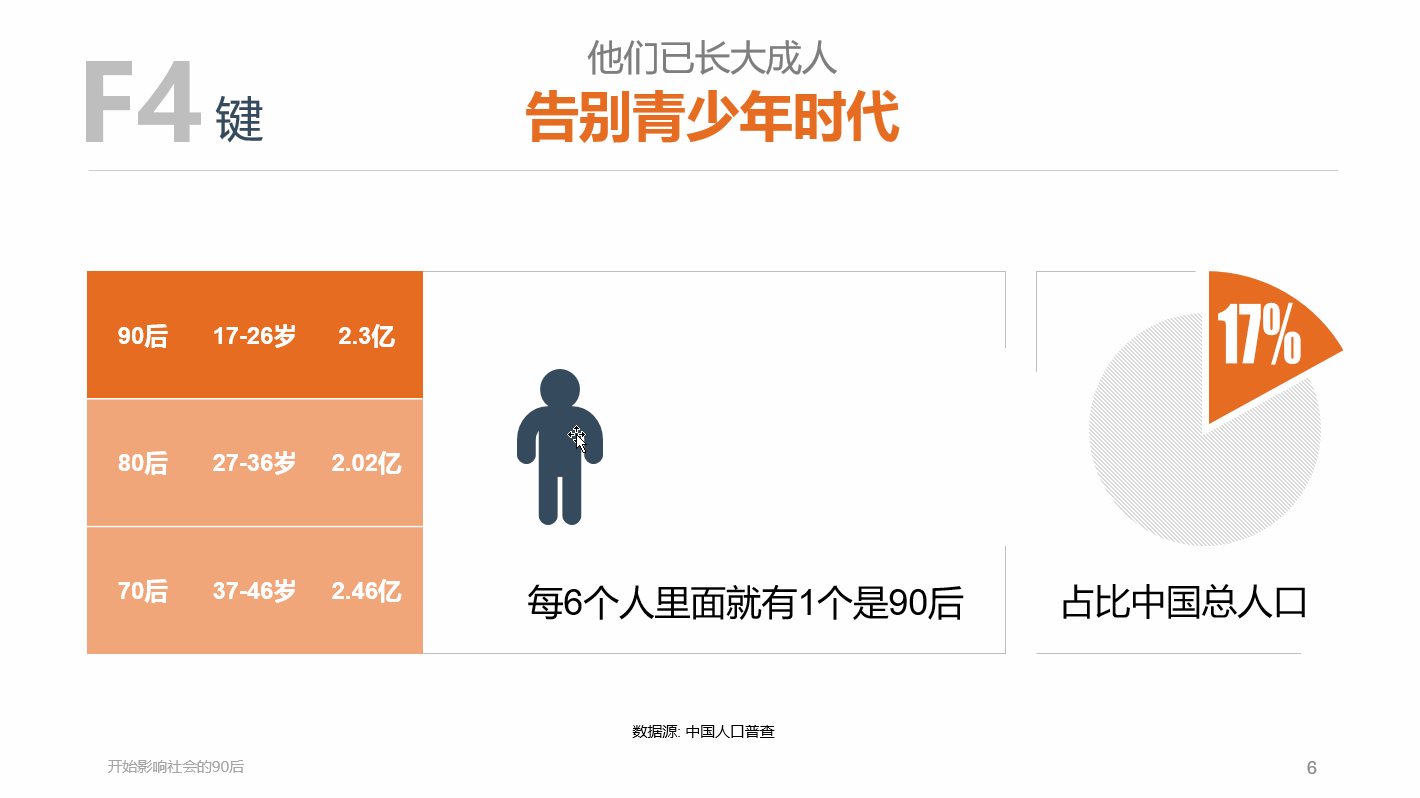
F4 key
The F4 key in PPT is almost like a god. It can improve details and improve efficiency, especially suitable for the following PPTers (please check the number yourself):
Patients with obsessive-compulsive disorder - can't help but want to align every graphic and text box;
Heavy mouse users - stare at the screen, move the mouse slightly, and wait for the "alignment" prompt of the "smart guide"!
Feeling pie - almost, I think it's aligned~
Habit Advocate - Alignment tool in PowerPoint already works great!
Novice tender dishes - where is the alignment tool?
For example:
To appreciate more the excitement of the F4 key, please look here [A PPT magic skill that subverts the three views (the king of efficiency)]
Content modularity
The information in the report is very complicated: necessary text descriptions, pictures, data charts and so on.
If they all have to be placed on one page without being too messy,
Then try modular typography, often using borders, color blocks, and aligning borders to look orderly.
Then remember to highlight the key points to be reflected through the differentiation of colors!
Here is also a modular comparison case of the extremely feared intensive report, let’s watch [How to break a PPT report with a lot of text? 】
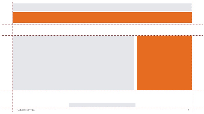

Image padding
As long as there are pictures in the PPT, most of the PPTer should be inserted one by one,
If you want to be faster and save trouble, you don’t need to typesetting, it’s easy to modify, and the size of the picture can be reduced?
Try another way to fill it with pictures~
The layout of pictures made by MM is filled with pictures~
I'll show you if you don't believe me
Let’s start with a few rectangles (the F4 key plays a friendly role)
Once the image is filled in, it's time to call it a day
The details have been written before, look here, and you will find more [These secrets of PPT inserting pictures are rarely told to you! 】
ok, the above is for reference as some experience~
There are experts behind the scenes, and I feel that there are always more exciting things to share in the PPT.
In fact, there is a little secret about the design improvement and optimization of this PPT report:
If you want to be simpler~
Download directly from the "Icon Library" and insert it into the current page. The downloaded icon directly adapts to the current theme color, and even the color does not need to be readjusted~
A real chart that can change parameters with one click
This is the PPT artifact developed by the big cows, an upgraded version of NT!
Added functions of various libraries, one-click insertion into PPT, and free editing of those personalized charts,
Very convenient, already in the final testing stage,
Xiao Ai is looking forward to it like everyone else,
Make PPT easy! !
Every day, more than 1,000,000 business presentations are held worldwide,
Professional design can convey and express information more effectively.
PPT slides can also be a kind of power,
Be able to persuade, be able to influence, be able to move!
Articles are uploaded by users and are for non-commercial browsing only. Posted by: Lomu, please indicate the source: https://www.daogebangong.com/en/articles/detail/iSlideTell%20you%20the%20secret%20between%20Before%20and%20After%20with%20ten%20years%20of%20PPT%20design%20experience.html
 支付宝扫一扫
评论列表(196条)
测试