You should already know how to organize a good pyramid structure. But in the final report, we usually not only have a text draft, but also prepare a PPT. When many people make PPT, they are very confused about how to choose graphics and how to draw the logic clearly. In the end, it took longer to do the PPT than the analysis.
In fact, as long as the analysis logic is clear, PPT drawing is super fast.
Today I will share how to use PPT to chart the pyramid structure to improve reporting capabilities.
One chart type
I divide the charts displayed in PPT into three types.
- Logic diagram
- Relationship diagram
- Statistical chart
PPT charts have two commonly used functions, one is SmartArt and the other is charts.
SmartArt comes with many different types of charts preset, and we can call them directly without combining the graphics ourselves. SmartArt basically covers all the logical schematic diagrams and relationship diagrams we need to express.
The chart provides the statistical charts we need, and all our visualization tools can be found here.
Second logic diagram< /span>
There are generally only four types of logical structures in the pyramid, namelychronological order, structural order, importance order, and deductive logic . Once you understand the logical type of the pyramid, it will be easy to choose the graphics. There are a large number of combined schematic diagrams in the SmartArt function of PPT, and we can directly select the graphics among them.
2.1 Time Order
Chronological order is a one-way flow order. The chronological order is divided into before and after. Therefore, it is more suitable for directional diagrams. We can choose from the following graphics:

2.2 Structural order
The contents of this item of structural order are in a parallel relationship. We can choose a tree diagram:
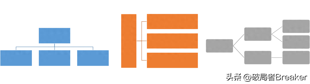
Or parallel graphics:

Some structures are combined based on two dimensions, such as the SWOT model. This structure can be used as a matrix:

There are also some special structural orders, the boundaries between them are not particularly clear, and there is partial overlap between them. This knot can be crossed:

2.3 Order of importance
The order of importance is similar to the order of structure. Generally speaking, graphics and structural sequence diagrams are consistent, and can be in the form of tree diagrams or side-by-side diagrams.
2.4 Deductive Logic
The last one is the deductive logical structure. The deductive structure consists of three parts: major premise, minor premise and conclusion, which are generally represented by such a graph.

Look if we have sorted out the pyramid, our chart has basically been determined. So it’s not about sorting out the picture content and then looking for the chart. If you feel confused about choosing an icon and don’t know what to choose. Then it must be that your previous logic was not sorted out clearly
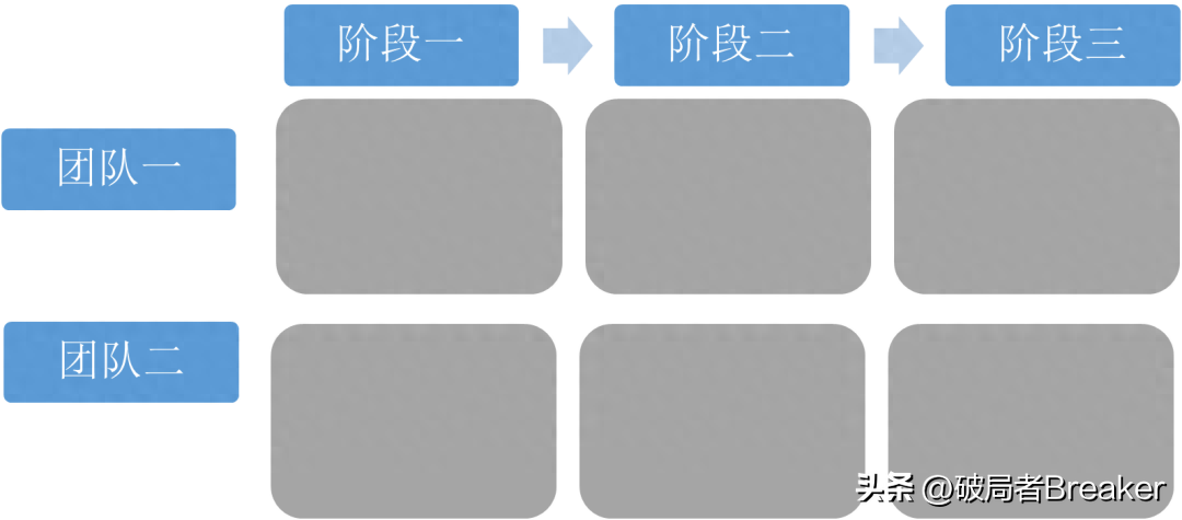
2.5 Combinational Logic
The above graphics can represent the pyramid framework of a single logical structure, but sometimes what we want to say is complex and contains two logics at the same time. For example, if there is a project report, the progress report is in chronological order, and each stage has various work contents in structural order. In this case, we can extend one dimension to two dimensions and make a graph like this.
Three statistical charts< /span>
The last type of chart is the quantitative part of the argument, which requires the use of statistical charts.
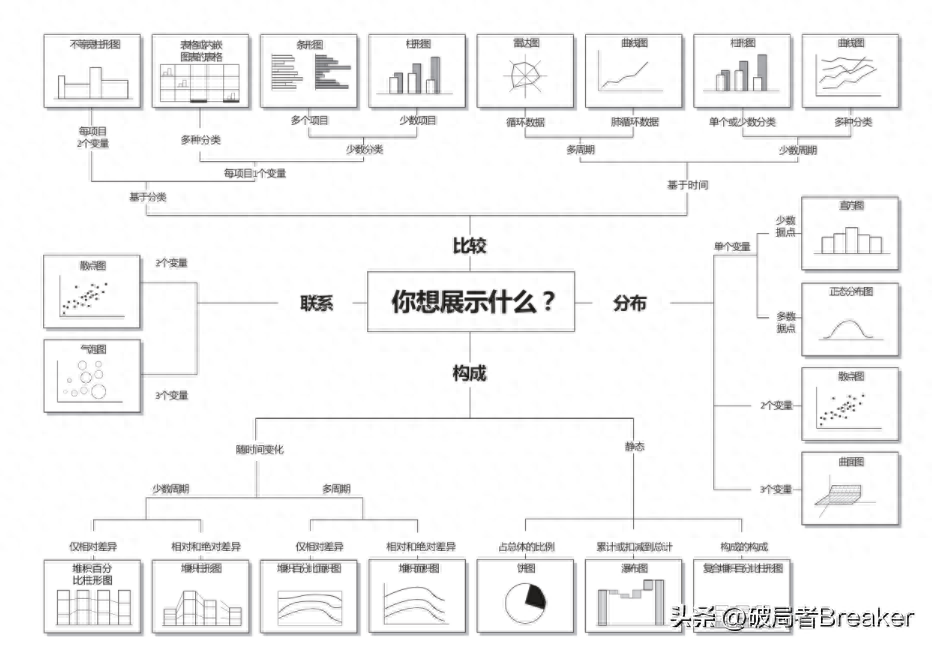
There are many types of statistical charts. Commonly used statistical charts include:Column chart, bar chart, pie chart, scatter chart Dot plots, radar charts, etc. The choice of these charts also depends on what you want to show.
There is a very detailed schematic diagram on the Internet, which summarizes the four major categories of display logic, namely comparison, connection, Distribution, Composition. The specific details can be seen in the picture below, so I won’t introduce them here.
Four relations diagram< /span>
In addition to the logical reasoning part, PPT generally also explains the background, role, planning of the project, etc. . Relationship diagram is more suitable for this kind of project introduction.
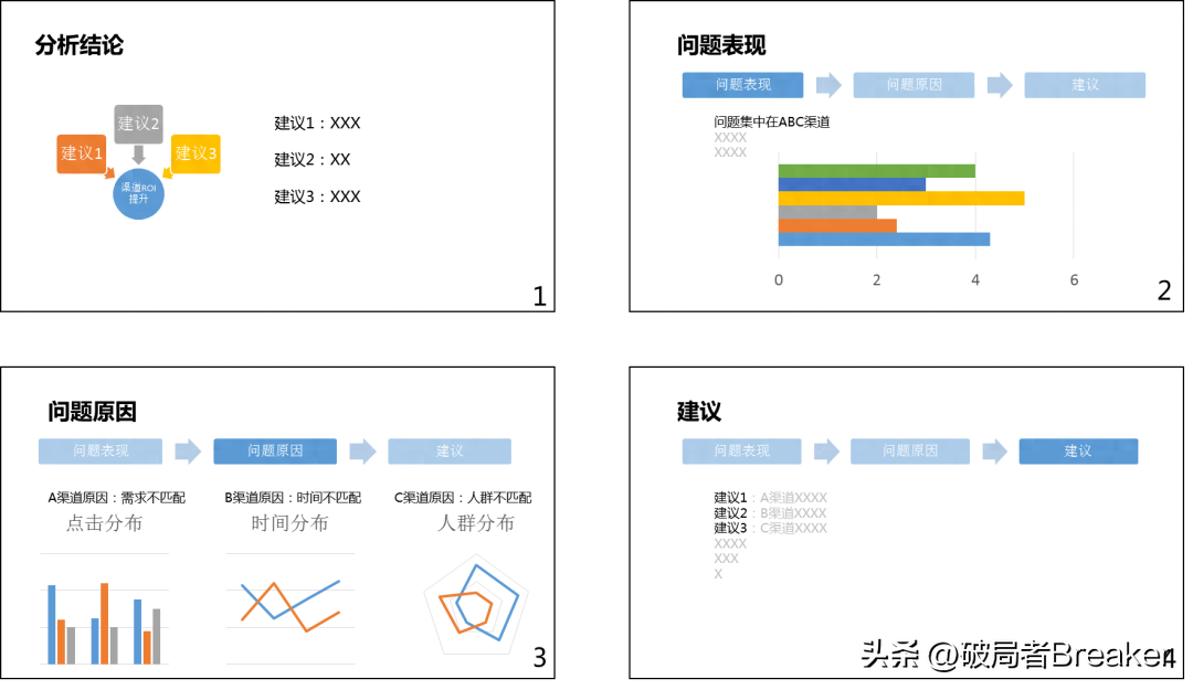
For example, a channel analysis finally gave three optimization suggestions. If you can only use one picture to show the conclusion of this report, then it can be like this:
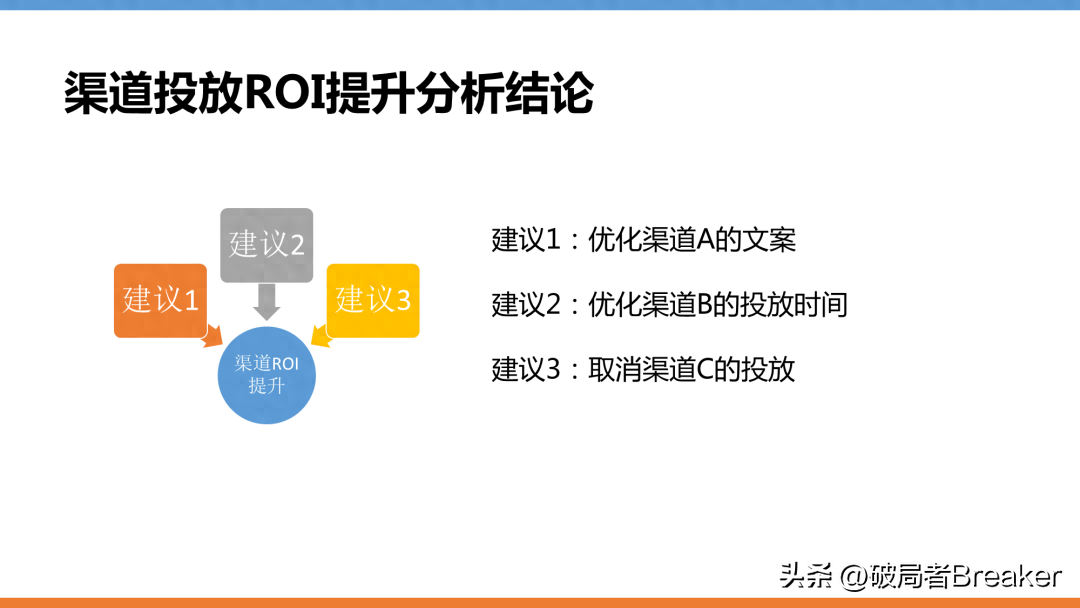
This picture shows at once that all the suggestions can improve the ROI of the channel. A picture is worth a thousand words and saves a lot. What needs to be explained.
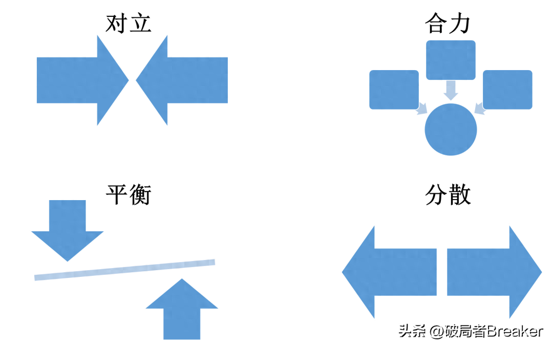
In addition to the above-mentioned relationships, common relationships include: Opposition, synergy, balance, dispersion wait. These can be found in smartart.
5 Practice it
How to combine the above information into a complete PPT, let’s take the channel analysis of the previous article as an example.
Relationship diagram
First of all, the final conclusion is that the three suggestions jointly improve channel ROI, so the relationship diagram of "joint force" is chosen, which has been mentioned above.
Logic diagram
Our general logic is deductive syllogistic logic, which ultimately draws conclusions by analyzing the phenomenon and causes of the problem.
So the logic diagram uses a syllogism diagram:

Statistical chart
Finally, there is the argument for the problem phenomenon and the cause of the problem in the logic diagram. This part contains quantitative data and requires the use of statistical charts.
The problem is that the low ROI of channels is concentrated in the three channels ABC. Here we need to show that the ROI of the three channels ABC is low. Bar graphs and column graphs are both acceptable.
The reason for the problem is that channel A needs to show the difference in click-through rates of different functions, and column charts and bar charts can be used; channel B needs to show The difference in the number of people changing over time is suitable for a line chart; the C channel needs to show the difference in characteristics between the target population and the channel population, so it is suitable for a radar chart.
Final product
Finally, by combining relationship diagrams, logical diagrams and statistical charts, a rough PPT framework can be drawn. Here is a demonstration:
I only spent three to five minutes on these pictures, and I didn’t do much to beautify them. , all using the templates and colors that come with Excel. If you want to fill in the text, it is estimated that you can complete a PPT in 15 minutes. This efficiency has been greatly improved compared to doing a PPT for half a day.
Six Summary
As long as the logic is clear, everything feels easy.
Articles are uploaded by users and are for non-commercial browsing only. Posted by: Lomu, please indicate the source: https://www.daogebangong.com/en/articles/detail/hui-bao-neng-li-xi-lie-PPT-tu-biao-hua-su-cheng-gong-lyue.html
 支付宝扫一扫
评论列表(196条)
测试