Source: Kuai Technology
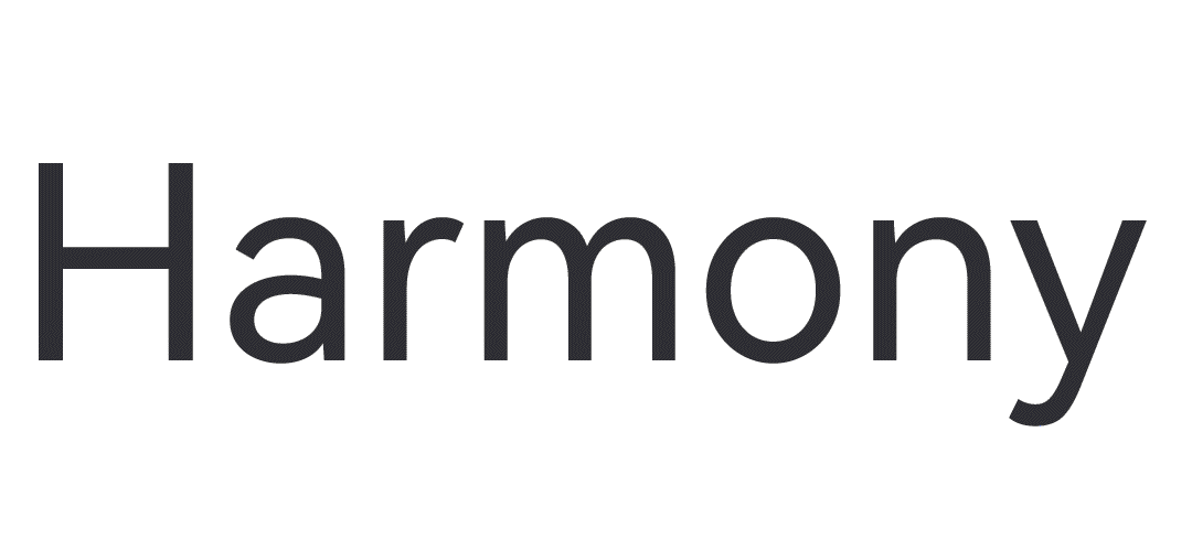
Huawei has officially released the HarmonyOS 2 Hongmeng operating system. Its font design is also a newly customized "HarmonyOS Sans", which is now publicly available and available for free commercial use.
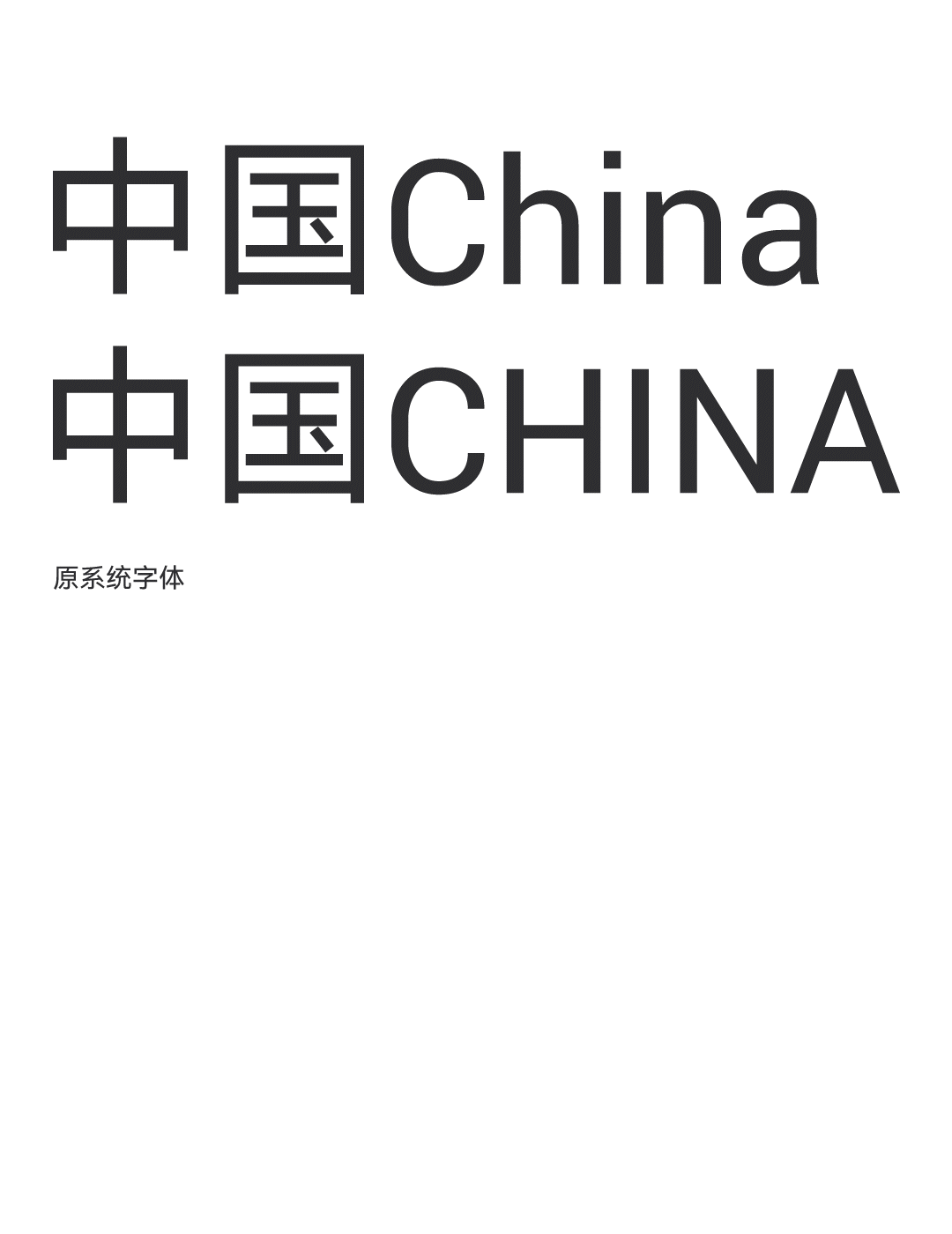
The font design focuses on functionality and universality. It is a multi-language stepless variable font that supports five major writing systems: Simplified Chinese, Traditional Chinese, Latin, Cyrillic, Greek, and Arabic. 105 Global coverage of languages.
Three major features of HarmonyOS Sans font:
1. Easy to read
System fonts are different from traditional flat printing fonts. In the application scenarios of smart terminals, legibility is the most basic and critical condition.
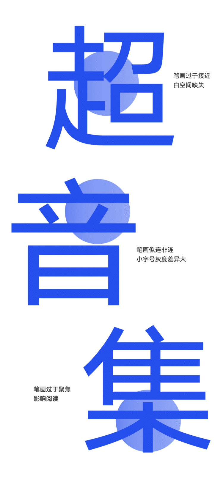
Chinese strokes are complex. During the design, HarmonyOS Sans was designed to deal with the situation where the joints of variable font strokes are easily broken, and optimized and unified processing was carried out to make the final presentation of the font clean and crisp.
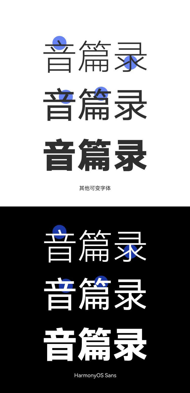
Cumbersome strokes and uneven whitening will directly affect users' reading. HarmonyOS Sans optimizes the "grayscale" feel of fonts for diverse application scenarios.
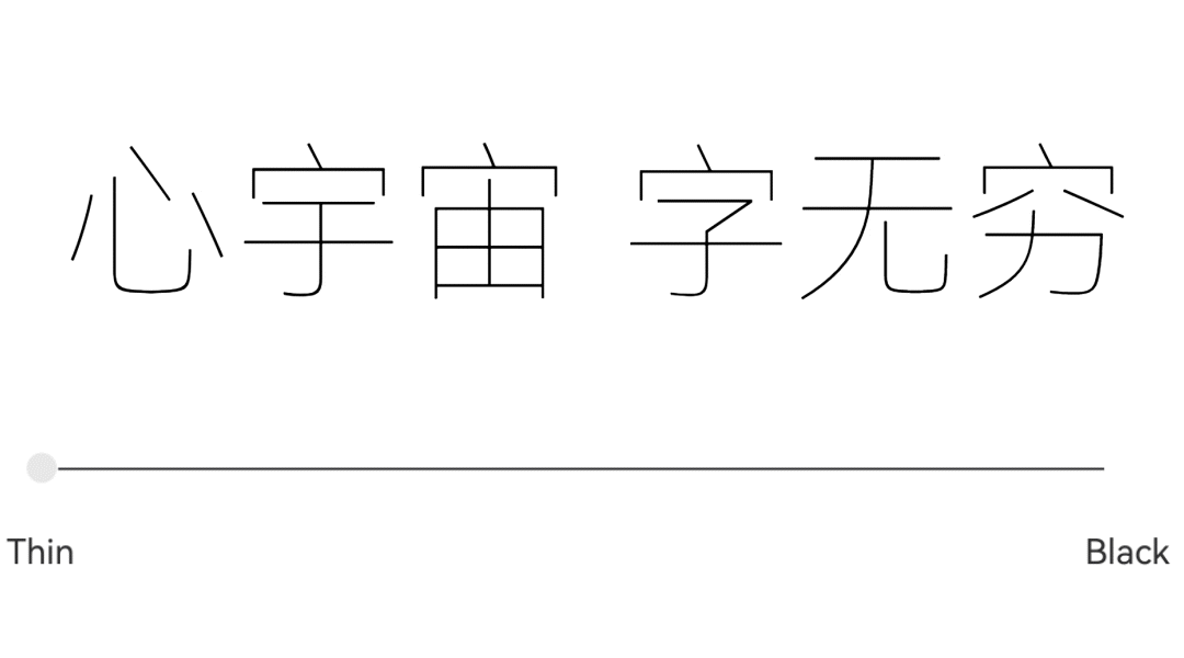
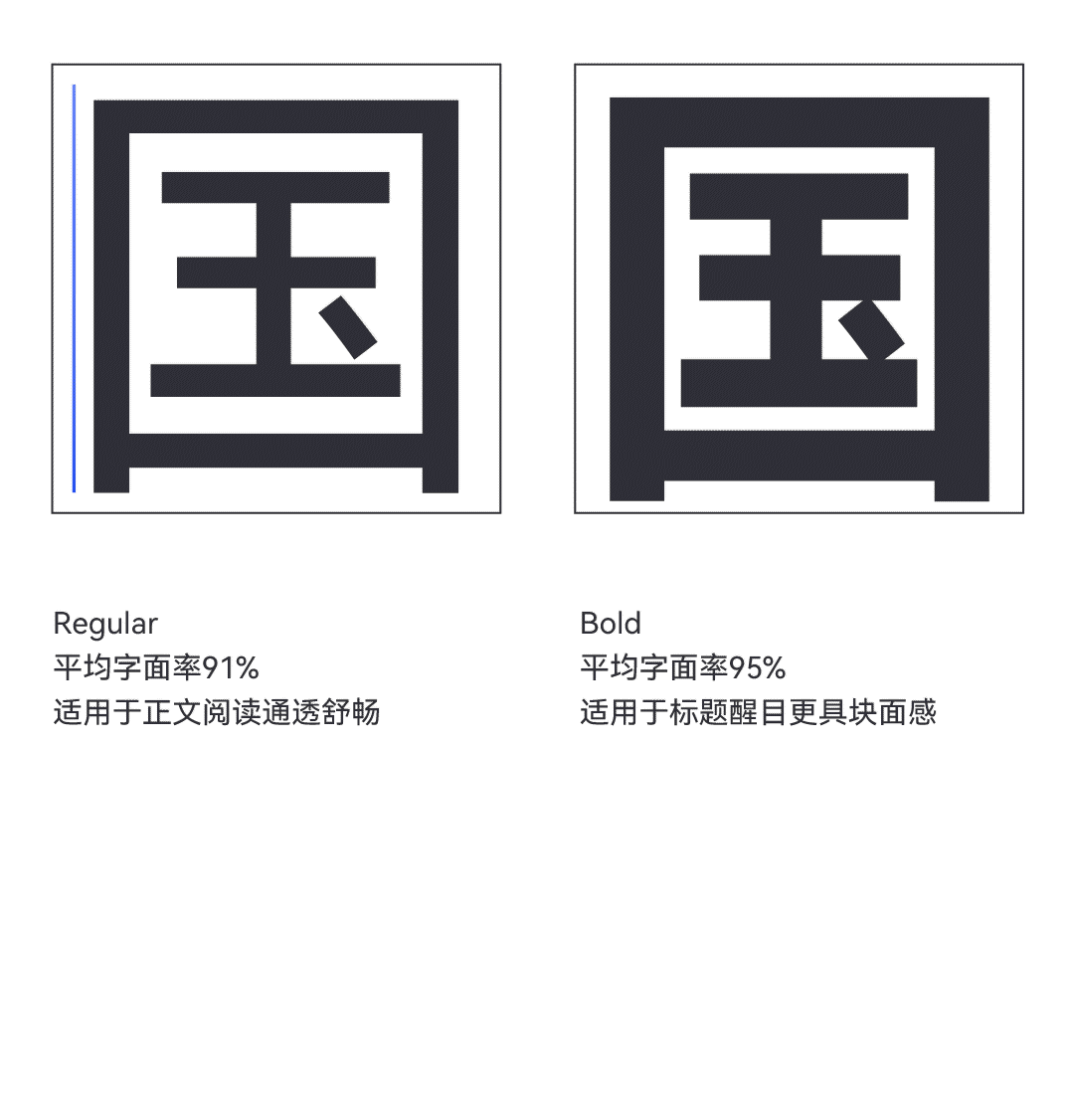
According to different usage scenarios of users,the literal ratio of fonts has been differentiated.
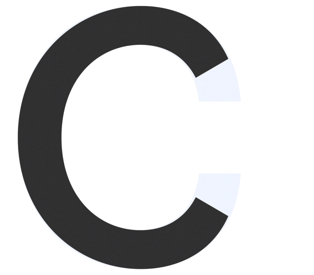
In order to enable users to quickly read information, the Western glyph design adopts pure and classic geometric shapes, which are intuitive and eye-catching.
Large opening styling treatment,
The glyphs are easy to recognize and the recognition is higher.
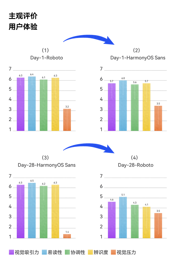
In the human factors research experiment, HarmonyOS Sans was compared with the high-quality fonts Hanyi Qihei and Microsoft Yahei. The eye movement experiment showed the following:
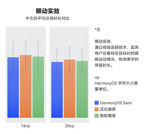
The average gaze time of the new font is lower than that of Hanyi Qihei and Microsoft Yahei.
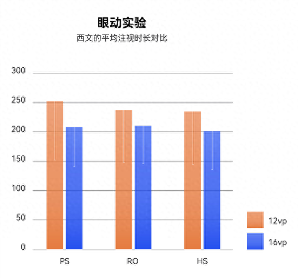
Comparing Spanish with Product Sans and Roboto, the average gaze time of the new font is lower than other fonts. The readability of both Chinese and Western texts in HarmonyOS Sans has been confirmed.
2. Unique
Huawei users' evaluation of font styles shows that users evaluate high-frequency words as: clear, neutral, elegant, natural, good-looking, and comfortable.
Users have a higher preference for the new font than the old font, and they perceive the optimization of the font strokes, such as weakening the mechanical feel of the black body.

Chinese “口” widget
, modern structural processing.
Stroke shape
, incorporating the beauty of writing.

On the premise of ensuring the font function, compared with other system fonts, the uniqueness of HarmonyOS Sans is that it has found a new balance between humanism and modernity.

Traditional geometric structures usually have poor legibility. In order to avoid such problems,when designing Western characters, the difference in glyph width proportions was reduced.
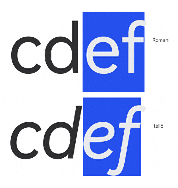
The design of “Italic” references the stroke structure of handwriting, paying homage to history.
3. Universal
In addition to text matching in multiple writing systems, the matching between text and symbols, icons and even mobile phone systems will directly affect the user experience.Huawei’s global vision and diverse and complex application scenarios are destined for HarmonyOS Sans must be extremely versatile.
During the human factors research process, Western user experience and readability research reported a very interesting phenomenon. When users change from the system default font Roboto to HarmonyOS Sans, they will not feel a jump, but when changing from HarmonyOS Sans to Roboto , the experience is significantly reduced.
In order to deal with the problem of inconsistent matching of Chinese and Western text typesetting, HarmonyOS Sans has made targeted optimizations. Overall,HarmonyOS Sans is larger and wider than Roboto, and is more compatible with Chinese.
HarmonyOS Sans also designs Italic, Condensed, and Condensed Italic fonts, providing more possibilities for diverse and complex application scenarios.
In order to meet the different usage scenarios of users, HarmonyOS Sanssets a variety of typography attributes for symbols that match text.
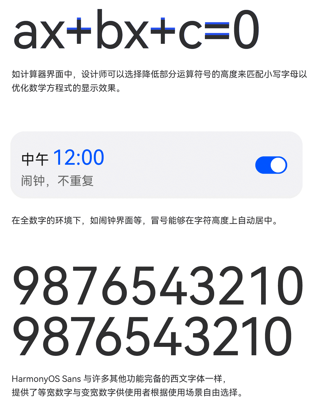
At the practical application level, the matching of text and system is a link that cannot be ignored. HarmonyOS Sansrefines the user's usage scenarios one by one and makes targeted processing.
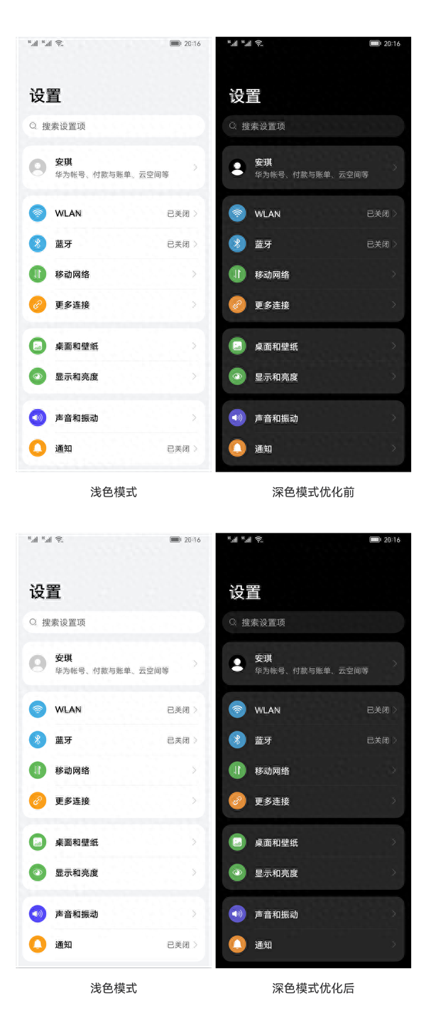
Human factors research results show that with the same word weight, text on a dark background is perceived to be thicker.
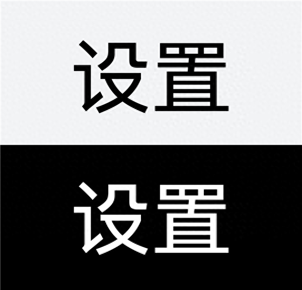
To this end, a Thinner font weight is used in dark mode to keep the visual weight of the font consistent with light mode.
The use of a unified design language for text and icons is also a key element in presenting users with a new experience of multi-device mutual assistance. The final presentation of HarmonyOS Sans is as follows:
Articles are uploaded by users and are for non-commercial browsing only. Posted by: Lomu, please indicate the source: https://www.daogebangong.com/en/articles/detail/hua-wei-quan-xin-ding-zhi-zi-ti-HarmonyOS-Sans-shang-xian-hong-meng-OS-zhuan-shu.html
 支付宝扫一扫
评论列表(196条)
测试