
Someone left a message before asking how to design a teaching-type PPT.
Today I would like to share with you a PPT about teaching and training. This set of PPT is also quite special and can be considered a relatively typical case.
Let’s first take a look at the effect of the overall design.
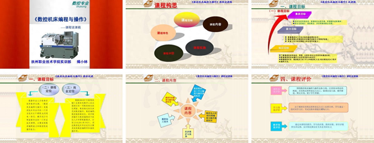
Do you feel that the page is messy, with too many colors and simple logical content, but the page looks very complicated?
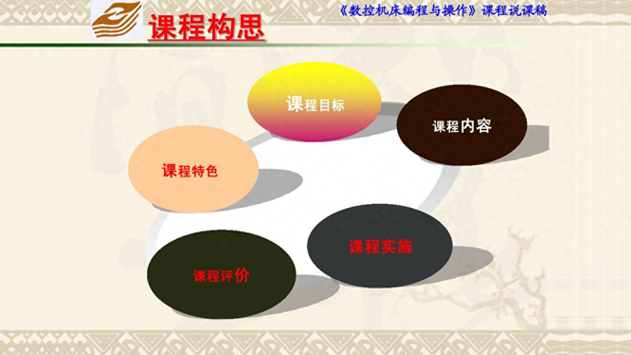
Okay, let’s redesign it. First, the theme color is given. According to the [CNC Professional] LOGO above, green is used as the theme color here. Take a look.

Next, let me analyze in detail how to optimize the design of this PPT.
Page Optimization Case 1
First of all, take a look at this cover page. The problems with this page are clear at a glance. The theme is not prominent, the content is too complex, and the contrast has no sense of hierarchy and other core problems.
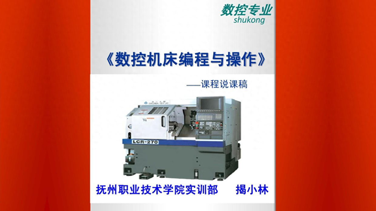
At this time, simplify the complexity, remove irrelevant background and other elements, use mask image design, and use line decoration to set it off to make the title content clearer.

In addition, if you want the page to be simpler, you can just use this light background design, and then rearrange the title content.

Page Optimization Case 2
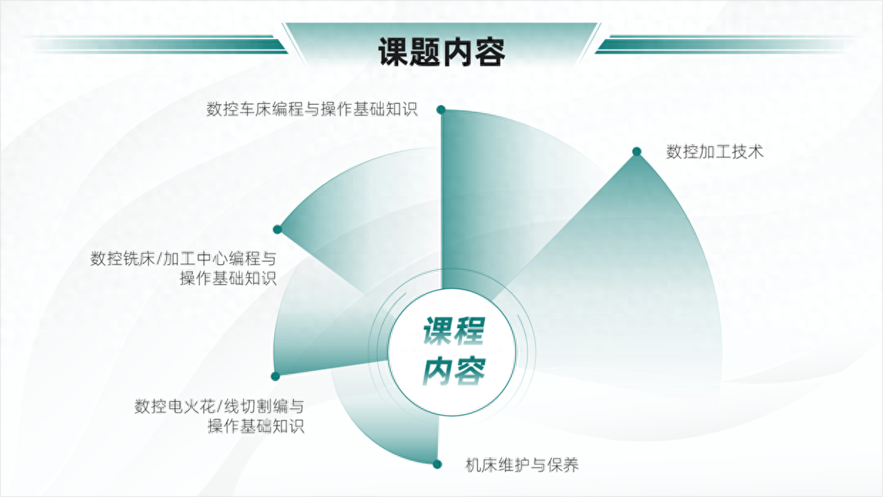
The content of this page can be regarded as a directory page. Obviously it cannot be designed in this style, right.
At this time, you can be simpler, use lines and icon designs to embellish the theme, and then process the title into a gradient effect.
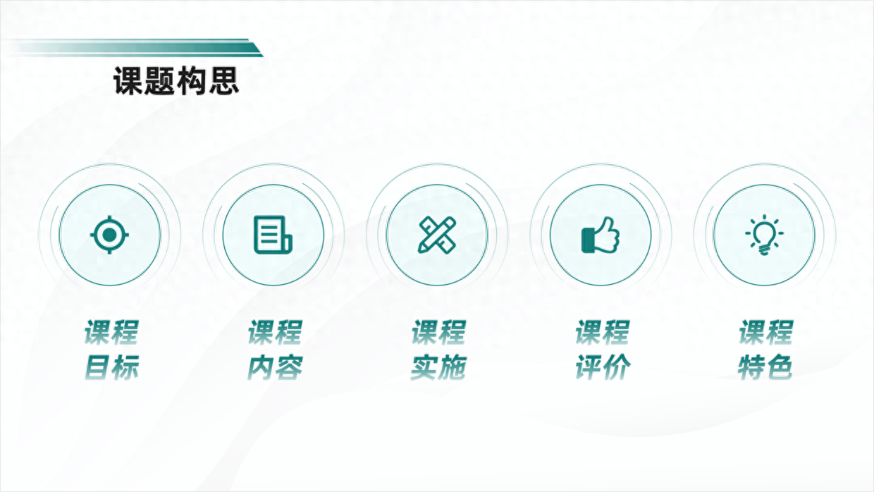
If you want the page to be fuller, you can use this circular layout and then use icon lines to design it.

Page Optimization Case 3
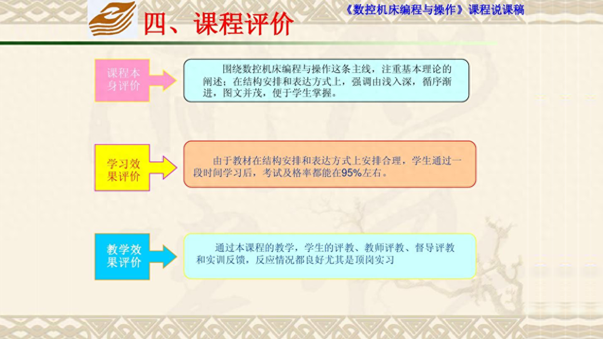
Go ahead and take another look at the [Course Objectives] page with three paragraphs of content.
This type of page can actually slightly increase the design feel of the page.
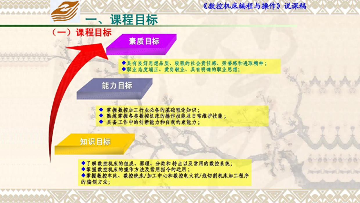
For example, use this left-right layout style to arrange arrows, icons, titles, and text in front-to-back order to increase the contrast on the page.

In addition, this gradient difference method can also be used to design, also in order to comply with the order of the three titles.

Page Optimization Case 4
The PPT on the following page has nothing to say in terms of content. It is just some general regulations, so the main thing is to adjust the layout.
It's very simple. Since the content is dead and the page layout is alive, you can use this left and right layout design.

Or you can adjust it and change the shape of the bottom into a diamond shape, and the effect will be more prominent.

Page Optimization Case 5
The processing method for these five groups of content is still relatively simple. Although the content is small, it cannot be added just to add elements.
It's simple, depending on the content, use this looped circle design and adjust it to a gradient effect and have a look.
Alternatively, you can also use this U-shaped design, which can just meet the needs of the content.

In addition, you can also change to this symmetrical circular design and use lines to indicate the content. The effect is also good.

Regarding this kind of layout template with a sense of design, you can check out the cases in the [KOPPT] plug-in and take a look.
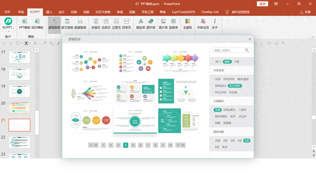
Plug-in material comes from KOPPT
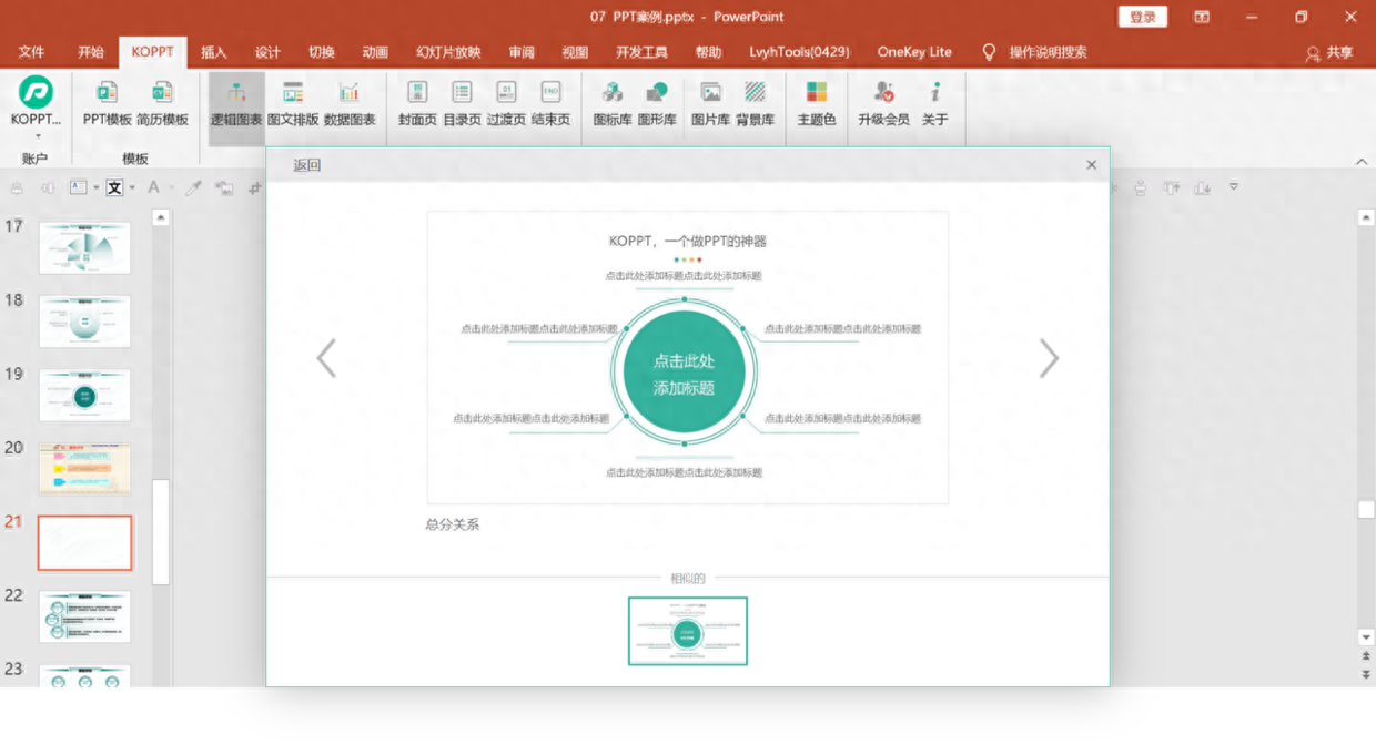
Plug-in material comes from KOPPT
For example, at this time, according to the theme content, you can find a suitable logic chart and then insert it directly into the page to use it. You can complete the PPT design in one second.
Page Optimization Case 6
Let’s take a look at the last case, which is a set of pages with three paragraphs of content.
This type of page only needs simple adjustments, such as using gradient shapes and circles to highlight the theme content.

Alternatively, adjust the layout and use a trapezoid to fill in the blank area at the bottom.

Okay, I will share so much about the theme PPT of this [Teaching Training]. Finally, let’s take a look at the comparison effect before and after the modification.

After the modification, the organizing style is not only unified, but the pages are also more designed and the content is clear.
The above picture and case materials are all from Internet sharing and have not been invaded or deleted.
That’s all I’ll share about this topic, I hope it’s helpful to you.
See you next time!
Articles are uploaded by users and are for non-commercial browsing only. Posted by: Lomu, please indicate the source: https://www.daogebangong.com/en/articles/detail/hua-le-2-ge-xiao-shi-she-ji-yi-fen-jiao-xue-pei-xun-PPT-xiao-guo-hai-ting-hao.html
 支付宝扫一扫
评论列表(196条)
测试