

hello, everyone, I am Brother Li!
Last week, the latest PPT beauty plan was arranged in Liyou Circle. On Friday, live comments and revisions were also conducted. .
Because April 23 is World Book Day, we haven’t done anything related to Book Day yet. PPT.
But we have cooperated with Fan Deng Reading before and helped him customize the company introduction PPT. So I still have some experience with reading-related PPTs.
Let’s take a look at last week’s homework.
I spent some time over the weekend to write this review tutorial article.
Next, let’s beautify this set of PPT and break down the beautification ideas for everyone.
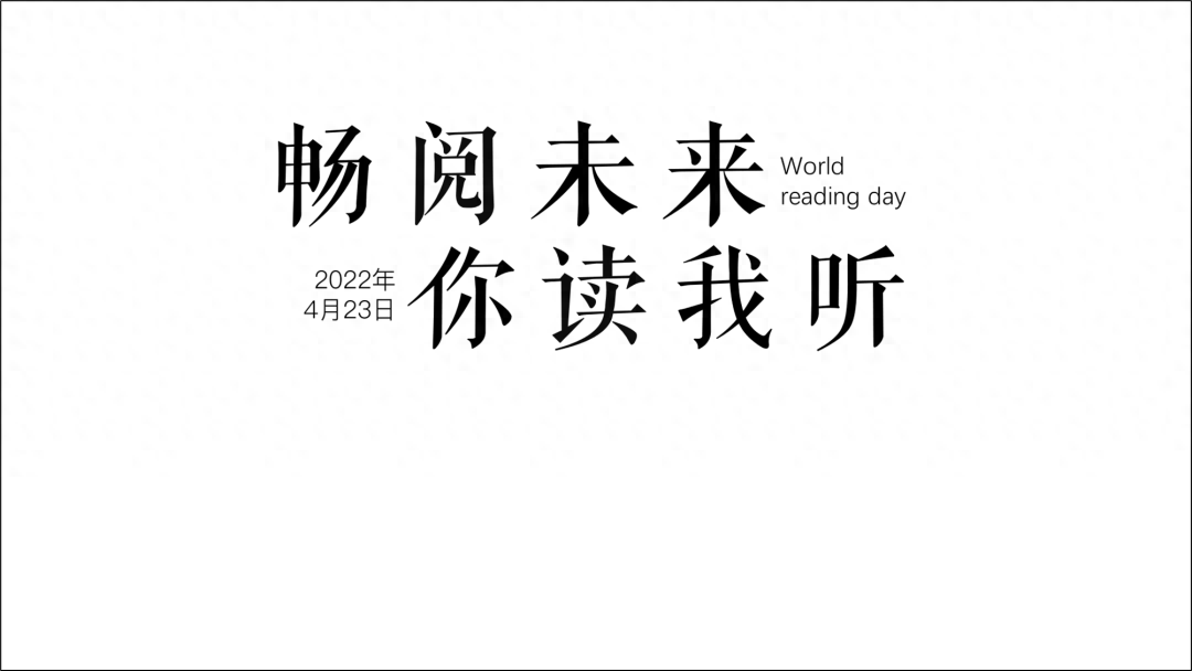
First Look at the cover page.

The processing of the cover page is divided into three steps.
1. The first is the processing of the title, which is basically a left-aligned structure or a center-aligned structure.


When we add the copy, we get the following effect.

Next, let’s look at the left-aligned structure.
2. Place text on the left and pictures on the right.
Here we found some illustration materials, and then took the green color from the illustration materials.
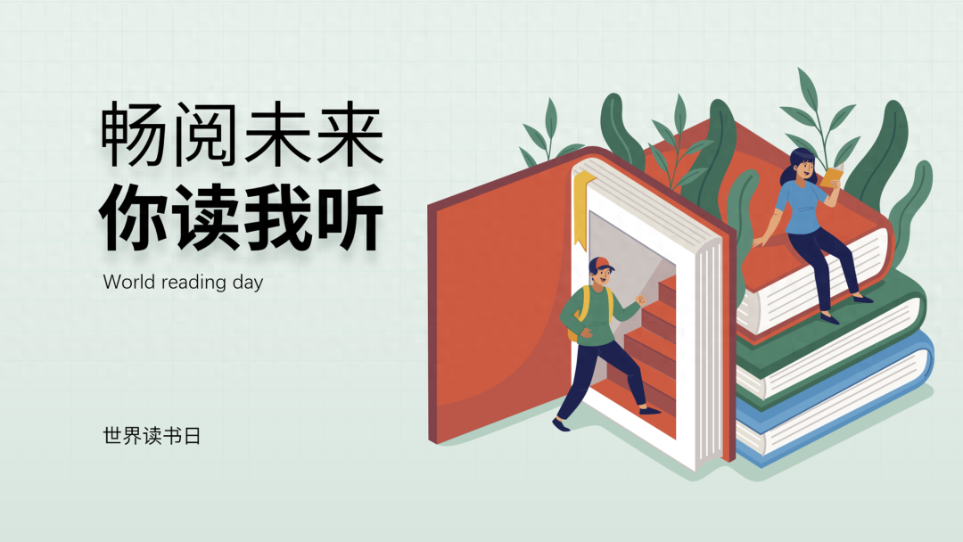
3. Optimize details, such as adding some small color blocks, such as adding some embellishments.

This is a cover obtained by left-aligned typesetting. Let’s change the idea next.
a. For example, center-aligned typesetting.
We used staggered typesetting, then split the words and changed the color of the strokes.

b. We add the main image below and add the material of a book to get this an effect.

c. Next, we optimize the details.
First, add some color blocks and use the curve tool to draw an upward spreading animation effect.

Next, we slightly add some embellishment elements to modify it, making the whole more rich and full.

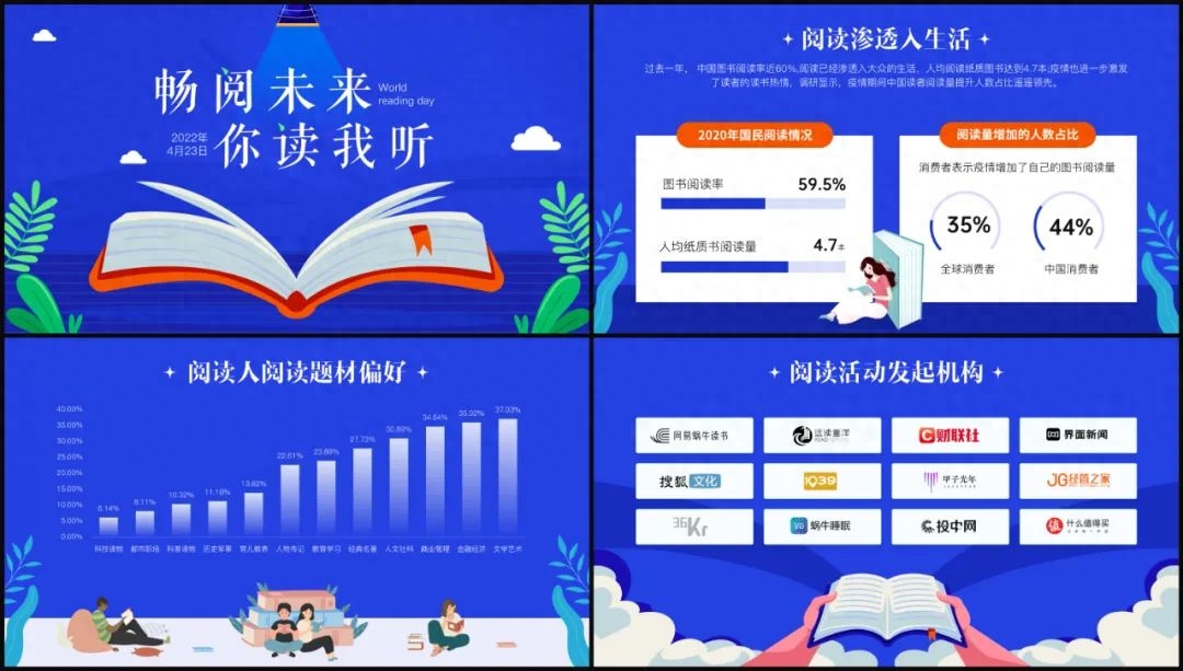
This is the cover page design.
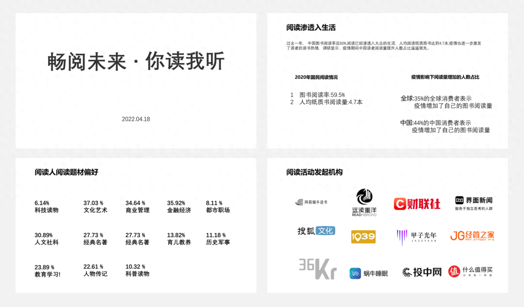
Let’s look at the layout of the second page.
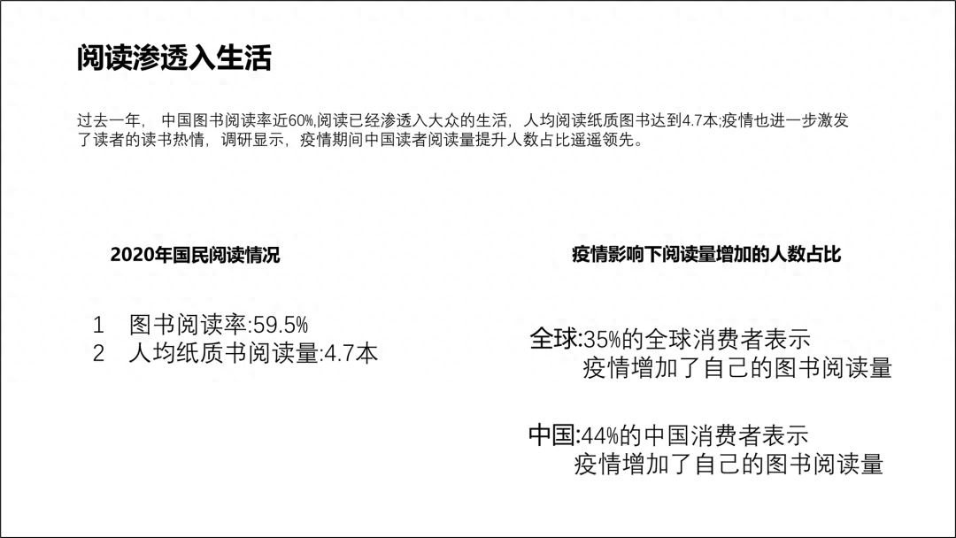
First of all, we have to understand the content. It mentions the reading situation. There are many numbers and percentages. We can extract the numbers.
Then express it visually.
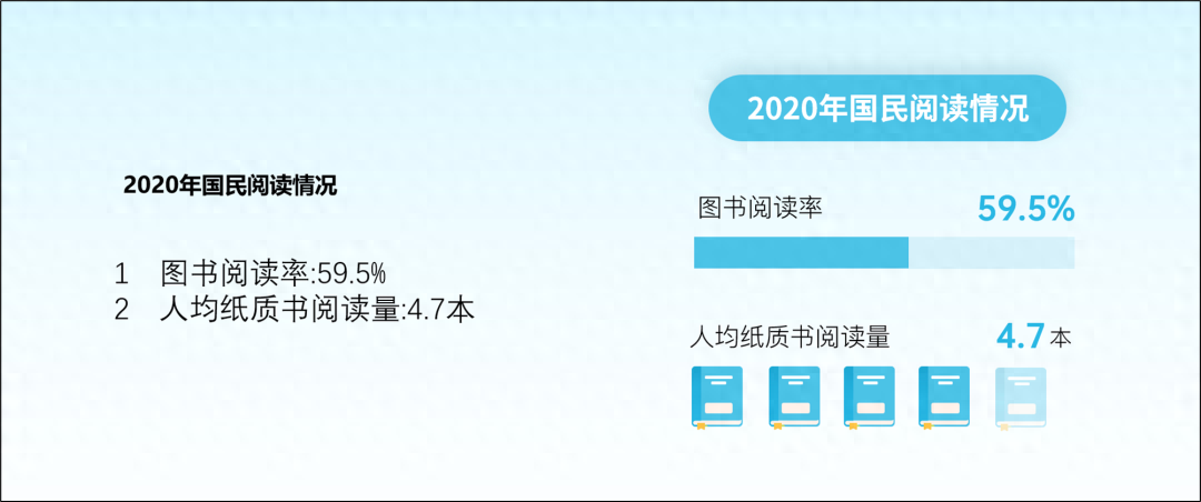
After the overall visual design of this page.
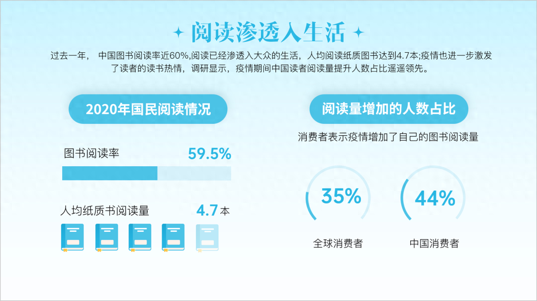
Finally, we add color blocks to increase the sense of hierarchy. You can also standardize content and strengthen grouping.
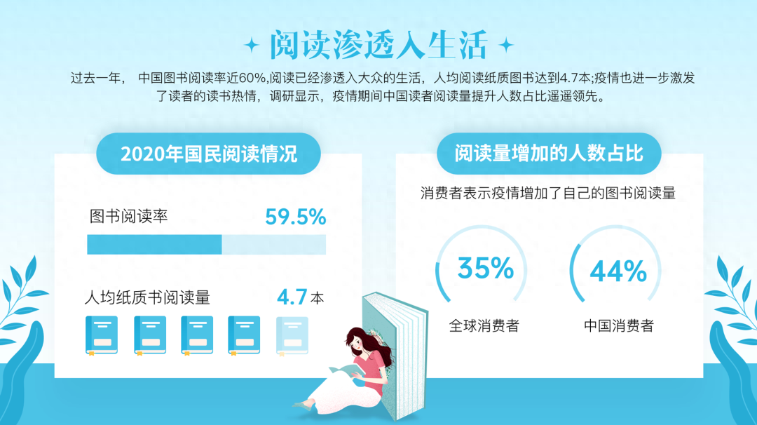
This is a modification of the second page, isn’t it pretty good?
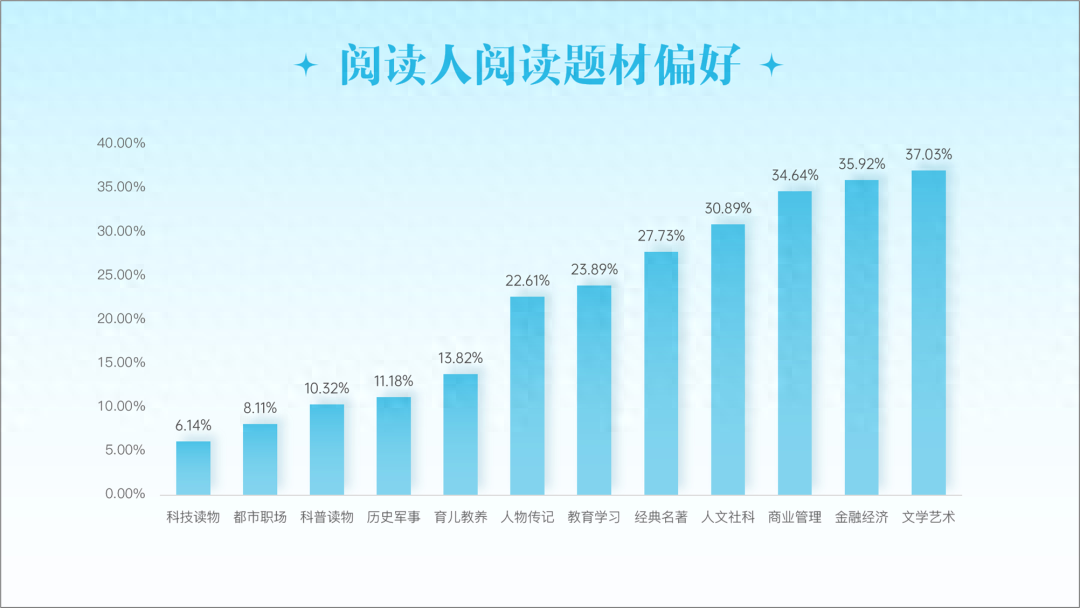
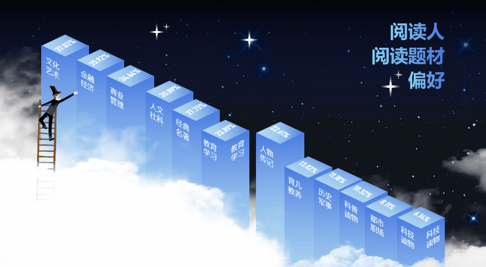
Let’s look at the layout of the third page.
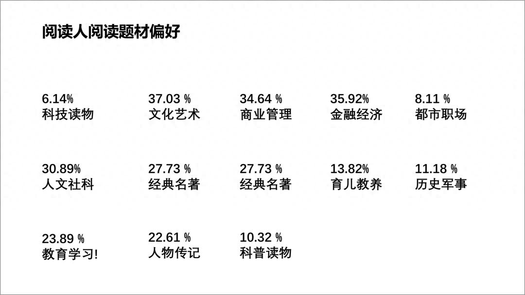
This PPT page is about reading preferences. There is a lot of content and numbers, but as long as you understand it carefully, you will find it.
This is just a bar chart, and it is more vivid to use a chart to express it.
Next, let’s adjust it, set up the scene, and create a reading atmosphere, such as adding Color blocks, add modified pictures.
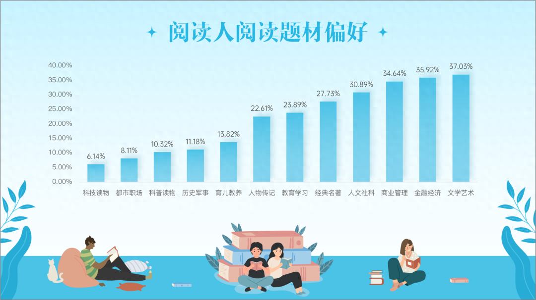
This is almost enough.
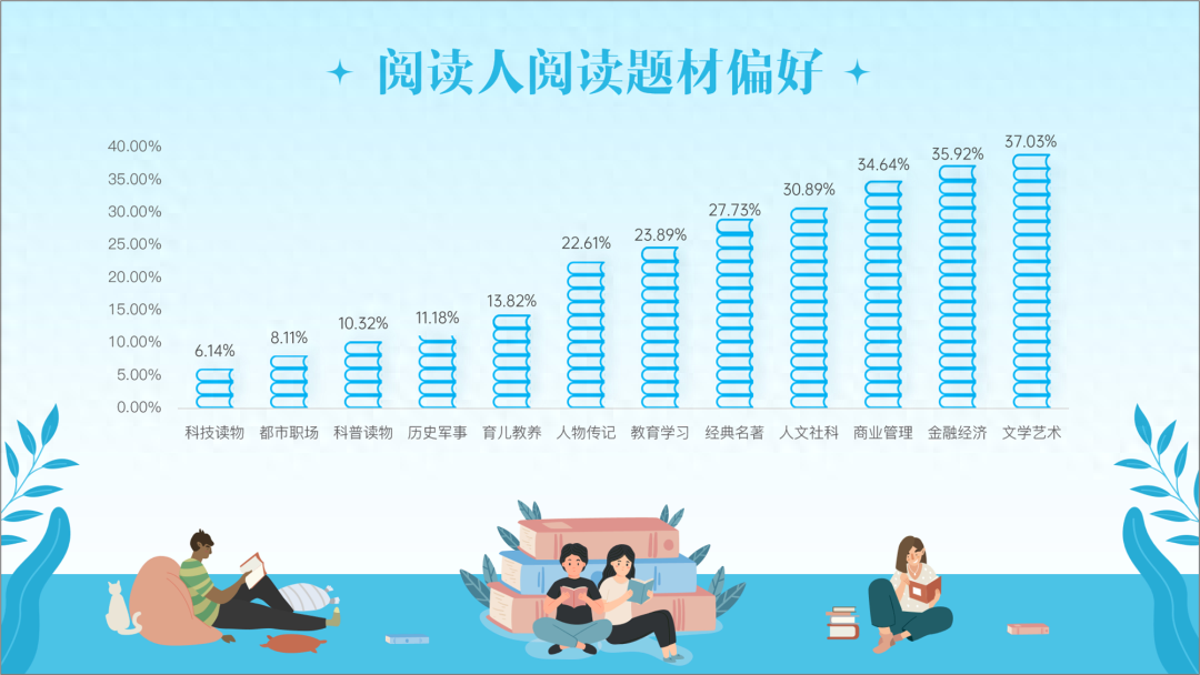
Later, I thought about whether the chart could be expressed in a more vivid way, so we made another PPT page like this.
Uses the chart filling technique.
These skills are all taught in the course: I have been a PPT designer for 8 years and have summarized a set of PPT production methods.
Next, let’s look at the last page of PPT.
Let’s look at the layout of the fourth page.
The current PPT on this page has large and small logos, and the layout is not uniform and neat.
The best way is to add a unified rectangular frame.

If the lower half is a bit empty, you can rotate it and add some materials, such as materials related to reading.
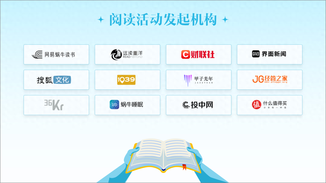
It's a bit simple. Let's add some shapes to get a page of PPT like this.

Finally, let’s take a look at the modified PPT as a whole and see if it’s not bad.
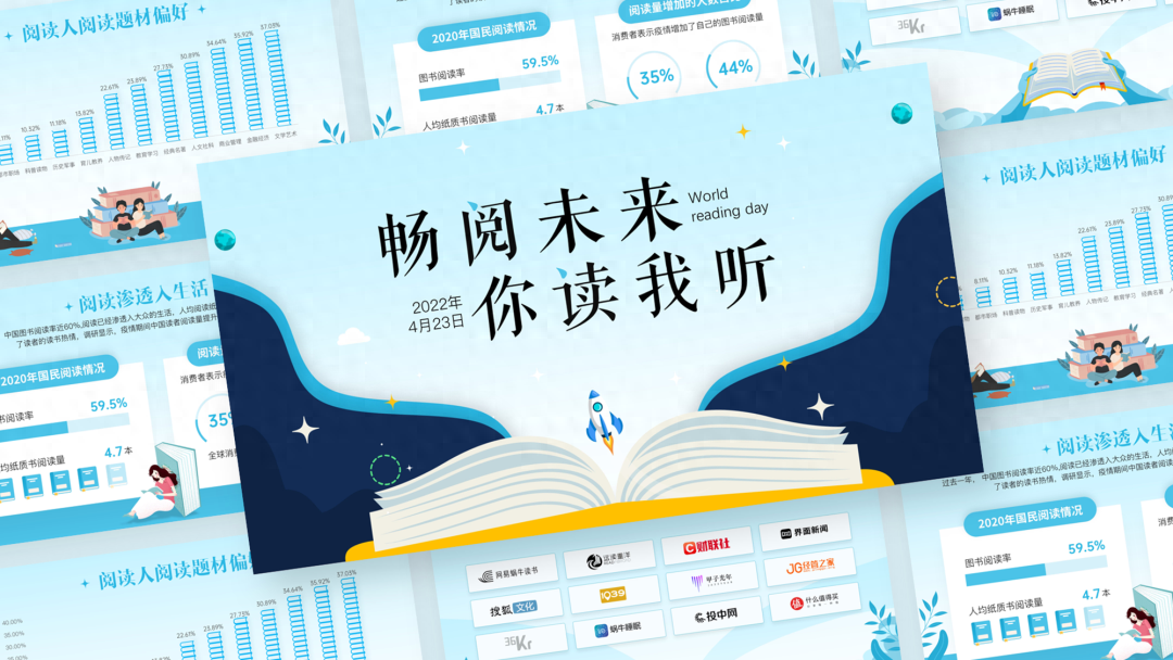
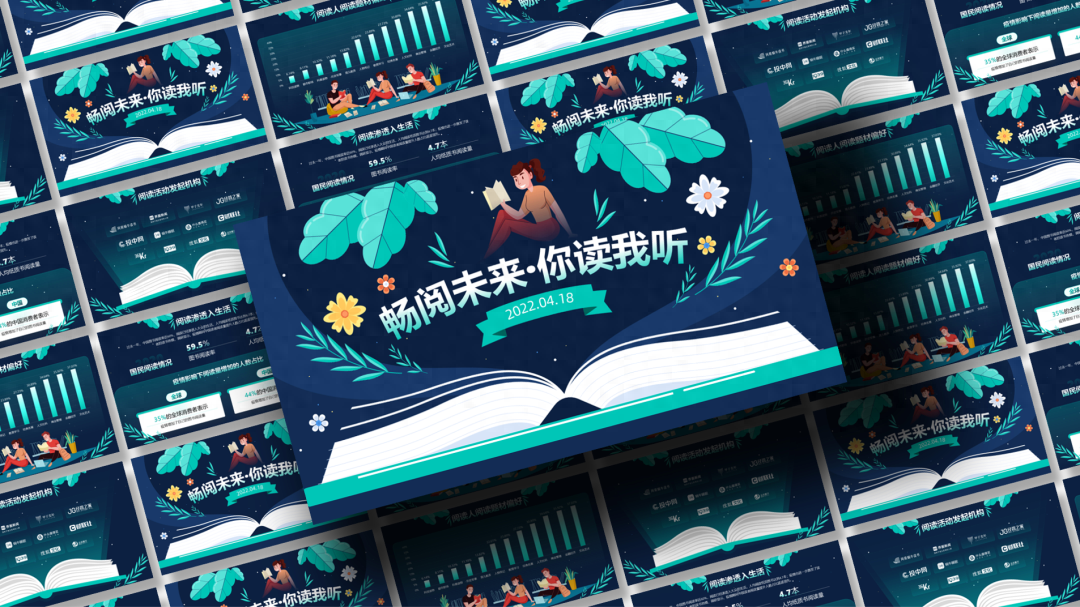
This is a set with a relatively refreshing style. We also made a set with different colors.
A set of colors with strong impact may not be acceptable to some people.
That’s it for today, what do you think? its not bad, right.
This is a PPT I made. You can draw some PPT inspiration. Many students in Liyou Circle also did a great job.
For example, this one from @杀风云 is very well done.
For example, this one@Li Yunwei This animation is very cool, I like it so much.

The above is today’s content. One person’s inspiration is limited, but a group of people can always burst out different ideas together. idea.
See the picture below for how to get the source files:
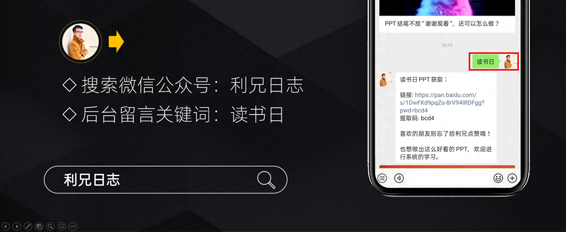
If you also want to make good-looking PPT, you can learn from Brother Li. The column has a total of 40 video lessons , which are very systematic and of super high quality.
There is also a Q&A community, and 5G PPT materials are also provided.
That’s it for today.
Articles are uploaded by users and are for non-commercial browsing only. Posted by: Lomu, please indicate the source: https://www.daogebangong.com/en/articles/detail/hua-le-1-ge-zhou-mo-zuo-le-8-ye-PPT-chao-zan.html
 支付宝扫一扫
评论列表(196条)
测试