Hello everyone, I am @一一阿benben and I am an outstanding student of the "Learning PPT with Qiuye" course. Today I am honored to be invited to share my experience of learning PPT.
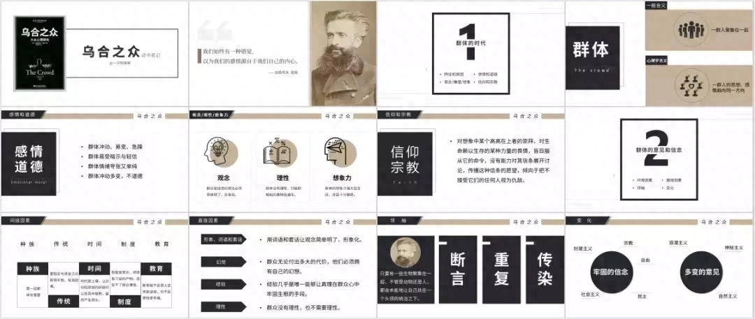
In my spare time recently, I read an interesting social psychology book "The Crowd" and made a reading note in the form of PPT.
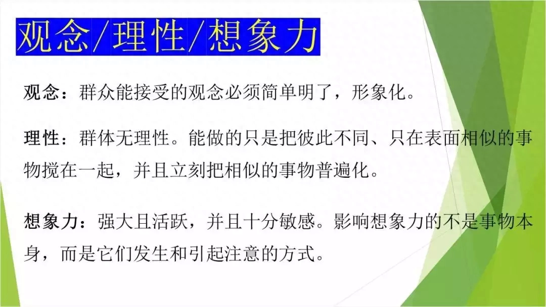
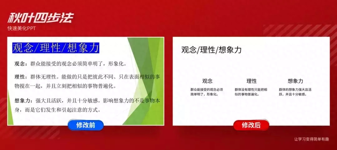
If I hadn’t taken the course at the beginning, I’m afraid I could only make this PPT:

But now after taking the course, I have systematically mastered the method of making PPT and can easily make beautiful PPT:
From a novice who knew nothing at the beginning, to now being able to independently complete a PPT work, I still feel a sense of accomplishment~
So what is it about this method that works so well?
Next, I will tell you with a case.
When making PPT, the final effect will be different depending on the content.
So, don’t rush to beautify it, but first clarify what the production content is?

This page mainly has the following questions:
❶Chaos templates, inconsistent styles
❷The content of the copy is repetitive and not concise enough
❸The text is too large and difficult to read
So many questions...where to start?
Don’t worry, follow me and use the classic and versatile four-step autumn leaf method to easily beautify your PPT!
Before beautifying, we first take off redundant elements, such as PPT templates, which will limit our beautification ideas.
At the same time, the copywriting also needs to be streamlined and the complete meaning expressed in simple words and sentences.
On this basis, we officially start the four-step beautification process~
/ 1 / Unified font
As usual, the first step is to unify the font.
The unification of fonts makes it easier for you to read the content, which helps you understand the content and think about how to beautify it next.
Unify the fonts into Siyuanheibo CN Regular.
Did it become much clearer immediately?
A very important point when making PPT is not to mention the sense of design first, but to let others see it clearly first!
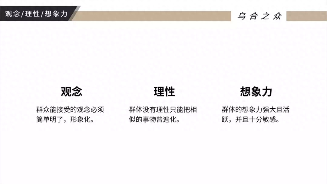
/ 2 / Highlight title
The core of the slide is to convey important information to the audience, so it is very necessary to highlight the title in a suitable way.
Commonly used ways to highlight titles:
❶Increase font size
❷Bold
❸Line break
Of course, you can also reduce the text content appropriately to create contrast to highlight the title.
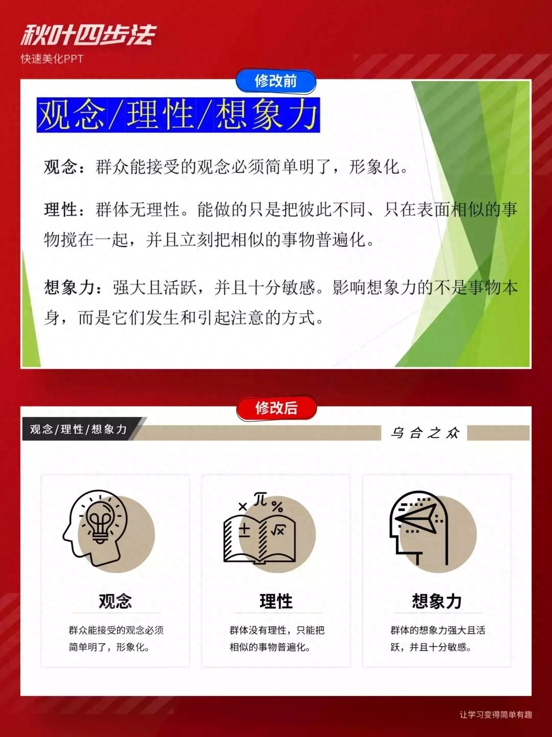
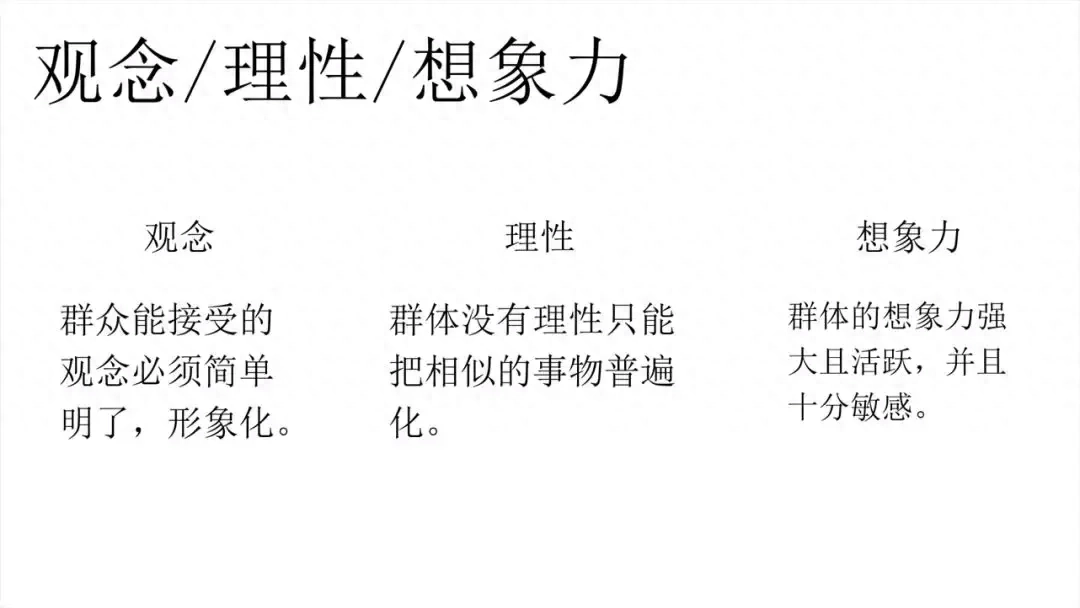
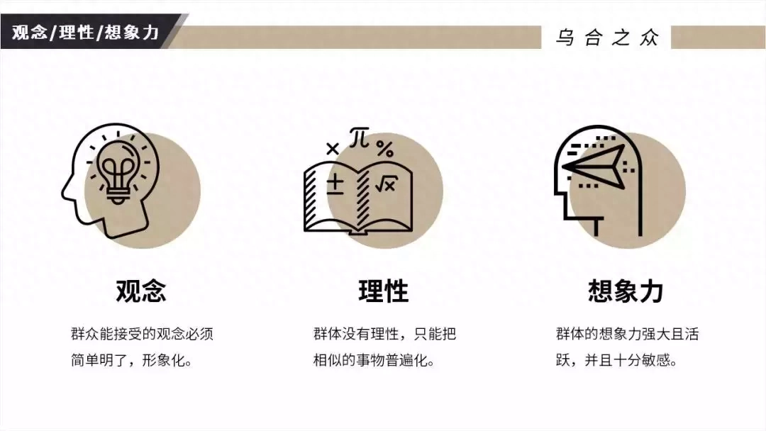
The analysis of this page is mainly from the three aspects of "concept", "rationality" and "imagination". Here I will appropriately reduce the content of the text and bold and enlarge to highlight these three subtitles. , and adds a stylish title bar to it.
/ 3 / Play with color
How can I make the page more designed?
Shape text. For example, adding diamond-shaped color blocks to three subtitles and using shapes to beautify PPT is a very common method.
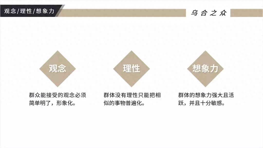
The color of the color block can refer to the color matching of the title bar. Just use the color picker to directly pick up the color!
How about, after adding color blocks, the page immediately became a lot richer!
/ 4 / Quick image matching
As the operation progresses step by step, my beautification ideas are also constantly upgraded.
The last step of the four-step autumn leaves method - quick picture matching.
Since the three main points are abstract words and pictures are difficult to find, I tried to use icons.
Icons, with their exquisite outlines, can well enrich the visual effect.
Where can I find the icon? Recommend a universal vector icon library to everyone: Noun Project

The style of this icon library is mainly black and white. You need to register before you can download it when you log in for the first time~
For example, I search for: rational and choose the appropriate download.


There are two formats to choose from, PNG and SVG. Here I choose the PNG format.
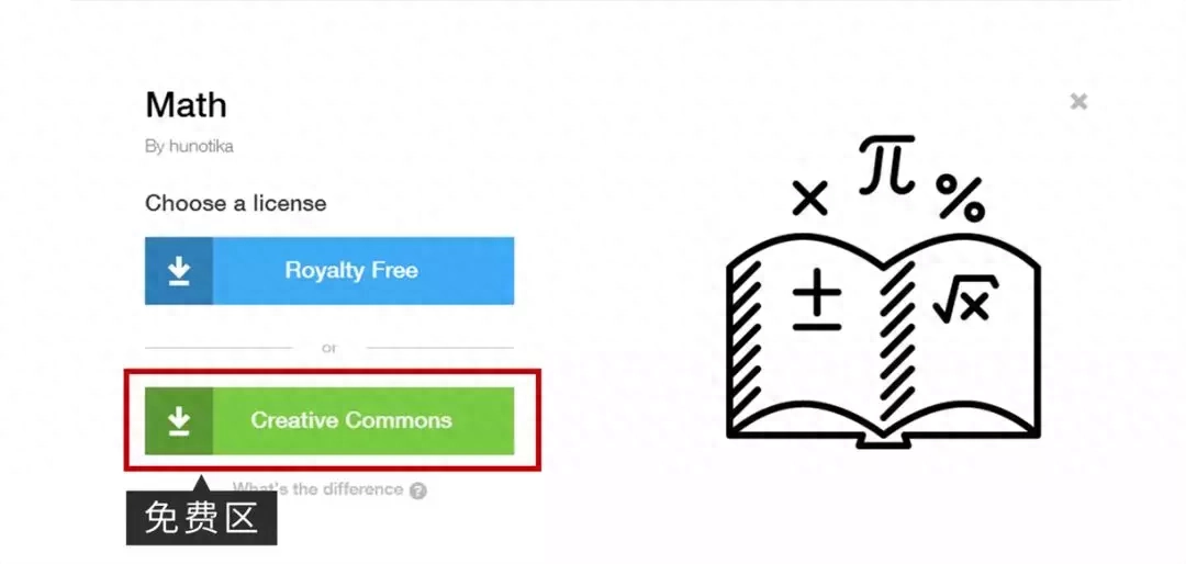
Click the green box to download it for free~
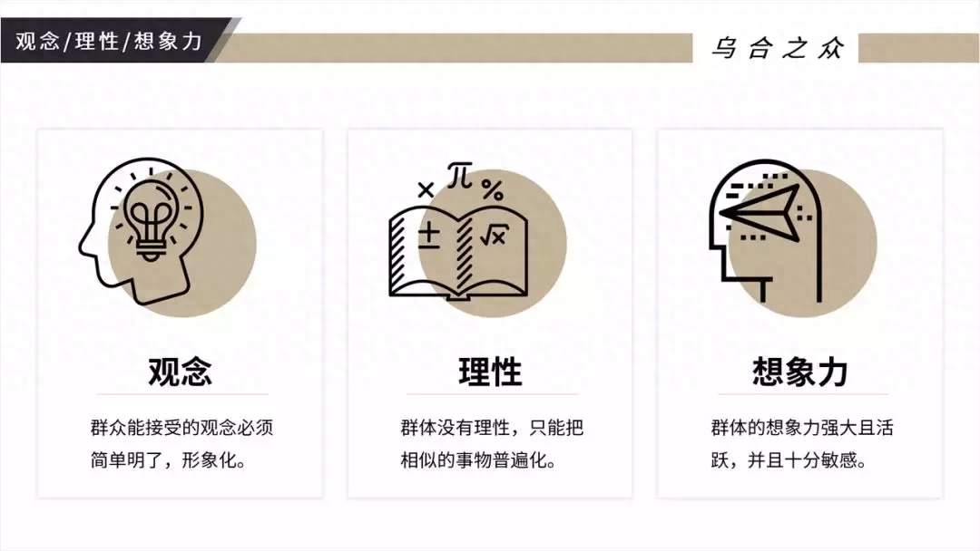
In the previous step, the color block was used to highlight the title; after the icon is available, the color block can be used on the icon.
The misalignment between icons and color blocks enriches the visual hierarchy and makes the page look more designed!
Look, after the four-step modification, the page has been greatly improved!
/ 5 /Advanced gameplay
In order to make the page more designed and layered, I put a frame on each of them! Makea clear distinction between different blocks of content.
How about it? The page suddenly becomes three-dimensional, like three cards!
/ 6 /
Summary review
The Four Steps of Autumn Leaves is such an existence that can turn your PPT into something magical.
4 steps, easy to get started, and more importantly, the effect is very good.

Let’s quickly review this case and compare it before and after the modification. Is it immediately transformed?

Articles are uploaded by users and are for non-commercial browsing only. Posted by: Lomu, please indicate the source: https://www.daogebangong.com/en/articles/detail/hao-kan-de-PPT-hen-nan-zuo-bu-tao-yong-mu-ban-yong-zhe-si-bu-qing-song-gao-ding.html
 支付宝扫一扫
评论列表(196条)
测试