Text/Di Wenjun There are many ways to change the stroke shape, and each change will give Chinese characters a different meaning and adapt to different situations.


As we all know, the basic elements of a font are: structure, size, center of gravity, strokes and other aspects.
① A serious black body. The strokes of the black body are hard, thick and even in thickness. There are few curved lines. The beginning and end of the strokes are square. There is no obvious decoration on the strokes, so the black body appears Tough and serious, it is more suitable for men or formal occasions.
② In the simple Song style, the "horizontal" and "vertical" strokes of Song style are the same thickness, the "horizontal" strokes are slender and decorated with strokes, and the other strokes have varying thicknesses, and With obvious starting and ending decorations, Song style embodies a solemn and simple feeling, and is more suitable for traditional and solemn occasions.
③Lovely young circles, the strokes of young circles are thin in shape and even in thickness. There is an obvious arc transition at the "fold" pen, and the strokes present a delicate and rounded style. , showing pure and innocent temperament between horizontal and vertical lines, suitable for use in cute and children's themes.
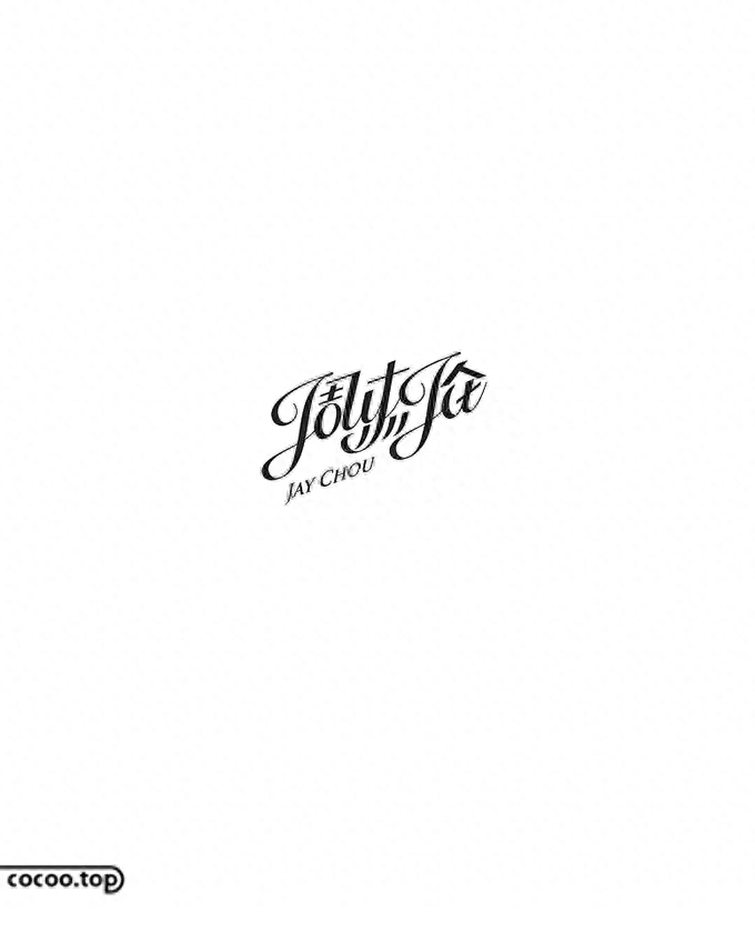
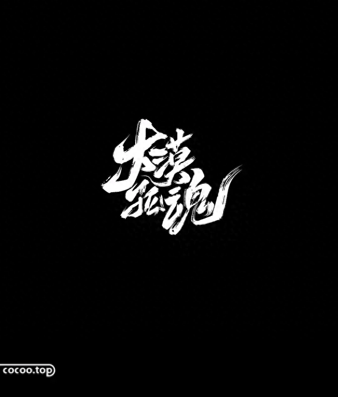
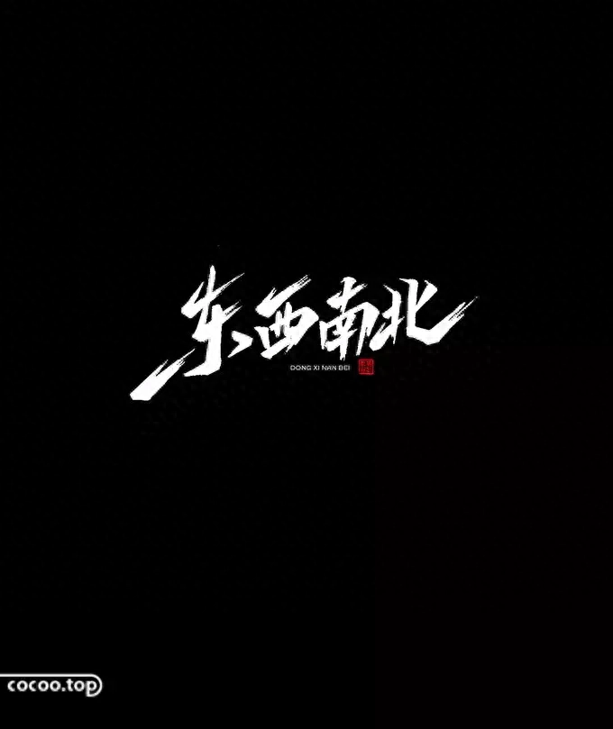
④The freehand Chinese regular script, the strokes of the Chinese regular script have an obvious sense of calligraphy, and are modified by the starting and ending of the pen in traditional Chinese calligraphy. The thickness of the strokes also changes accordingly, so it is full of It has a sense of elegance and smoothness, coupled with its unique calligraphy feel, which also gives it a unique temperament of classical Chinese style.
⑤The elegant Founder Yao style. The horizontal strokes and vertical strokes of the Founder Yao style are of different thicknesses. The curved strokes are usually divided into two parts. The upper part remains vertical, and the lower part remains vertical. The half part begins to have obvious curved lines, and the transition from thick to thin strokes is also increased, so the square Yao style looks beautiful and modern.
It can be concluded from the comparison of the above five fonts that changes in font stroke style will have a particularly significant impact on the shape and meaning of the entire font.

The pen shape, as the name suggests, is the specific shape of the strokes of Chinese character fonts, including the eight main stroke shapes of horizontal, vertical, left, back, lift, dot, hook, and fold. As the basic elements that make up Chinese characters, strokes affect the whole body. Taking strokes as the starting point, we study different changes in stroke shapes in order to understand and understand more of the true meaning of Chinese character font design.

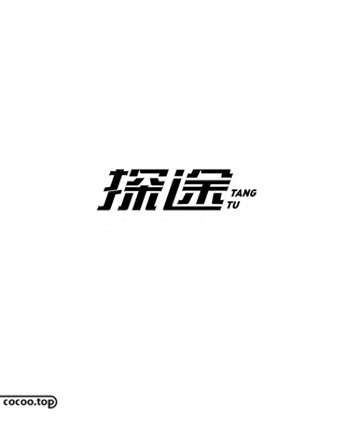
Rectangle is a common geometric figure, also called rectangle. When all the strokes are rectangular, the dots, folds, hooks, etc. in the original Chinese character strokes will be replaced by horizontal and vertical strokes, or even omitted. Such a change, coupled with the shape characteristics of the rectangle, make the overall Chinese character It presents a neat, formal, serious and tough feeling.
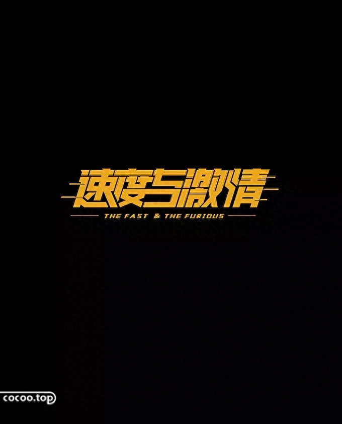
①After rectangularization, the horizontal and vertical strokes have the same thickness. Chinese characters will naturally appear horizontally and vertically, and the bones will become extremely clear. They are widely used in a series of related theme designs such as male characters and law.
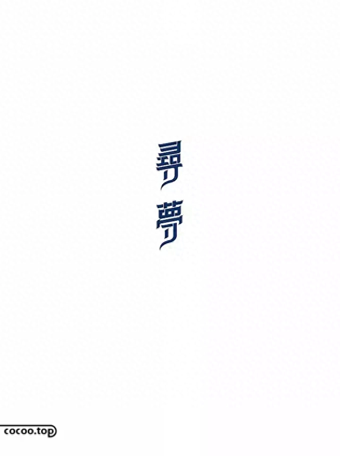
②The thickness of horizontal and vertical strokes after rectangulation is inconsistent. When the thickness of the horizontal and vertical strokes after rectangularization are inconsistent, the Chinese characters will become more flexible and the sense of rhythm will be instantly enhanced. This type of Chinese characters can be widely used in a series of theme designs such as fashion, youth, campus, and dynamic.
③Add decoration to the rectangular strokes. Adding decoration to the rectangular strokes refers to the so-called secondary deformation and optimization design of the rectangular strokes. There are many ways to decorate, such as adding sharp corners, rounded corners, irregular shapes, etc., but no matter what style of decoration is added, it should not break the original compact and powerful characteristics of the rectangular pen shape.

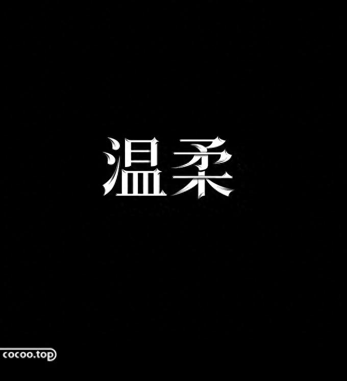
If the rectangular strokes look like a man, then the curved strokes will undoubtedly look like a woman. All the sharp strokes such as "fold" and "hook" in the stroke shape will be softened. , the Chinese characters composed of processed strokes will show a soft, emotional, romantic, cute, childlike feeling.
①Mature and slender curves. This type of curve can be drawn without a straight line segment, or with some straight line segments. This type of font is more suitable for expressing themes such as women, romance, emotion, gratitude, etc.
②Cute and round curves. This kind of curve has no edges and corners, and the whole thing looks round and cute. Chinese characters designed with such characteristic curves will give people a cute and lively feeling. This type of font is more suitable for expressing girls, cuteness, children, animals, etc. type of theme.

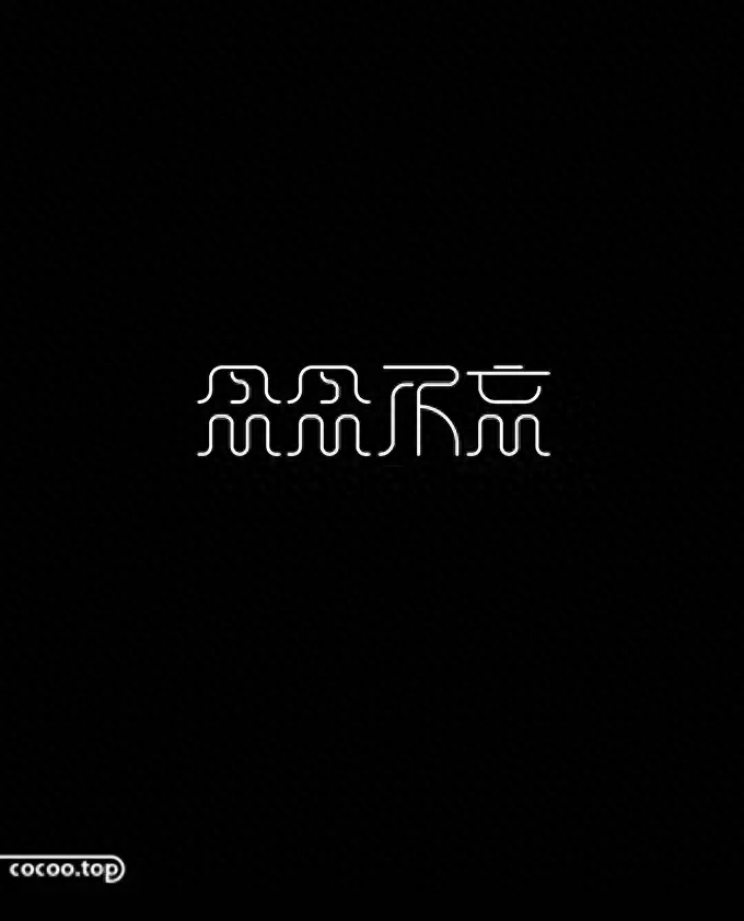
The so-called single line means that the strokes are composed of multiple single lines. As the lines are broken, chained, bent and folded, the distance between the strokes will change. Relatively far away, the overall atmosphere shows a relaxed and quiet atmosphere without giving people a feeling of depression and solemnity.
① Process both ends of the stroke. When the two ends of the strokes are processed into arcs and rounded corners are added to the folds, the font will often show a hard yet soft feeling. Such Chinese characters can be used in a series of theme designs such as quiet and ethereal. .
② Strokes are linked, omitted or disconnected. It is precisely because of the flexibility of single lines that after the strokes are single-lined, the interaction between strokes increases, making it more suitable for linking, omitting or disconnecting strokes. This type of Chinese character design is more suitable for use in themes that are relaxed, pleasant, and have a sense of design.

Irregularity means that the shape of the strokes is no longer limited to horizontal, vertical or completely curved states, and the shape of the strokes takes on an irregular geometric shape. The strokes of Song style and calligraphy are also irregular shapes and have their own characteristics. Using the characteristics of these two strokes, you can also design unique Chinese characters.
①Any geometric shape. The strokes are irregular, either straight or curved, and the strokes are no longer smooth, but have a certain slope. They are usually used in a series of themes such as breaking tradition, individual youth, and festivals.
②The stroke form with Song style characteristics. The shape of the strokes borrows the characteristics of Song style strokes, especially the "dun" strokes and "zhe" strokes have unique characteristics. This design method with the characteristic strokes of Song Dynasty is suitable for themes showing Chinese style.
③The stroke form with the characteristics of brush fonts. The shape of the strokes uses the stroke characteristics of the brush font. Each stroke will have the unique rough edge feeling after writing with the brush, making the font more freehand.

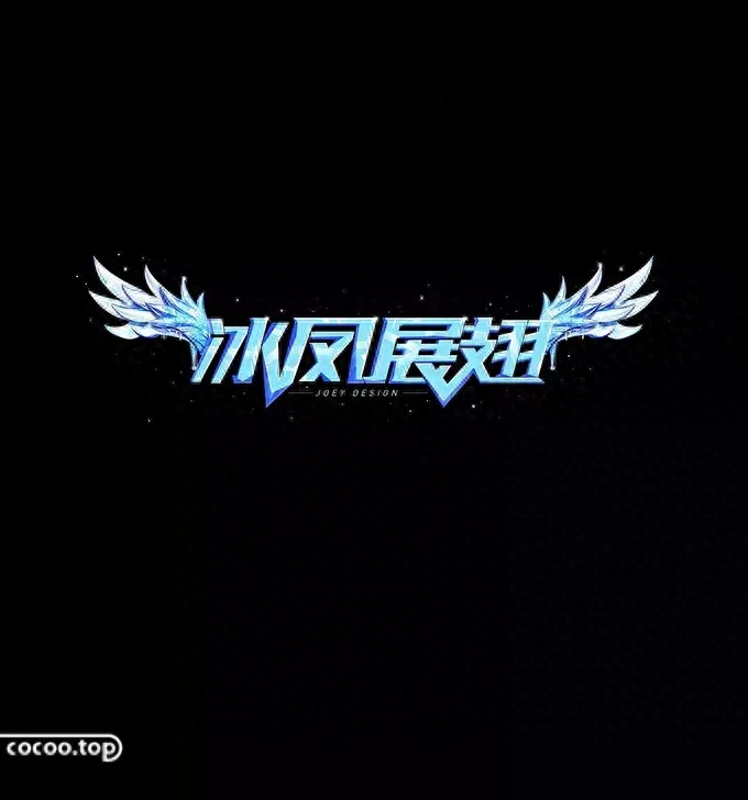
The strokes are replaced by concrete graphics, such as flowers, grass, leaves, sunshine, etc., which have direct symbolic meaning. The meaning of the Chinese characters designed in this way will be directly affected by the concrete graphics. , what does the graphic symbolize, and the Chinese characters will naturally show the corresponding meaning. It should be noted that this kind of Chinese character design does not mean that all strokes must be graphic, only some strokes can be replaced.
Recommended: Font design techniques pixel method ( video tutorial)

① Official headline number: Intelligent design and manufacturing, a must-have for top creative designers
② This article is edited and compiled by Design Intelligence www.cocoo.top. The copyright belongs to the original author. Please indicate the source when reprinting!
Articles are uploaded by users and are for non-commercial browsing only. Posted by: Lomu, please indicate the source: https://www.daogebangong.com/en/articles/detail/han-zi-she-ji-ji-qiao-bi-xing-bian-hua-fa.html
 支付宝扫一扫
评论列表(196条)
测试