With the popularity of Onmyoji in the past few years, as well as Love and Producer, which has been contracted by the husbands of Guliang for the whole last year, and the fairies' wardrobe Miracle Nuannuan, etc., light-weight games of the cultivation system have occupied a large area. For the female market, their common features are good modeling scenes, good plots and exquisite picture quality. But some people will also complain that it is difficult to operate and the values are not good, which shows that most players are still more emotional.
For game UI, whether it is easy to use (interaction) and whether it looks good (visual) is something that needs to be considered carefully. Everyone knows that the game interface is different from the general UI interface. The whole picture is more gorgeous, and in these gorgeous The screen also needs to allow users to find the operation buttons in the first place, which is actually something worthy of our research and learning (as a chicken player, I feel that the buttons are difficult to operate after playing three games. I think this research necessary).
Operation guidance
Operation guidance is our operation design for an interface. Taking into account the hot zone range of gestures, important function buttons are placed within the hot zone range that is convenient for users to operate.
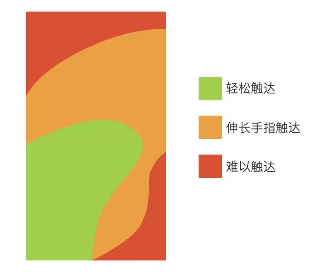

The game UI will also follow this rule, and the more important functions will not be placed in places that are difficult to operate. However, since most game interfaces are more gorgeous, the display of buttons will be more special. As shown below:
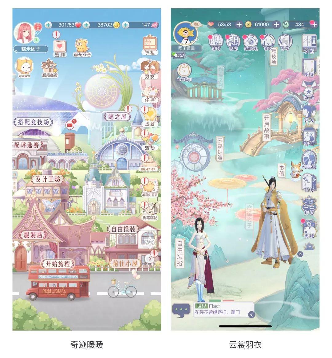
Miracle Nuannuan added a white label at the bottom to increase the presence of the icon button, but because the button's style and background are very similar, if there is no red warning reminder, it will be easily ignored. Relatively speaking, Yunshang Yuyi's button recognition is It will be better. The style is different from the background but visually harmonious. At the same time, the text is superimposed on the icon, which improves the use of space.
similar
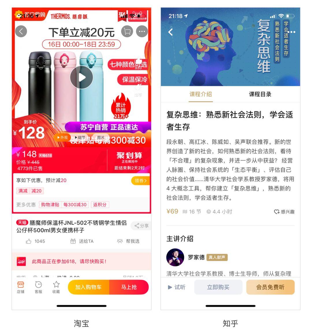
In the interface we use every day, because the content is relatively simple or there are relatively few buttons, users can always find the buttons and operate them quickly while maintaining the main style of the interface, as shown in the following figure:
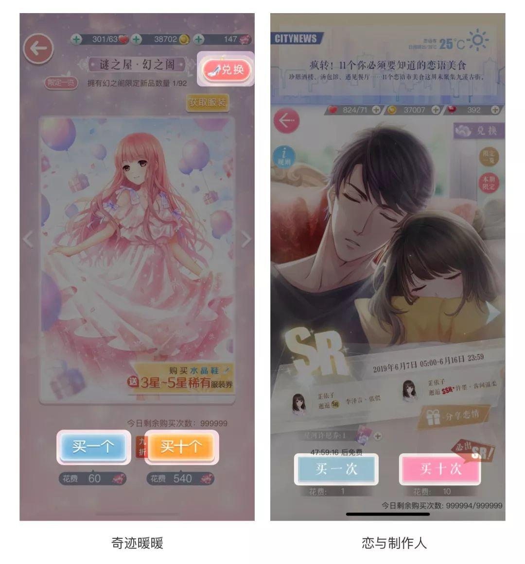
However, it is characterized by a lightweight game interface with exquisite graphics. In the background of the page itself, it has to deal with a lot of button entries, maintain a unified style, and be easy to operate. This is a relatively complicated matter in itself. We You can see how Love and Producers and Miracle Nuannuan deal with it. As shown below:
On the main page of the producer, the text below each icon is added with the same type of gradient base map. This approach from part to whole ensures the consistency of these function icons, and there are many function buttons that will not make people feel uncomfortable. The feeling of disorganization is because buttons of the same type are placed together, and there is no interference between buttons of different types.
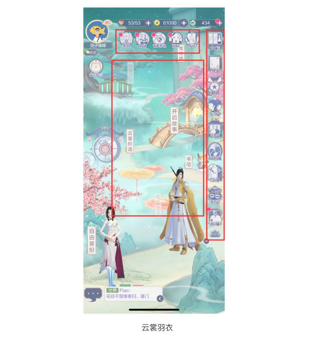
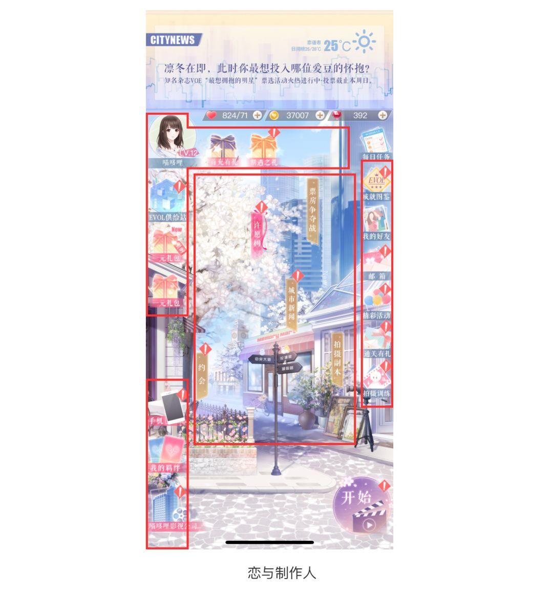
In the picture above, the main functions of Yunshang Yuyi are integrated into the background in 3D form, and the unopened functions are grayed out. At the same time, the same type of function buttons are placed in the upper right corner of the interface and arranged in sequence.
The buttons are arranged like this, rather than arranged according to the importance of the product. I think that in addition to visual coordination, it is also like when we usually pack things, putting things of the same nature together, and we can’t remember what we are looking for. Just look for the same type of place and you will definitely find it. At the same time, they all use visually strong red exclamation marks to prompt users to perform click-and-go tasks, improving the user experience.
In game UI production, because the accuracy requirements are very high, the inverse relationship between color brightness and area is very important, because this directly determines the primary and secondary relationship in UI colors. The brighter and the higher the purity of the color. It must be avoided as it will cause visual stress to the user. Let’s take a look at the interface of Nuannuan and the producer:
It is still difficult to design a good game UI. Today we just briefly talked about the content of buttons. Let’s summarize it below:
- 1. When the interface background is more colorful and complex, we can highlight the button by making it different from the background (but ensuring visual coordination);
- 2. Make the function Put similar buttons together to make it easier for users to find and use, while adding strong reminders to prompt users to operate;
- 3. Buttons with a small proportion of the interface should be highlighted through contrasting colors or buttons with better purity. While adding highlights to the interface, it also improves user recognition.
This article comes from the Internet. If there is any infringement, please contact us to delete it
Here I believe there are many people who want to learn UI design. I have been engaged in UI design for many years and have private customized courses. At the beginning of this year, I spent a month compiling a list of learning tips and tutorials that are most suitable for learning in 2019. The basics are covered, and various frameworks are organized. If you want to give it to every UI designer, you can follow me and send me a private message in the background: learn, and you can get it for free.
Articles are uploaded by users and are for non-commercial browsing only. Posted by: Lomu, please indicate the source: https://www.daogebangong.com/en/articles/detail/guan-yu-qing-liang-ji-you-xi-UI-de-she-ji-fen-xi.html
 支付宝扫一扫
评论列表(196条)
测试