
Why do you like using Google Chrome?
Is the page simpler?
Not crowded with ads?
Compared with Baidu, search is faster?
...
Speaking of simplicity, most of the popular brands on the market currently like to adopt a simple style, such as Japan’s MUJI. Apple and other mobile phones are also becoming more and more minimalist in design.
The same applies to PPT. Workplace PPT tends to be more minimalist and elegant.
So how to make a simple and elegant workplace PPT?
I found a Google PPT document, and saying it is an example of a workplace PPT is not an exaggeration at all.
The entire PPT does not use complex elements, and is completed with color blocks, lines, etc.:
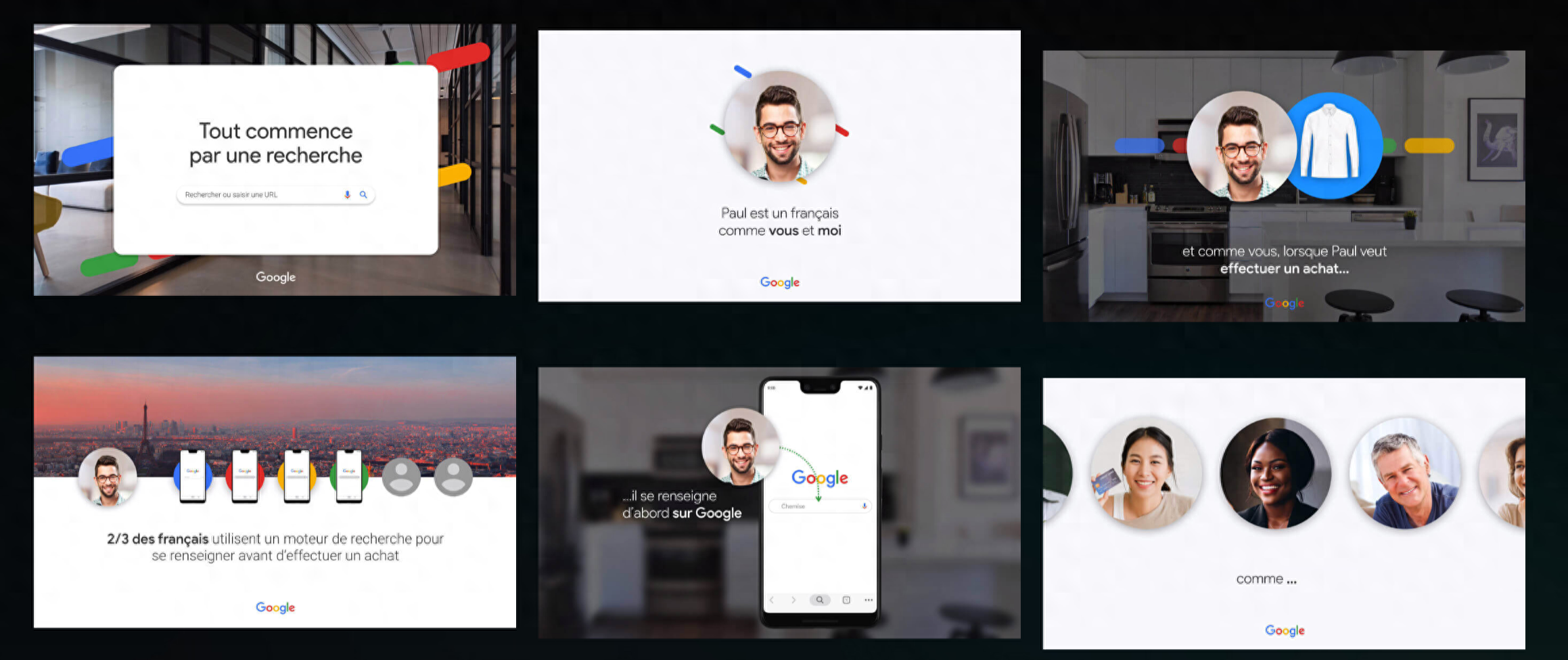
With the animation effects, it’s so cool:


If you carefully disassemble this PPT, you will find that it is nothing more than a blurred picture as the background, with pictures and text information added, but the effect is amazing!
Share 3 tips that novices can learn immediately:
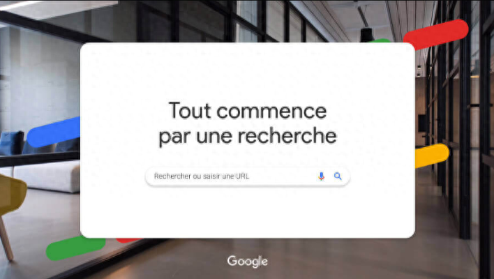
1. Cover page
A rounded rectangular color block is directly used to carry the cover title. In order to avoid the monotony of the page, a small rounded rectangle is added behind the color block, and the color is extracted from the Google logo. It forms an interspersed effect with color blocks to enhance the sense of jumping on the page.
2. Character introduction page
To display the character image page, display it directly in the format of the account avatar. The circle frames the character image, and a blur effect is added around the circle to make it appear softer.

3. Use of prototype materials
Readers who have read my article know that prototypes are included in many of the PPT cases introduced. For example:

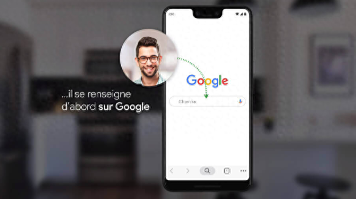
Indeed, in addition to beautifying the page, mockup materials can also enhance the realism and make it easier for the audience to have a sense of immersion.
Putting the screenshot on the page can simulate the feeling of operating on the mobile phone~

That’s it!

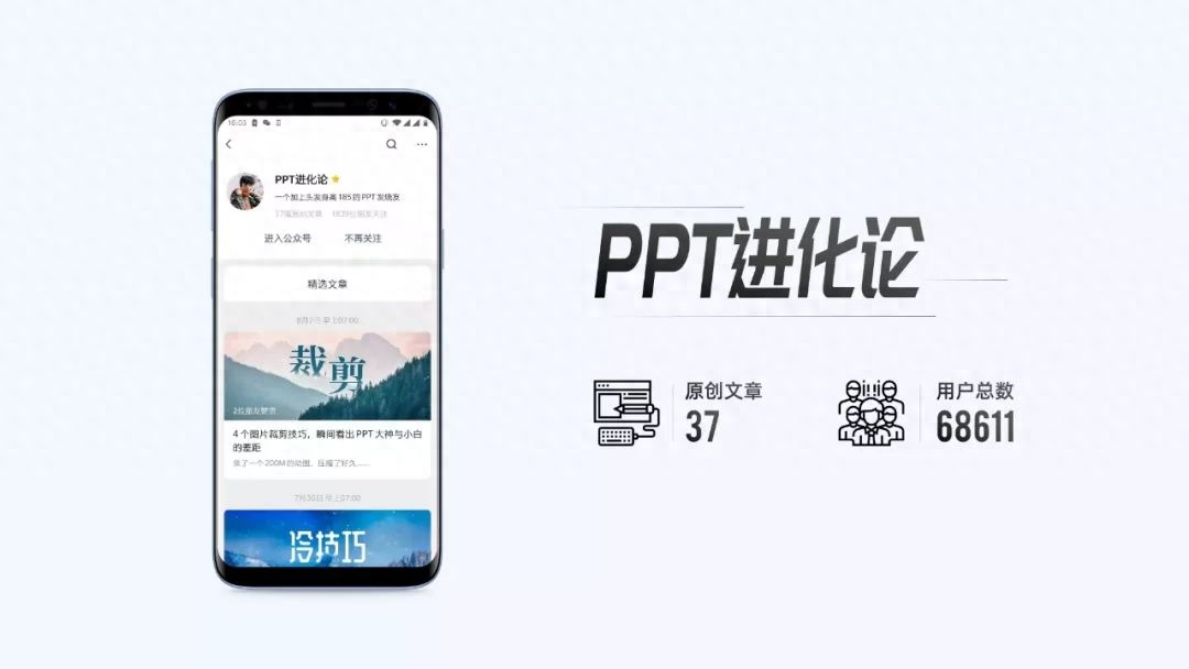
Finally, follow @PPT Evolution and reply via private message with the keyword [press conference]
You can now get my collection of PPT resources from major manufacturers’ press conferences!
The pages are super cool and can be used as your PPT case inspiration library.
Articles are uploaded by users and are for non-commercial browsing only. Posted by: Lomu, please indicate the source: https://www.daogebangong.com/en/articles/detail/gu-ge-nei-bu-ji-jian-feng-PPT-she-ji-kan-chen-zhi-chang-lei-PPT-fan-ben-wang-you-shou-cang-xue-xi.html

 支付宝扫一扫
评论列表(196条)
测试