Fonts are one of the most important communication elements in visual design. The visual characteristics and quality of the fonts themselves affect the quality of information transmission. For designers and anyone involved in typography, using two or more fonts at the same time is perfectly normal. There are many ways to use two fonts together, but generally follow the timeless idea: either harmony or contrast to avoid abruptness. With principles in mind, we still inevitably need to make choices among thousands of fonts. Therefore, it is really not easy to choose a suitable English font from the vast English font library, and it is even more difficult to choose a pair of fonts to use together. The number of English letters is much less than that of Chinese characters. Therefore, in comparison, the cycle of designing a set of English fonts is short and the return rate is high. Of course, there are more English fonts (this certainly does not mean that the design of English fonts is better than that of Chinese fonts). The font is simple, although English font design does require less work). Designers like me who have difficulty choosing usually spend a lot of time on matching English fonts. This article recommends a set of classic font combinations that the editor also commonly uses, and analyzes why this set of combinations can present good visual effects. I hope it can help you.
01.Futura + Garamond
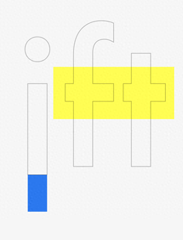
Appropriate font matching can apply the functionality and beauty of the font itself to the text, and present the emotions expressed by the text with appropriate visual effects. Futura and Garamond, this classic font combination perfectly reflects the harmony of the combination.
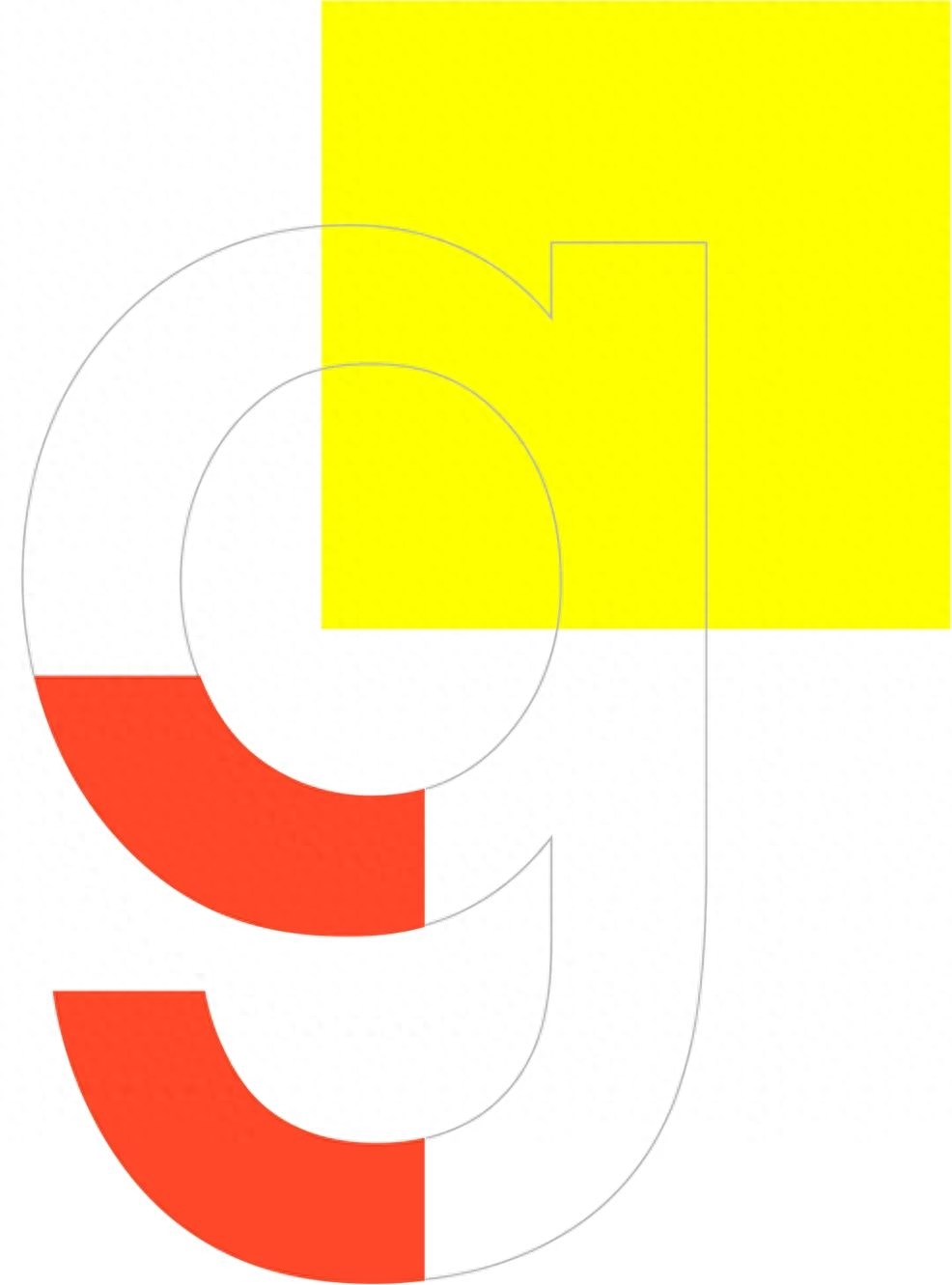
Futura + Garamond illustration
02. Font introduction
Futura PT:
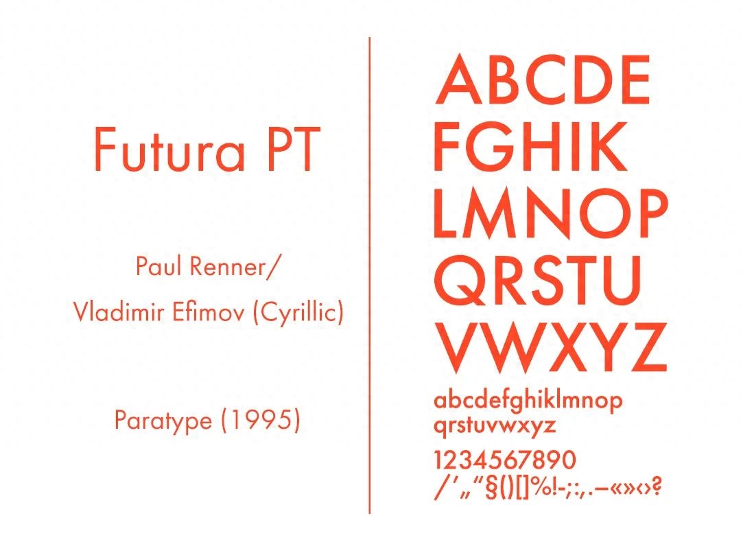
Type designer Paul Renner wanted to design a font that could satisfy the avant-garde aesthetic, and hoped that the font would promote a mechanical aesthetic while showing a simple beauty. The typeface Futura was born and quickly became the first commonly used geometric sans serif typeface. The success of Futura has also attracted a series of imitation works. Even the famous humanistic sans serif font Gill Sans has added a design very similar to the glyph structure of Futura in the improved font. In addition, Futura's simple design and attractive Roman letter proportions make it still highly used today, 25 years after its introduction.
Adobe Garamond Pro:
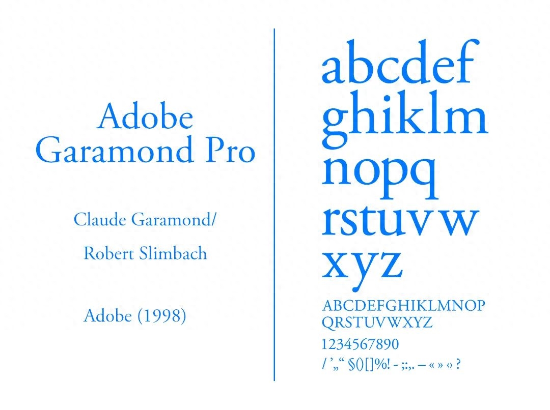
Adobe Garamond is a replica created by Robert Slimbach based on the work of sixteenth-century type designer Claude Garamond. Garamond font expresses the Renaissance understanding of beauty and harmony. It is loved for its retro, traditional, not strong personality and very easy to read characteristics. It is still widely used by many European media today.
03. Why did Futura and Garamond work together?
Proportions:
The pairing of Futura and Garamond is based on contrast: despite the many differences in the origins and characteristics of the two typefaces, they fit neatly together thanks to similar proportions. These two fonts have almost identical vertical metrics, namely x-height and extender length. The moderate lowercase letters and the height of the ascenders give these two fonts a "slim" visual effect, so that they can still maintain a sense of space between lines in a typesetting environment that lacks leading.
The uppercase letters of Futura and Garamond both adopt the classic Roman capital letter proportions. Although the proportions of the lowercase letters of the two fonts are very similar, there is an easily detectable width difference in the lowercase letters of Garamond. This proportional feature reflects the classic proportions of the Humanist minuscule of the 16th century and was largely influenced by the "beautiful form" trend of the Renaissance. Futura, which emerged in the 20th century, chose classic proportions similar to those of 17th-century Garamond, apparently to ensure that the typeface would not become outdated anytime soon.
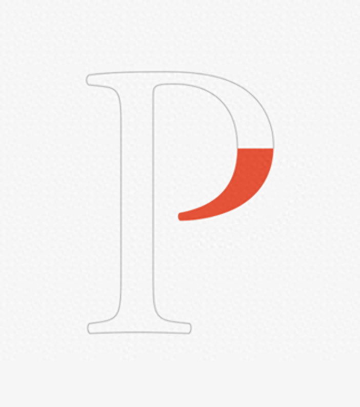
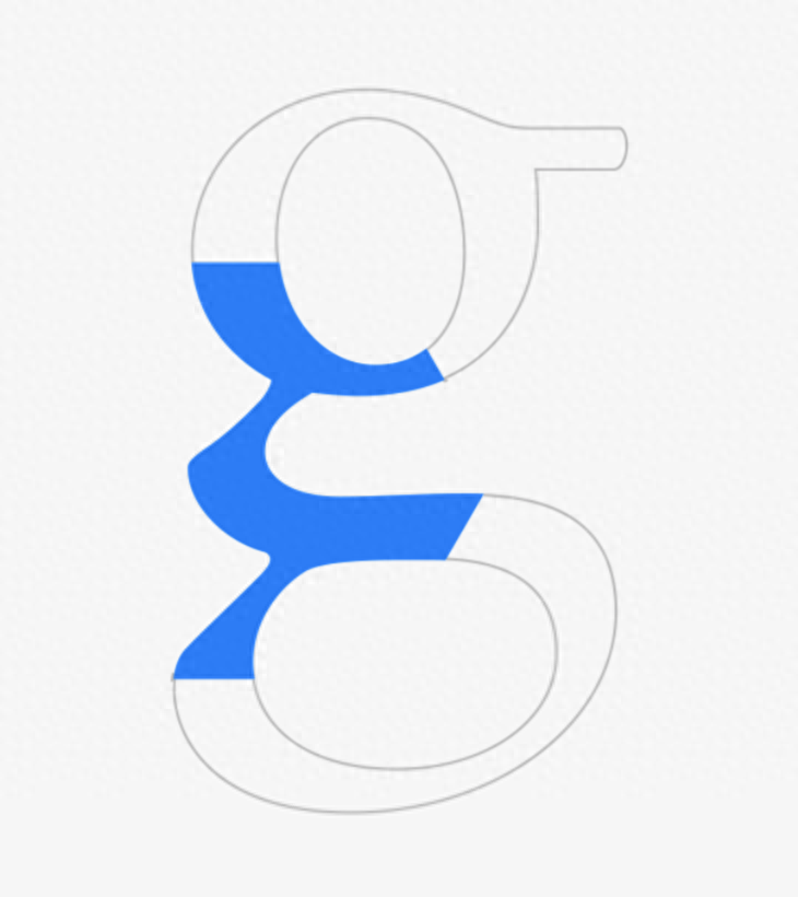
Details:
Garamond's design can reflect the common characteristics of Renaissance handwritten serifs, while Futura is a font completely based on geometric shapes. Each letter is a geometric shape: triangle, circle, square or above. Made up of fragments of shapes.
- Futura:
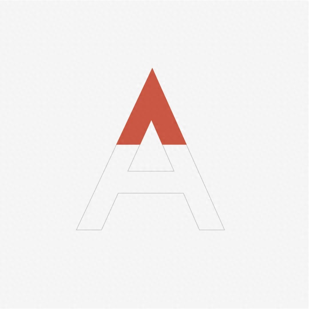
The capitalization of Futura has many interesting little details: such as the triangular design of A, M, N, V, W, Z,
B, P, R are upwardly stretched word bowls.

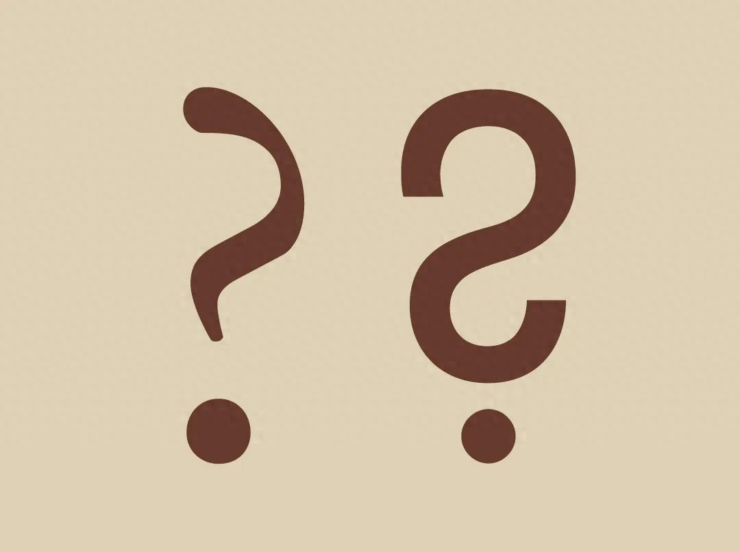
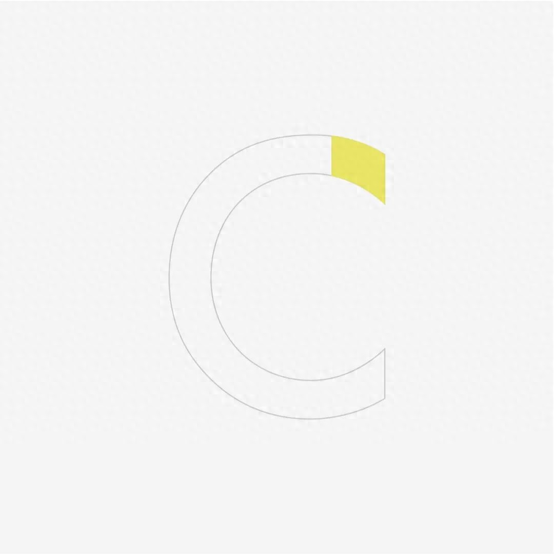
In addition, the vertical stroke endpoint design of the letter C provides a better reading experience for the combination of H and K (ch, sch, ck).
Different from the gorgeous uppercase design, Futura's lowercase design uses very limited graphic elements.
- Garamond:
Based on the Roman alphabet glyphs, Garamond's uppercase letters retain all the signature elements of humanistic type design, such as well-sized serifs and the split bowl of the letter P. wait.
Garamond's lowercase letters embody the vivid movement of handwriting using a wide nib.
The above is a set of font matching recommendations brought by the editor for you. Too little and not enough? It doesn't matter!
Layer Studio will continue to recommend more classic combinations, so you no longer have to spend too much time choosing fonts!
The content of this article was compiled by "Layer Studio — Niu Niu & HingHing". The article is for sharing and communication only. The copyright of the article belongs to the original author "ReadyMag". Please reply "Reprint" for reprinting, and you are welcome to forward it!
Articles are uploaded by users and are for non-commercial browsing only. Posted by: Lomu, please indicate the source: https://www.daogebangong.com/en/articles/detail/fen-xiang-ying-wen-zi-ti-tai-duo-xuan-ze-kun-nan-le-zen-me-ban-jing-dian-da-pei-tui-jian-Vol-1.html
 支付宝扫一扫
评论列表(196条)
测试