Fonts are often a big killer that can influence the quality of PPT, but many people don’t know the skills of using fonts.
I always feel that just inserting fonts into PPT is enough.
As everyone knows, there are a series of issues such as adaptability, aesthetics, copyright, etc. The small fonts contain a lot of knowledge.
Today, the visual designer of the iSlide design team@pineapplezhucha brings you a super detailed font information.
At the end of this issue, there is a free commercial font download benefit launched by iSlide and iFonts.
This valuable font is exclusively named and copyrighted by iSlide,
Now it is completely free and open to the majority of PPT users. A good PPT should be equipped with good fonts.
- 01 -

When making PPT, do you often face a long list of fonts in the drop-down menu and don’t know how to choose?
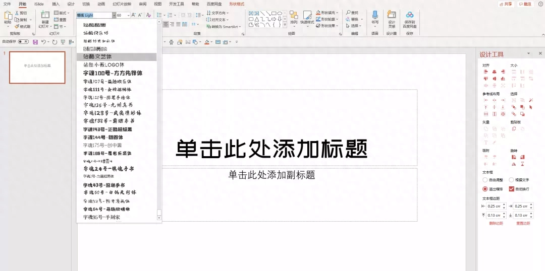
Let's first understand the style characteristics of fonts, and look at the temperament and application direction of each type of font, so that when choosing a font, you can first determine the font type, and then start from Font type to select a specific font.

Helvetica, also known as Cube or Gothic, has no serifs, clear stroke structure, horizontal and vertical lines, all handwriting has the same thickness, and no unnecessary modifications. Because Chinese characters have many strokes and small black fonts have poor clarity, they were mainly used in article titles in the past.
However, as typewriting technology improves, there are many new boldface styles suitable for body text.

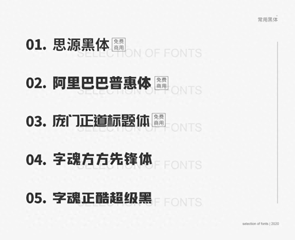

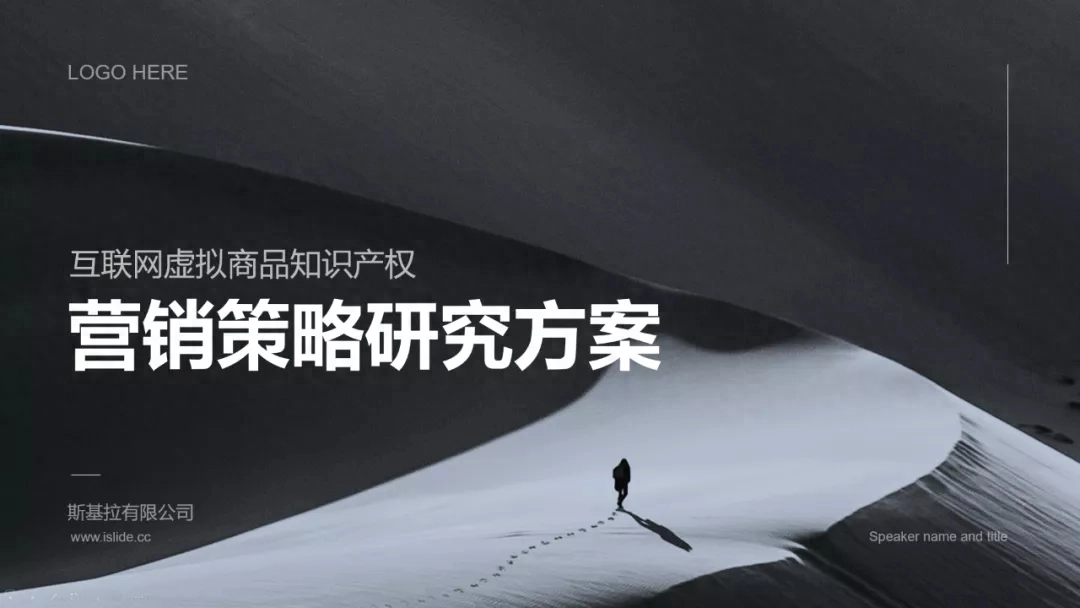
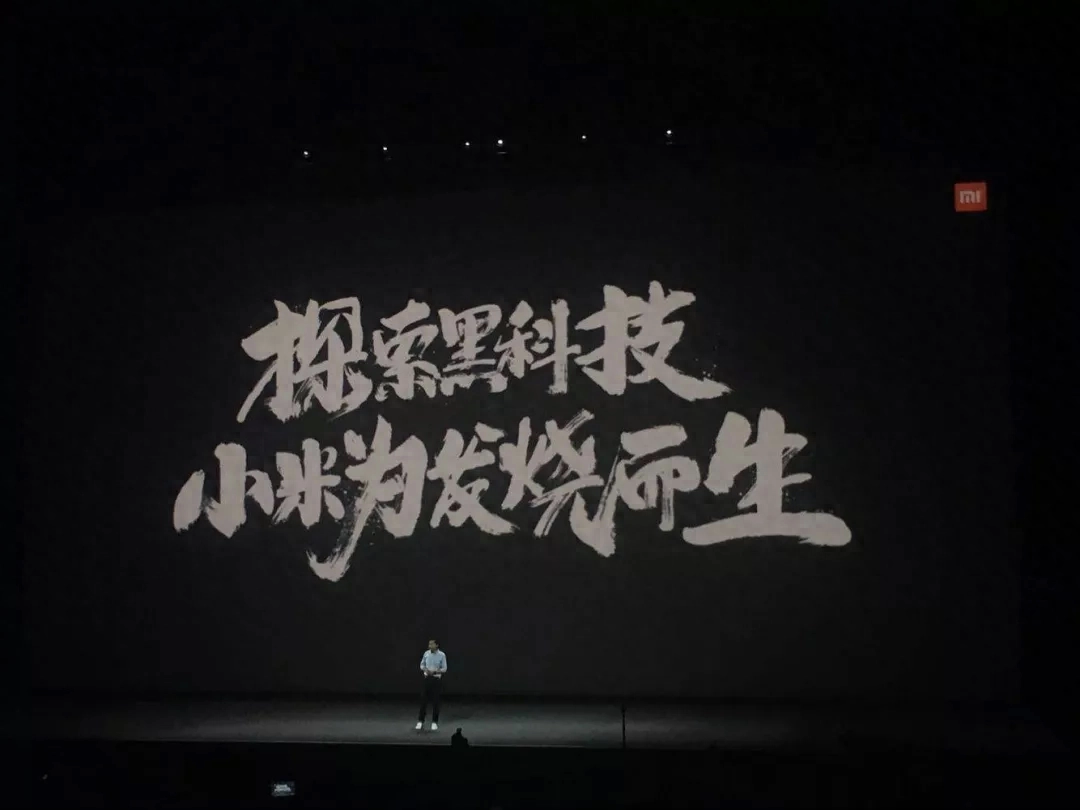
Bold fonts full of modernity and power often give people a formal, concise and clear psychological impression, so they are very suitable for use in work reports and business speech-type PPTs. .

In addition, the thicker design bold font is suitable for use as titles in graphic designs such as promotional posters and promotional discounts.

▲Xiaomi 10th anniversary warm-up poster

Song style is a Chinese character font that appeared to adapt to printing technology. The strokes vary in thickness, and are generally thin horizontally and thick vertically, with decorative parts at the ends. Strokes such as dots, strokes, strokes, and hooks have tips. They are serif fonts and are often used for text layout in books, magazines, and newspapers.
I rarely use the Song font that comes with Microsoft. It looks thin and difficult to meet the aesthetic standards. Therefore, it is recommended to use the following new Song fonts in title design.
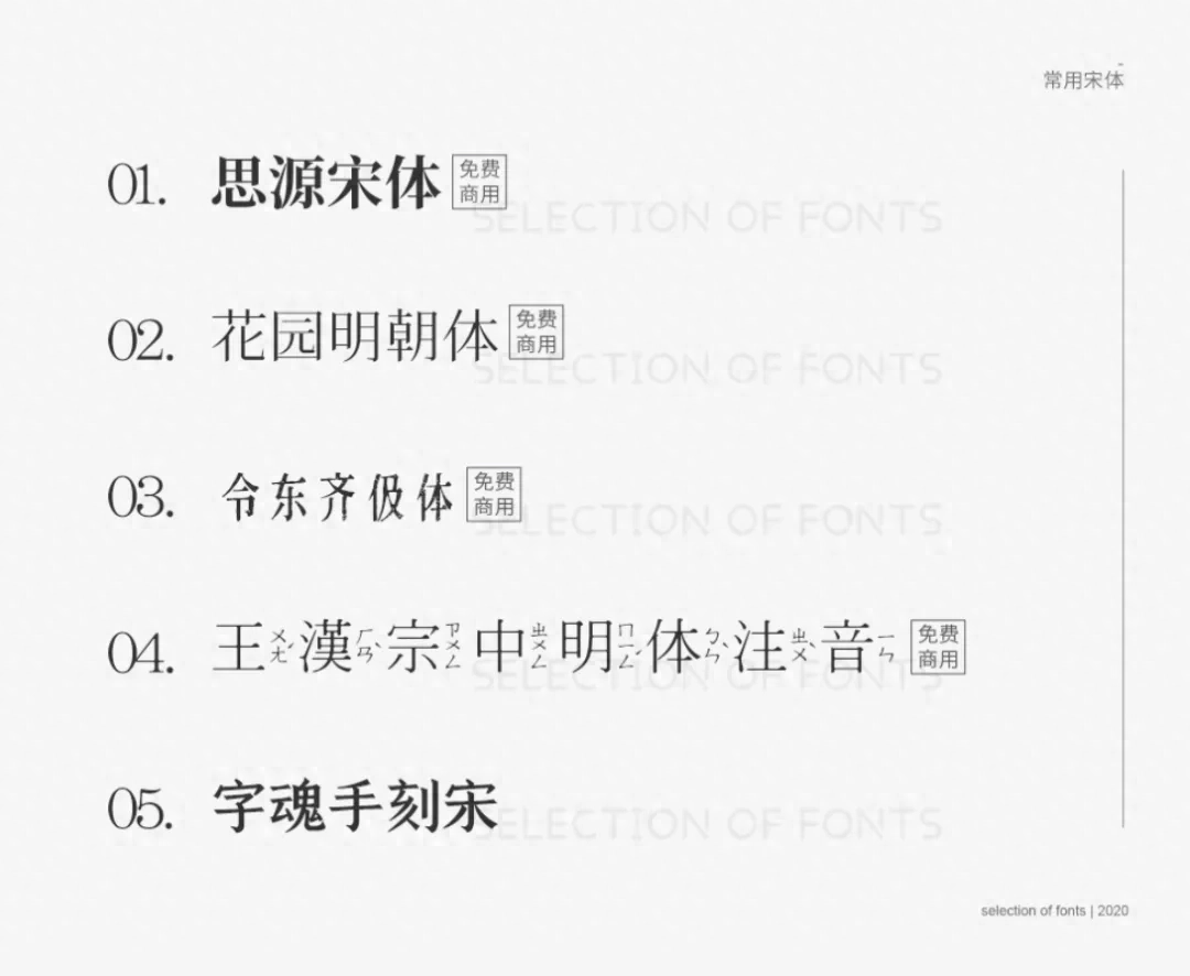

Song style, which is full of cultural heritage, is very suitable for use in PPT related to art and traditional culture, and can reflect exquisite beauty and unique humanistic temperament.
The thinner New Song font is slender and soft, and is more suitable for use in PPT designs in the cosmetics industry, fashion industry and literary and artistic themes.

The round body evolved from the black body, and the corners and ends of the strokes are arc-shaped. Compared with black body, it is less formal and more rounded and lively.
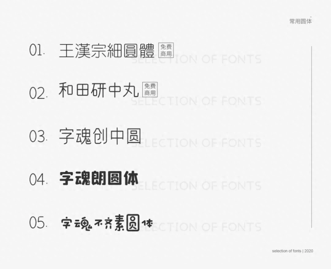
The round body is suitable for use in designs that need to be lively and friendly to convey a relaxed and casual atmosphere.


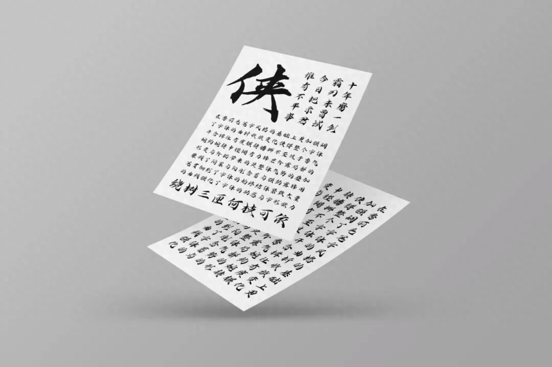
Traditionally speaking, calligraphy fonts can be divided into five categories: running script fonts, cursive script fonts, official script fonts, seal script fonts and regular script fonts. Each major category is subdivided into several smaller categories. For example, seal script is divided into large seal script and small seal script, regular script is divided into Wei Bei and Tang Kai script, and cursive script is divided into Zhangcao, Jincao and Kuangcao.
However, in PPT design, we only need to classify according to the design style.
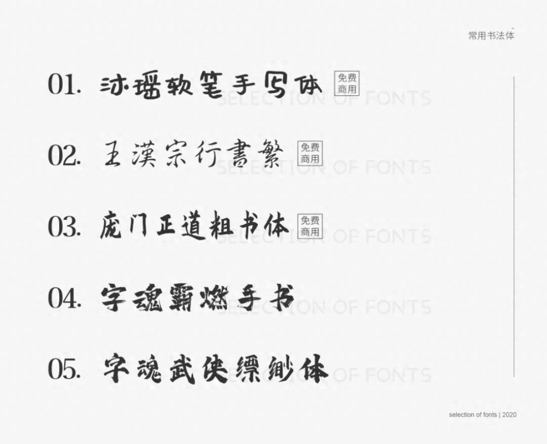
Some calligraphy characters are elegant and delicate, while others are majestic. No matter what, they all have a strong sense of design and artistic expression, suitable for use in some introductions, slogans, and corporate culture-related PPT design.
- 02 -


When choosing fonts, pay attention to whether the temperament of the font matches the temperament of the designed content. Choose the font type based on the industry attributes and target audience of the design project.
In the case below, the brush calligraphy mainly brings a cultural atmosphere, giving people a vigorous and bold feeling, so it will look a bit awkward when used in PPT related to business courses. , and changing it to a bold black font full of business atmosphere gives people a formal business feel, and the entire picture looks more harmonious.


The essence of design is to convey information, so when making PPT, you cannot just use text as a design element and ignore the recognition and legibility of text for the sake of design.

Pay attention to the legibility of individual words, and when formatting multiple words in the text, pay attention to the legibility of the entire text.
In the case of the picture below, the picture on the left makes it easier for readers to read vertically due to the large word spacing and small line spacing (the peripheral vision of our eyes is easier to read when reading than before). Notice the characters near). In the picture on the right, increasing the line spacing and narrowing the character spacing improves legibility.

So what is the line spacing that makes it easier to read?
I usually set the line spacing to be wider than the default line spacing of PPT, 1.2 or 1.5 times, which makes it more comfortable to read.
Last point, pay attention to the matching of text and background image. If the font color and background color are too close, the recognition of the text will be reduced:


Pay attention to the font size, distinguish the hierarchical relationship of text, and widen the font size gap between different levels. The font size of the title should be larger, and the font size of the explanation and annotation should be smaller. This allows readers to clarify the key points in a limited space, faster and more Read information comfortably.
When setting the font size in PPT, you should also consider the size of the screen and room.
Use a smaller screen in a larger space and everything will appear smaller than it actually is. The font size should also be adjusted appropriately according to the actual situation. For example, in a PPT class with 70 people in a classroom, font size 14 is generally the minimum application bottom line.
- 03 -

Another particularly important point is that you must pay attention to the copyright issues of fonts when designing, otherwise be careful of the lawyer's letter and warning~
How to avoid this? In addition to designing and modifying fonts yourself, the easiest way is to directly use commercially available fonts.
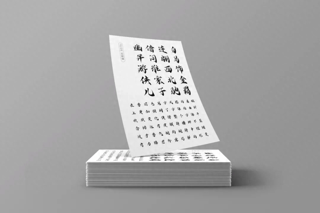
In order to allow everyone to use good fonts and make PPT more efficiently and brilliantly, iSlide and iFonts have launched an exclusive font, iSlide Yunyuti.
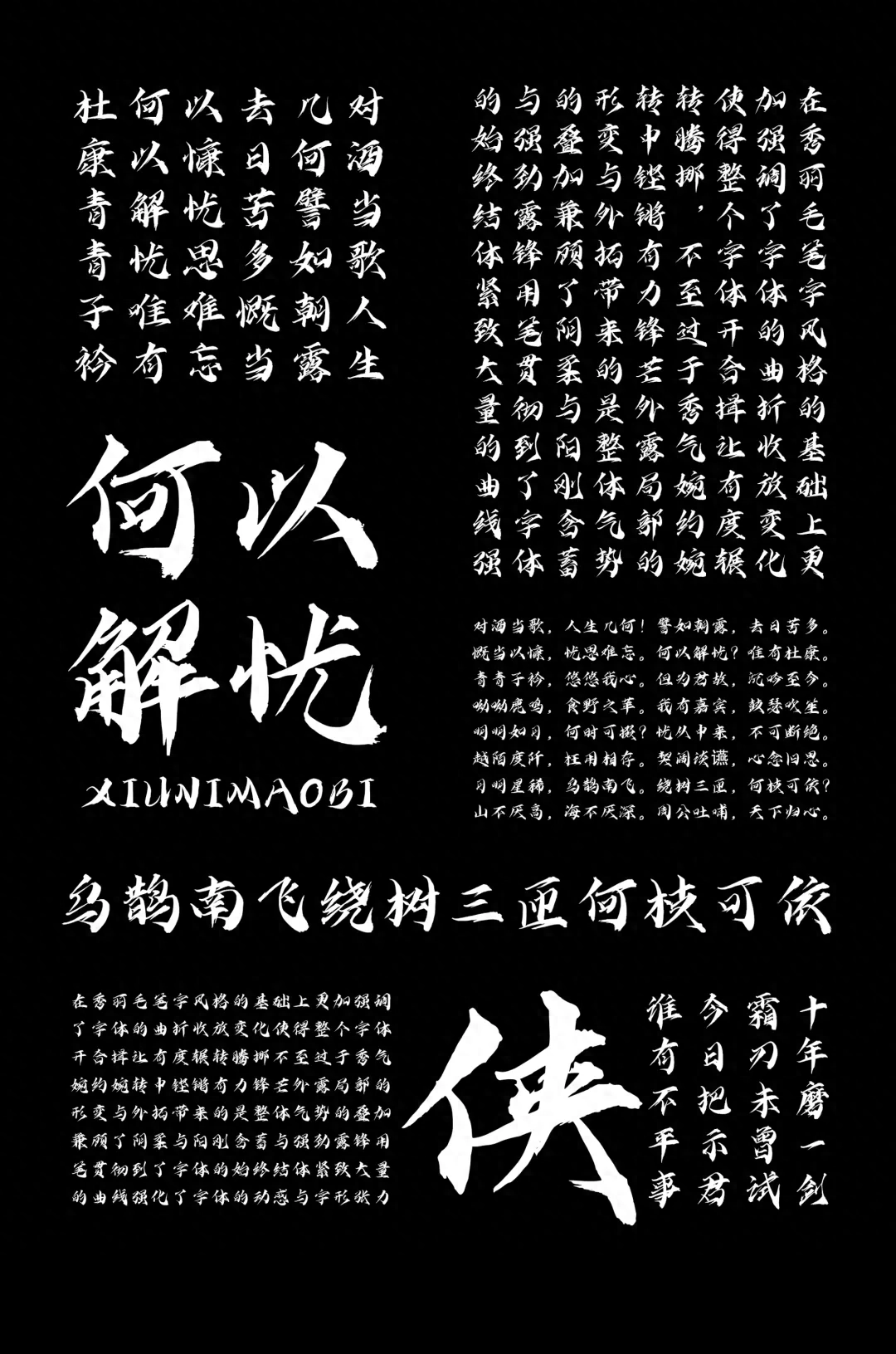
Based on the beautiful brush calligraphy style, this font puts more emphasis on the twists and turns of the font, making the entire font open and close in a moderate way, and tossing and turning, without being too delicate and graceful. It is sonorous and powerful in its tact, and its edge is exposed.

Partial deformation and expansion bring about the superposition of overall momentum, taking into account both femininity and masculinity, subtlety and strength. Lu Feng used his pen to implement the font from beginning to end. The structure is tight and the large number of curves enhance the dynamics and glyph tension of the font.

How to use iSlide for free
Yunyu Ti is exclusively named by iSlide and enjoys the copyright of the font, so that everyone can really enjoy copyright-free use of the font.
Log in to download iFonts on PC and search iSlide to use it for free~
Articles are uploaded by users and are for non-commercial browsing only. Posted by: Lomu, please indicate the source: https://www.daogebangong.com/en/articles/detail/du-wan-zhe-pian-wen-zhang-geng-jia-dong-de-PPT-zi-ti-de-yun-yong-bing-huo-qu-yi-kuan-zhen-gui-zi-ti.html
 支付宝扫一扫
评论列表(196条)
测试