Hello, I am Chen Xi.
I'm here to write useful information again. What I want to explain today is a real customized PPT case, a PPT design related to Dukang wine.
This PPT has many pages and the space is limited, so I have selected a few pages to analyze and dismantle it in detail.
It is designed and produced by the custom designer "Ale" of Chen Xi team.
▣ 01
OK, without further ado, let’s get started.
First of all, of course, we need to look at the original PPT file provided by the customer.
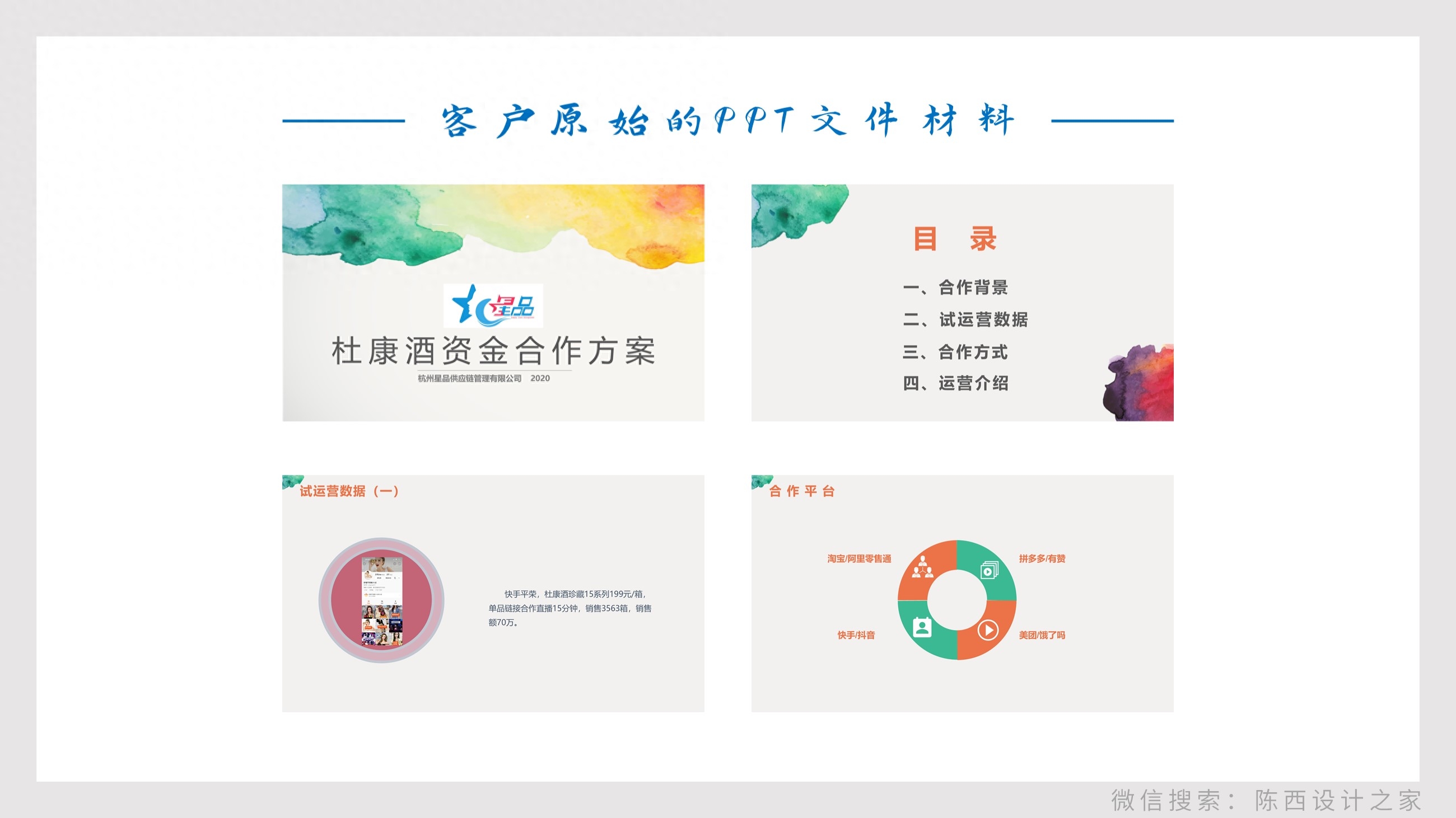
You can tell at a glance that it is a first draft document made using a simple PPT template.
It is relatively clear and concise, but it is definitely not a qualified PPT document and still needs to be designed.
The design effect is as follows:
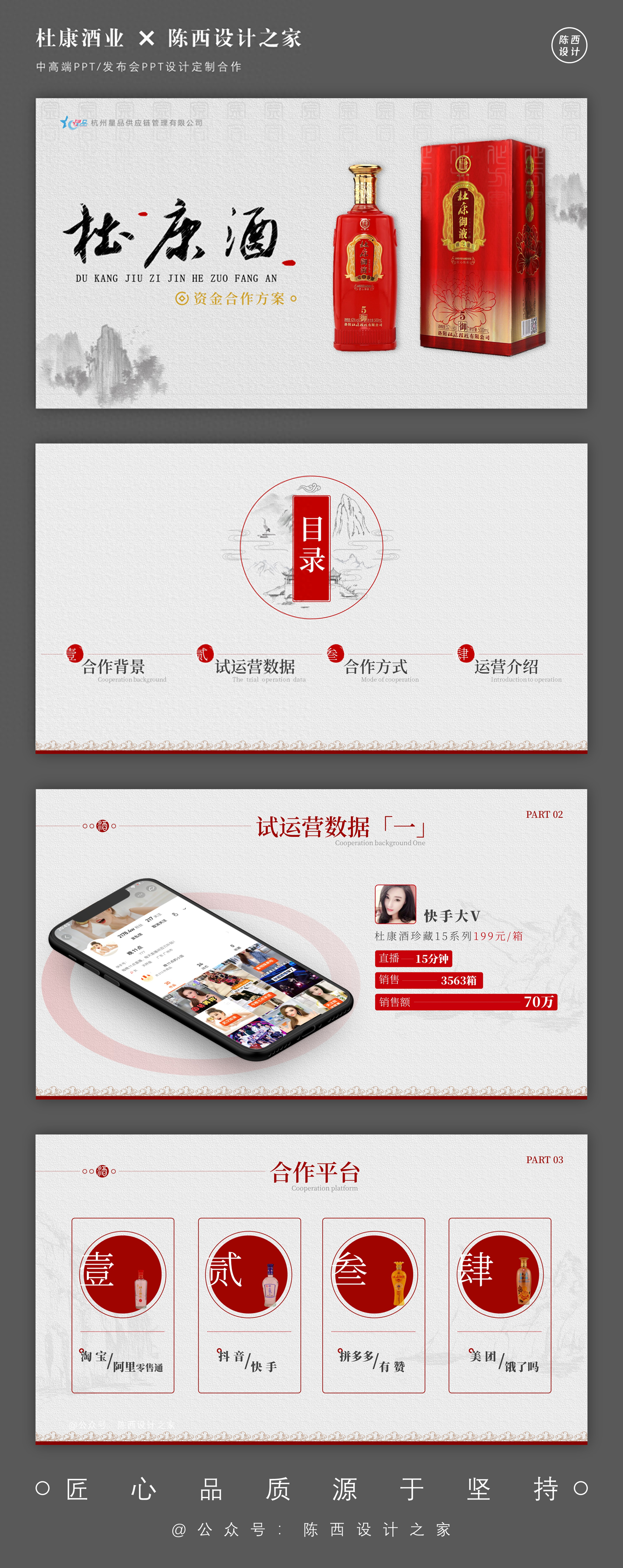
This is an effect plan we designed after comprehensive consideration.
There are definitely other design ideas for different people. Everyone is also welcome to design and produce in other styles.
▣ 02
Here we will conduct a dismantling analysis based on the case.
▌First page
This is a PPT cover page.
To make a PPT, we first need to set the style and tone. After these are clear, the follow-up design will be easy.
How to set the tone for this PPT?
The customer did not give specific requirements. Generally speaking, in this case, it can be understood that the customer wants high-end, grand, textured, and upscale effects.
Let’s return to the topic of Dukang wine. What is the most famous thing that comes to mind when talking about Dukang wine?
That's right, it's Cao Cao's famous short song line, drinking and singing, what's the difference in life! Yes, this is it. There is another sentence in it: How to relieve worries? Only Du Kang.
So, Dukang wine is a wine with historical and cultural flavor. Of course, the style can adopt the style tone of elegance, antique style, and texture.
After the style and tone are clear, the effect is designed like this:
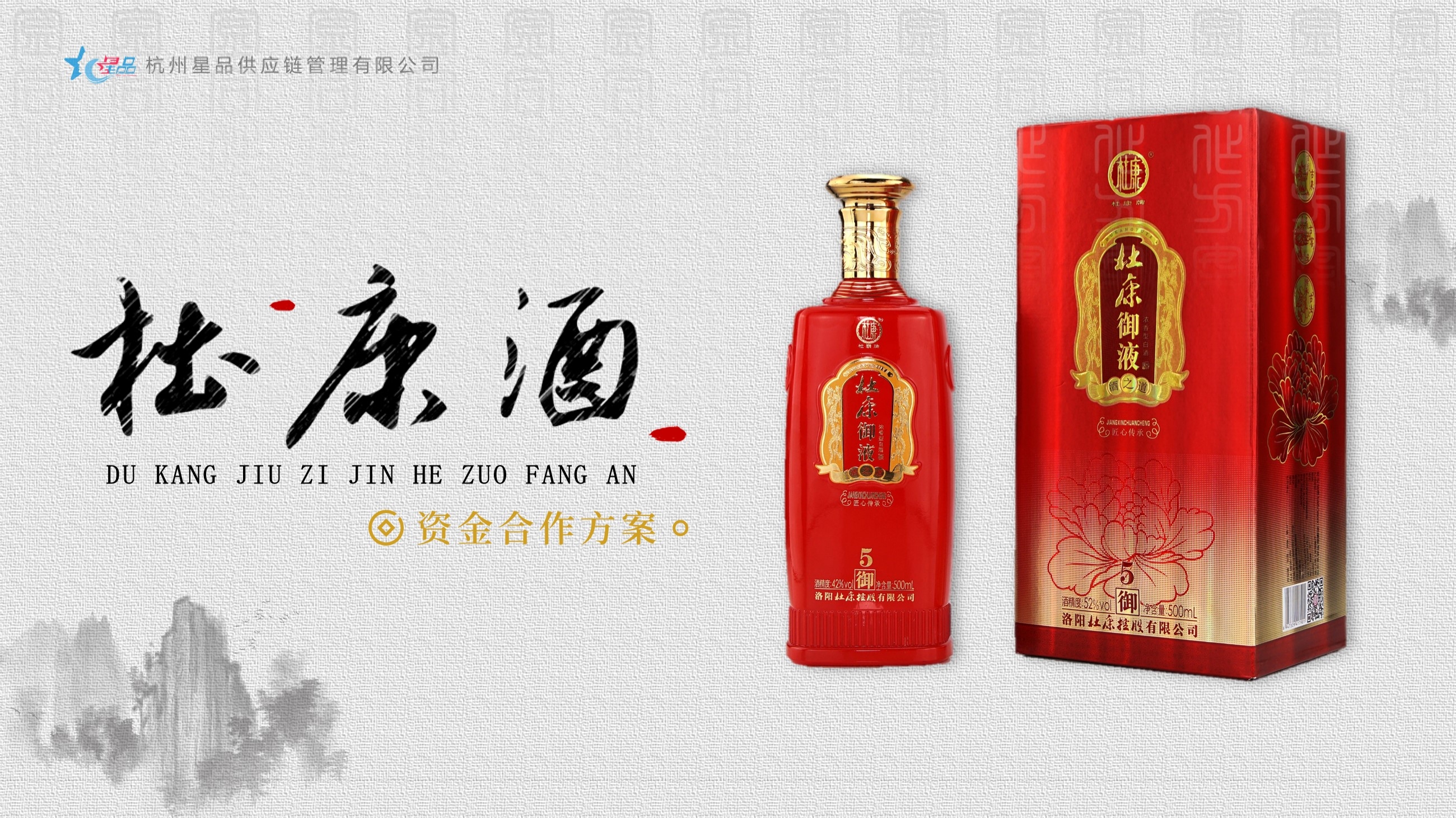
Elegance, antiquity, quality, and culture are all a perfect match.
After analyzing the design ideas, let’s break down the design process and operations in detail.
First, of course, is the design treatment of the background, which is crucial.
as follows:
Because it is based on an ancient texture, we chose texture pictures with textured particles, ancient text, and ink landscapes.
The purpose is to create a more elegant antique texture effect.
Of course, it is not easy to find suitable materials. It still requires patient search and daily accumulation.
Then, carry out the layout design, as follows:
Get a background effect like this.
Then consider the left and right layout. The left side is the layout design of the theme copy, and the right side can be placed with related product pictures.
The product images provided, although of high quality, are not in PNG format. In order to better combine with the background, the product image needs to be simply cut out.
as follows:
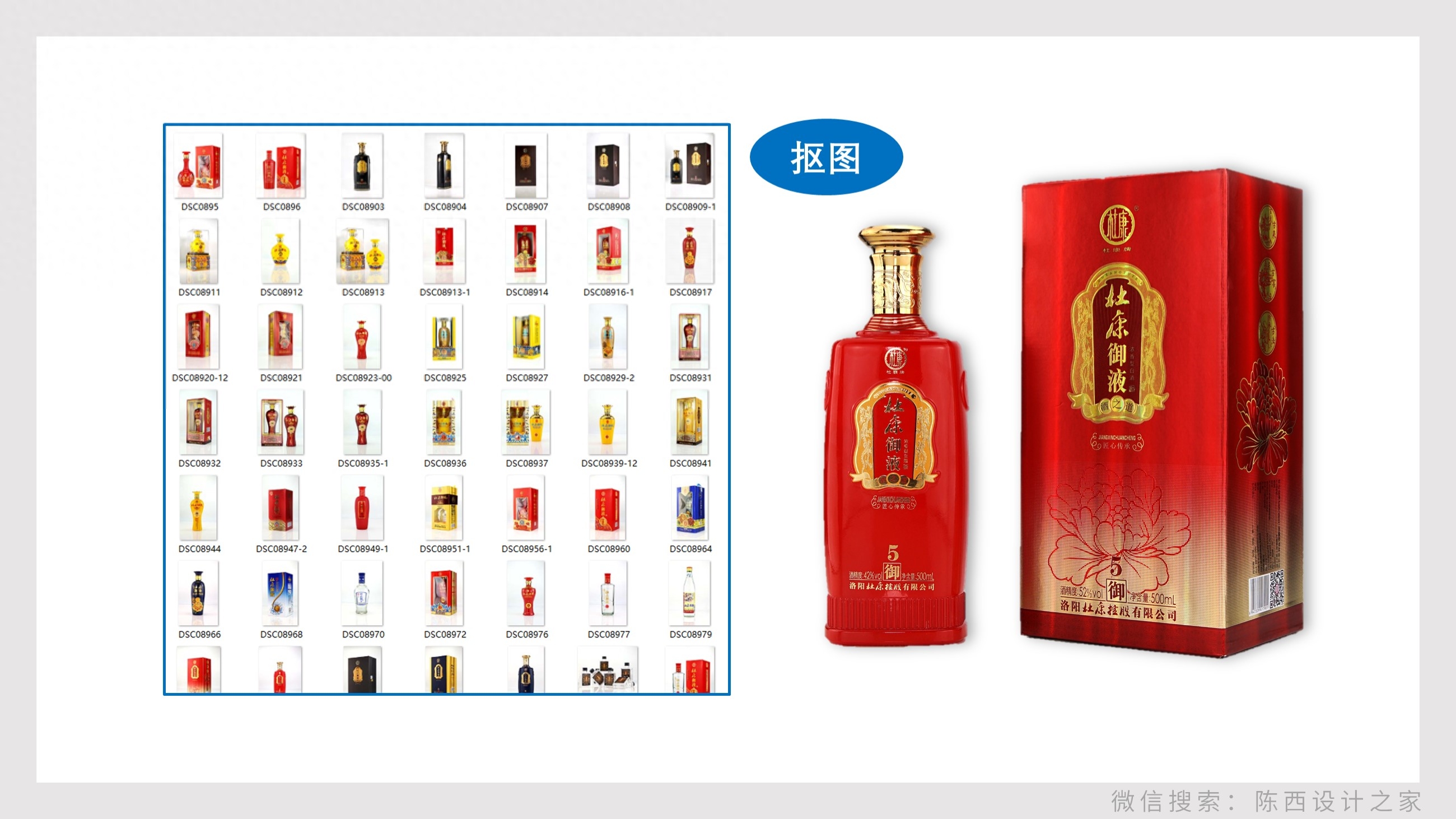
You can use the cutout function that comes with PPT to cut out images, but if you want better results, you must use PS software to cut out images.
After cutting out the picture, add some shadows to make it more three-dimensional.
Then carry out the design processing of the text. as follows:
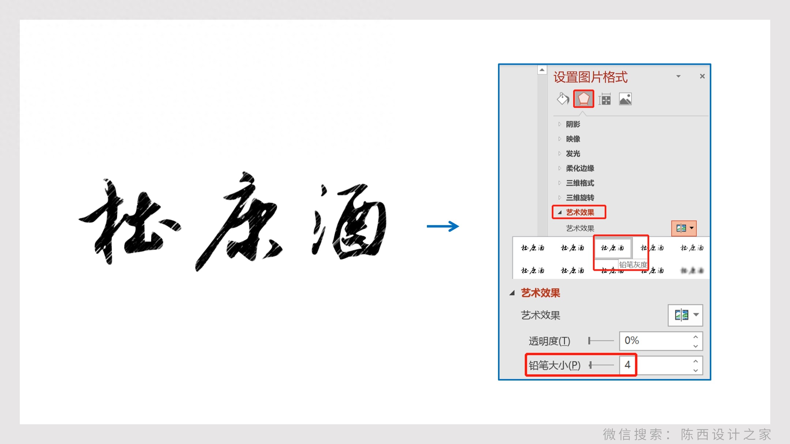
We also added some textures to the text, which gives it a sense of vicissitudes and history.
The specific operation is to paste the text into a picture and then set the artistic effect of the picture.
Select the pencil grayscale, and the pencil size can be adjusted to 4, so it will be effective.
Then add some decorative elements of ink droplets and other text information, and then proceed with typesetting.
as follows:
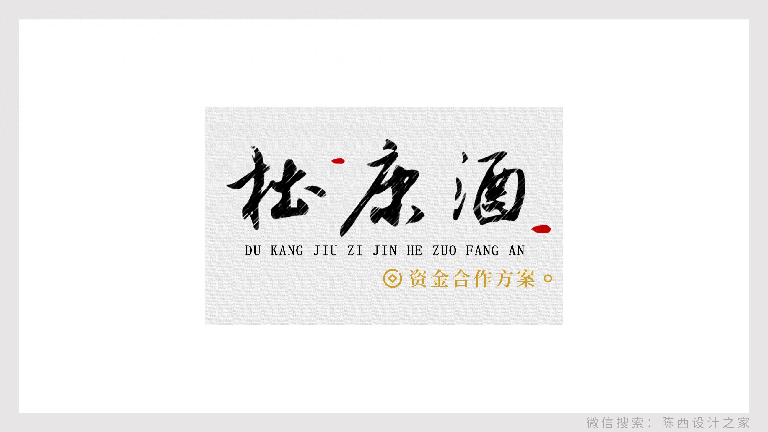
After the text part is also processed, let's put it together and the PPT cover page is designed.
as follows:
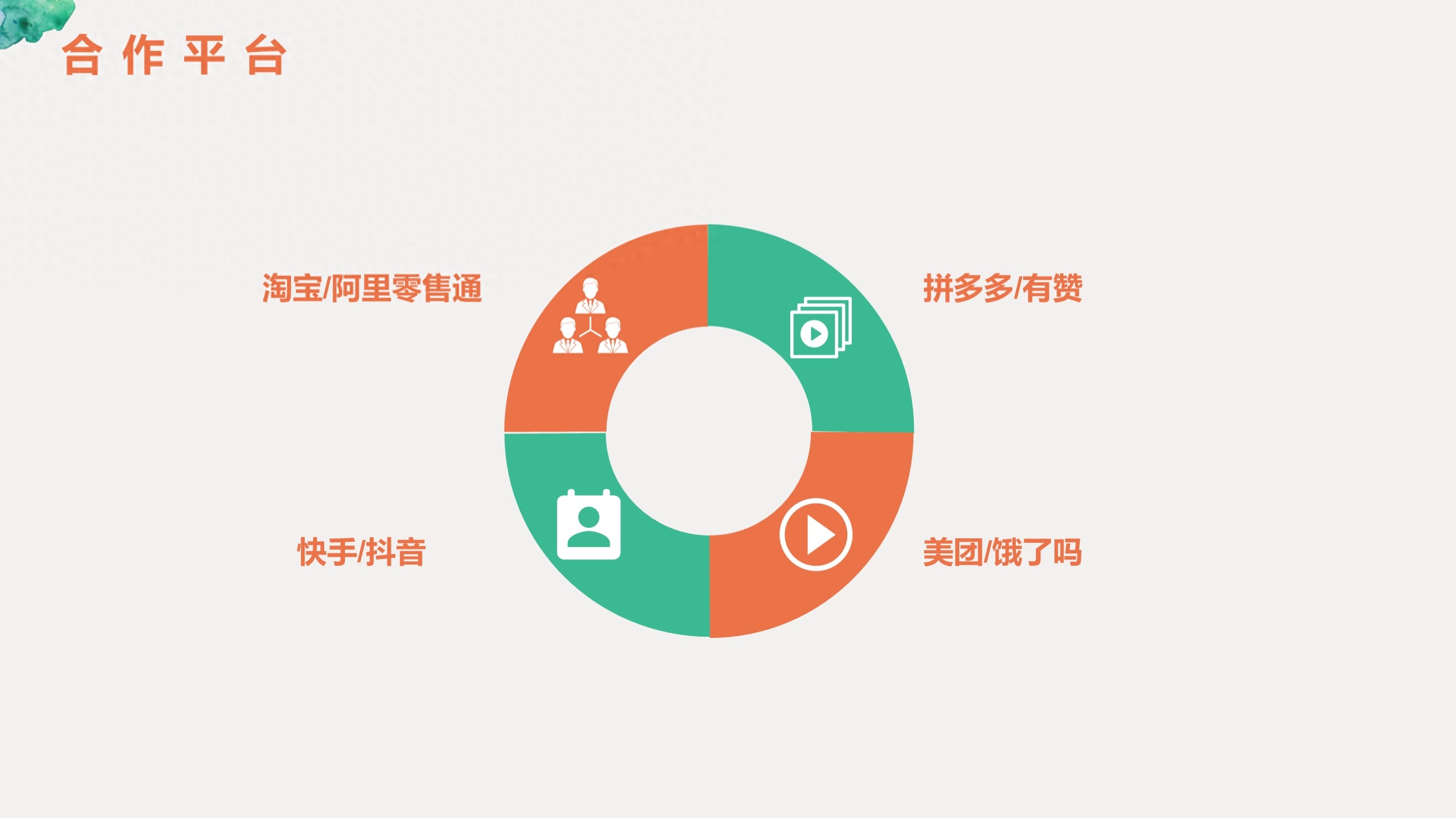
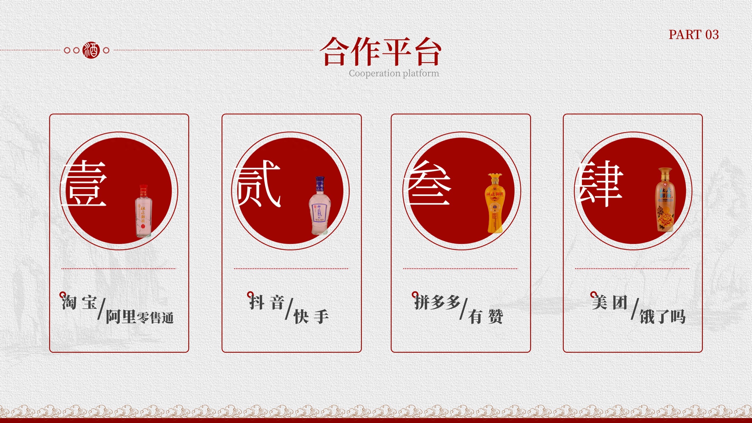
▌Second page
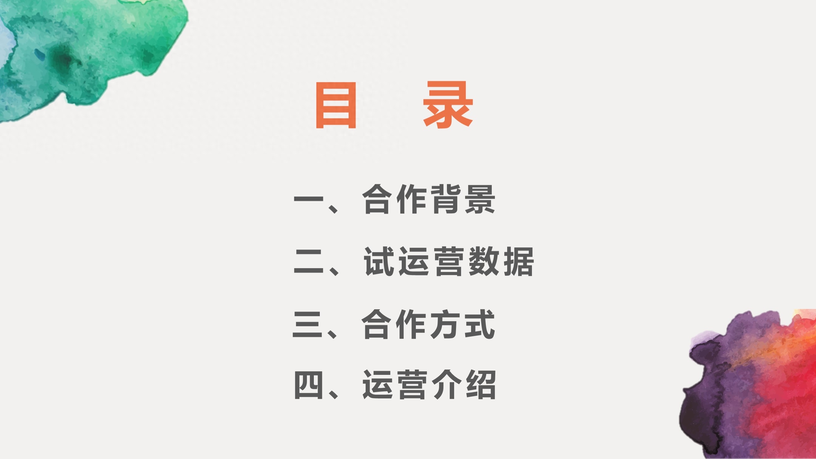
A PPT content page is relatively clear and concise.
What we have to do is to design this directory page according to the style and tone we have set.
as follows:
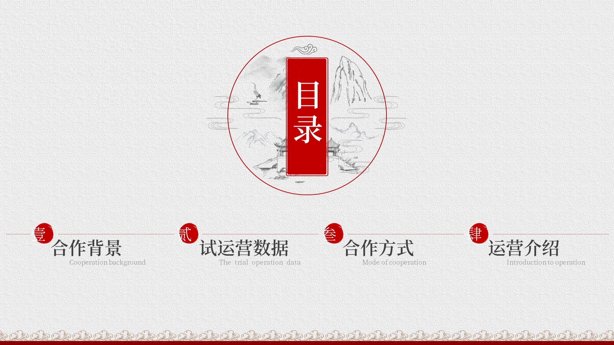
The main color here is red, so I need to explain it.
Because Dukang Holdings’ logo and many product pictures are mainly red, red is also used as the main color of the PPT here.
The background follows the texture effect, and a red texture is added to the bottom of the page. This also needs to be designed.
as follows:
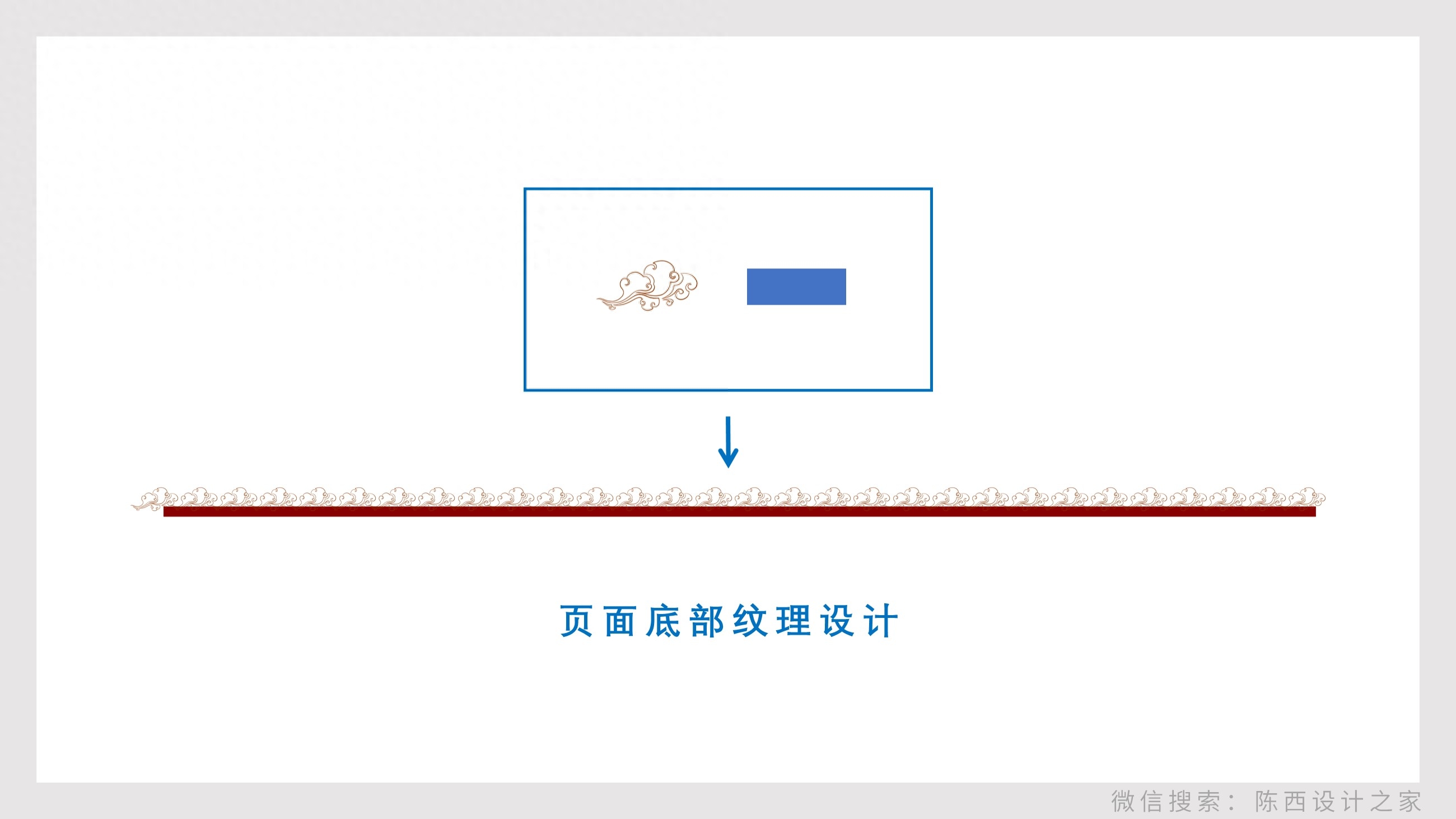
This splicing creates a bottom texture effect.
In addition to these, the pictures below the table of contents are also designed.
In order to increase the level of the page so that it is not empty and has a more sense of design, antique elements are added.
as follows:
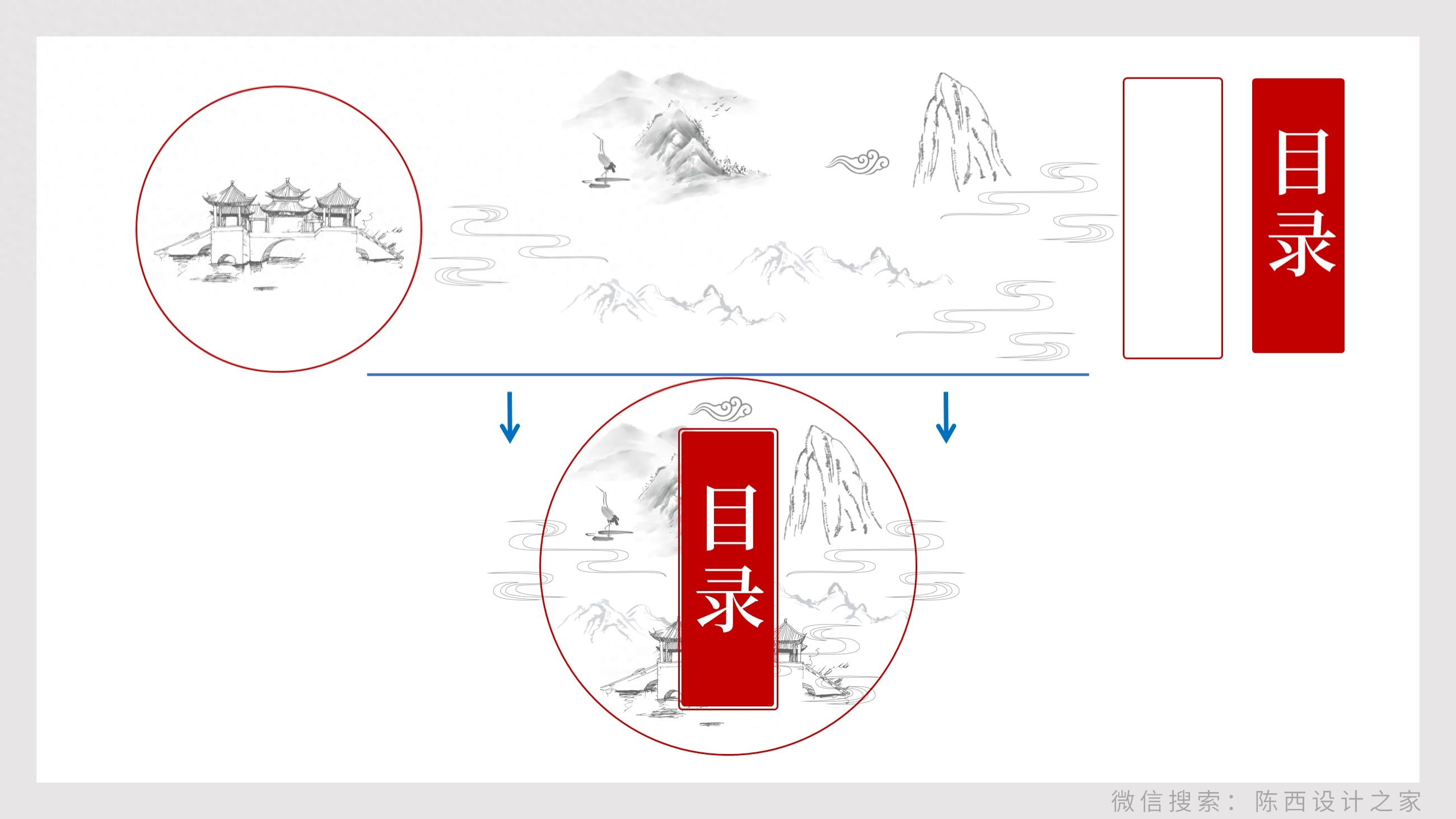
The most important thing is to choose appropriate materials, then stitch them together and type them, and just pay attention to the details.
The last step is the typesetting of the text in the four catalogs. as follows:
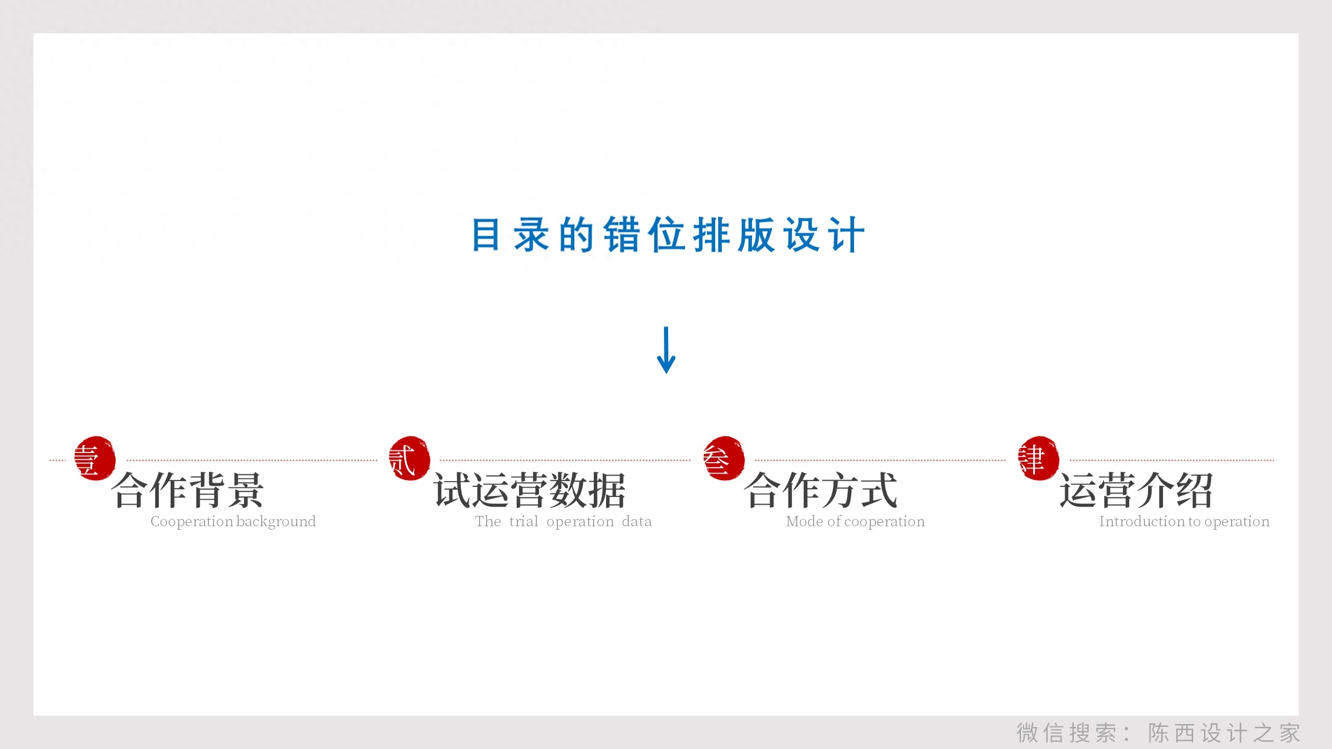
Adopts a misaligned typesetting process. As for why? Well, maybe it’s to break the rules and be more individual!
Taken together, you can get the final effect. as follows:
▌Page 3
This is a PPT content page. It’s a mobile phone screenshot with captions.
The design effect is as follows:
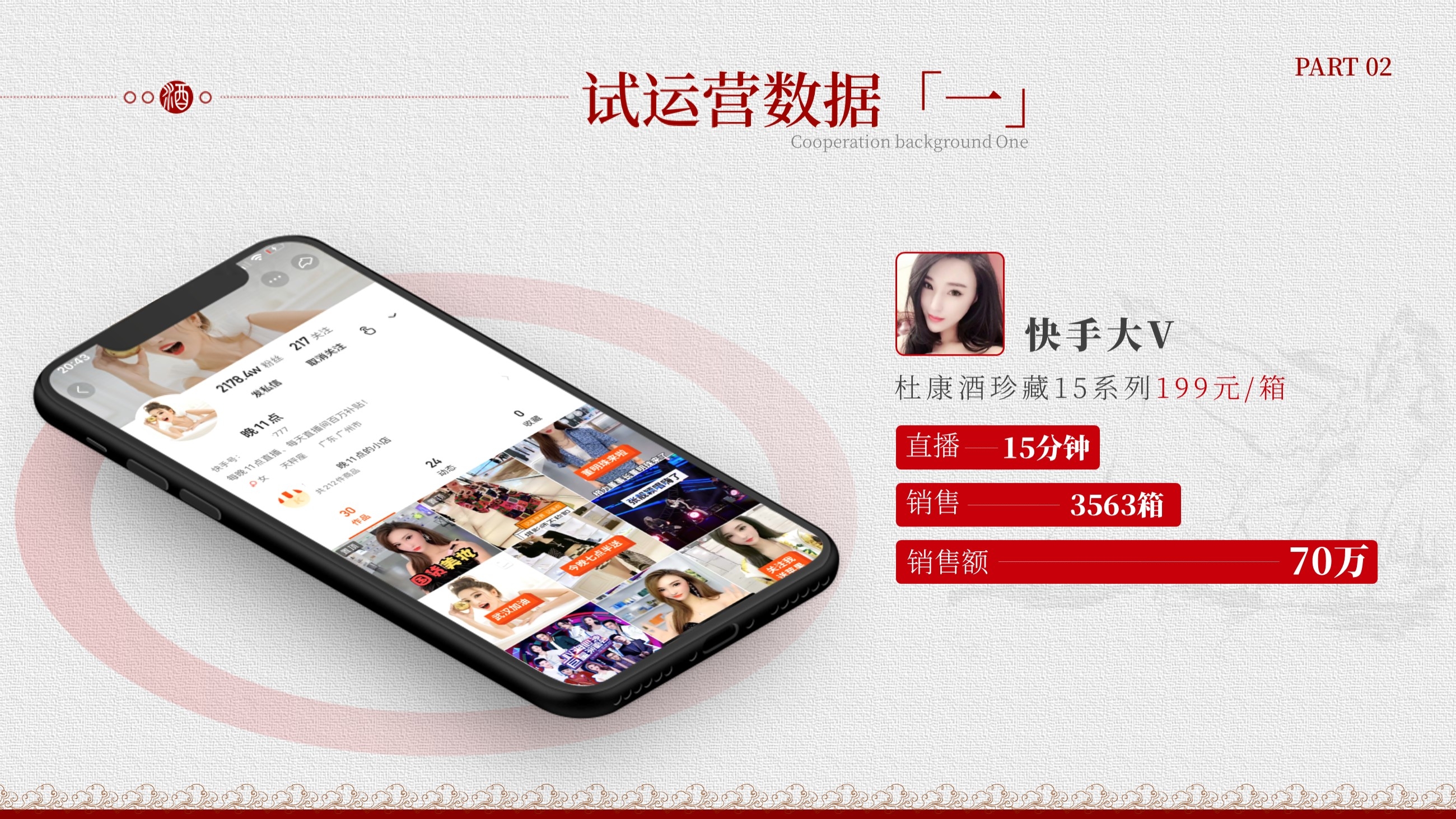
One of the best design techniques for mobile phone screenshot pages is to use mobile phone mockup models.
This page is processed using a mobile phone prototype, let’s take a look. as follows:
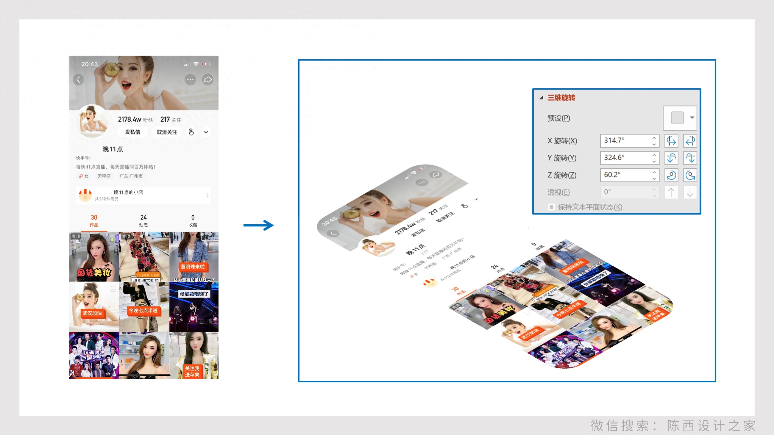
First, perform a three-dimensional rotation process on the mobile phone screenshot. Because our prototype model is a three-dimensional perspective effect. This is related to the downloaded material.
After processing, place it in the mobile phone prototype model. as follows:
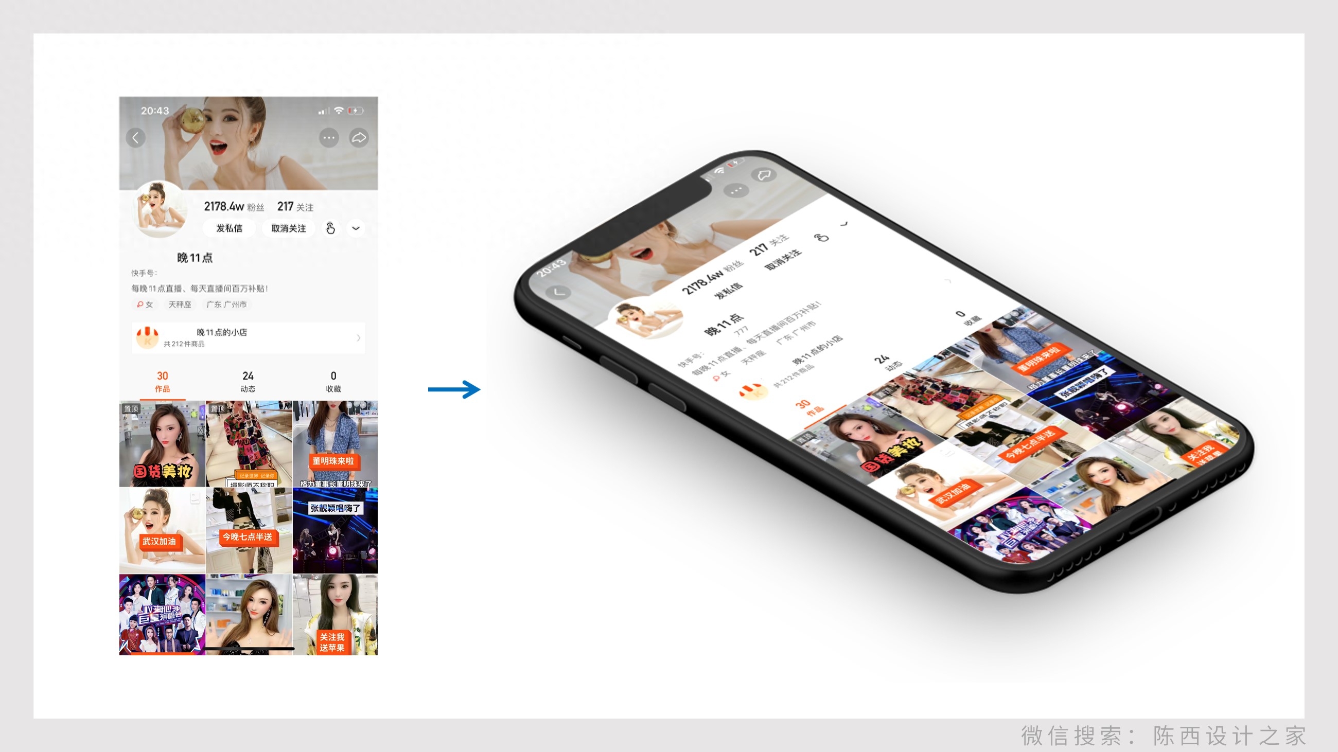
This mobile phone prototype itself has a shadow effect. If not, we can also add it ourselves.
Next comes text processing. as follows:
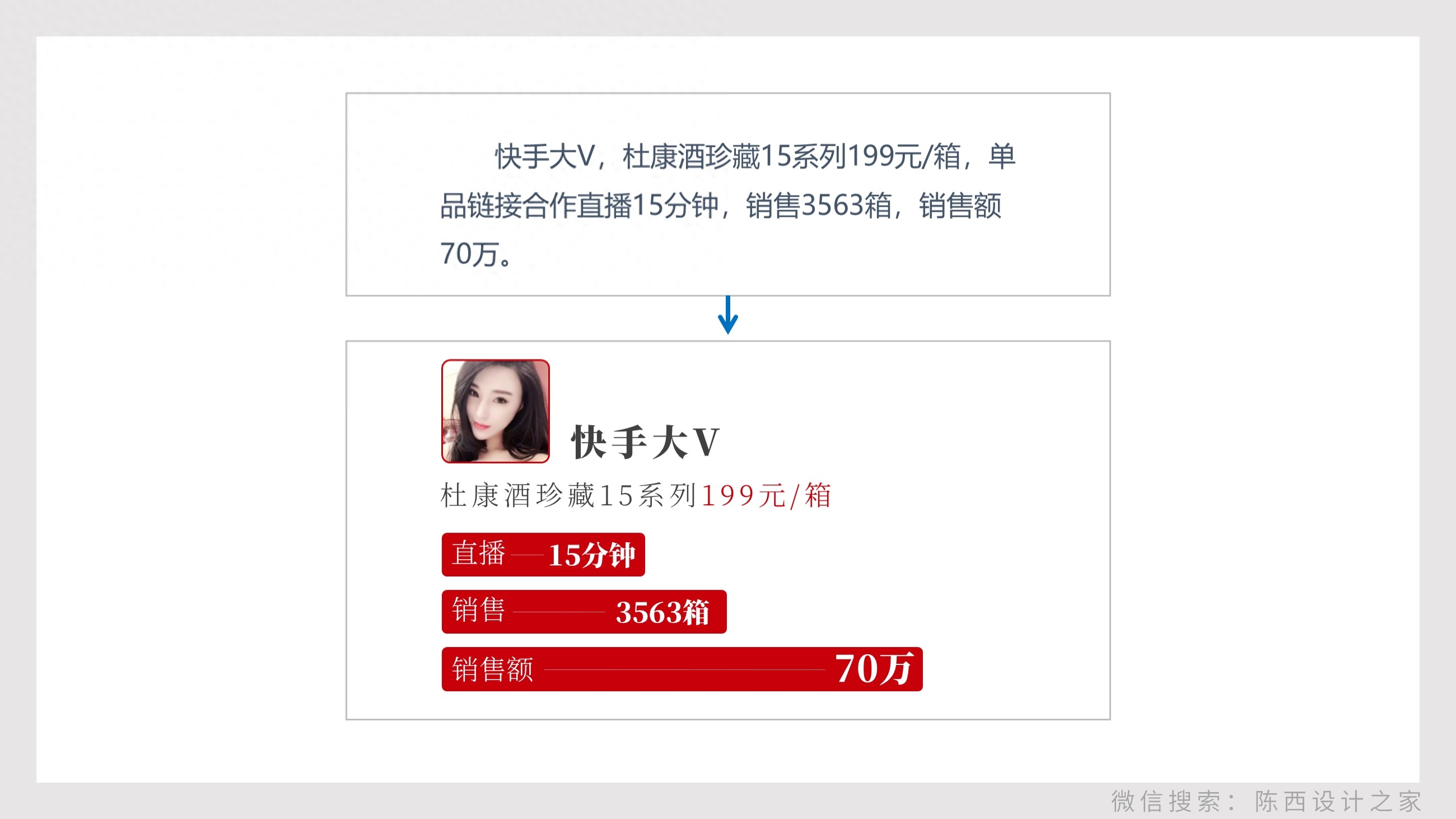
Word processing here is also relatively important.
We need to refine this paragraph, find the main information, and highlight the key points, such as singling out the numbers, emphasizing what should be emphasized, and classifying the categories.
The text needs to be expressed visually so that it is easier to understand.
Many times when we make PPT, we may like to just throw in a paragraph and then nothing more.
PPT is a presentation software after all, not Word, so we try to consider text refining and visual processing when designing and producing.
After doing this, add some decorative elements and details, and the page is ready.
as follows:
▌Page 4
This is also a PPT content page.
The logic is very clear. What we need to do is also carry out more detailed design processing according to the set style and tone.
as follows:
Carry out modular processing. It is clear and concise, each point is divided into a module, and pay attention to the alignment of the layout.
In order to avoid monotony, corresponding pictures and color blocks are matched, and some layouts are misaligned to give a more design feel.
All designs are completed here. Let’s take another look at the overall effect:

Well, it's still possible. I hope you all gained something.
Creating is not easy, please share it, like it, give me support, and let’s make progress together.
Above.
Articles are uploaded by users and are for non-commercial browsing only. Posted by: Lomu, please indicate the source: https://www.daogebangong.com/en/articles/detail/du-kang-jiu-de-PPT-ding-zhi-zen-me-zuo.html
 支付宝扫一扫
评论列表(196条)
测试