It’s already May 2019, and there are still 224 days left until 2020.
The office software has been updated to the 2019 version, time flies so fast.
Are you still at the level of Level 2 in computer science when making PPT? You can only create new ones, insert pictures, copy slides, and add animations.
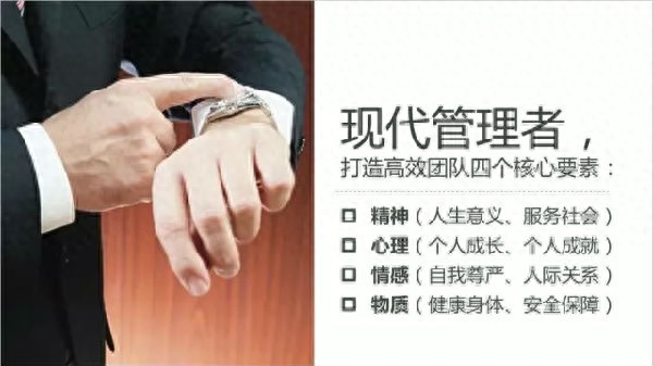
But some people played with PPT until it took off and made all kinds of cool things!

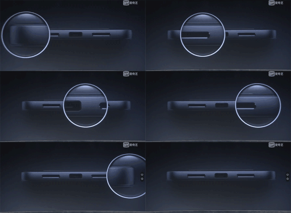
Haha, because the master has exploited the extremely small tricks of PPT to the extreme, and as long as they are fully used, you can create cool effects!
Let’s take a look at these cold facts. How many do you know?
There is a benefit at the end of the article: click on my avatar, reply to the keyword [Headline Benefit] via private message, and there will be a surprise!
Quick Access Tool
Let me first talk about a scenario that we often encounter when making PPT:
In order to make the page look more regular and neat, it is necessary to keep the text on the page on the same horizontal line. How many steps are required?
Normally, we need to select the text, click Format, find Align, and finally click Bottom Align. A total of four steps are required.
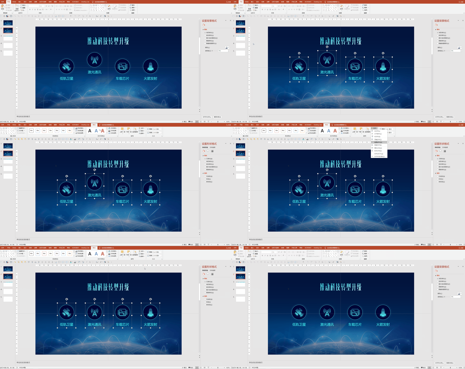
And let's try again using the quick access tool.
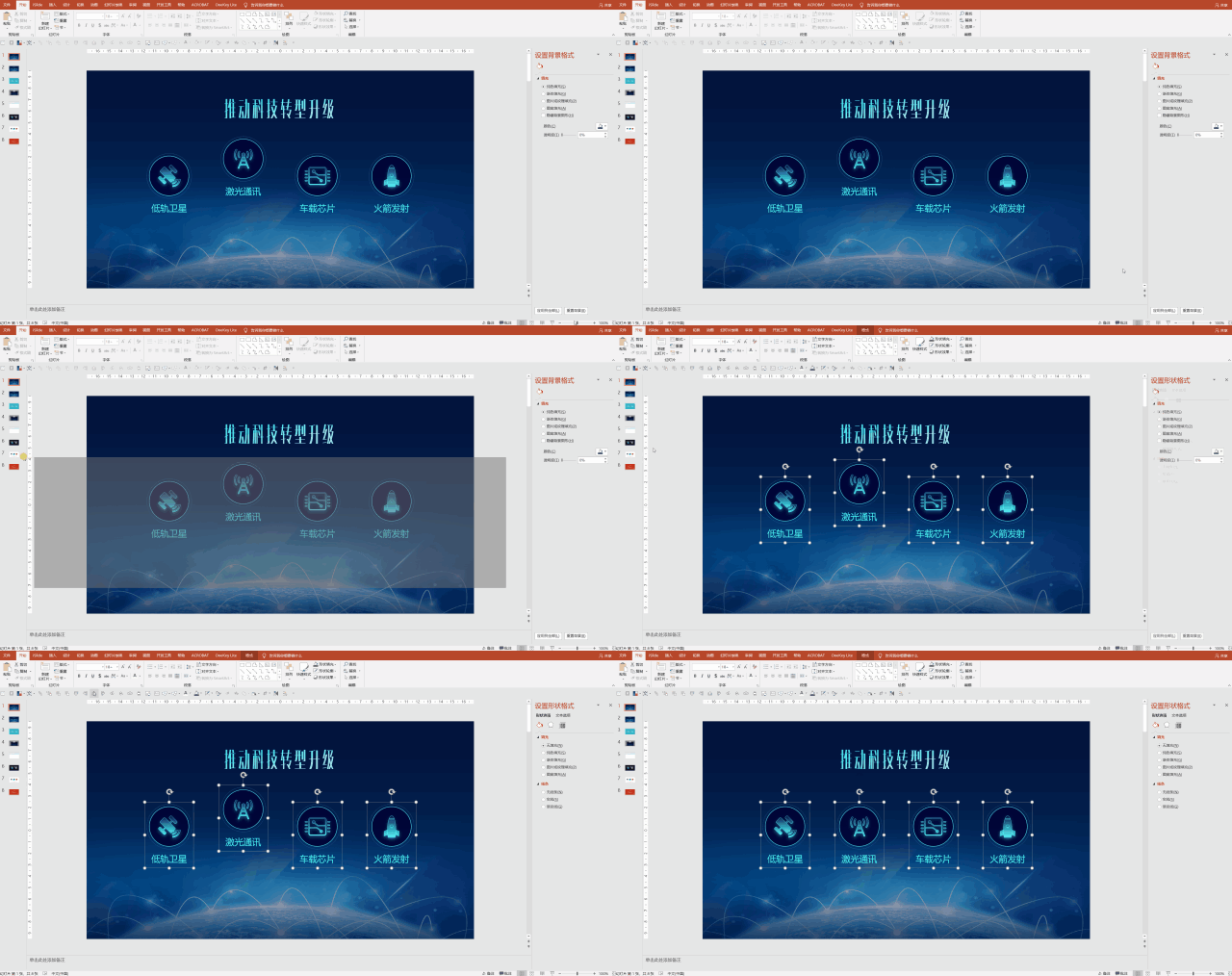
Select the text and click Align Bottom in the quick access toolbar.
Only two steps are needed to achieve the alignment effect. Compared with just now, there are two fewer steps, and the mouse no longer needs to be moved back and forth on the desktop, right?
Maybe you think that eliminating two steps does not have much impact, but you might as well imagine that if you can reduce unnecessary steps every time, this will How much time will it save you?

It is actually a shortcut in the PPT software. It puts those deeply hidden functional commands closer to the canvas, so that we can quickly use them when needed. Find this function button.
So, how to put those commonly used function buttons in the quick access toolbar?
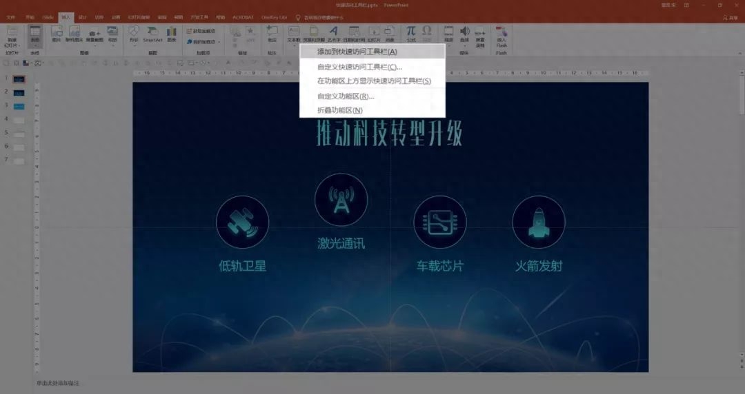
Take inserting a text box as an example. We directly find the insert text box, right-click it, and then click the quick access toolbar.
Reference lines
Many people basically do not use PPT reference lines when doing PPT, and one result is that PPT is used. Extremely rough.
The first function of reference lines:
auxiliary alignment
For example, in order to ensure the neatness of the page, we need to align the pictures and text on the right side of the page to the left. How to do this?
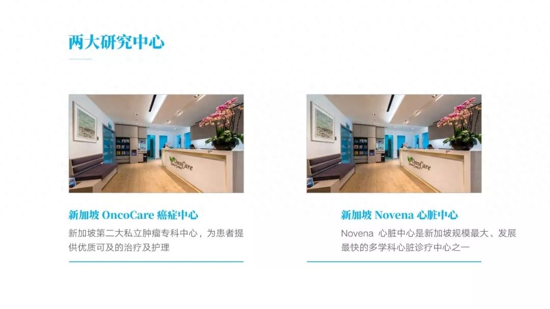
The usual approach is to directly select these two elements and then click left-align. But in fact, when we zoom in, it is obvious that the text and the picture are not aligned in the true sense.
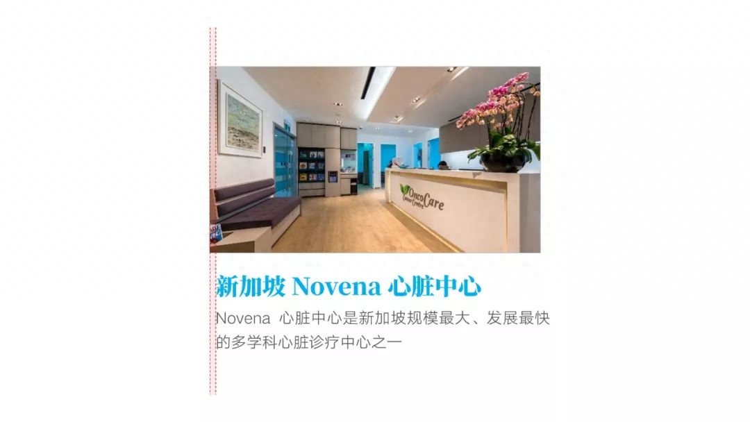
At this time, we can use the guide lines to manually adjust the elements. This allows the elements on the page to be accurately aligned.
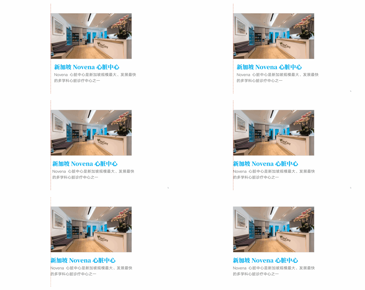
Of course, in addition to assisting in the alignment of elements on the page, guide lines can also help us define the scope.
Excellent slides will have a unified range, like this:
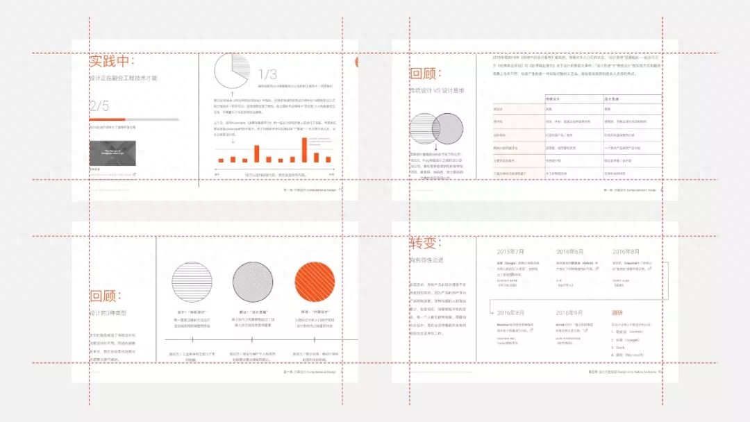
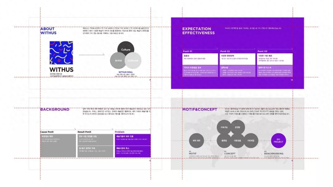
So where is the reference line function?
Take the 2016 version as an example, click View Options> and check the reference line. Two dotted lines crossing horizontally and vertically will appear on the page.
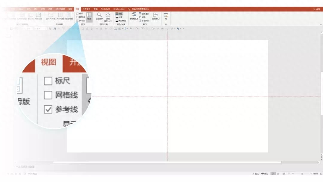
Just manually adjust it to the position you need.
Slide background fill
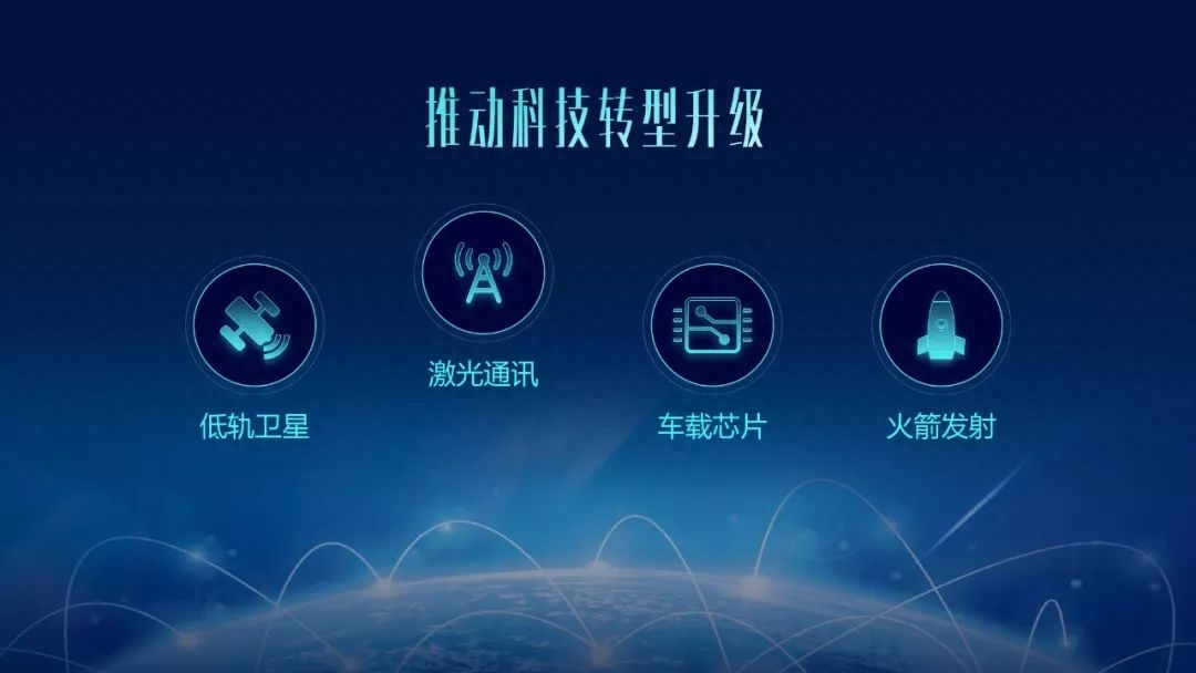
This effect of digital transformation is achieved by using this function!

That's cool, let me teach you how to do it?
1. First set the page background to image fill
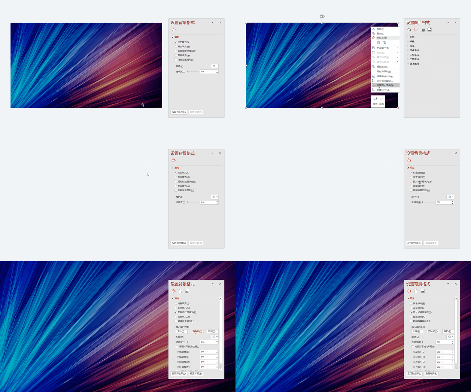
Select the picture and cut it, select the picture or texture fill in the background format, and finally click to insert the picture from the clipboard.
2. Insert 4 text boxes into the page, enter some numbers randomly vertically, and displace the text boxes
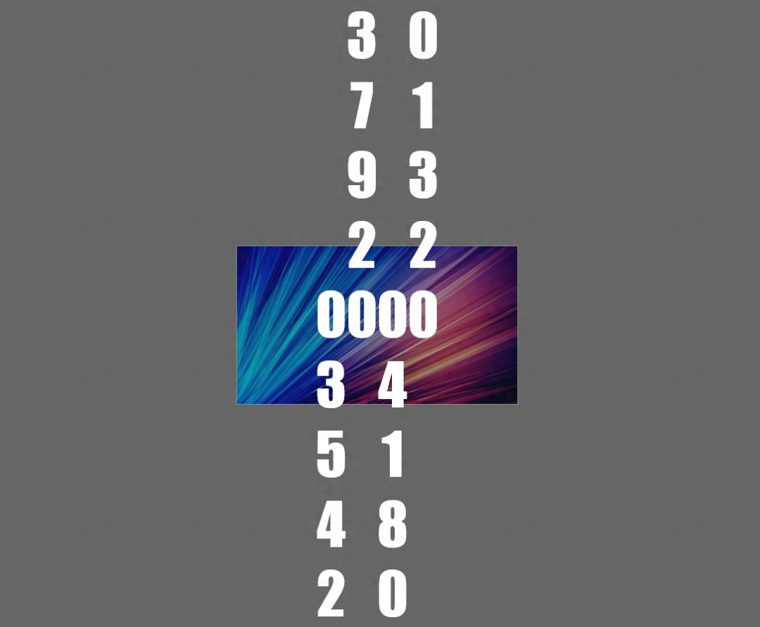
3. Add linear path animation to the four text boxes respectively:
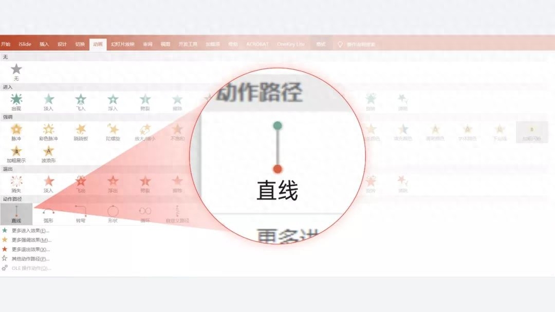
At this step, the general effect of numerical scrolling has been completed:

4. Next, what we have to do is use color blocks to cover the numbers that do not need to be displayed.

Because the color block and the background do not blend in, the page looks very abrupt!
5. Finally, we set the color block as the slide background fill, so that the color block can be perfectly integrated with the page background:

But the important thing is that the first step must be to fill the page background with an image.
Let’s take a look at the effect:

Okay, today I will introduce the cold knowledge about PPT first.
The following are the welfare times:
Click on my avatar, reply to the keyword [Headline Benefits] via private message, and you can get a large number of PPT templates in my collection.
Due to limited space, there are still some cool facts that have not yet been written. Do you still want to read them? You can tell me in the comment area!
Articles are uploaded by users and are for non-commercial browsing only. Posted by: Lomu, please indicate the source: https://www.daogebangong.com/en/articles/detail/dou-9102-le-zuo-PPT-hai-shi-er-ji-shui-ping-zhe-xie-PPT-leng-zhi-shi-rang-ni-yi-miao-bian-da-shen.html

 支付宝扫一扫
评论列表(196条)
测试