- Graphic skills
In the last issue, we learned how to make dynamic charts, but only the data of one project was displayed.
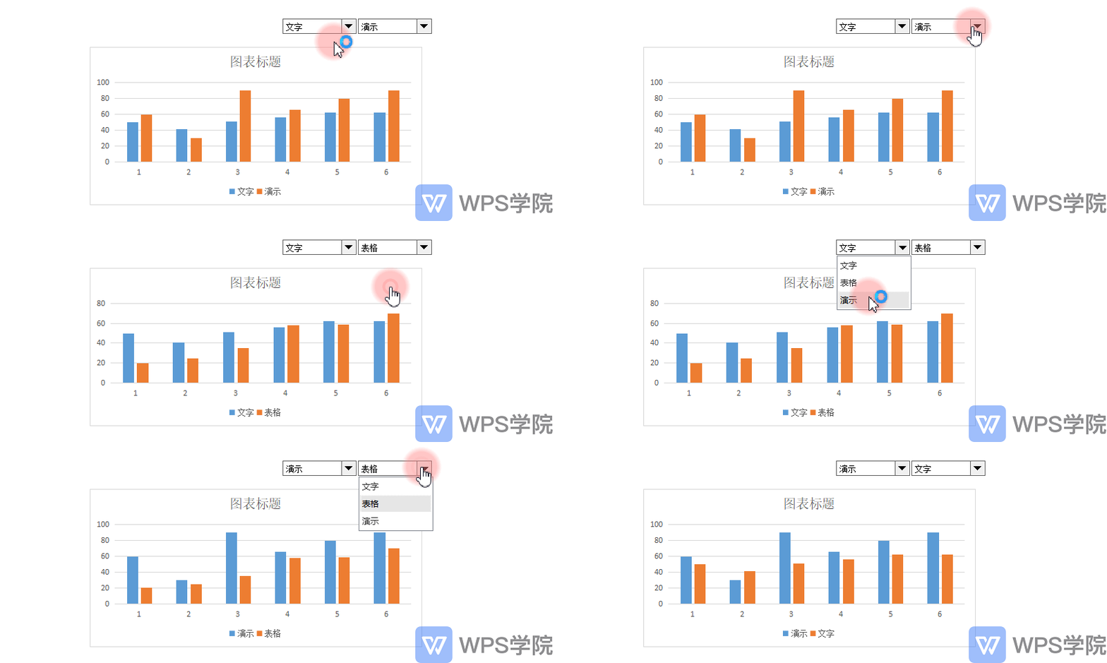
How to create a chart in a table that compares the data of two projects, and can change it at any time through the drop-down box to view the comparison of different projects?
The answer is, just add a control!

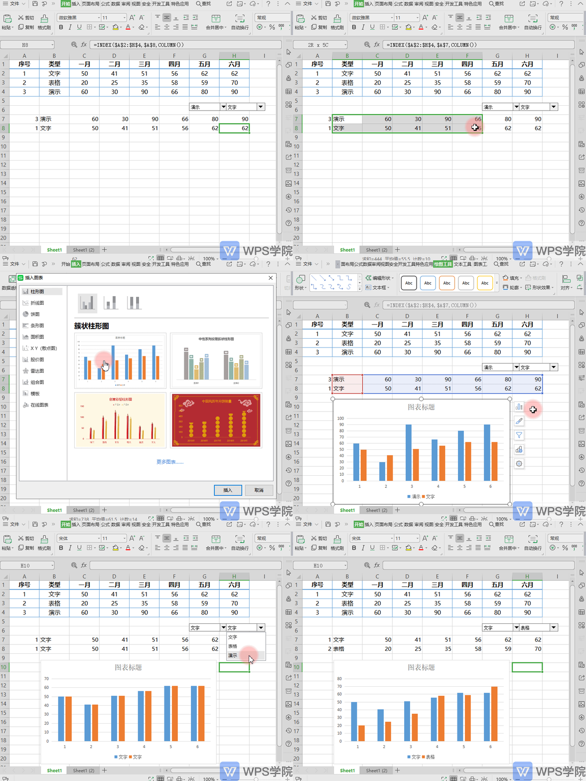
In this table, add a control and a set of data returned by the function. For specific operation steps, please refer to the previous issue "How to Make Dynamic Charts".
Then use the data returned by the function to create a chart. The effect of the dynamic comparison chart is as follows. Switch the controls to generate different comparison charts.

Articles are uploaded by users and are for non-commercial browsing only. Posted by: Lomu, please indicate the source: https://www.daogebangong.com/en/articles/detail/dong-tai-shu-ju-dui-bi-tu-biao-ru-men-jian-yi-zhi-zuo-jiao-cheng.html

 支付宝扫一扫
评论列表(196条)
测试