Welcome back
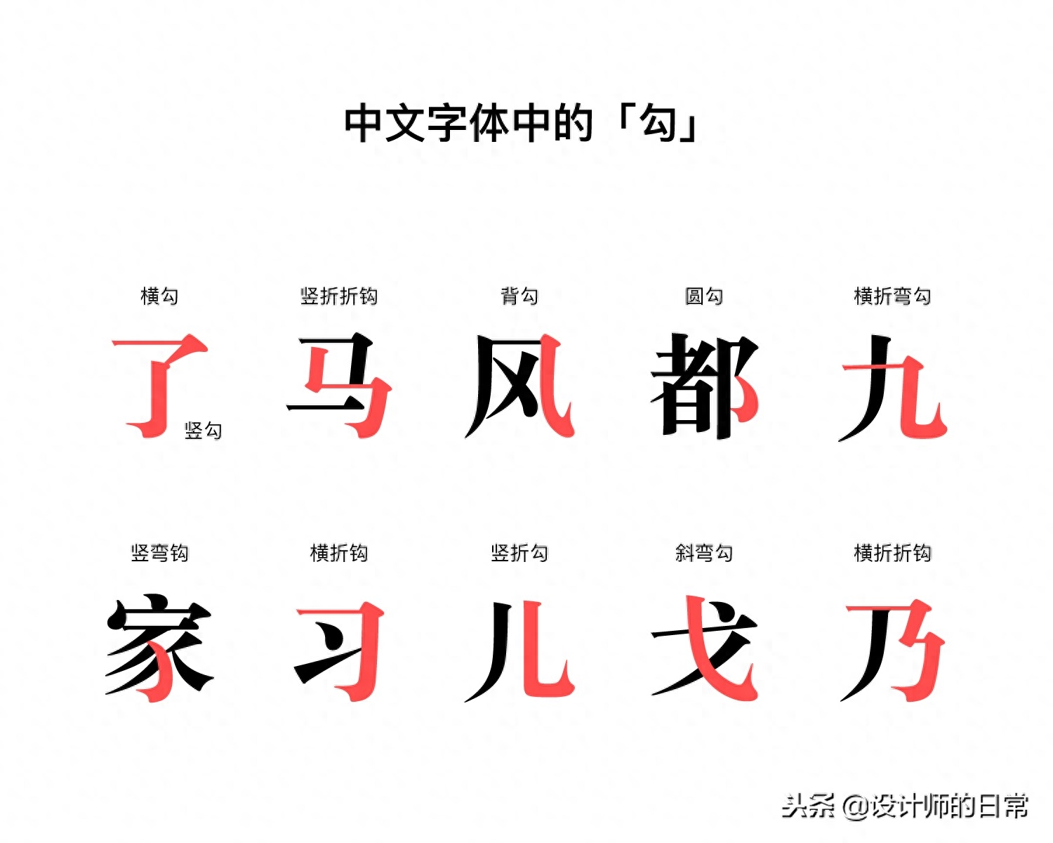
In the previous chapter, we talked about how to identify English fonts. In order not to make the article too long, we will continue to talk about "How to identify Chinese fonts" in this chapter. After mastering the recognition skills of English fonts, it will be much easier to master the skills of Chinese font recognition, but there are still differences in the development and design methods between the two. Each sentence in English is composed of words, and words are composed of twenty-six types of letters; while Chinese characters are square characters, and each word is composed of strokes. The stroke "hook" alone has as many as eleven types of hooks.
When we treat Chinese fonts, the identification characteristics we need to discern are slightly different, but there are still many things in common.
Identification characteristics of Chinese fonts
1. Serif
For Chinese fonts, we can still divide them into two types: "serif fonts" and "non-serif fonts". The "strokes" in calligraphy and the "triangles" in typography can all be counted as serifs. Serif fonts appear more classical and charming, but at the same time they appear rigid, because serif fonts are used in many official documents. Sans-serif fonts are widely used in electronic display media to spread information more clearly, but also lose a little bit of the beauty of calligraphy.
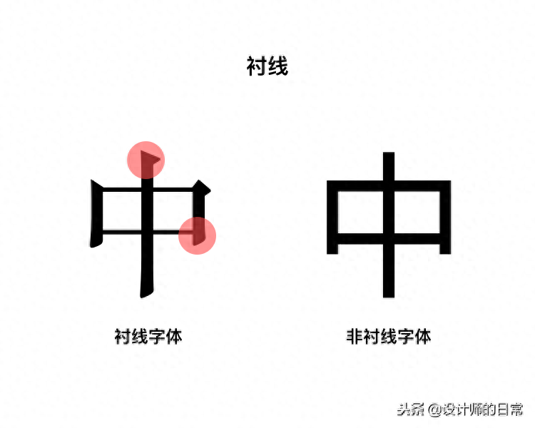
Like English fonts, serif fonts also have various serifs. Comparing serif shapes is a good way to distinguish fonts. Our common Song and Kai fonts are serif fonts, while black fonts are non-serif fonts. Although both Kai and Song fonts can be considered serif fonts, Kai font is more inclined to simulate brush writing, while Song font is sharper and flatter, suitable for printing.
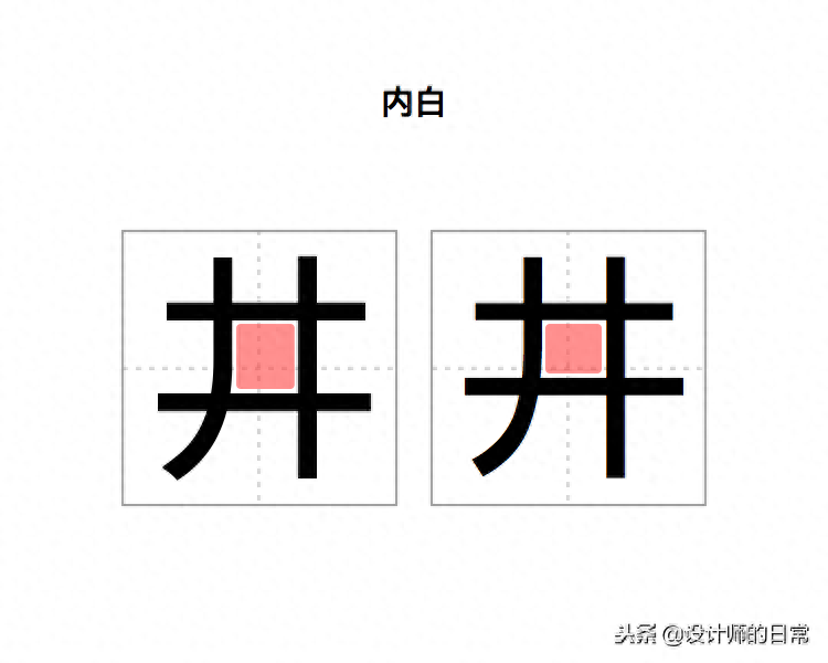
2. Neibai (zihuai)
Like English fonts, the spaces between the strokes of Chinese fonts can be called word pockets or inner white. Different from English fonts, Chinese characters with fewer strokes naturally have larger inner white space, and characters with more strokes naturally have smaller inner white space, while English letters are relatively even.
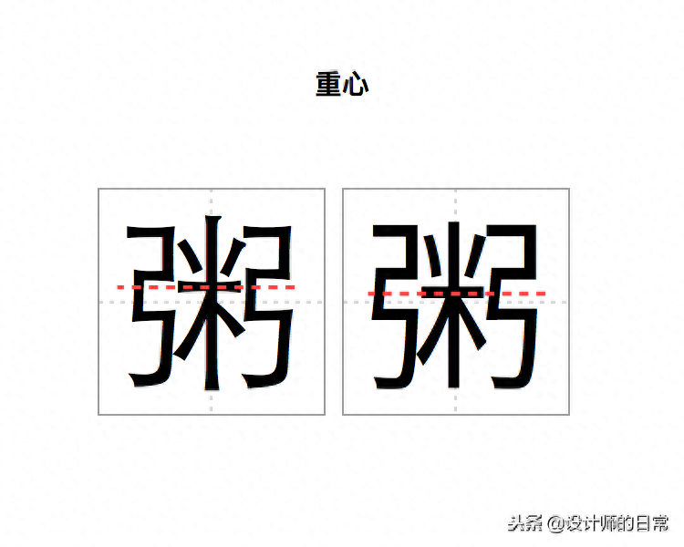
3. Focus
The visual focus of the word. The center of gravity of a set of fonts is almost the same, and the center of gravity of different fonts is slightly different.
4. Small details
(1) Trumpet
A bell is the widening at the end of a stroke. Some fonts have bells and some don't.
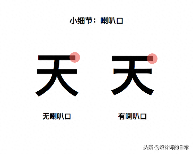
There are many uses for bell mouths: Initially, the middle area was heavily colored during type printing, which resulted in the beginning and end of the strokes being relatively rounded, so the ends of the strokes were thickened to visually align with the middle area, resulting in the bell mouth. But today's screen resolution can accurately display fonts, and the meaning of the trumpet has changed from "optimizing for the media" to "aesthetic options", such as "making the fonts more powerful and charming." Generally speaking, fonts with flares appear less and less frequently.
Here I have to mention a similar example in English fonts-Bell Centennial. Bell Centennial was released in 1978 as a font designed specifically for the phone directories published by AT&T (a US telecommunications operator) at the time. Due to the need to carry large amounts of information while keeping costs down, phone books use very thin, low-quality paper and very small font sizes.
In order to solve the problem of ink diffusion at the intersection of strokes, designer Matthew Carter hollowed out some spaces at the intersection of strokes, so that the ink can be filled automatically after spreading, and it will be visually normal. The design of Bell Centennial and the bell mouth are optimized for the media, and they are also gradually eliminated due to the iteration of the media.
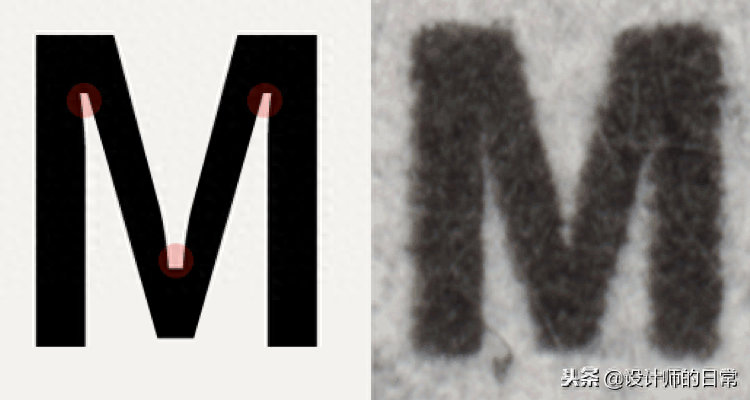
Bell Centennial actual font (left) and the effect of printing on the phone book (right)
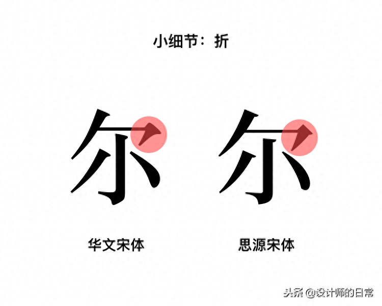
(2 fold
"Zig" strokes are a good way to distinguish fonts. Different fonts may have different "fold" angles, the shape of the strokes (serifs), and the end form of the strokes. As you can see from the picture below, the fold in Chinese Song style has a feeling of the pen leaving the paper at the end. The folds in Siyuan Song-style are more deliberate. It feels like some force was used to leave the paper, making it fuller.
(3 points
I remember when I was writing the word "心" in primary school, these three points were always wrong. "Diandian" in Chinese fonts is more complicated than imagined. The arc, length, and position of the dots may give the font different qualities. Moreover, many characters have more than one dot, which is an important detail that highlights the characteristics of the font. We can distinguish fonts by comparing the simple stroke of "dot". It can be seen from the following example of "three points of water": the "point" of Ping Fang is curved, and the "point" of Flag Black is almost straight.
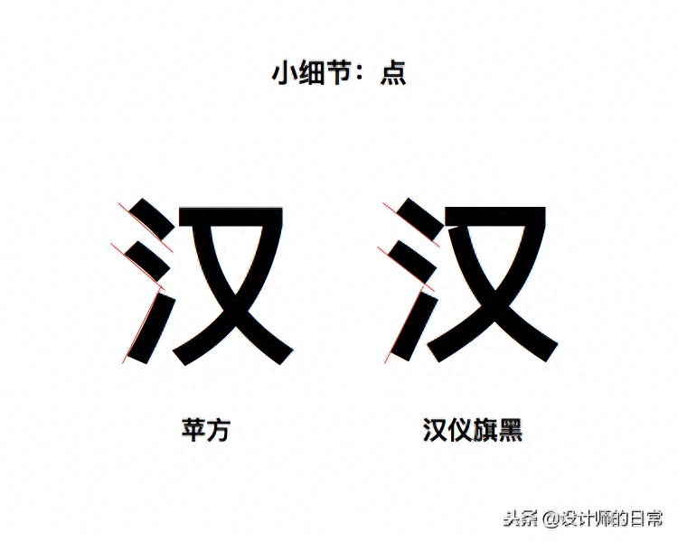
The picture below illustrates the difference a simple stroke like "dot" can make:
Comparison and characteristics of four fonts "dot"
You should know that these are not all Chinese font features, but they are enough for us to quickly identify and distinguish fonts.
Practical application cases
After learning so much knowledge about font identification and doing so many exercises on distinguishing Chinese and English fonts, you may wonder why you learn these? Our answer is "To lay the foundation for the next chapter on how to choose fonts". In fact, you have begun to understand the reasons for "why you choose a certain font". Let's look at an example:
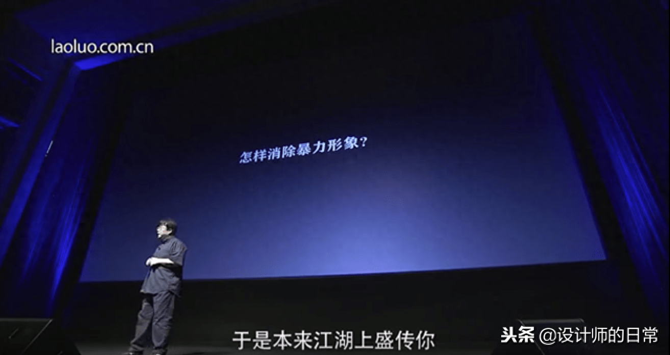
Font selection for Smartisan Technology Conference
Smartisan's press conference slides were once the benchmark for press conferences in the domestic technology industry. Of course, their slide design is constantly evolving, and the biggest change is the change in fonts. The following is a font comparison chart between Smartisan’s first launch conference and the 2018 summer new product launch conference:
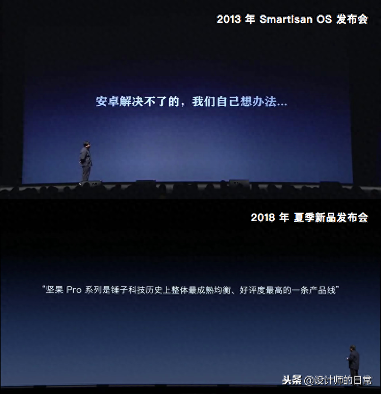
If you have learned to distinguish Chinese fonts, you will be able to tell it at a glance. The 2013 conference slides used a thick serif font, but the 2018 slides have been changed to a Thinner sans-serif fonts. Although Smartisan Technology has not officially explained it, from the perspective of application, I thought about why such a change occurred?
We can first take a look at the slide show environment. As you can see from the pictures, the size of the slide show in 2018 is much larger and wider than that in 2013, which means that the number of people and the venue are also relatively larger. We know that for fonts with small inner white, if the viewing distance is relatively long, the centers of the fonts may be blurred together, while thinner sans-serif fonts can ensure that the words will not be blurred together when viewed from a long distance. This may be one of the reasons for the font change.
Let’s look at the content of the conference again. In the 2013 conference, only the mobile phone system was released, and subsequent conferences will also release mobile phones. The difference between mobile phones and operating systems is that when launching a mobile phone, you need a slide to list all the parameters and selling points, like this:
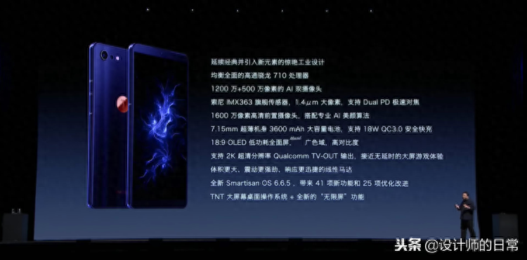
Strictly speaking, the design of this slide is not satisfactory because it carries too much information, making it very stressful to read. But considering that it is more prepared for the media, media teachers can capture all the features of the mobile phone by simply taking a picture of this slide, which is equivalent to the "one picture flow" of the official press conference. Imagine if so much information were in a thicker serif font, the font would be too small and the words would turn into small white blocks with different outlines, which would be very disastrous.
Finally, the font change may also be due to brand image considerations: first, to unify the fonts on the website, promotional materials, mobile operating systems, etc., and also unify the fonts in the slides; second, as a technology company , even for tech companies with a more artistic flair, using thicker serifs can give people a bulky, rigid, retro feel. And these are labels a tech company doesn’t want to have.
Conversely, if you continue to explore Luo Yonghao’s speech slides, you will find that the fonts in the 2013 conference slides actually inherited the fonts in the slides of the series of speeches "An Idealist's Entrepreneurship Story":
At that time, the venue for Lao Luo's speech was smaller than now, and there was no need to list the parameters of a screen. The most important thing was that Lao Luo did not represent a technology company. So in the context of "An Idealist's Entrepreneurship Story", a thicker serif font makes perfect sense. If you use a thin sans-serif, it will look frivolous. Therefore, there is no "good or bad" font, only "right or wrong" font selection.
The above is our analysis of "font selection" based on the knowledge of "distinguishing fonts". I believe you understand the importance of learning to "distinguish fonts". We will explain in detail how to choose a suitable font in the next chapter. Now, let us return to "font differentiation" and use the following three sets of exercises to test our differentiation ability:
Chinese font differentiation practice
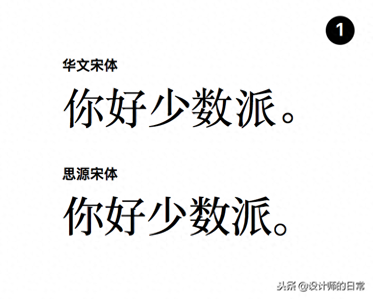
The first question is about two Song fonts from different brands.
Let’s start with a general observation: Comparing the female character next to the word “好” and the inverse text of “number”, we can see that the Siyuan Song style has a larger inner white and the overall body is fuller, while the Chinese Song style is smarter. In addition, the Chinese Song font is narrower and feels taller.
Detailed observation: Both are serif fonts, the serifs of Siyuan Song font are sharper, and the serifs of Chinese Song font are rounder. The vertical hook on the right half of the word "you" in Siyuan Song font is almost in contact with the horizontal fold on the top. When the font is small, it may feel like they are stuck together.
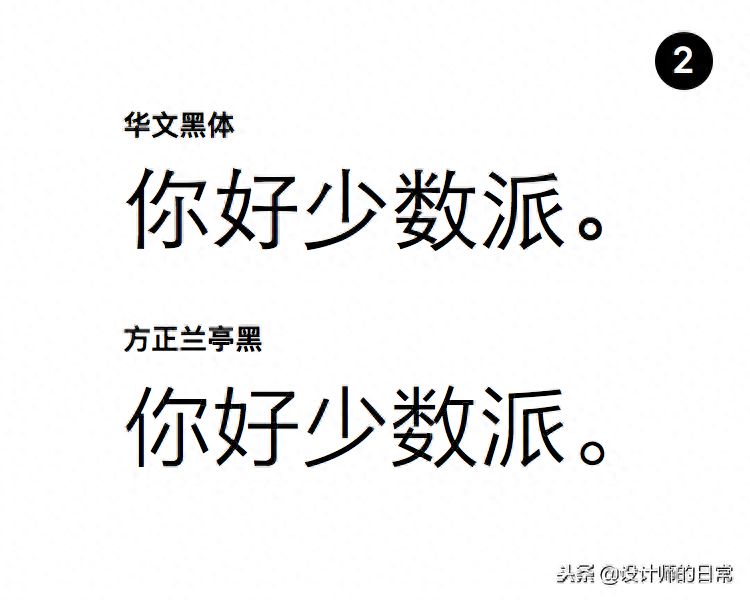
The second question, two bold styles.
The most obvious difference is whether there is a bell mouth. The Founder Lanting Black without bell mouth looks more modern, while the Chinese Black body is more stable.
There is not much difference in the processing of inner white between the two fonts, but the strokes of Founder Lantinghei are more straight-line. For example, the first stroke on the right side of the word "Pai" is obviously curved in Chinese black, while in Lanting black it is closer to a straight line.
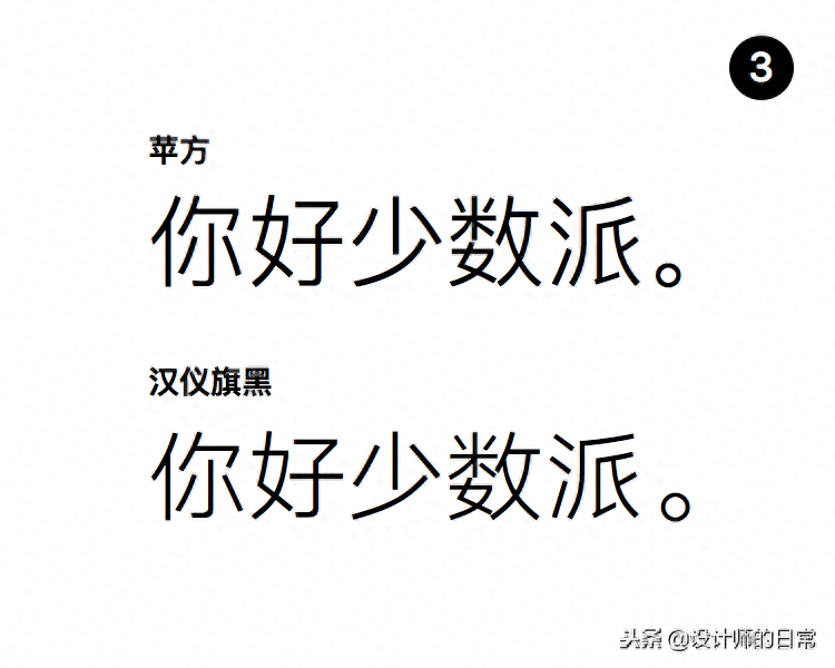
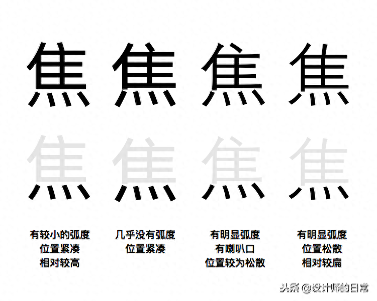
The third question, two black bodies without bell mouth.
Hanyi Qihei and Fangzheng Lantinghei in the previous question both belong to the style where the strokes are similar to straight lines. It can be seen from the inverse text of "number" that the inner white of Qihei is larger than that of Pingfang. In addition, the last long stroke of the character "小" in Qi Hei is more parallel, intentionally making space for the upper part. The overall center of gravity of the font is slightly lower than that of Ping Fang.
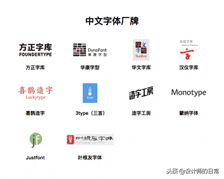
Who is making the fonts?
Chinese font brands include the famous Founder Font, Huakang Font, Hanyi Font, etc. They also design and own a large number of copyrights for text fonts and title fonts, and when naming a font, they often use the brand name. , such as "Chinese Song Style" and "Fangzheng Kai Style". The international manufacturer Monotype also designs many Chinese fonts. In addition, there are brands such as Zaozi Studio, Ye Genyou Font, Magpie Zaizi, and 3type that focus on title fonts. Justfont from Taiwan focuses on producing Chinese web fonts.
So, where do I buy fonts? Compared with English fonts, Chinese fonts do not have a unified platform. They are usually only purchased on the official website of the font brand, and almost all of them are buyout systems, not subscription systems. You can purchase font licenses from the official websites of these brands.
Due to the huge workload of Chinese font design, there are very few independent designers and free fonts. But you will find that there are many "font download websites" where you can easily download fonts that were originally paid. So can this kind of fonts downloaded for free from font download websites be used?
My answer is:Whether it is a Chinese or English font, the scope of its authorization must be clearly defined. For paid fonts, it is not advisable to use them for any purpose without purchasing a license; for free fonts, they will also be divided into two types: "free non-commercial license" and "free commercial license". You must Be optimistic about the scope of authorization before using it with confidence. Having said that, the "font download website" is a gray area. It allows designers to try out the fonts without purchasing them, and use their favorite fonts on the design draft so that they can be purchased when needed. It is also a trap that provides users with the opportunity to use fonts. Possibility of unauthorized fonts.
I highly recommend the designer benefits of Founder Font Library and the free non-commercial license of Zaozi Studio. Both of these font brands provide their fonts for everyone to download and try for free, and you only need to pay the corresponding licensing fee for commercial use.
Recommended reading
"Chinese Type Designer: One Word for Life"—Liao Jielian
Compared with "Western Fonts" recommended in the previous issue, this book has more cultural accumulation. Through interviews with twelve Chinese font designers, it tells the emergence and changes of Chinese font design, and also reflects the changes in society. Although the whole book has a pessimistic atmosphere, you can learn a lot about the hardships behind Chinese font design and the differences from Western fonts.
justfont blog
justfont blog is the previously mentioned Chinese Webfont studio located in Taiwan. Their blog has many articles about Traditional Chinese font design, and the content discussed in the article also applies to Simplified Chinese typesetting. The topics chosen by justfont are very interesting, such as "Strokes are votes: looking at the chief executive election from the perspective of font design", "Typhoon weather, let's talk about the design of Taiwanese characters" and so on.
Type is Beautiful
Type is Beautiful is a Chinese font design blog. Their articles can help you understand the basics of font design, the basics of typography principles and some historical background, without losing interest. Their "Words Talk" podcast is also well worth listening to.
Adobe CJK Type Blog
Adobe's official CJK (Chinese, Japanese, Korean) font blog, including text encoding, historical background, news information, etc. But the language of the blog is English.
Once you have the ability to recognize fonts, you can distinguish the fonts in front of you at a glance after some independent training. This self-directed practice can happen at any time and does not need to be intentional. It can be the fonts you see when browsing the web, fonts on home appliances, fonts on billboards, etc... Pay attention to the fonts around you, they are all exercises.
Conclusion
In this chapter, we learned to identify some characteristics of Chinese fonts, and used these characteristics to do three exercises. We learned about Chinese font brands and where to buy fonts. Finally, we recommended a book about Chinese font designers and three A website related to Chinese font design.
We have finally completed the basic knowledge of Chinese and English fonts. This knowledge is not for us to design a font, but to choose a "correct font". Thank you for reading and see you in the next chapter.
The article was reproduced from a minority group and deleted. Hope to share it with everyone! ! !
Articles are uploaded by users and are for non-commercial browsing only. Posted by: Lomu, please indicate the source: https://www.daogebangong.com/en/articles/detail/dong-dian-she-ji-xi-lie-3-ru-he-qu-fen-zhong-wen-zi-ti.html
 支付宝扫一扫
评论列表(196条)
测试