

Text/Feng Haoyu Although with the maturity of e-commerce and the improvement of Internet technology, richer elements have been added to web pages, text is still an indispensable carrier. E-commerce designs lacking text often cannot bring the most comfortable experience to users. experience feelings.

Text can appear anywhere on the e-commerce interface, whether it is the homepage, product introduction, or navigation. The function of text is not just a written language. It conveys culture and has the additional function of improving the aesthetic value of the web interface. Excellent text design and layout will increase the visual effect of the entire e-commerce webpage, attract users to browse, and thus promote product sales.
First of all, the text must be clearly visible and easy to identify. What consumers seek when consuming online is simplicity, directness, and convenience. Good e-commerce visual design will definitely give consumers a clean and convenient initial visual impression. Secondly, the text in the e-commerce visual design must be easy to read. The typesetting and layout of the text are very important to the viewer’s visual experience. We can design from the line spacing, character spacing or text arrangement.

Finally, e-commerce visual text design is generally light and heavy. On the premise of not affecting the overall style, more appropriately changed text can make the web interface more rhythmic and energetic.


Tab tags are an indispensable part of a web page. In static page design, try to avoid using multiple rows of horizontal tags. You can use vertical tags instead; if there is a structure between tags, you can group the tags. The grouping can be a drop-down menu or Color grouping and other methods; if there is a difference in tag importance or relevance, you can display the most important tags and then add the "more" option; if the tags are all equal to each other, you can consider operating the tag bar, such as Add left and right movement buttons, etc. to allow users to slide or drag.

The Tab label is divided into two parts, the label area and the content area. Tags are divided into selected tags and unselected tags. Generally, the color of the selected tags is clearly distinguished from the background color of the unselected tags, which has a high degree of discrimination. There should be some specific connection between the title text in the tag area, there should be no contrast or parallel relationship between the information, and the title text should also be short and concise. The content area is an overlapping area, and the content on each layer is displayed alternately, which not only organizes the information, but also displays a large amount of content in a limited space. The information can be presented in text or as a logo as shown in the figure below, but the arrangement must be neat and uniform.


Navigation takes the form of column menu settings, auxiliary menus, and other online help on web pages. Web page navigation settings are based on the column structure of the web page and further provide a prompt system for users to browse the web page. Web page navigation is generally divided into three types: primary navigation, secondary navigation, and breadcrumb navigation.

The main navigation is generally located at the top of the web page header or at the bottom of the banner, which can guide visitors to the required information column as soon as possible; the secondary navigation is generally located on both sides of the website. When visitors need to switch to other columns, they can enter through the secondary navigation; Breadcrumb navigation is a location navigation that is used to let visitors know the specific location of the web page they are on. It is a navigation that displays layer-by-layer guidance on the visitor's location on a website or web application.


Whenever there is a form that needs to be filled in on the page, users start to feel a headache, and some users even choose to give up directly. What designers should consider is how to prevent users from being disgusted when they see the form, so that they can directly pay attention to what they need. Fill in the required fields to reduce the interference of other information.

A form has the following six components: label, input box, behavior, help, information, and validation. Labels can tell the user what the element they are about to input means; input boxes allow users to provide feedback, including text input boxes, password input boxes, check boxes, radio buttons, sliders and more; actions are performed when the user presses A link or button that performs the corresponding action when the form performs the action.
Help will provide timely and effective operation guidance when the user fills in the form; information is the system’s feedback on the information entered by the user. The information behind the login name in the above picture is negative feedback, which is not affirmative of the information entered by the user. There are also Positive feedback, such as "user name is available"; verification is the most basic to ensure that the data submitted by the user meets acceptable parameters.

Logo is also essential in e-commerce design. When a user enters a website for the first time, the e-commerce logo is undoubtedly the first thing that enters the user's sight. At this time, if the logo does not have any characteristics, it will be unattractive. May leave zero impression on users. On the contrary, if the logo of an e-commerce website is eye-catching, it can increase the transaction volume of the e-commerce website. As the most important part of e-commerce promotion, the website logo is the most widely used and most frequent visual element.

During the browsing process, users can easily get lost and don’t know where to click. This is where the role of icons in web pages is reflected. Icons can not only beautify the web interface, but also clearly tell the user’s location and what to do next. step. The use of icons on web pages has become one of the effective ways to efficiently deliver information to consumers.

In a general sense, an icon is an image, a representation, a symbol that is important and has lasting utility. Clicking on an icon can produce different behavioral results, such as opening a file or executing a program. In most cases, the image used for the icon is closely related to the content it is intended to represent.

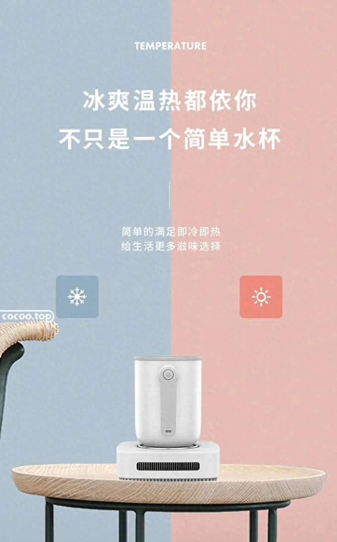
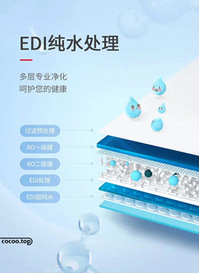
Among the many components of e-commerce design, color can arouse people's visual response more than text and graphics. Reasonable use of colors can classify products on shopping websites, thereby improving users' browsing speed, making it easier to search for the product categories they need, and defining the style of the entire e-commerce page.


① Official headline number: Intelligent design and manufacturing, a must-have for top creative designers
② This article is edited and compiled by Design Intelligence www.cocoo.top. The copyright belongs to the original author. Please indicate the source when reprinting!
Articles are uploaded by users and are for non-commercial browsing only. Posted by: Lomu, please indicate the source: https://www.daogebangong.com/en/articles/detail/dian-shang-shi-jue-li-bu-kai-zhei-xie-yuan-su.html
 支付宝扫一扫
评论列表(196条)
测试