Welcome to Design Empire
Reprinted from | Design IN Taiwan>
There have been a lot of popular predictions lately, and fonts have also joined in the fun. Design media CreativeBoom recently released a list predicting the top 20 fonts that may be popular with designers in 2020. Let’s take a look at them together!
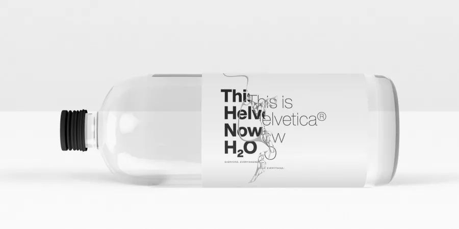
#01HelveticaNow2019
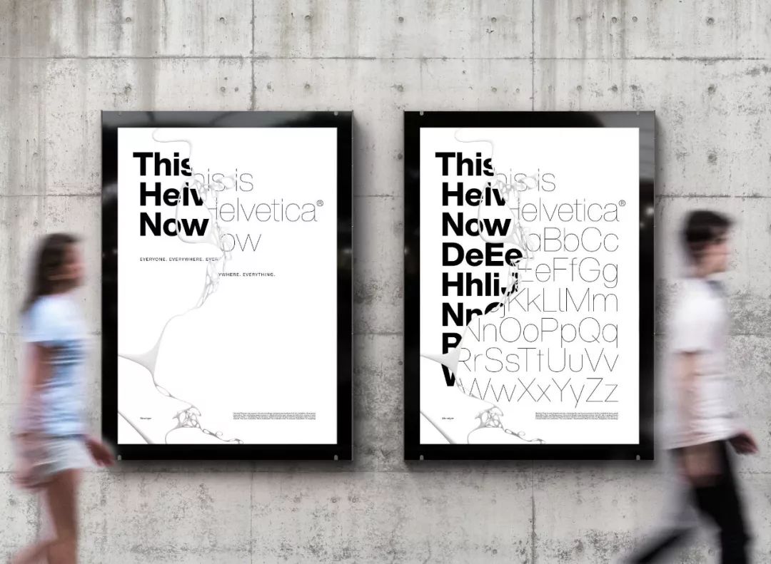
The biggest news this year is that Monotype launched HelveticaNow in April. This is the first redesign of Helvetica in 35 years. Each letter has been redrawn and provides practical options to suit the needs of modern designers.
HelveticaNow has been very popular over the past six months and I believe it will continue to be popular in the future.
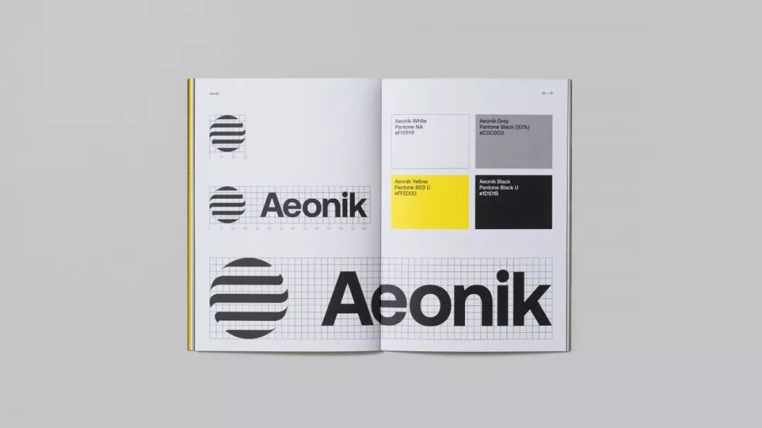
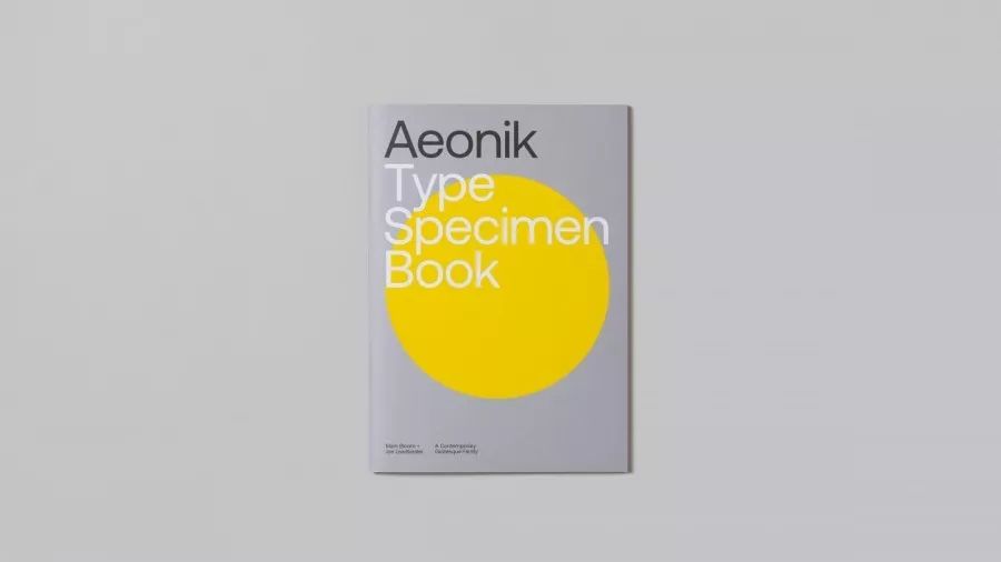
#02Aeonik
Designer Mark Bloom has been working in the font field for many years when he was at Mash Creative. He launched his own brand CoType this year.
CoType's font Aeonik has a strong structure and mechanical details. The designer positioned it as neo-grotesque with a geometric skeleton. It has a total of 7 weights and italic (italic) that can be widely used.

#03NewsSansNewsSans
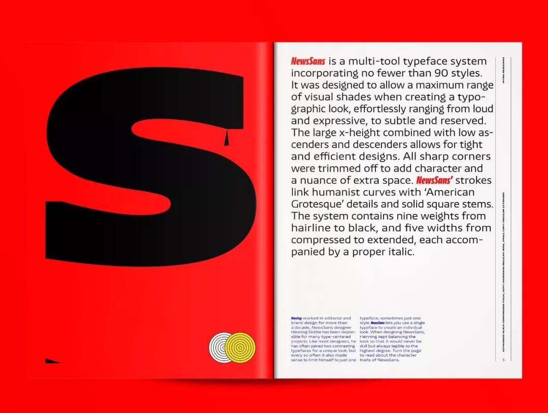
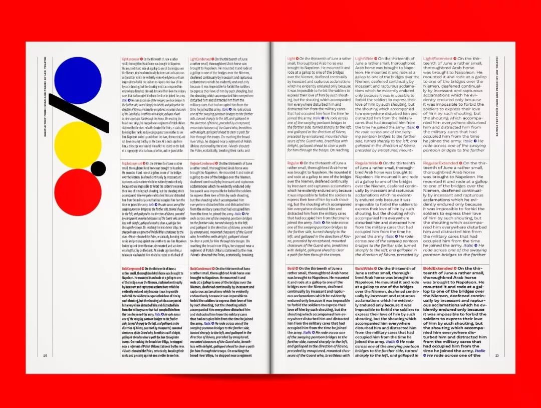
It can create changeable visions and switch freely between noisy and high-spirited emotions as well as low-key and calm. All the sharp corners have been changed into arcs, giving NewsSans a little more personality.
There are a total of 9 font weights and 5 widths to choose from, all with italics. A free trial version of NewsSans can be downloaded at charactertype.com.
#04BeatriceDisplay
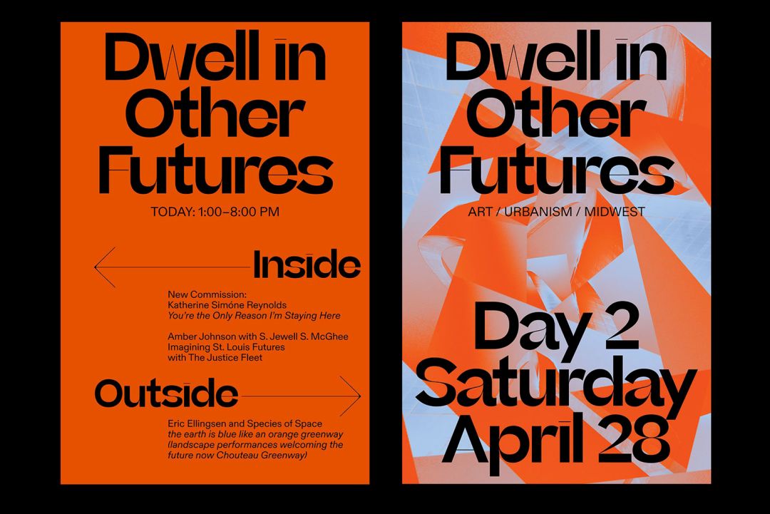
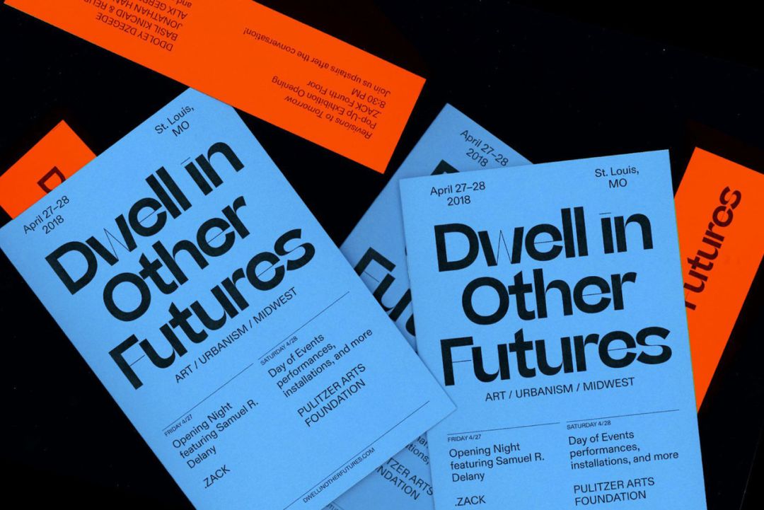
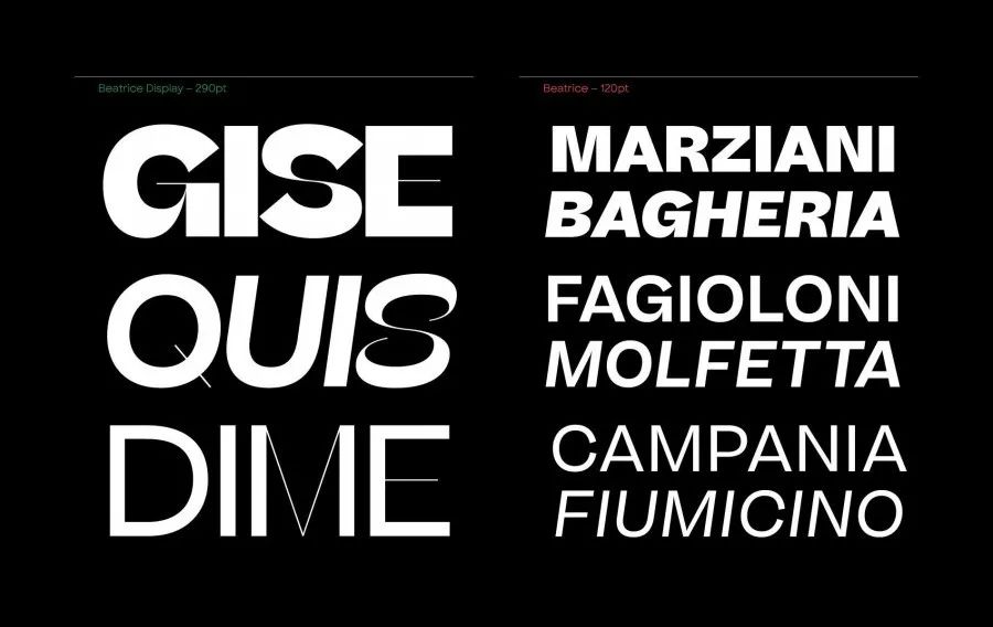
Beatrice, newly released by New York font company SharpType, is based on traditional American Gothic and tightens the character spacing. The Beatrice font family provides many character weight options, including high-contrast, tight character spacing BeatriceDisplay (pictured below, left), and standard Low contrast fonts.
#05UntitledSansUntitledSans
It comes from Klim, the New Zealand font company that launched caliber, and belongs to NeoGrotesk sans serif.
The design of UntitledSans is derived from traditional typefaces between the Caslon and Times periods. This font is highly used and can be seen in many works.
Articles are uploaded by users and are for non-commercial browsing only. Posted by: Lomu, please indicate the source: https://www.daogebangong.com/en/articles/detail/da-zao-yong-heng-ying-wen-zi-ti-zhang-wo-liu-xing-qu-shi-rang-ni-de-zi-ti-she-ji-yong-bu-guo-shi.html

 支付宝扫一扫
评论列表(196条)
测试