The ancients said that words are like people, just like fish and water blending together, seeing words is like seeing people.
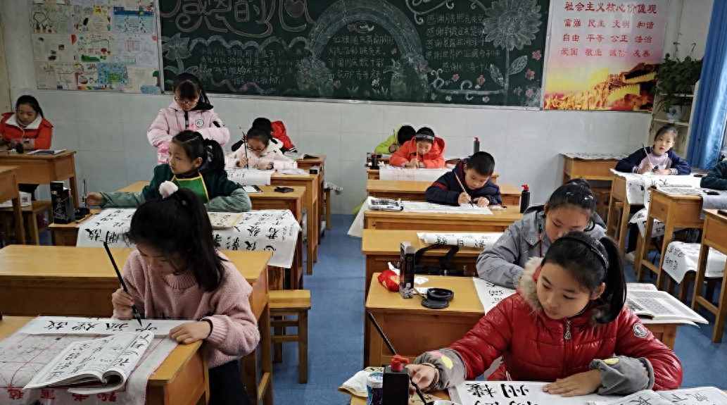
This sentence illustrates the importance of good calligraphy. However, in today's society, few people regard "calligraphy" as a required course. In the Internet era, electronics have gradually become popular, and handwriting has degenerated into a "rare species".
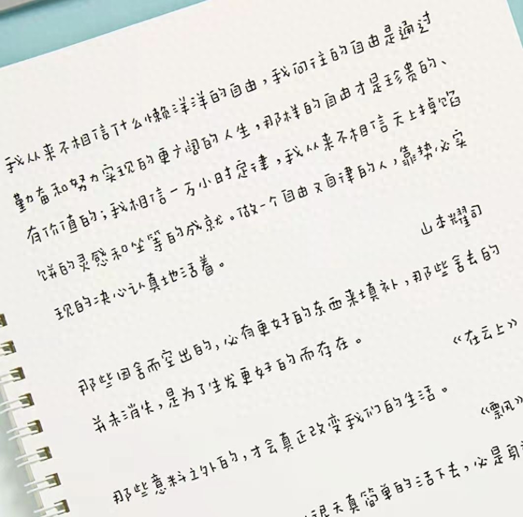
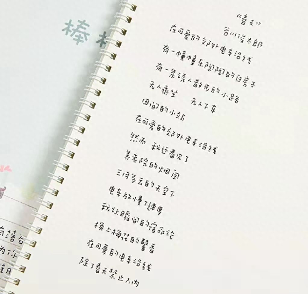
Beautiful fonts have become a rare thing in the eyes of teachers. The "rice ball font" created by a female college student has become popular. It has a round, chubby shape, is very cute, and is admirable.
The "rice group" of college girls became popular, their handwriting was round and chubby, and the teacher was amazed after reading it
College students are different from middle school and high school students. They have more free time arrangements and can also develop some extracurricular hobbies to enrich themselves. Especially some female college students are not willing to "live wildly" after class, so practicing calligraphy has become a pursuit of many people.

Not only do they try handwriting some common fonts, but they also create various beautiful new fonts. There was a time when retro "address books" made a comeback, and female college students were the "creators" of the new generation of fonts.
The most eye-catching one is the round "rice ball font", which quickly became popular and caused many college students to imitate it.
The reason why it is called "Fan Group" is mainly due to the shape of the font. This font does not have the smoothness of running script, the strictness of regular script, and the firmness of wild cursive.

On the contrary, the "fan group" is small and shy, with a cute atmosphere, which is very suitable for girls to practice. Even the teacher was amazed when he saw it.
However, the teacher still reminds everyone that although this font looks beautiful, it is not recommended for writing in exams. It doesn't matter whether college students keep accounts or write in daily life. The key test is to write straight Chinese characters on the board. Don't use this font to "fill up the numbers".

In fact, many Internet celebrity fonts have become popular in recent years, including the well-known cheese fonts, whale falling fonts, vine fonts, etc. These are new fonts invented by people in their spare time.
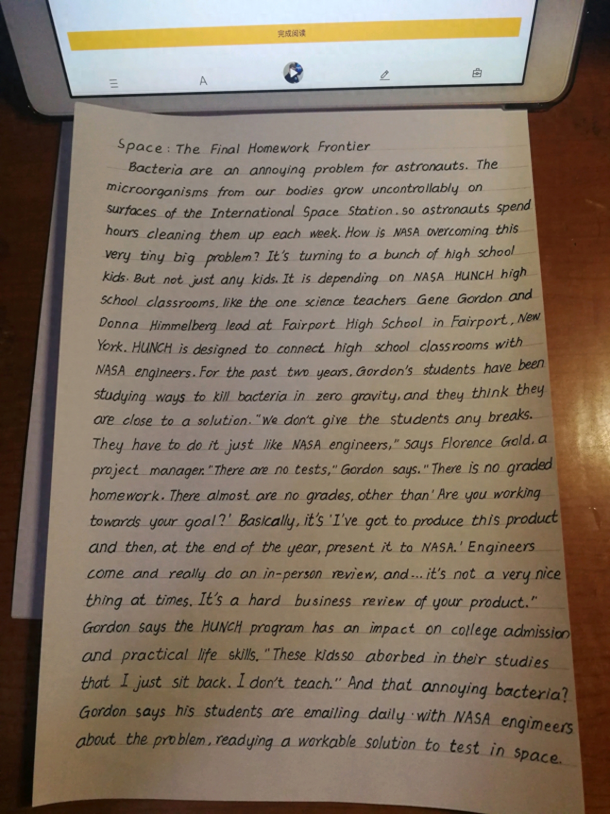
Some are suitable for writing during exams, while others can only be used by hand and cannot be used on the table. Among them, the most suitable font for the exam should be "Hengshui Style", which is an "officially certified" font that everyone is encouraged to practice.
The "Hengshui body" is neat and tidy, horizontally and vertically, making the paper look very neat and uniform. This kind of test paper is very pleasing to the teacher. Compared with Hengshui, the cute "fan group" seems less formal, but more like daily writing, used to relax oneself.

For college students, exams are not particularly frequent. Except for midterms, finals, postgraduate entrance examinations, etc. of each semester, there are few formal large-scale exams, so it is more free to choose the font you write in.
The situation is very different for middle school and high school students. They need to go through non-stop "exam bombing" and it is not recommended to practice new fonts such as "Fan Group" after class. Not only is it a waste of time, but it may also be a thankless effort. If you even throw away the original font, it is a bit of a waste.
Middle school and high school students should still practice calligraphy in a disciplined and disciplined manner. There is no need to pursue aesthetics too much. "Horizontal, horizontal and vertical" is always the essence of Chinese characters. Try hard to use "clean and neat" fonts. This effort must be done in daily life and you must develop good writing habits so that you can do well in the exam.

The editor has something to say:
Regarding the various new fonts that have become popular in recent years, the people involved generally enjoy them, but the elders and teachers cannot stand them. In their view, many fonts have lost the most basic essence of Chinese characters and are not rigorous enough.
On the contrary, the editor feels that we can try to adopt an inclusive attitude towards this matter, and we need to "treat it differently" in stages. Just like the college students mentioned above, it doesn't matter what they try in their spare time. After all, they have plenty of time.
For middle school and high school students, it is not recommended to waste a lot of time on practicing Internet celebrity fonts. It is better to write more questions.
With the improvement of social tolerance, multi-angle innovative fonts are also a manifestation of personalization. There is no need to overdo it and think that it threatens the "survival" of Chinese characters.
Do you recommend students practice with a variety of new fonts? Tell us your opinion in the comment area~

(The pictures in this article are from the Internet and have been deleted due to infringement.)
Articles are uploaded by users and are for non-commercial browsing only. Posted by: Lomu, please indicate the source: https://www.daogebangong.com/en/articles/detail/da-xue-nyu-sheng-fan-tuan-zi-ti-zou-hong-zi-ji-yuan-run-pang-du-du-lao-shi-kan-wan-zan-tan-bu-yi.html

 支付宝扫一扫
评论列表(196条)
测试