Editor's note: While admiring the beautiful and handsome appearance, you can also learn the character characteristics of the font. Today, Ali’s classmate Dao Shi will use an interesting way to popularize the character traits of Chinese fonts. As the saying goes, “Words are like the person they are.” After reading this article, you will quickly understand which font type you belong to!
Daoshi mentioned that we usually do not directly connect fonts with personality, but it is easy to connect fonts with appearance characteristics. For example, when we see a soft, fresh, and timeless font, we may take it for granted that it was written by a gentle and sweet woman. On the contrary, if we see a middle-aged man with a rugged appearance, a beard, and a regular fitness routine writing with a pen, we may expect that he will write strong, angular words.
This feeling arises, Daoshi believes, because of the innate attributes of Chinese characters. Chinese characters originated from hieroglyphs, the earliest oracle bones. The origin of writing is pictures. Pictures were simplified into symbols. After a long period of evolution, symbols formed today's writing. Therefore, words are still essentially graphics to us. It is natural for us to associate physical features with words.

Our prediction of a person's handwriting actually projects the person's physical features (especially facial features) onto the text.
To illustrate with a specific example, let us first consider what physical characteristics a normal male may have:
They usually have thick and straight eyebrows, large and straight nose bridges, hard eyes and faces, and angular facial contours. Some even have tough wrinkles on their faces like knife carvings.
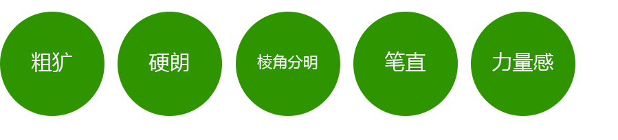
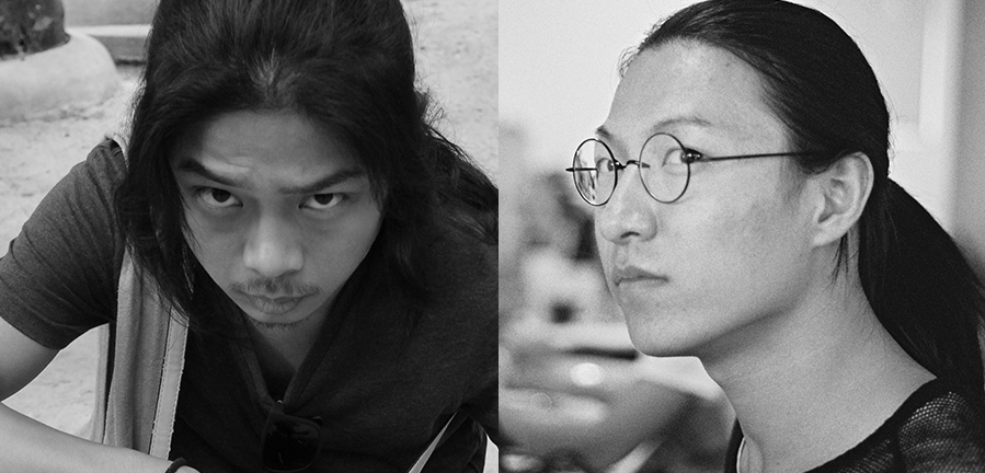
Looking at the two long-haired designers on our team, one has a strong masculine vibe, while the other is often nicknamed “girly.” The reason behind this is the amount of graphic traits that men have. These characteristics can be described using the following words:
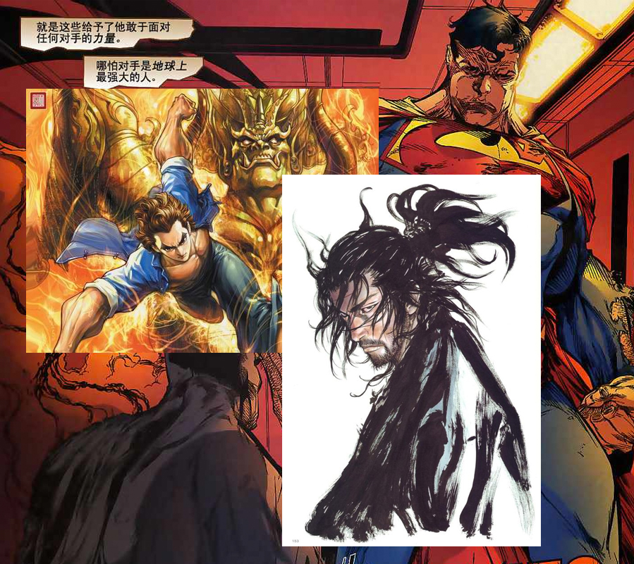
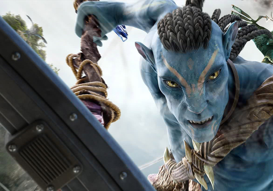
Correspondingly, masculine graphic expression techniques will also reflect these characteristics. For example, the male comic characters below all have the characteristics of the keywords we mentioned.
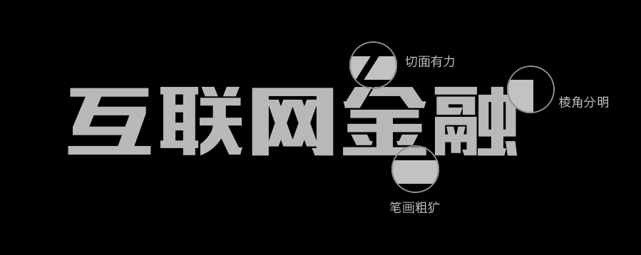
The same graphic characteristics can also be applied to text. Text that has characteristics such as roughness, hardness, strength, sharp corners, and a sense of strength is masculine text. For example, the font shown below has these characteristics:
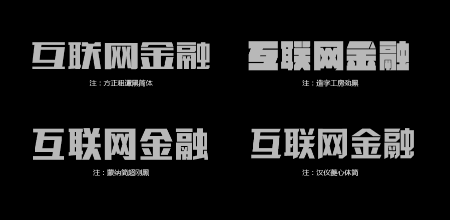
Take the fonts recommended below as another example. They all have the above graphic characteristics and can be regarded as masculine fonts.

These recommended fonts are not comprehensive. They are just fonts that Dao Shi personally thinks are more beautiful and are used more often. Other fonts with the same graphic characteristics are also masculine fonts, and you can choose accordingly.
Now that we understand masculine fonts, how should we apply them? Masculine fonts are usually used in designs where men are the main working group or consumer group. This can enhance the masculine atmosphere of the design and produce an effect greater than one plus one. For example, in this year’s World Cup held in Brazil, football, as a sport mainly participated by men, almost all used this masculine style font in all related designs.
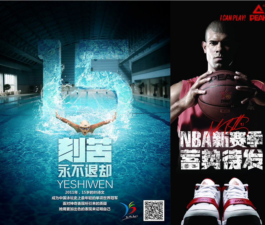
Football aside, most sports give people intense, intense
Articles are uploaded by users and are for non-commercial browsing only. Posted by: Lomu, please indicate the source: https://www.daogebangong.com/en/articles/detail/chuang-yi-zi-ti-she-ji-tan-suo-wen-zi-de-duo-yang-xing-yu-biao-da.html
 支付宝扫一扫

评论列表(196条)
测试