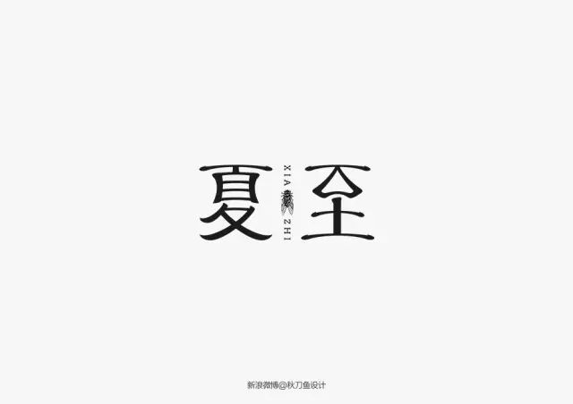
1. Borrowed words for “Western Chinese style” and “Ancient Chinese style”
This design method may not be very popular with Party A, because in Party A’s view, it only makes minor changes to the strokes, but the cost is close to designing a poster. They may choose to find suitable ones in the office font library. font.
 Kashiwa Sato: Le Cuitei Museum of Art
However, borrowing strokes from ancient characters or other countries’ characters actually tests the designer’s skill and accumulation. Because the changes are small, a more sophisticated design is needed to attract people's attention; this requires designers to continuously learn and understand calligraphy and glyph design from ancient and modern times, both at home and abroad.
 Designer Saury's work
If you want to express a rustic texture without looking monotonous, try adding images or English characters around the text.

2. Split geometric figures
Replace the original angular or rounded parts with geometric shapes such as squares, rectangles, trapezoids, circles, etc. to create a rounded or tough style.


This approach has a clear structure and makes it easy to draw inspiration from architectural elements. If the client has a physical store, certain features of the building structure (exterior or interior) can be adopted to make the font design more consistent with the brand style.
 Musashino Art University Poster
3. Integrate into the image
Similar to dividing geometric figures, incorporating images also requires converting Chinese characters into patterns, but the former is more concrete. Chinese characters, due to their totemic and hieroglyphic origins, are easier to design interestingly than English.
 Oracle
Integrating the image is to restore the Chinese characters to their original form - pictures, but this design needs to consider the brand image. If the pictures in the glyphs can be cleverly used to express the functions of the product or store, the effect will be very good.

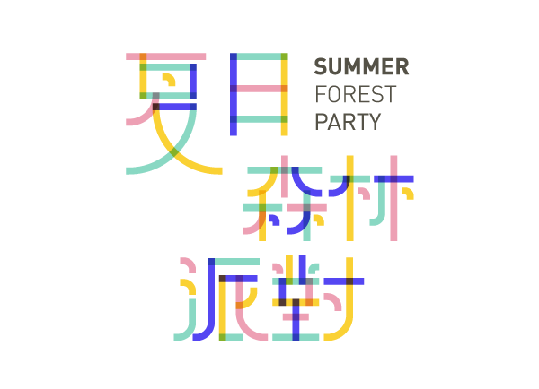
4. Line vectorization
Similar to MBE-style vector design, Chinese characters can also be converted into pure lines. Although this will cause the font to lose the thickness variation of each stroke, the orderliness of the lines helps to create a unified visual effect.
 Works by designer TaiChung
Articles are uploaded by users and are for non-commercial browsing only. Posted by: Lomu, please indicate the source: https://www.daogebangong.com/en/articles/detail/chuang-yi-zi-ti-she-ji-liu-ge-du-te-de-ji-qiao.html
 支付宝扫一扫
评论列表(196条)
测试