(This article is original and the copyright belongs to the author)
The evolution process of fonts is very complicated. It has evolved from oracle bone inscriptions to hieroglyphics, from bronze inscriptions and small seal scripts to traditional Chinese characters, and now to today's simplified Chinese characters. It has gone through thousands of years of changes.
It is said that“Words are like people.”A person’s handwriting can project many kinds of details, such as personality, insight, knowledge, etc., which can all be reflected in a person’s handwriting.
And our country is a country with a history of more than 5,000 years. The font has evolved several times before we have the simplified Chinese characters we have today. This is the most precious wealth left to us by our ancestors.

When we first went to school, the teacher taught us how to write, starting from the simplest "one" until we gradually became more proficient, and the font was slowly formed during this period.
At this time, we can see the words written by the students. Some are neatly written, some are scrawled, some are written horizontally and vertically, and some are written crookedly.
And some students will have "moths" when writing, writing a word in another way.

"Cheese font" became popular among students.
Many teachers have reported that a "cheese font" is quietly becoming popular among students, and it has become popular among many students, with several students in a class imitating it.
The so-called "cheese font" is actually a software font on the Internet. Different from wild cursive script and strict regular script, cheese font is a relatively "soft" font.
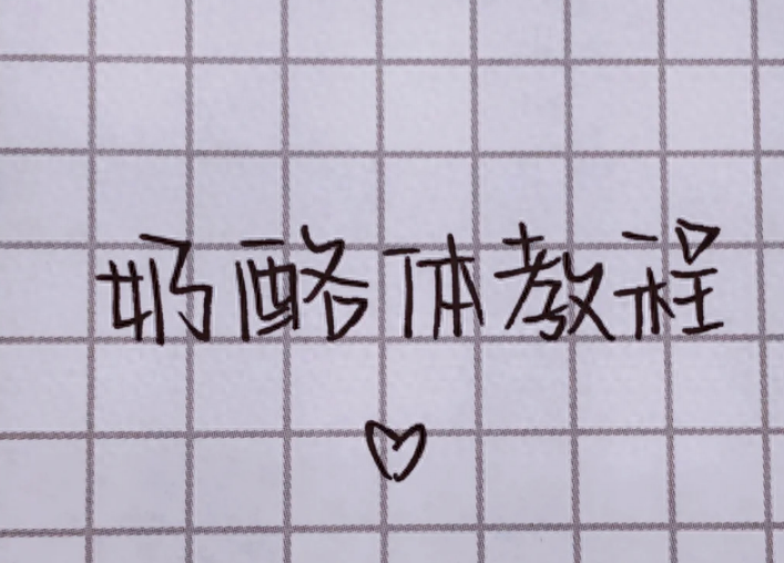
Other fonts pay attention to horizontal and vertical lines, but the cheese font does not pay attention to these. The font is crooked and occasionally has some expressions, which makes it look unusually cute.
Therefore, cheese font is very widely spread among junior high school girls, andmany girls are learning this cheese font.
But the cheese font does not look standardized.
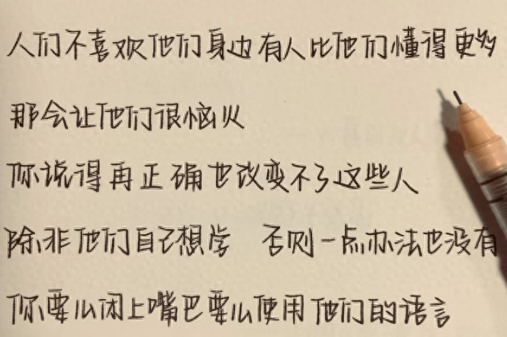
Maybe when you see the picture above, you don’t think it’s anything, but when you see the picture below, you feel a little dizzy.
The cheese font is not a font in the traditional sense. It is okay to write one or two characters. Once you write a lot, the crooked characters will make it difficult to read clearly.
Especially when writing a composition, the words are almost all next to each other. When the teacher looks at them, there will be a feeling of being densely packed, which is not so good-looking.

What are the negative impacts of cheese fonts?
I have been a paper judge before, and as someone who has been there, some of the words written by the students do make people feel a little "annoyed".
The teachers who judge essays have a relatively heavy workload. When judging essays, theylike students whose handwriting is clear and neat, and they are also willing to give high scores.
When you see such dense fonts, you will feel a little irritated. For such fonts,the teacher is likely to deduct wrong points because of "not being able to see clearly".

Then everyone must have questions, which font is the teacher’s favorite?
In fact, teachers’ requirements for students’ fonts are very simple. There should be no gaps between words but they should not be close together. The fonts should be neat and clear.
Some netizens may think: When we were in school, the teacher only said that it was enough to be able to see clearly. There were not as many requirements as there are now.
However, times are changing, and competition among students is becoming more and more intense. Clean scrolls will score more points than messy scrolls, and neat fonts will score more points than sloppy fonts. This is also A fact.

Therefore, it is best for students to keep in mind several methods of practicing calligraphy and writing.
- Master writing posture
From the first day of practicing calligraphy, the teacher taught us a formula, which is "one foot, one inch, one punch". As long as you pay attention to these three, you will master the most basic method of practicing calligraphy.
To put it simply, "one foot" means that the student's eyes should be kept one foot away from the book, "one inch" means that the part where the pen is held should be kept one inch away from the book, and "one punch" means that the student's eyes should be kept one inch away from the book when reading and writing. A punch's distance from the desk.
If students can master this formula, they can improve their reading and writing skills, and they will be less likely to suffer from myopia.

- Don’t rush when writing
Writing is a relatively time-consuming process, and many students are almost "flying" at the end of writing because they do not have enough patience.
This is because parents did not set good rules for their students when they were young. As a result, students did not have a good concept of writing and wanted to finish writing quickly and complete the task before going out to play.
Therefore, if parents want to correct their students' writing, they should avoid making them impatient and allow them to calm down and write stroke by stroke. Over time, the writing will become more and more beautiful.

- Practice copybook
Maybe some parents will give their students the task of practicing calligraphy, and when students first start practicing calligraphy, it is best to start practicing with regular script.
This is because regular script is the entry-level font for all fonts. It is gradually evolved from official script and becomes more simplified. It pays attention to horizontal and vertical directions. This is also the teacher’s favorite A font.
Moreover, it is also very suitable for today's students in the beginning, because the students' books are also in regular script, and the students have reference materials for reading every day, so they can practice calligraphy better.

After reading this article, do you think the cheese font is really good-looking? What font do you think you wrote in? Welcome to leave a message for discussion!
Articles are uploaded by users and are for non-commercial browsing only. Posted by: Lomu, please indicate the source: https://www.daogebangong.com/en/articles/detail/chu-zhong-sheng-kai-shi-liu-xing-nai-lao-zi-ti-zi-ti-ke-ai-que-bu-bei-chang-dao-lao-shi-nao-yan-jing.html
 支付宝扫一扫
评论列表(196条)
测试