
Good evening everyone Yeah, I’m Brother Li~
Last time I shared with you the PPT beautification of the Internet car rental report. Maybe you haven’t done it yet. Enough to watch.
Still like this today A copy of the original manuscript and continue to beautify and revise it.
This PPT , a total of 4 pages, including "Cover Page", "Timeline Page", and "Content Page".
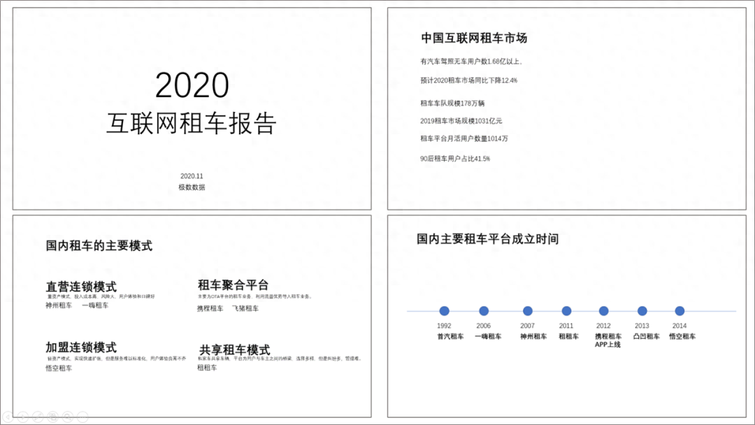
Before we start production again, let’s follow the old rules It is necessary to determine the "style" and "color matching" of the PPT.
Generally, this kind of business report is directly There is absolutely nothing wrong with using business style.
For color matching, I used "Dark gray" and "orange" are the main colors, and "yellow" and "white" are the secondary colors.

After determining the color, we can start typesetting.
Cover production
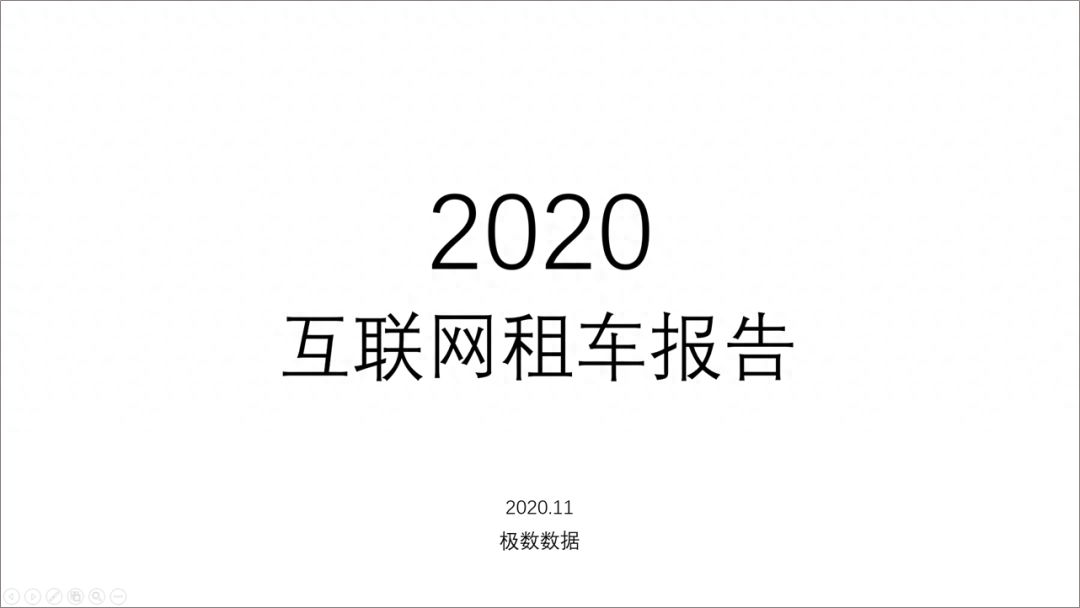
The layout of the cover is actually very simple and cannot be That is "center-aligned", "left-aligned" and "right-aligned".
Align the copy to the left and place it on the right A picture is the most common type of layout.
We can first adjust the font size of the copy and layout position.
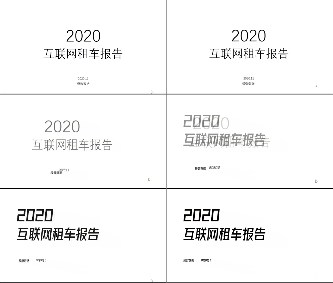
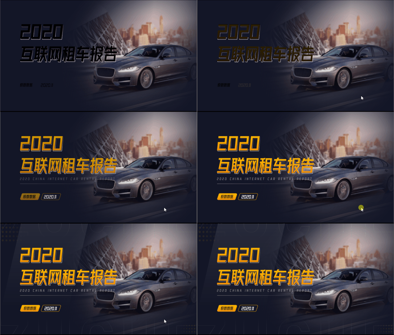
The copy on the left has been placed, and the right can be placed A picture of a car that is relevant to the copy.
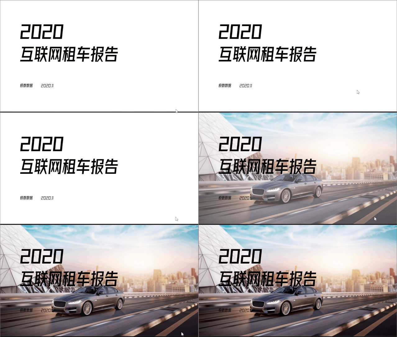
But the position of the car in this picture is in the middle, It looks like there's "space" on the right, so we can crop the image.
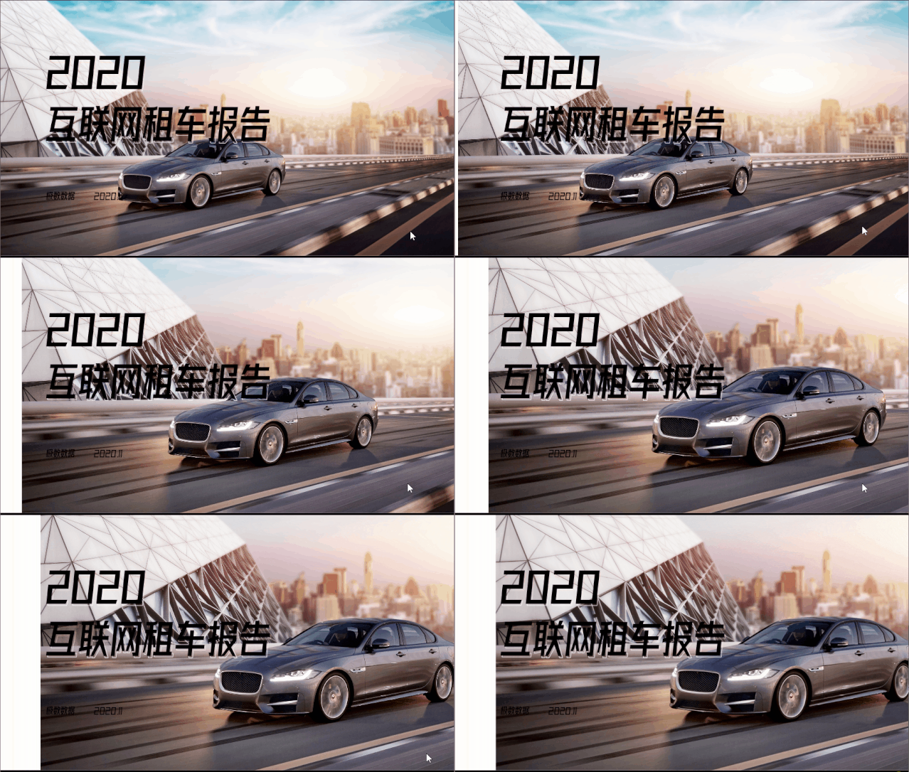
The picture here has been cropped, but There's more white on the left. At this time we can add a mask to block it.
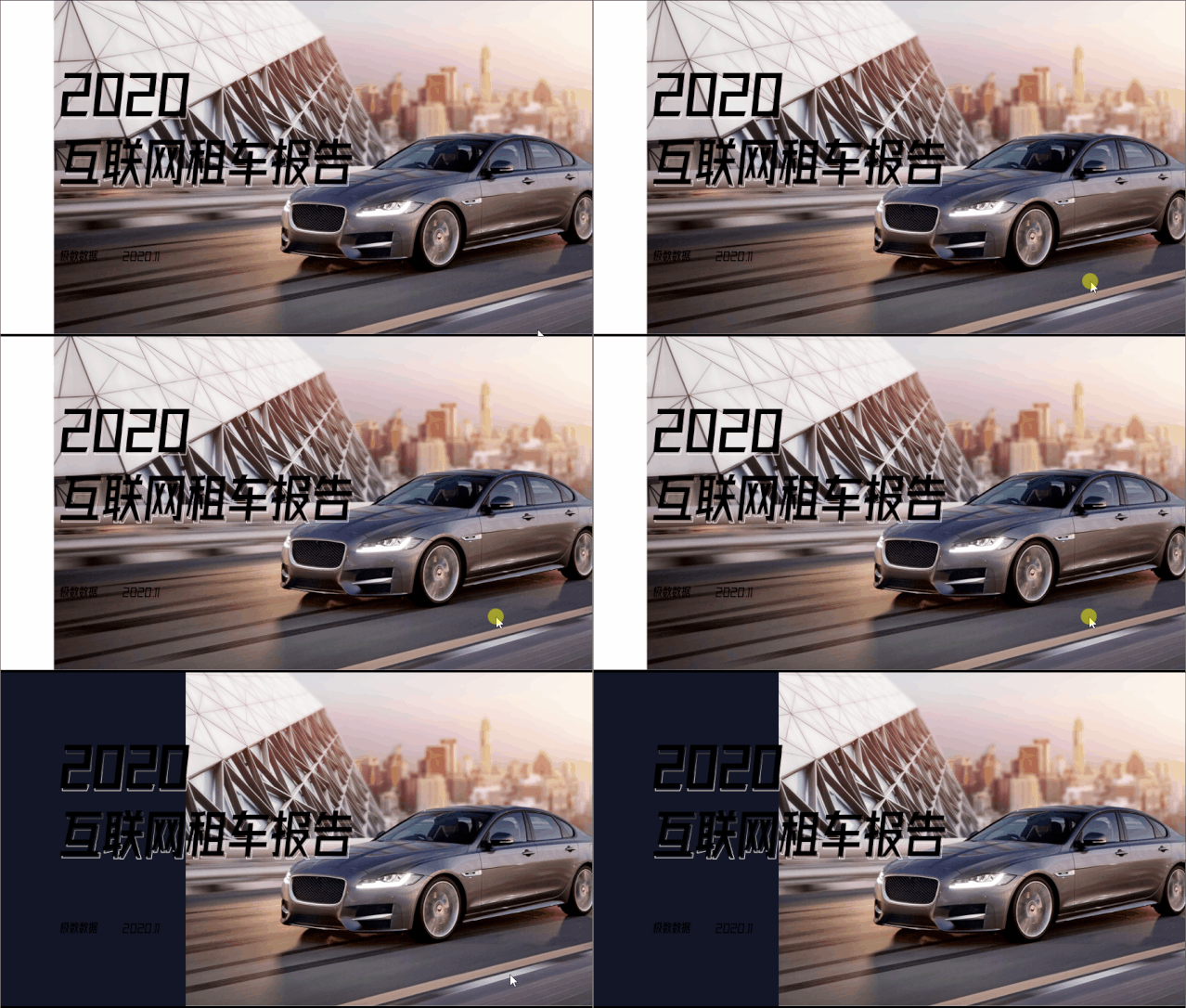
Some people here may be wondering why this blurry The version is so small. In fact, I also need to add a mask separately on the right side.
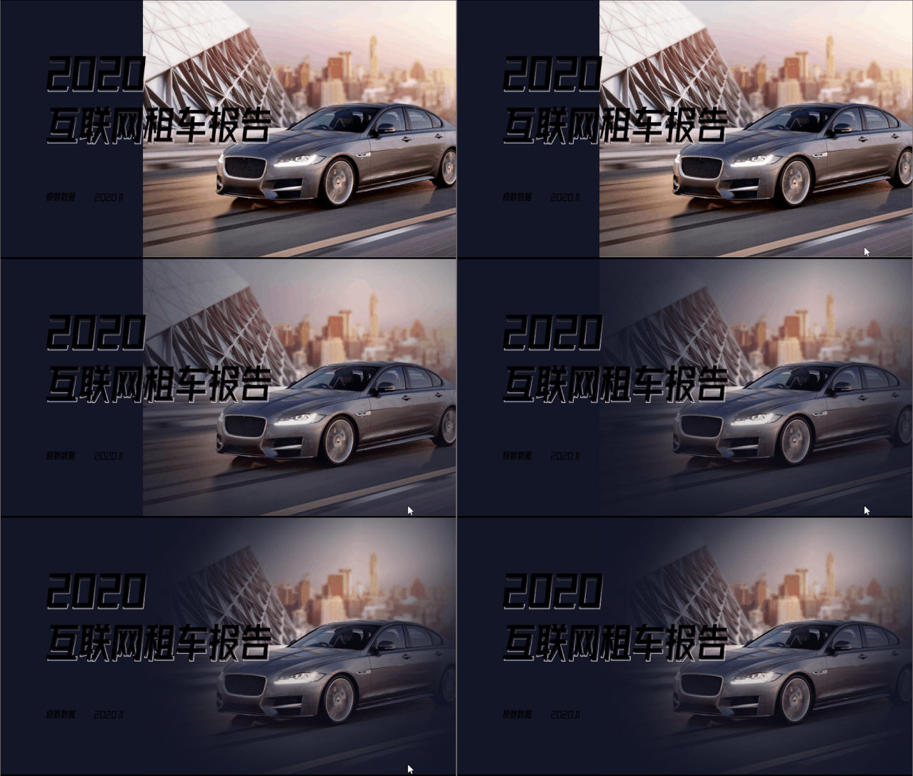
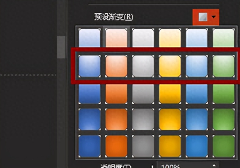
See if this mask looks better More advanced? In fact, it is a combination of multiple gradient masks from different angles. The purpose is to ensure that the transparency of the middle car part is higher than that of the surrounding parts.

This kind of arc gradient is to adjust the "preset" "Set Gradient" type, different angles and values need to be adjusted by yourself (the file will also be given to you)
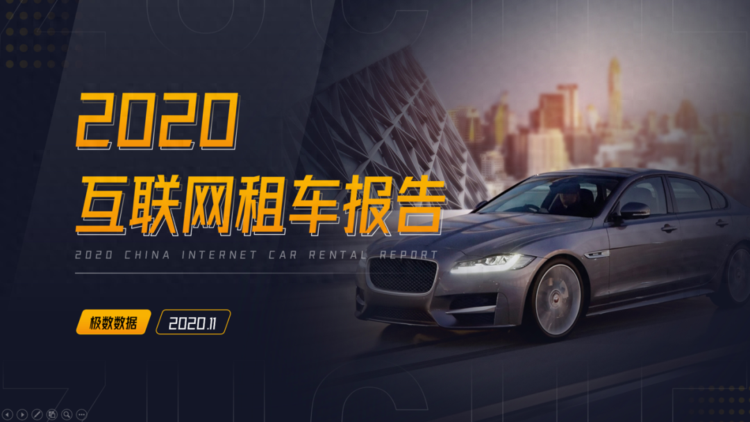
Finally change the color of the copy and surround it Add some small decorations and a cover is completed.
Production of content page

There are two content pages here, don’t worry Come page by page.
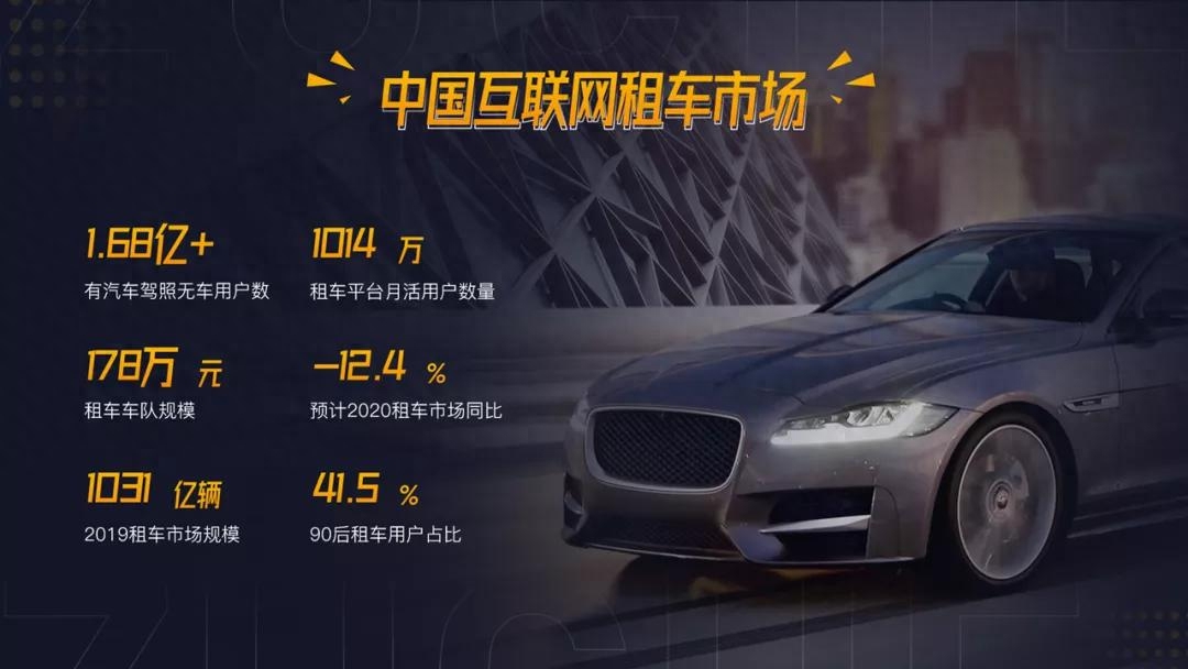
Let’s take a look at the first page, this It is a PPT with six data.
It is better to adjust the position and size of the copy first.

Obviously this copy is too little, only If it can occupy "half of the country", then we can add a picture to the other side of the PPT like a cover.
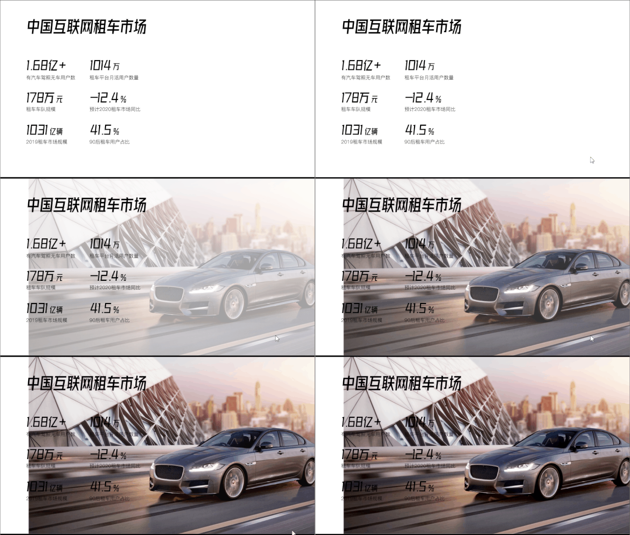
But in order to be a little different from the cover, I Try changing the orientation of the car picture. (You can change it or not)
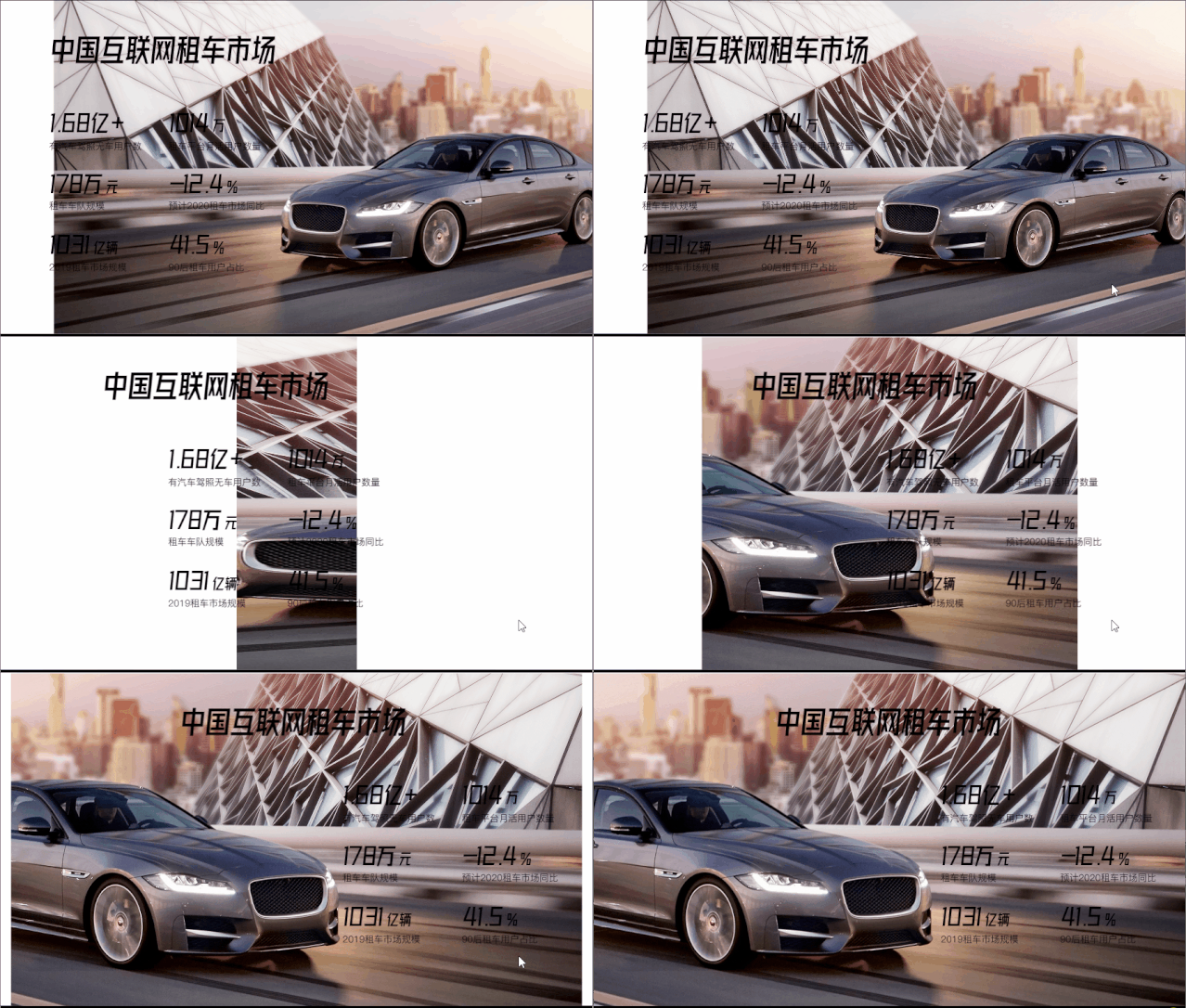
Here you need to add a "mask" Now, it’s still the same method of superimposing multiple masks to create such a mask.
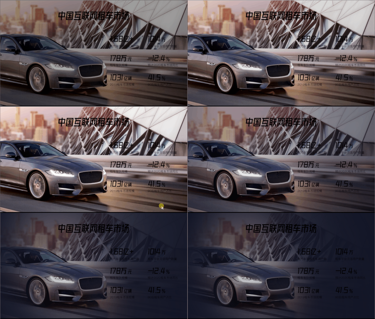
The last step is also the easiest step. Just adjust the color of the copy and add some decorations.
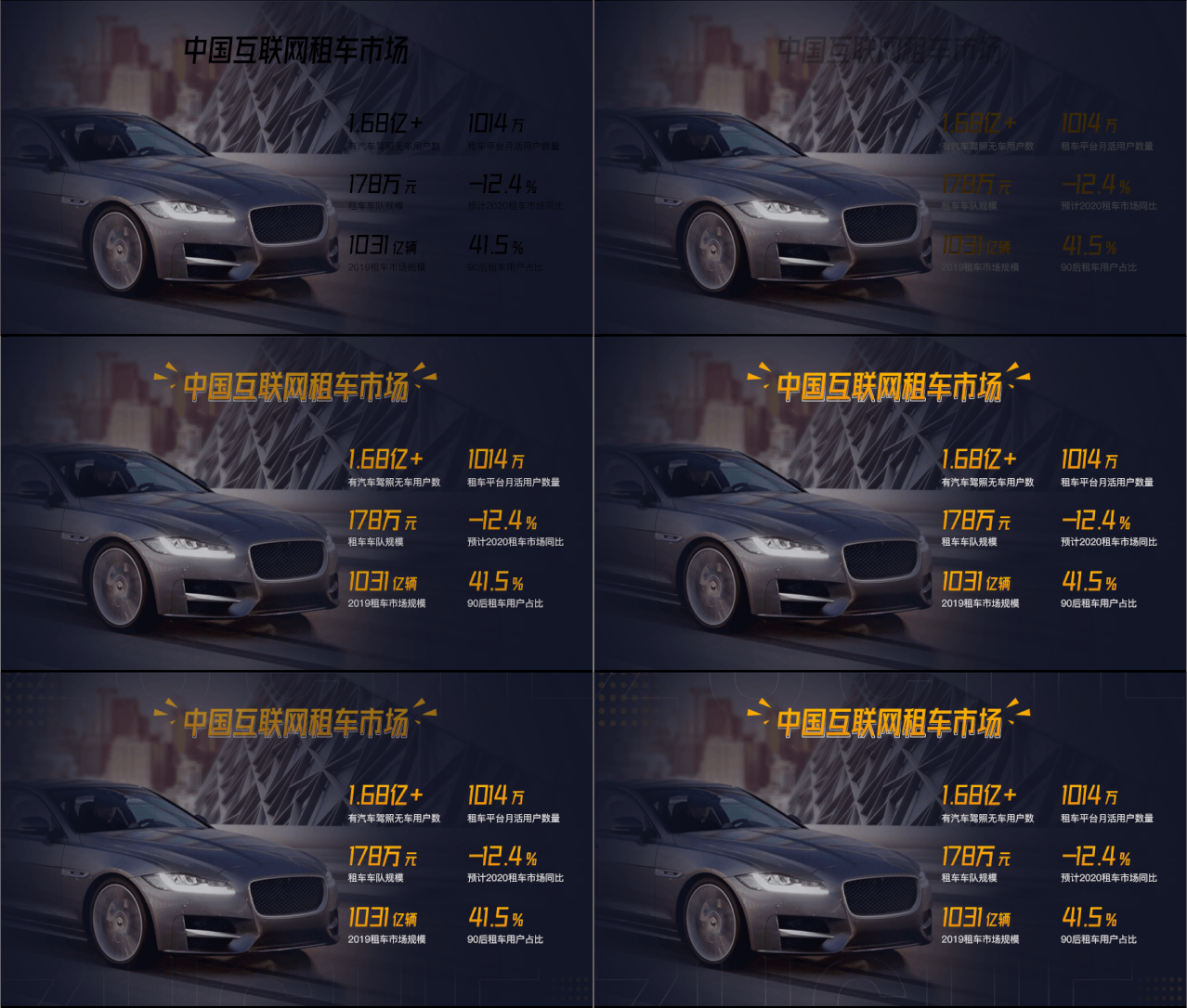
This is what it looks like if the direction is not changed.
Let’s take a look at the PPT on the second page. This is a PPT with four contents.
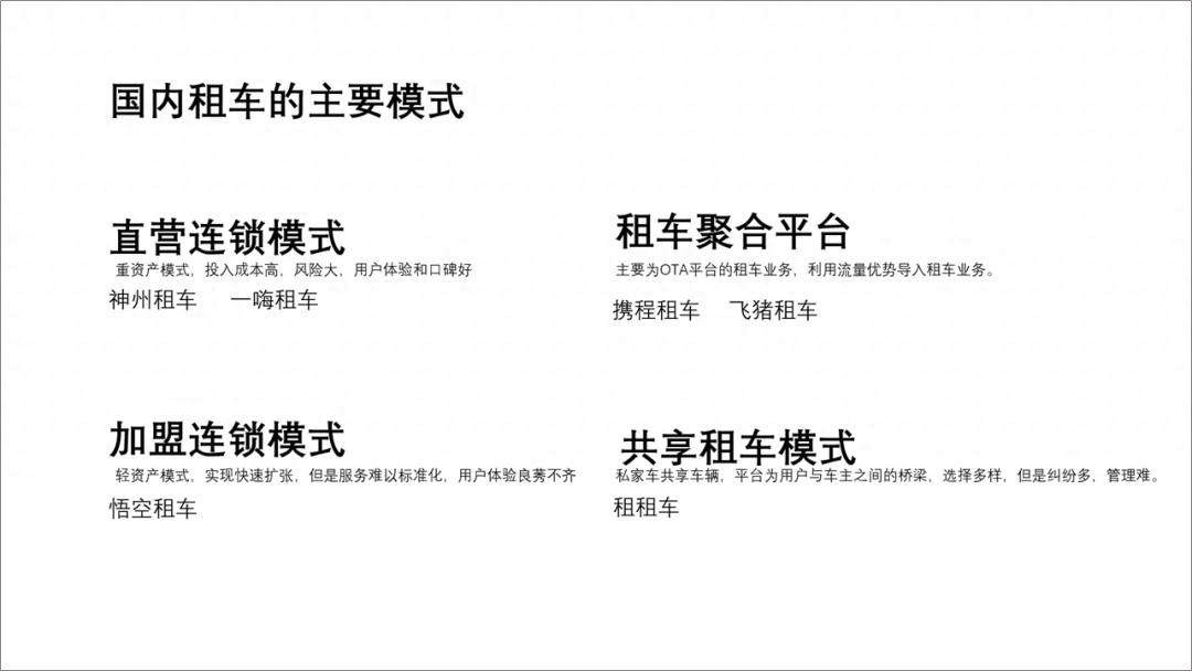
Read the copy, these four contents belong to If they are on the same "level", the easiest way is to place them side by side. Just like this~

After clarifying the layout, we will follow the layout Adjust the size and layout of your copy.
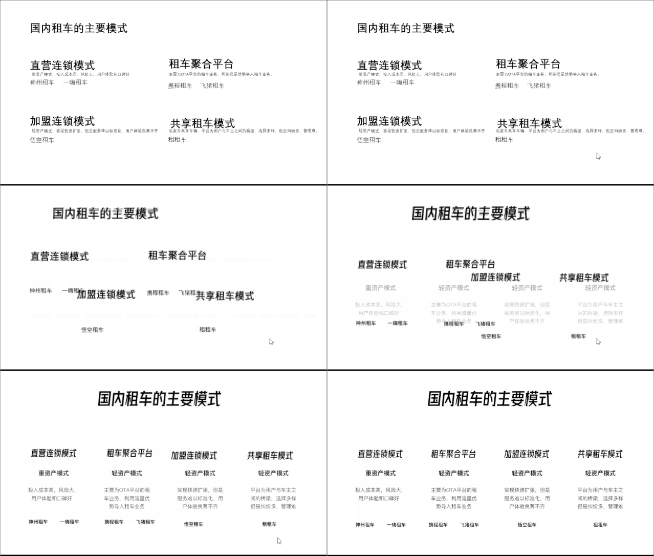
Next, you can use color blocks to decorate it Copywriting.
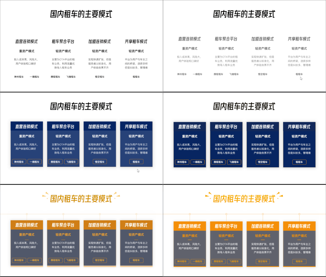
The next step is the background, which must still be Using the car picture, the mask adjustment was still the old method.

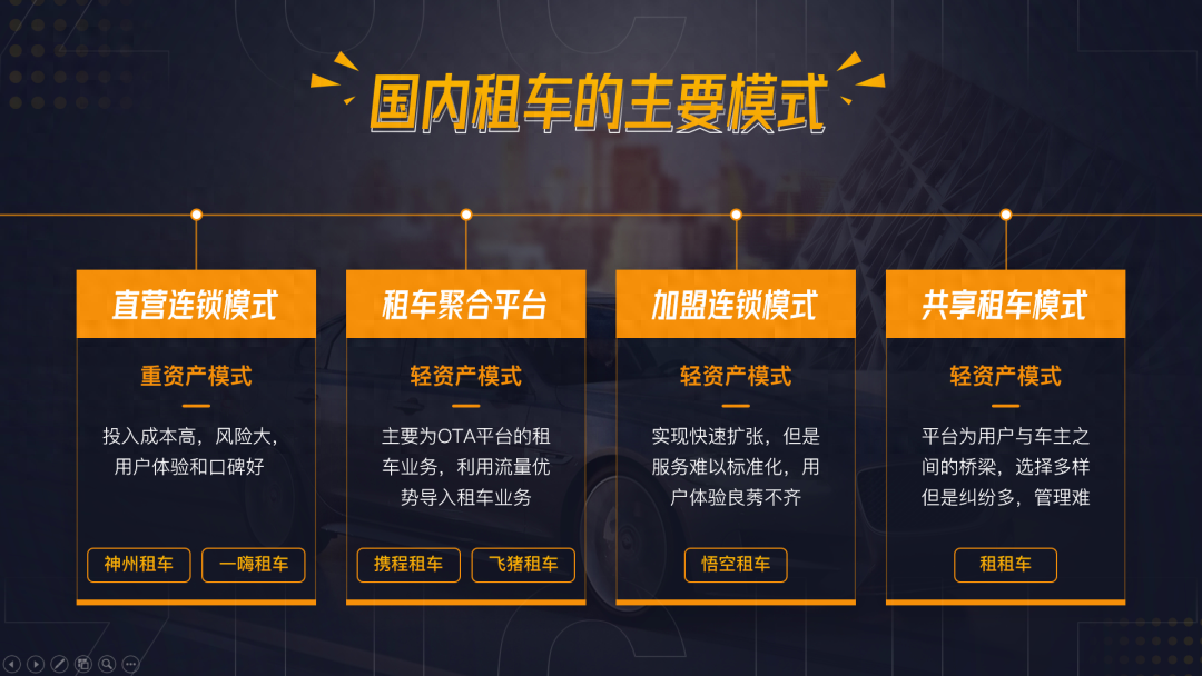
Finally add " Once the "Background" and "Copywriting" are integrated, the production is complete.
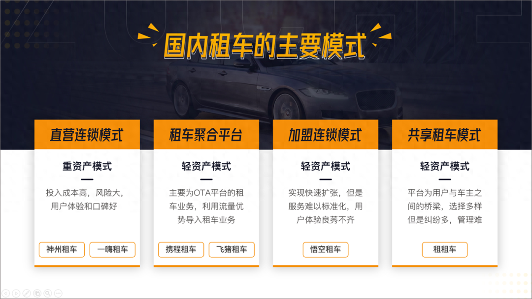
If you don’t like this full screen, you can also You can try split screen up and down. (The boss will do whatever he likes)
Production of timeline page

Actually, the time axis is pretty good. Much more. It’s nothing more than drawing a line and placing the copy on both sides of the line.
The first step is to adjust the position and position of the copy font.

Linear layout is too ordinary, please change it a little , adjust to the timeline of the curve.
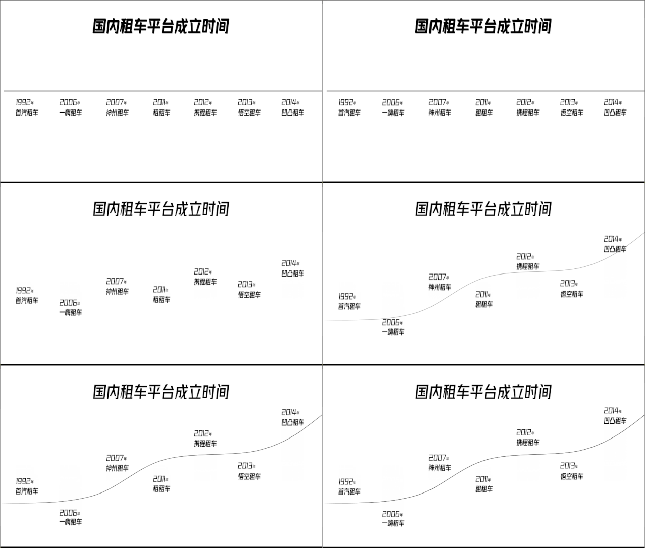
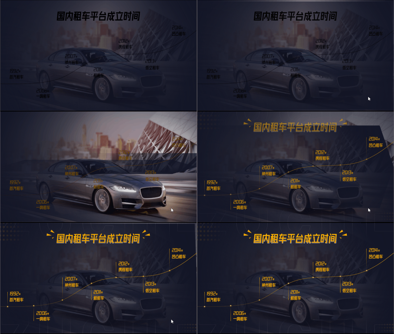
The next step is the background, which is on the content page It has been done before and can be used directly.

The last step is left to do this , just adjust the color of the copy.
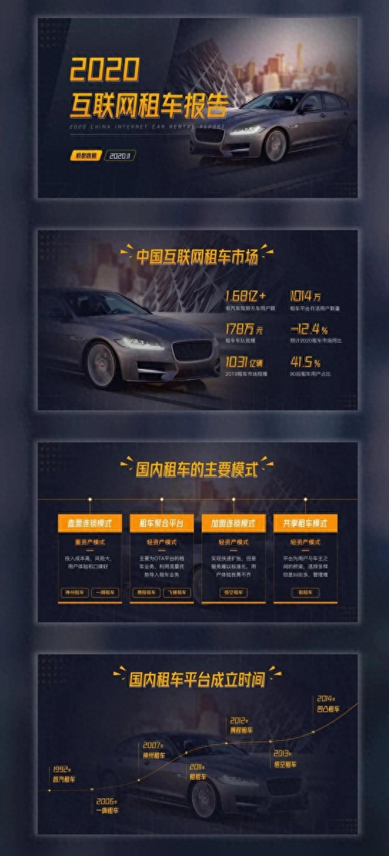
Okay, that’s it for this PPT Now that it’s all done, you can take a look at the before and after comparison.

That’s all for today.
It is not easy to make. If you like it, please help and forward it. Thank you very much.
File collection method:
1. Help is easyForward this article, thank you!
2. Copy this content Then open the Baidu Netdisk mobile app, the operation is more convenient
Link: https:// pan.baidu.com/s/1pq-8HL87kgcVb3GpJrJbKg Extraction code: twi3
Those who have received the documents can Type "Received" in the comment area, thank you.
Learn more PPT tips. You can follow my headline column.
Articles are uploaded by users and are for non-commercial browsing only. Posted by: Lomu, please indicate the source: https://www.daogebangong.com/en/articles/detail/bu-shi-ba-wei-shen-me-kan-ni-xiu-gai-PPT-jiu-zhe-me-jian-dan.html

 支付宝扫一扫
评论列表(196条)
测试