The following article comes from Meigong Meibang, author Lao Zhang

To learn e-commerce design, pay attention to "Artwork Meibang"! Regularly publish e-commerce design information, share excellent works, cases, and all kinds of interesting design things. You can talk freely here, and we will walk hand in hand on the road of art!
In many excellent design works, we often see the appearance of some English words, which are also different in form: small enough to be invisible without looking carefully, large enough to be larger than the product, which will also cause Party A to People may not understand, "Aren't you robbing our product body by putting such a large English text?", "Whoever sees such a small English text can't see it, so it's better not to add it!"
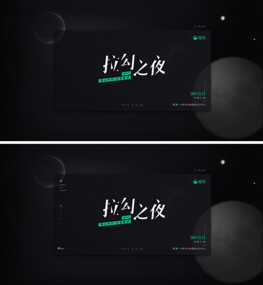
Facing this kind of layman’s advice, all you have to do is use cases to speak~
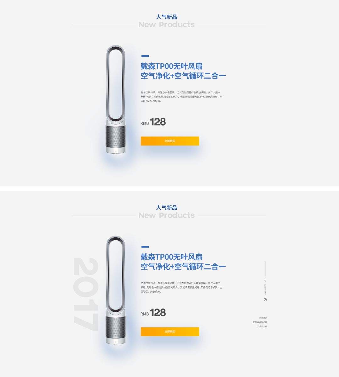
When the sense of content of the work is missing, the visual center of gravity is unstable, and the picture is empty, you can use English to fill it in. Commonly used English can be keywords or word translations, LOGO , numbers, such as:
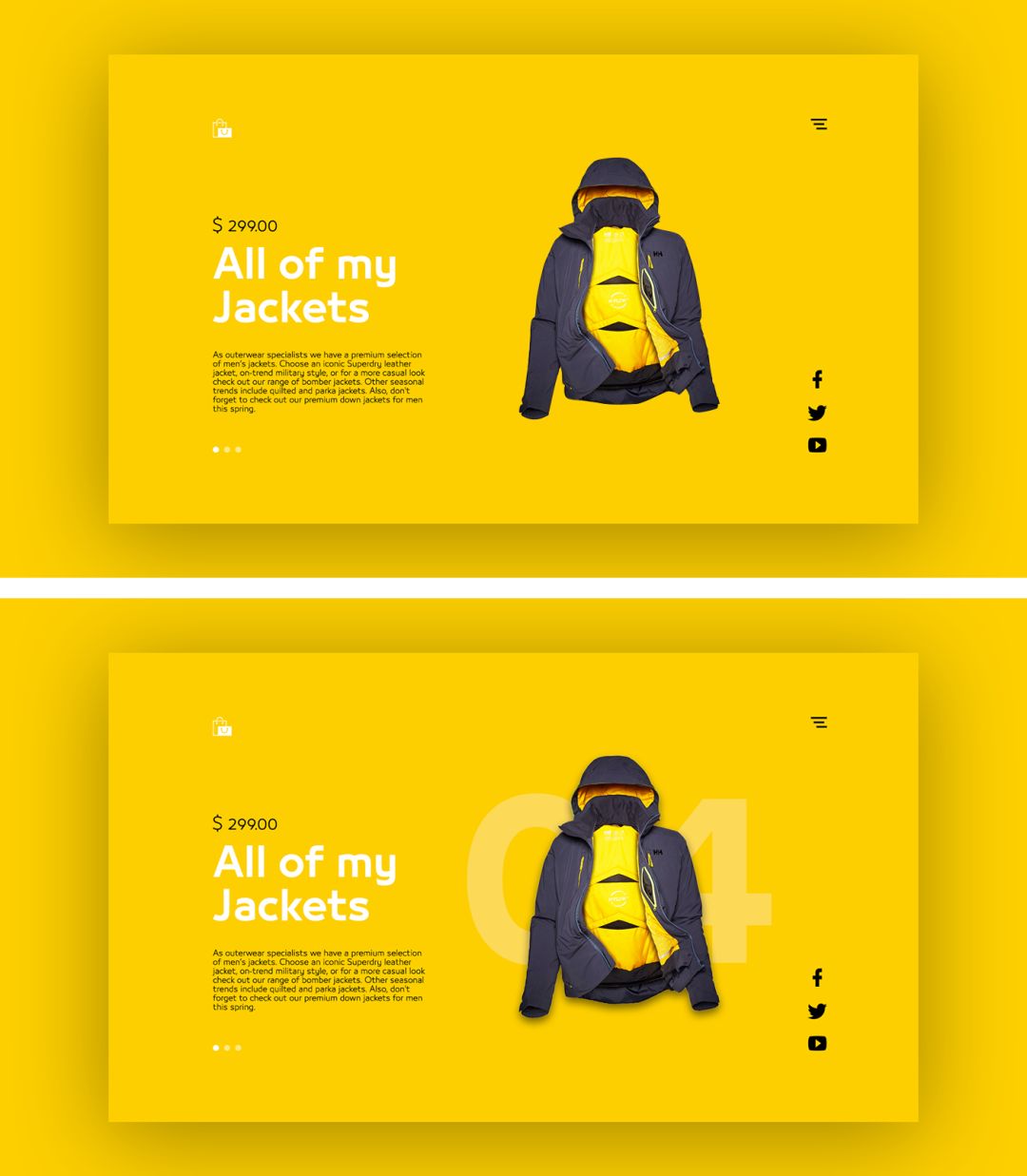
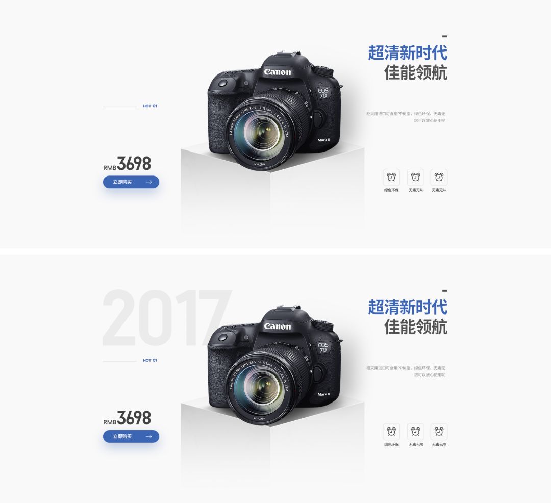

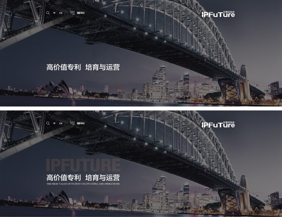
However, when English exists as filler, you need to pay attention:
First: The existence of English cannot occupy the main body, because the main purpose of this kind of English is just to fill in the redundant blanks and increase the sense of content. It is not necessary for the main information and is only used as Secondary elements exist!
Second: The large-size filled English can only appear in 1-2 places in a screen: the common method is to give about 10% transparency, which is not too obvious and can play a filling role. However, when filling in English in small fonts, it is necessary to try not to overwhelm the focus and can be used in combination with English and graphics.
Third: No matter whether the font size is large or small, try to keep the visual center of gravity stable.
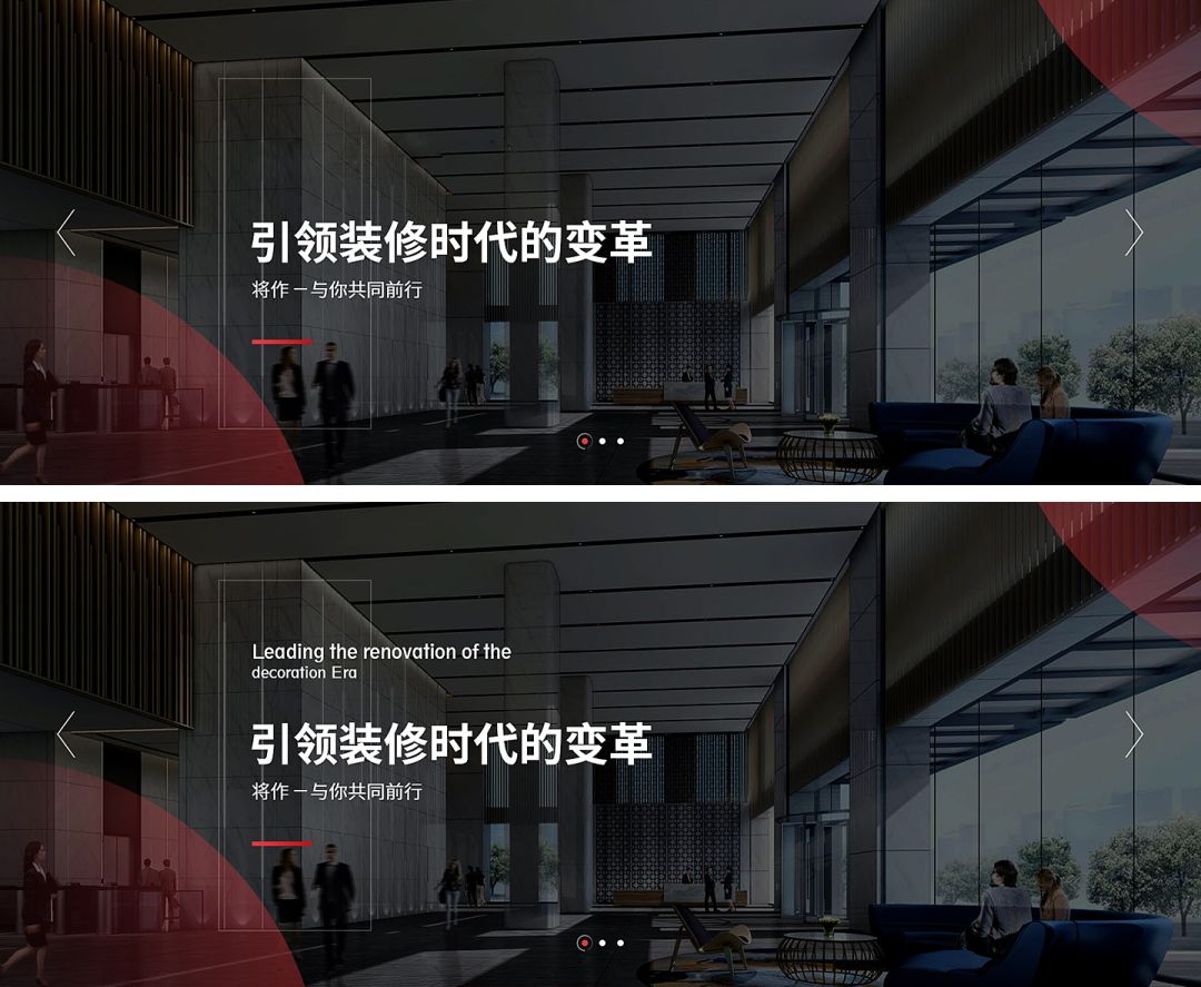
If you encounter a situation where there is too little text information and you cannot type it in your daily work, you can use English words of different sizes as an aid to increase the sense of hierarchy. and a sense of sophistication, such as:

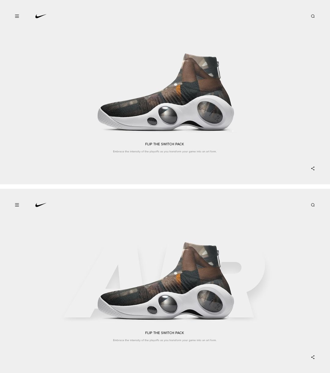

We can summarize the text layout:
First: When the text layout lacks contrast and there is not enough copywriting, the English translation
Articles are uploaded by users and are for non-commercial browsing only. Posted by: Lomu, please indicate the source: https://www.daogebangong.com/en/articles/detail/biao-ti-ti-sheng-hua-mian-she-ji-yu-ceng-ci-gan-cong-xuan-ze-he-shi-de-ying-wen-zi-ti-kai-shi.html
 支付宝扫一扫


评论列表(196条)
测试