- Image and text skills
In our daily work, we often set goals and then check the actual completion status against the goals.

So, how to create a comparison chart between target and actual in the WPS table?

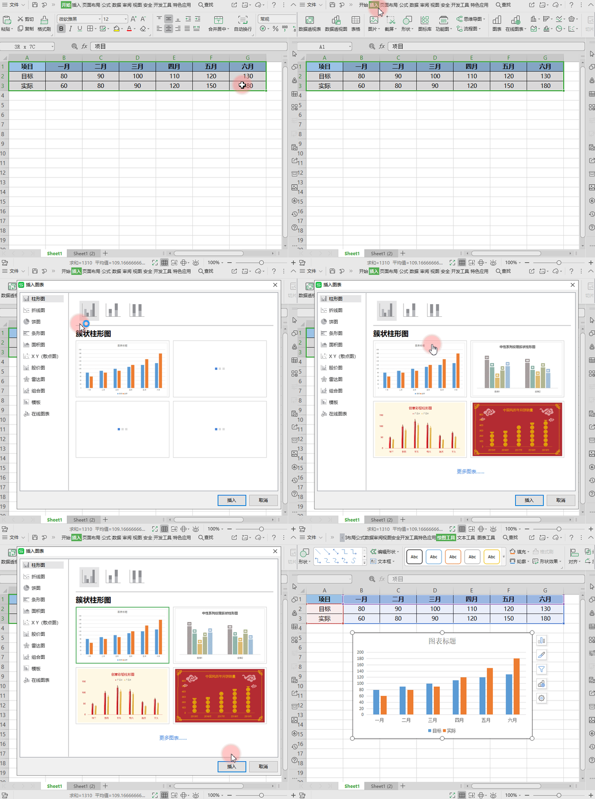
First prepare the table data.
■ In the first step, select the data area, click "Insert" - "Chart" and select "Clustered Column Chart".

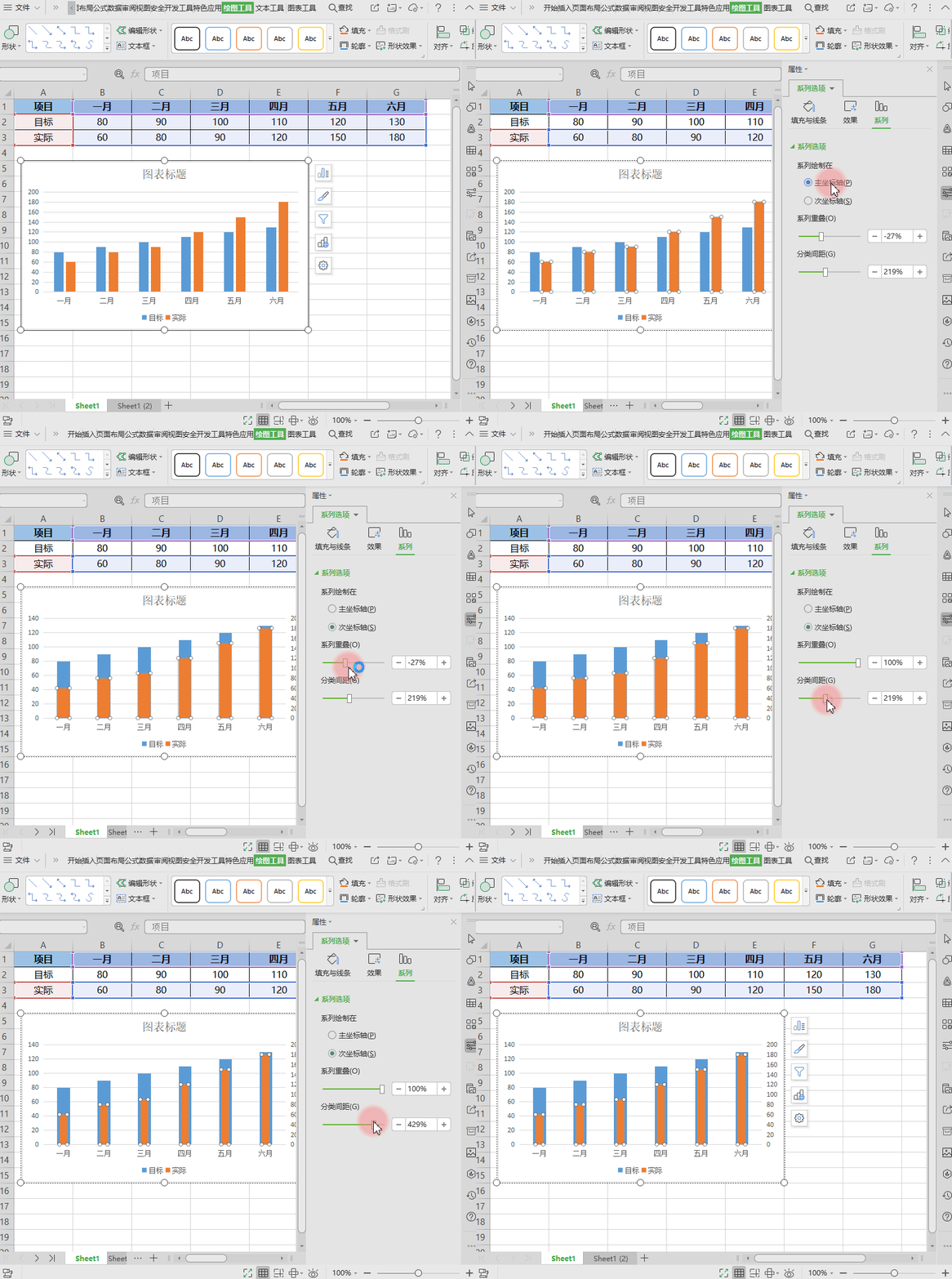
■ In the second step, double-click the "actual" graphic in the chart and set the "secondary axis" in the task pane that appears on the right.
Adjust the series overlap to 100% and adjust the appropriate category spacing.

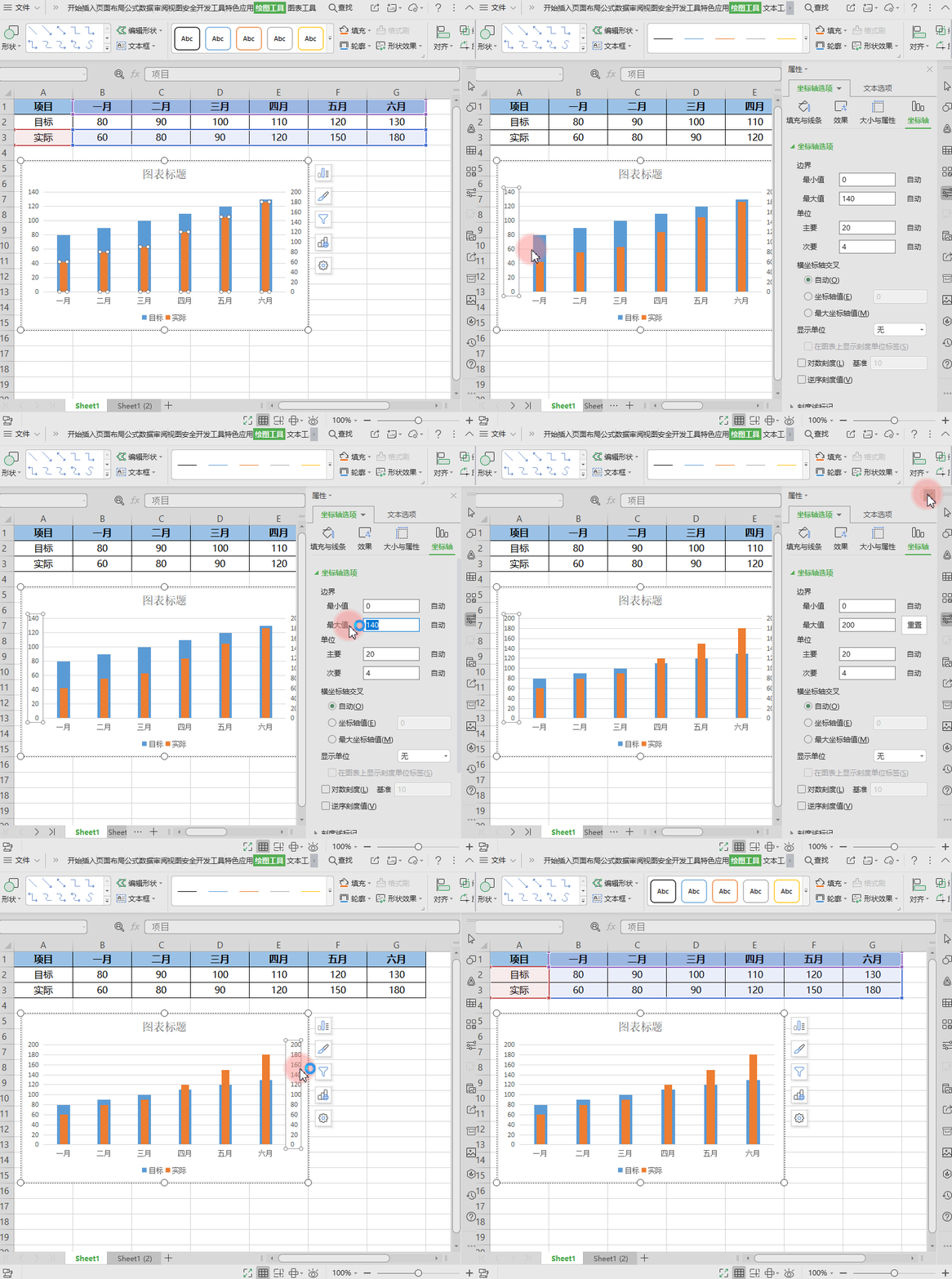
■ The third step is to unify the scales of the coordinate axes.
Adjust the maximum scale to the largest number in the two axes.
Double-click the left coordinate axis, set the maximum axis value to 200 in the task pane, and then delete the secondary coordinate axis on the right.
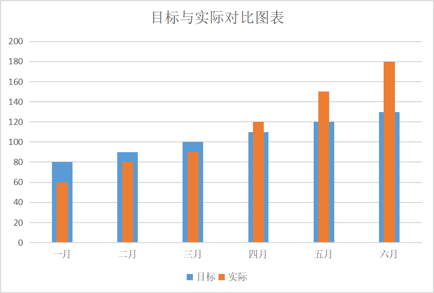
The completed effect is as shown below:

It is very intuitive to see the comparison between the target and the actual situation.
Articles are uploaded by users and are for non-commercial browsing only. Posted by: Lomu, please indicate the source: https://www.daogebangong.com/en/articles/detail/biao-ge-xin-shou-jiao-cheng-chang-yong-tu-biao-mu-biao-yu-shi-ji-dui-bi-tu.html

 支付宝扫一扫
评论列表(196条)
测试