(hello, there)
?

Our daily lives are filled with various uses of fonts, from identification systems, packaging, indicators, to promotional products, to student papers and client proposals. Although the options for Irving fonts are a dime a dozen, we always seem to be stuck on a few specific fonts.
Looking back from the late 1990s to the early 21st century, Meta fonts were very popular in Europe and the United States and were almost everywhere. At that time, the teacher who taught typography specifically reminded students not to use Meta fonts for the time being, because its excessive popularity made the design lose its uniqueness. Whether it's because of free fonts built into the system or because they're commonly used, designers may be limiting their creativity if they use certain fonts without thinking.
Next, we will introduce several common fonts and their designs, including some works by masters, as well as some fonts that particularly represent certain aesthetic trends. These fonts have a distinct sense of the times. So, why do these designs become classics? How should we use them correctly? If designers want to break away from these usual fonts, how should they choose?
Optima

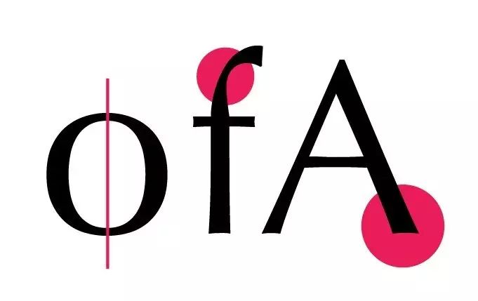
Optima is a sans-serif font designed by font design master Hermann Zapf in 1958. It is suitable for use in highly decorative situations such as titles or introductions. Its design combines elements of Renaissance humanistic style with neoclassical elements, and even features hints of Greek inscriptions. Although it is a sans-serif font, it has a thickness contrast similar to that of a serif font. The font is spacious and square in shape. The strokes have curves and the ends extend outward to form a trumpet shape. It is a very distinctive design.
Optima everywhere

Optima has become a representative with its elegant temperament and is widely used in the design of title words and brand standard words. Whether in stores, posters, brand identity, etc., as long as it is associated with a soft, elegant tone, Optima is an often considered choice.
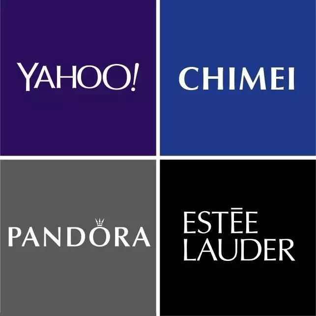
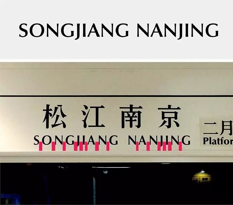
No matter where you are, it's not hard to find Optima. For example, the identity update design of Yahoo! in 2013, the English station name of Taipei MRT system, the cosmetics and skin care brand Estée Lauder, the high-end clothing brand Saint Laurent, the accessories brand Pandora, Chimei home appliances, etc. , you can see Optima's figure. However, due to its ubiquity, it also causes visual fatigue. It seems that all content is classified into the category of classical humanism. Even if it is used appropriately, it is difficult to highlight its characteristics. It just makes people sigh: Why is it so? Optima!

Despite Optima's overuse, if you still want to choose this font, make sure you use it correctly: First, choose the right one
Articles are uploaded by users and are for non-commercial browsing only. Posted by: Lomu, please indicate the source: https://www.daogebangong.com/en/articles/detail/bi-mian-cai-shi-chang-zi-ru-he-qia-dang-yun-yong-jing-dian-ying-wen-zi-ti.html
 支付宝扫一扫


评论列表(196条)
测试