
Recently, many readers sent private messages: The charts in the year-end report PPT are ugly, how to optimize them?
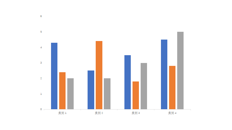
Most people's charts look like this:

And the chart of the great god is simply cool!
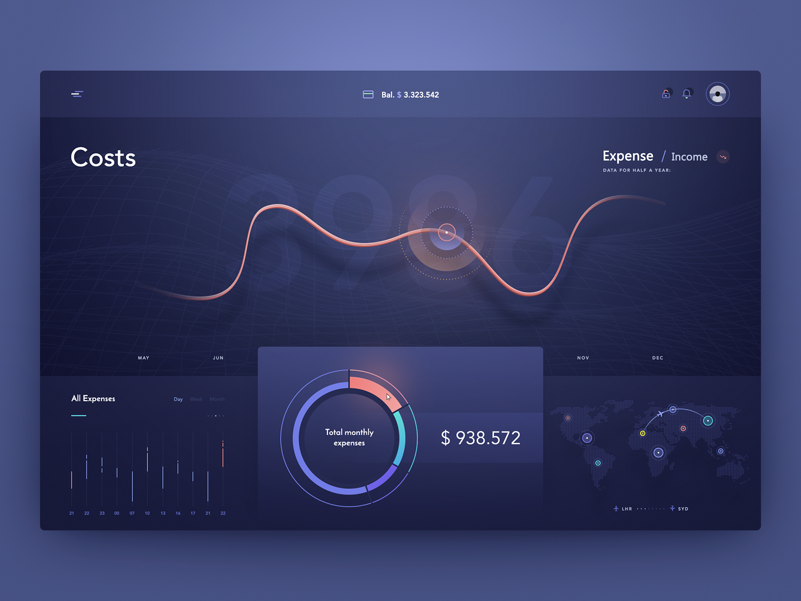
(The picture comes from the Internet)
Is the comparison obvious? In fact, it is not difficult to make a page like a master. It takes you 5 minutes to read this article, and you are guaranteed to gain something!
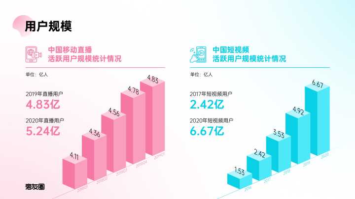
1. Histogram
After inserting the histogram in PPT, how would you optimize it?
Set the color of the gradient, remove redundant elements, and replace the rectangular frame with a rounded rectangle?
These are commonly used landscaping methods.
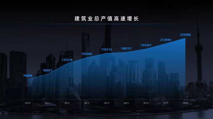
Similarly, the histogram can also be converted into a stereogram, similar to this effect:
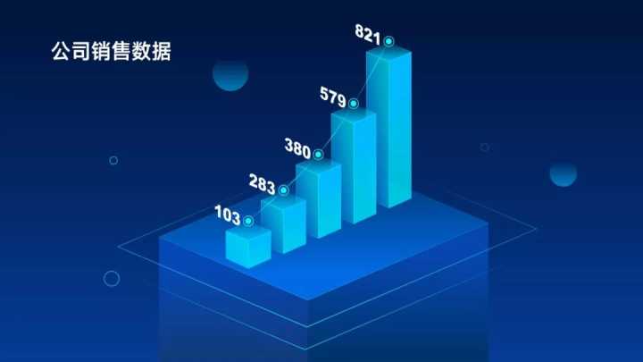
The page has a more three-dimensional sense of space.
2. Line chart
Common line charts:
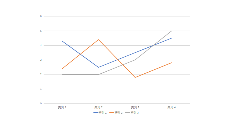
Simple lines would look a bit monotonous, right?
At this time, replace the line chart with a combination chart: a line chart plus an area chart, and then set it as a gradient color fill, it will be very different!
3. Pie chart
Pie charts used to represent percentages:

It is also relatively monotonous.
We can adopt a visual processing method to make it quasi-physical.
For example, here is a chart about the sales ratio of oranges. In order to highlight the theme, I found a PNG image of oranges and used round oranges as pie charts.

Get creative in no time!
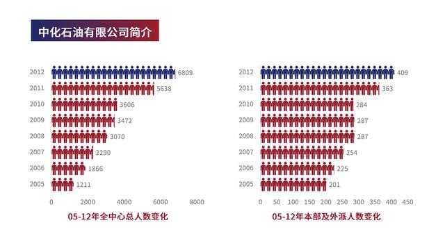
4. Table comparison
Likewise, small icons can be used to populate creative display data.
for example:

(picture source and network)
It is also a way of data visualization. Not only is the page beautiful and has visual impact, but it is also easy to understand. The audience can see the contrast relationship at a glance.
5. Add animation
Readers with strong operating ability can also use animation to highlight.
For example, to show the process of data changing from less to more, you can add the animation of water ripples to emphasize the data.


Will this approach make the leaders more satisfied?
That's it!
【Welfare】
It’s time for the year-end report again, and I’ve prepared a PPT template for you!
Pay attention to @PPT Theory of Evolution, private message to reply keywords【Year-end report], you can collect it!
Articles are uploaded by users and are for non-commercial browsing only. Posted by: Lomu, please indicate the source: https://www.daogebangong.com/en/articles/detail/Zhihu%2010K%20praise%20What%20does%20the%20eyecatching%20PPT%20chart%20look%20like.html
 支付宝扫一扫
评论列表(196条)
测试