On July 27th, Huawei's all-scenario new product launch conference is coming ! Have you read it?
Last night, a variety of new hardware products were unveiled one by one. Among them, I like the multi-device communication function of Hongmeng Family Bucket the most.

Image source network
Before, Yu Chengdong even said bluntly: "The number of Huawei Hongmeng devices has exceeded 300 million!" Good guy!
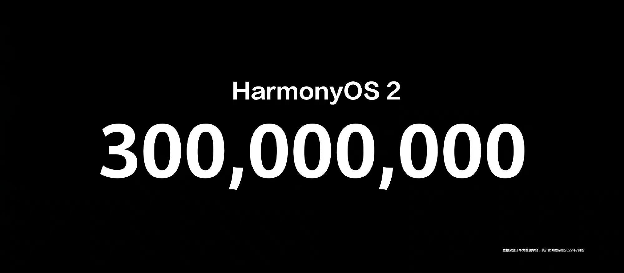
But I don't care about these, old rules, let's talk about the PPT design in the new product launch conference today.
Remember to read to the end, there are benefits at the end of the article!
Modular typography
How to format a page with too much information? The design of Huawei's product page provides ideas:
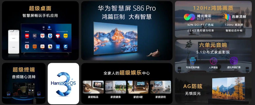
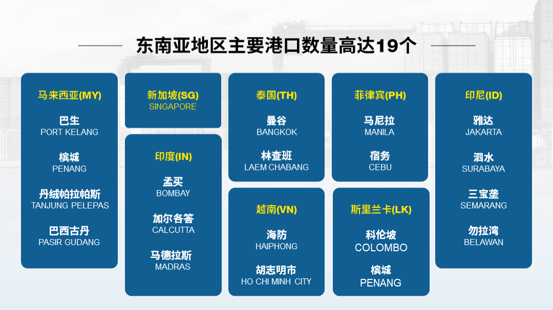
To put it simply, we only need to use modular thinking and draw the color blocks of the corresponding size.
To make the module regular, you only need to do these two points:
1. Text emphasis
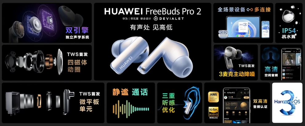
Looking at this page, the first feeling is that there is too much information. But in fact, we only need to highlight the key text through font enlargement or different colors.
2. Module regularization
In order to make the typesetting look neater, we need to make the visual weight of the left and right sides look symmetrical:
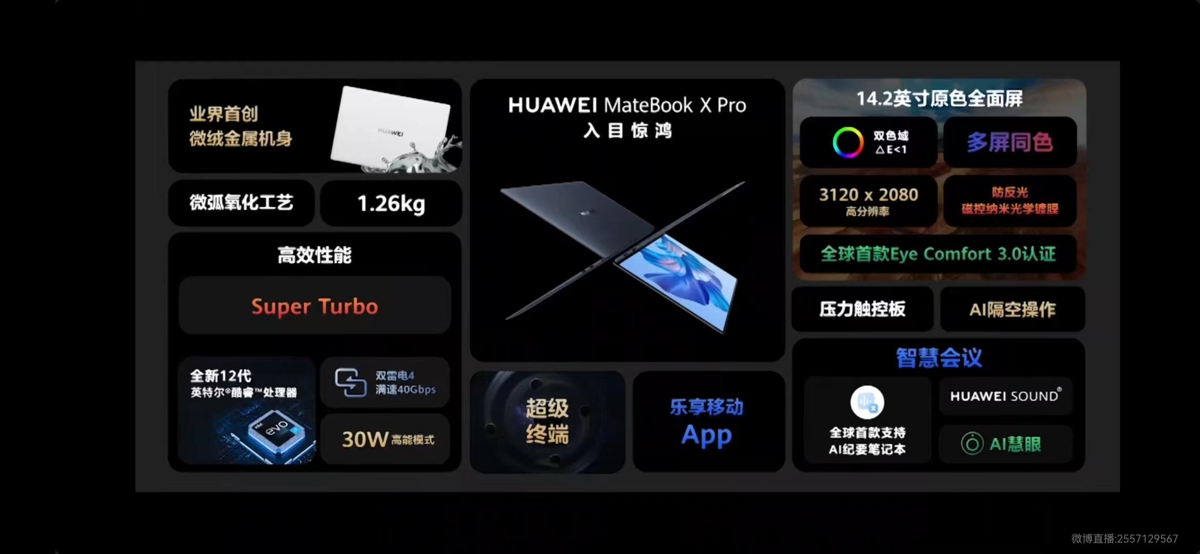
In this way, the presentation of information is very regular. For example the following page:
Ripple reflection
The "ink blue" reflected on the lake adds to the product page A lot of charm, it is indeed amazing!
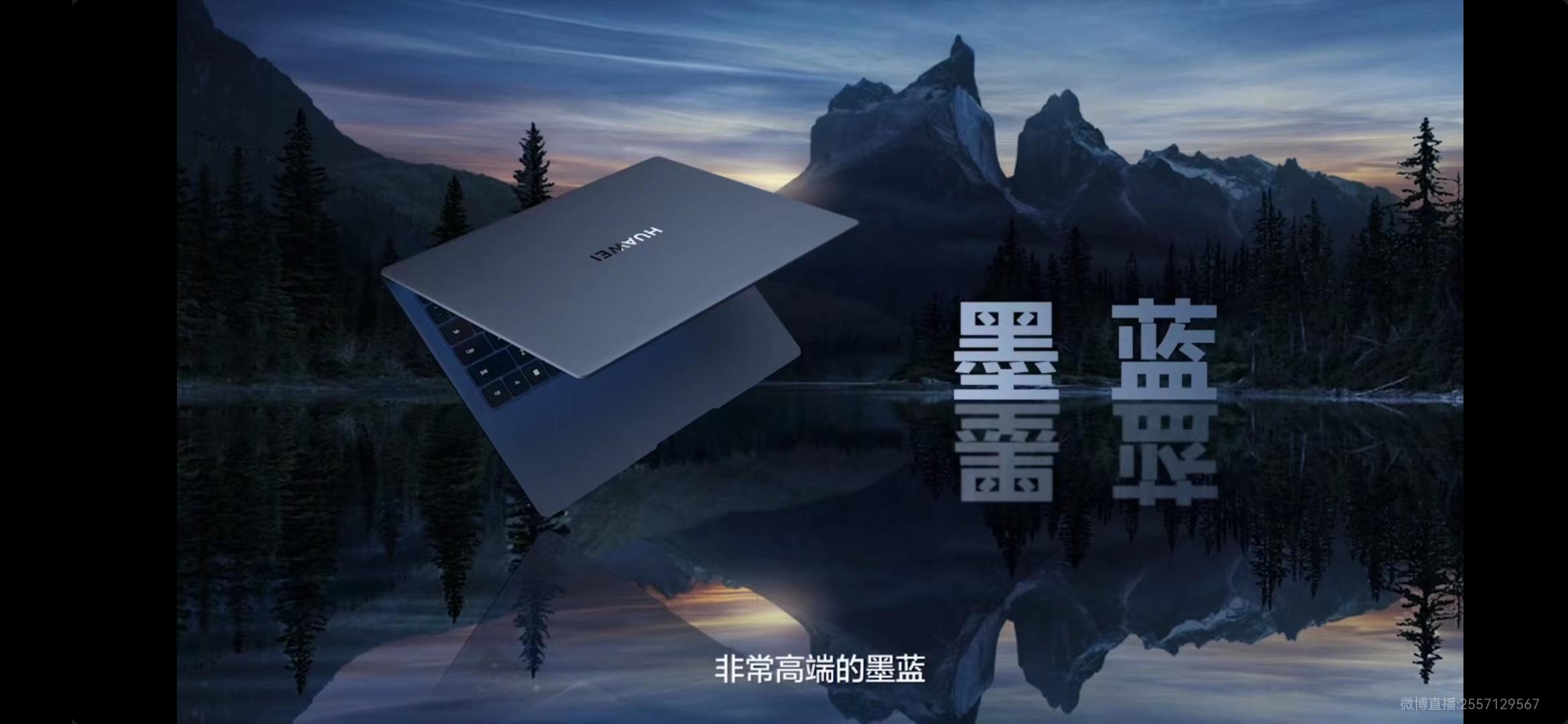
How can this reflection effect be applied to PPT design? it's actually really easy.

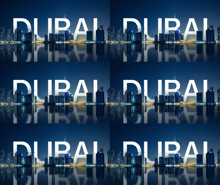
Find a publicity page of Dubai, and use the website to generate ripple reflection effect:
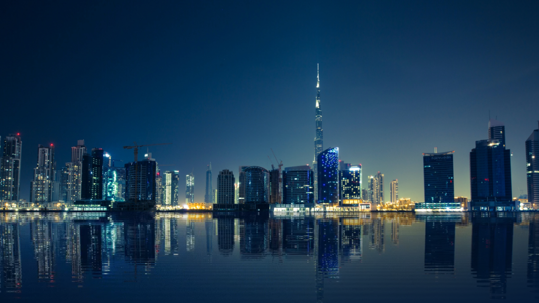
Still a bit monotonous? Then insert English words into the building, so that it will be more creative.
Center Surround Typesetting
The product page of Huawei’s press conference has been used many times Arrived at this typesetting method:
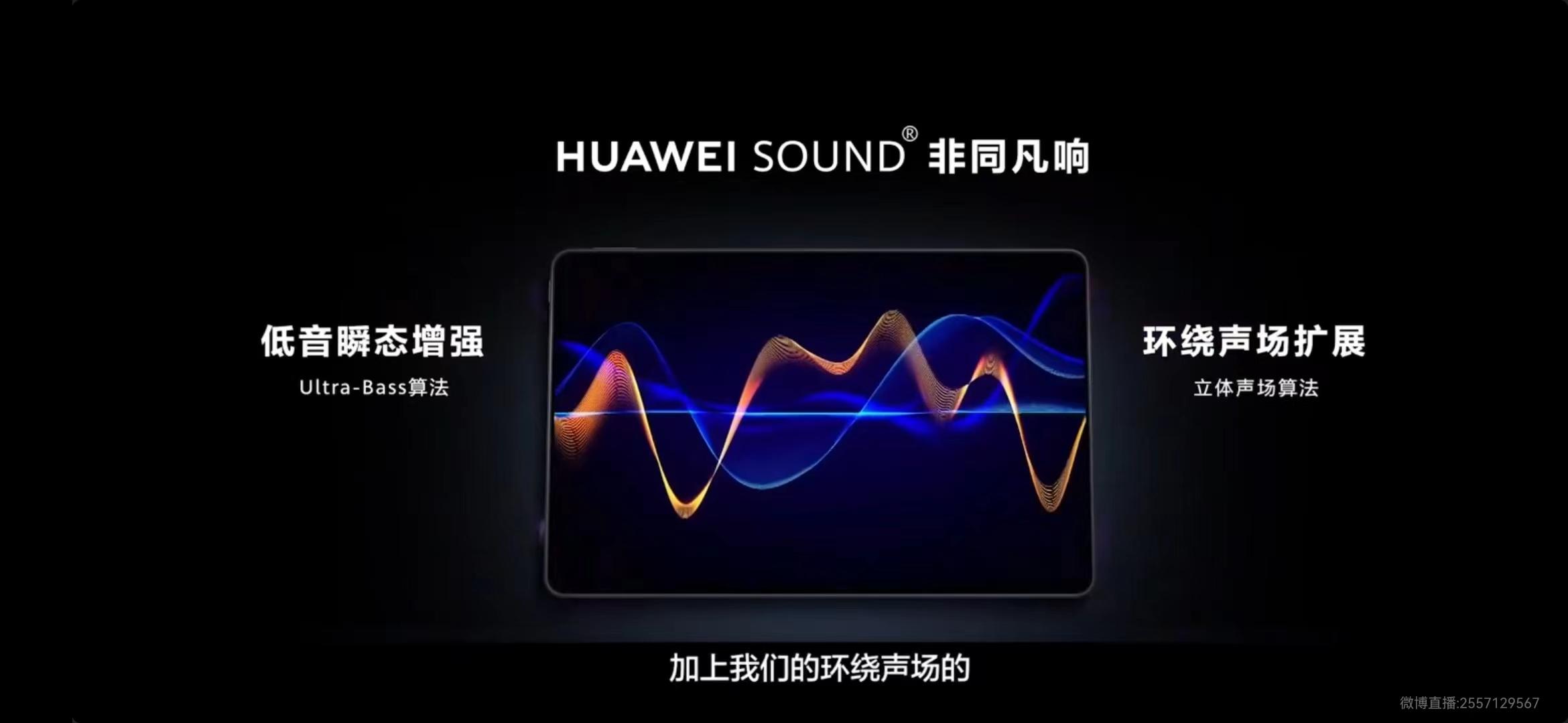
The center-surround typesetting method is exclusive to content that contains multiple arguments, and the essence is to arrange the arguments around the center.
This kind of layout is also very common in PPT design:
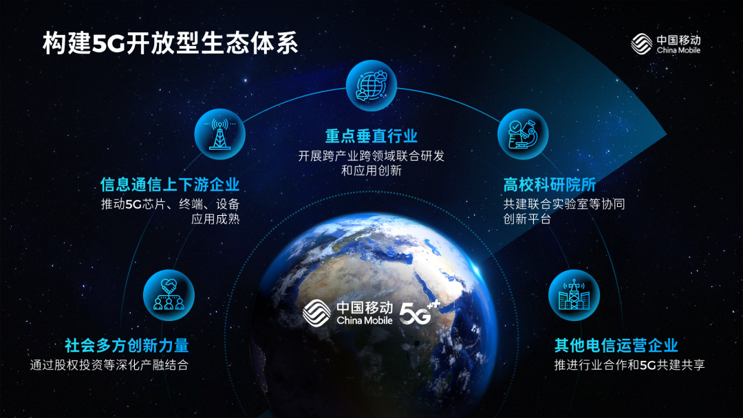
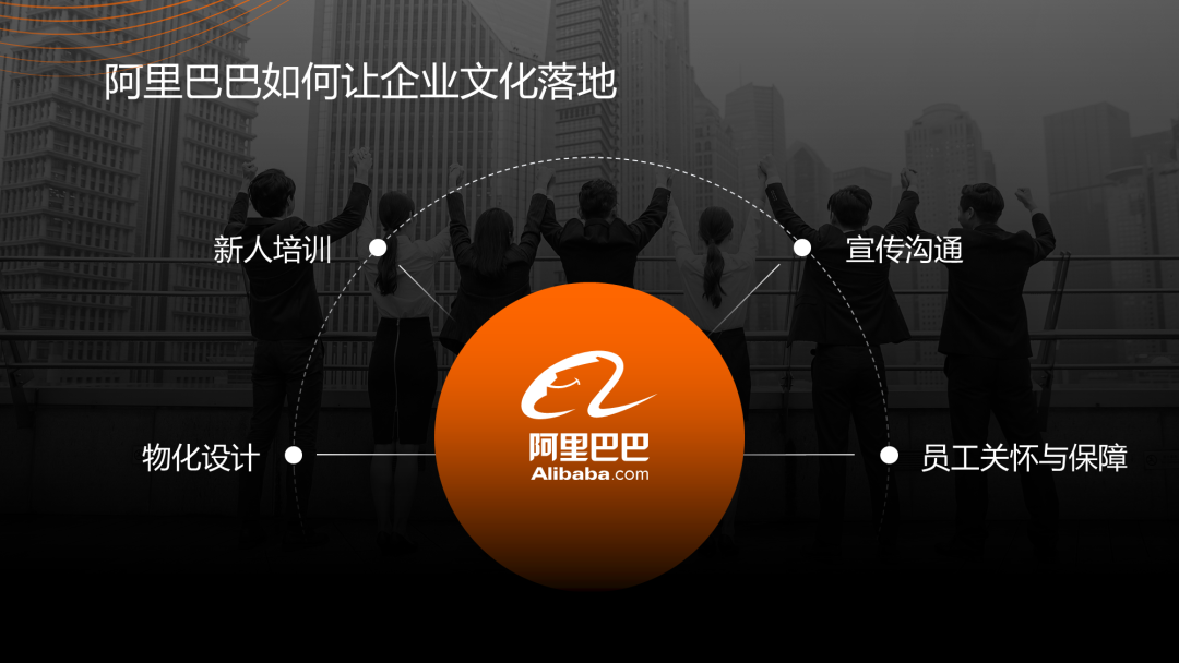
In addition to the center-surrounding typesetting method, here is another super practical typesetting method-the middle typesetting layout method:
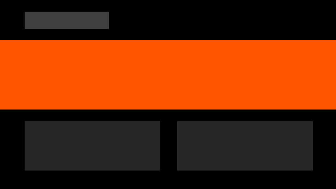
Its basic form is like this, but it will also change as the content changes.
This typesetting is suitable for [1+N] content, what is [1+N]?
To put it simply, it is a large paragraph of summary content, plus N paragraphs of statement content.
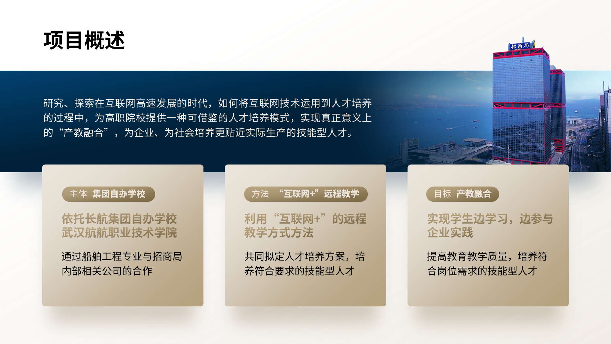
The picture above is the classic usage of typography in the middle, you can try more~
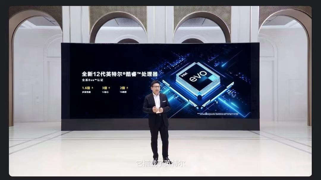
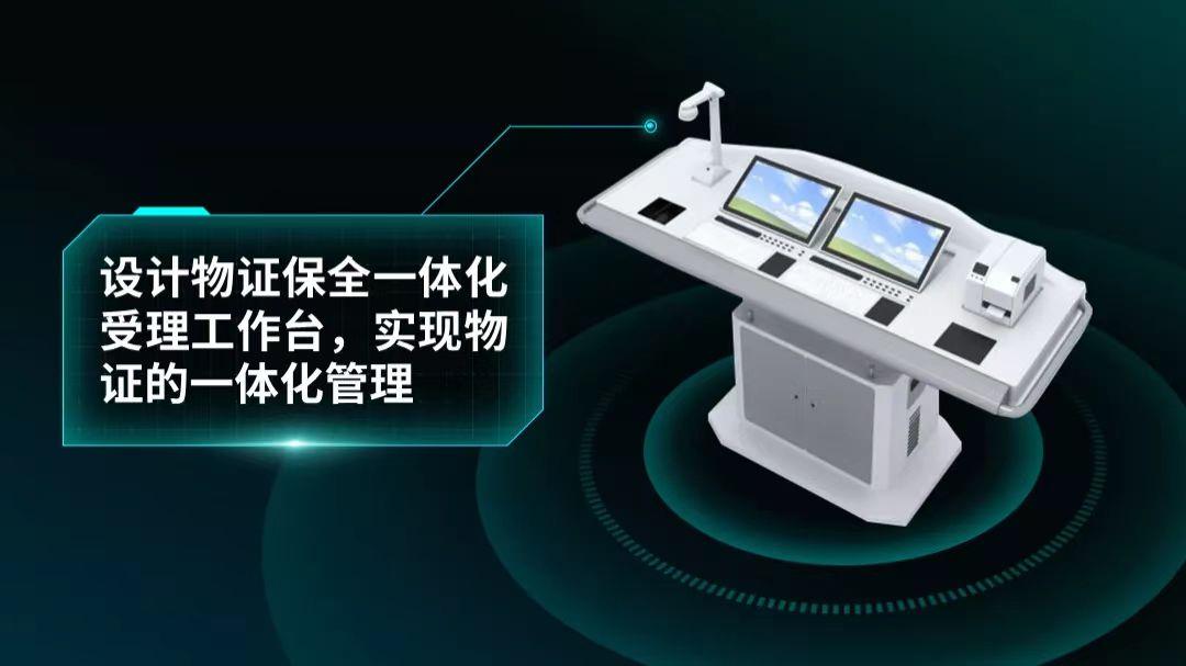
Science and technology lines
The rapid circuit flow is in this product introduction page, It looks very high-end!
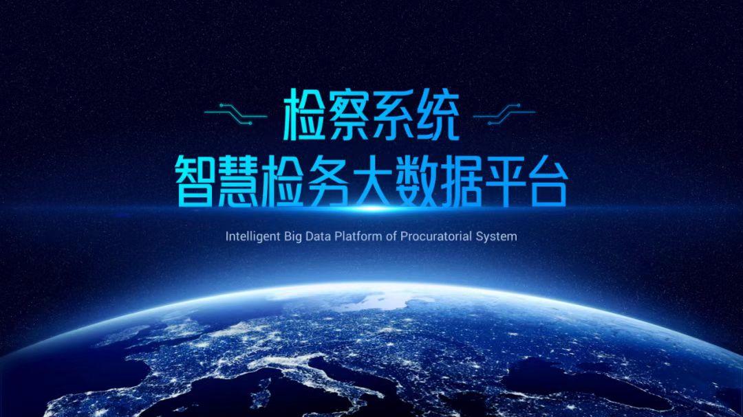
When doing PPT, adding appropriate lines can make the page full of creativity. For example:
Okay, that’s all for today’s sharing, I hope it can inspire you.
Here also provides you with a technological sense of light effect material benefits, don't forget to claim it!
By the way, let me add a digression, you are looking forward to tomorrow's Huawei Enjoy 50 Pro ? Welcome to discuss and exchange in the comment area~
Articles are uploaded by users and are for non-commercial browsing only. Posted by: Lomu, please indicate the source: https://www.daogebangong.com/en/articles/detail/Yu%20Chengdong%20is%20here%20with%20the%20Hongmeng%20family%20barrel%20The%20PPT%20on%20the%20product%20page%20at%20the%20press%20conference%20surprised%20me.html

 支付宝扫一扫
评论列表(196条)
测试