The following article comes from Meigong Meibang, author Lao Zhang

Learn e-commerce design and pay attention to "Meigong Meibang"! Regularly release e-commerce design dry goods, share excellent works, cases, and various interesting design things. Here you can speak freely, on the road of art, we walk hand in hand!
In many excellent design works, we often see some English appearing in different forms: too small to be seen without careful attention, so large that it is bigger than the product, which will also cause Party A to Wouldn't understand, "Aren't you robbing our product body by posting such a large English?", "Such a small English is for anyone to see, so it's better not to add it!"
In the face of this layman's advice, all you have to do is to speak with a case~
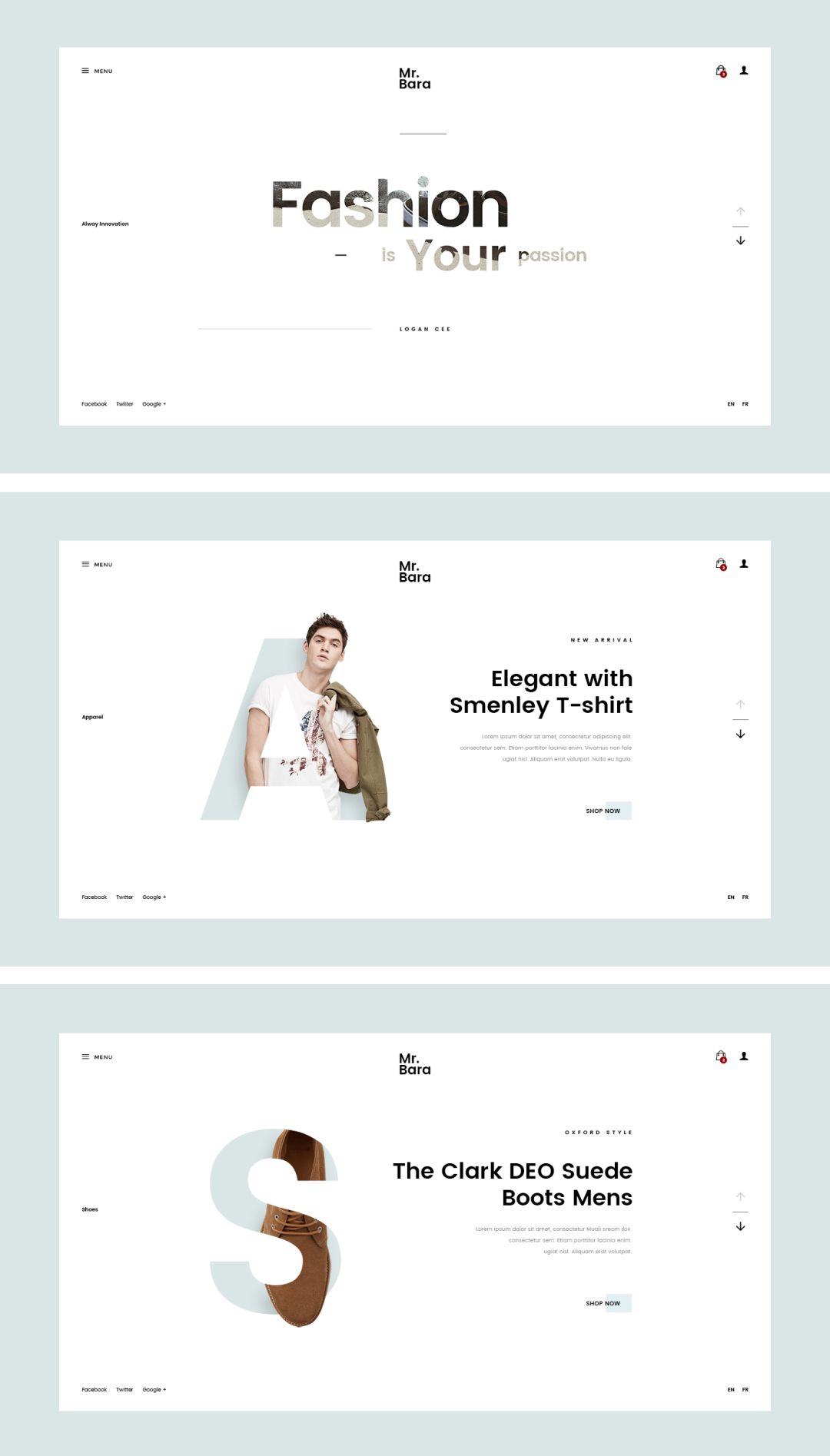
When the content of the work is lacking, the visual center of gravity is unstable, and the screen is empty, etc., English can be used to fill it.Common English can be the translation of keywords or words, LOGO , numbers, such as:

However, when English exists as a filler, you need to pay attention:
First: The existence of English cannot grab the main body, because the main purpose of this type of English is to fill in the redundant space and increase the sense of content, which is not necessary for the main body information, but only as a Secondary elements exist!
Second: Large-size filling English can appear at most 1-2 places in a screen: the common method gives about 10% transparency, which is not easy to be too obvious, and can play a filling role. Yes, but the filling English in small font size should try not to overwhelm the host as much as possible, and can be used in combination with English and graphics.
Third: Regardless of whether the font size is large or small, try to achieve a stable visual center of gravity.
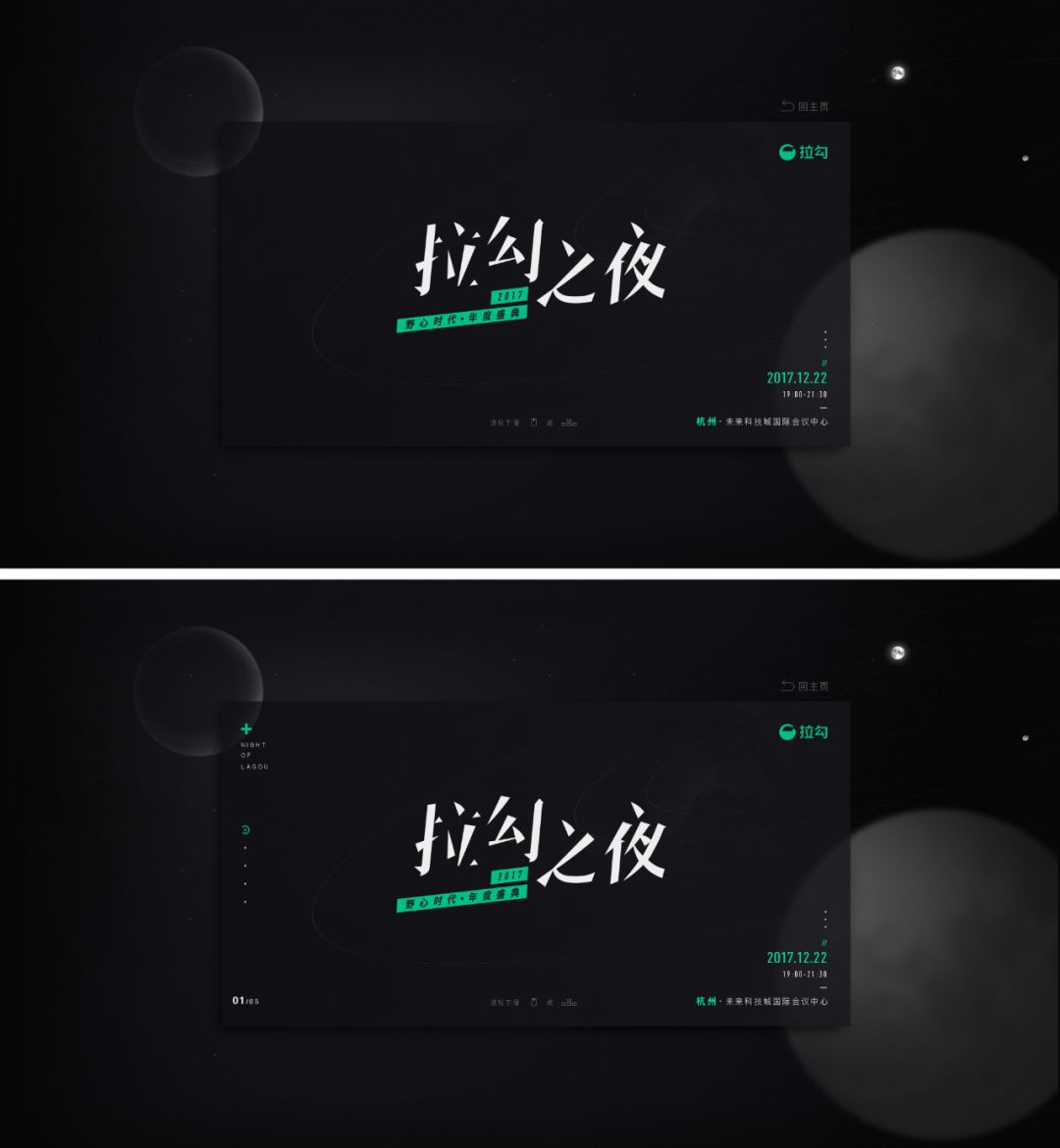
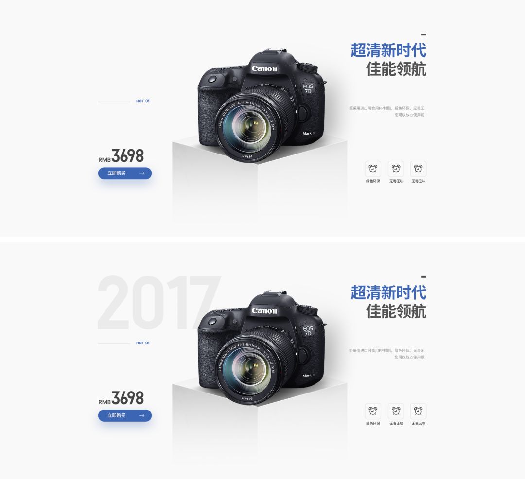
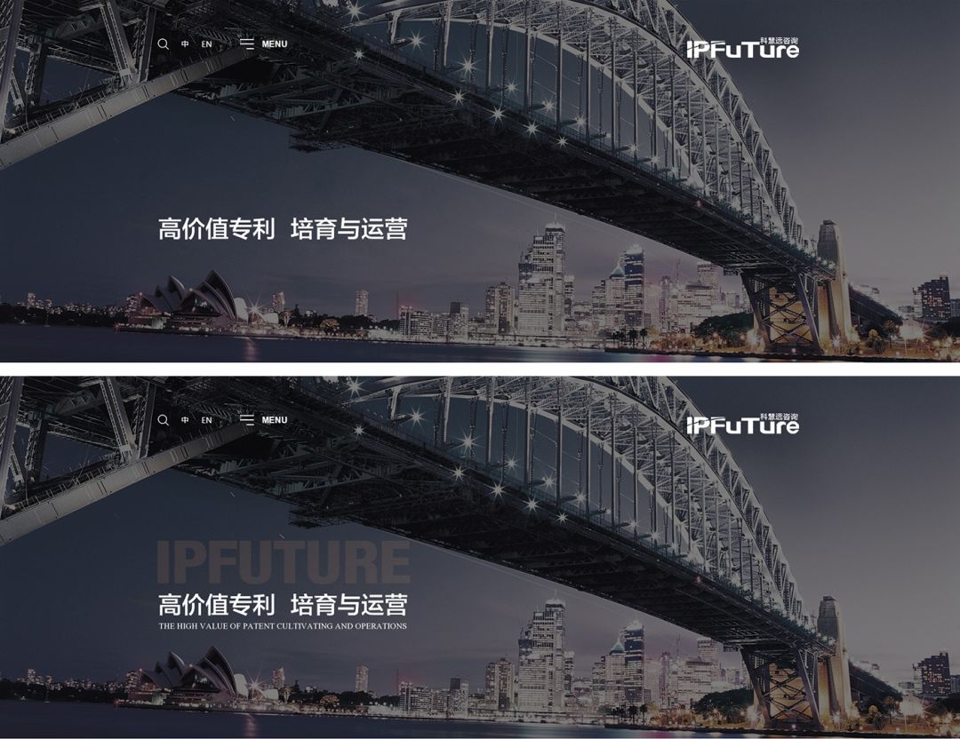
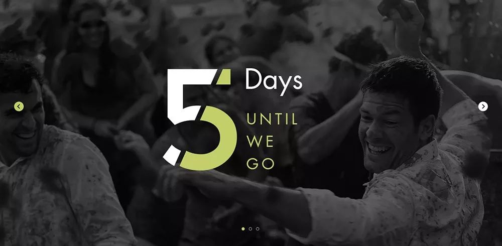
If you encounter too little text information in your daily work and cannot typeset, you can useEnglish in different sizes as an aid,to increase the sense of hierarchy and sophistication, such as:


For text layout, we can summarize:
First: When the text typesetting lacks contrast and there is not enough copywriting to fill in, the English translation can fill and increase the contrast, avoiding single typesetting and lack of change. The specific English font size The size depends on the actual situation!
Second: When the typesetting lacks a sense of hierarchy or there are too few groups, it can also be solved through English translation, because our commonly used typesetting is divided into at least two groups, and three groups are the most reasonable
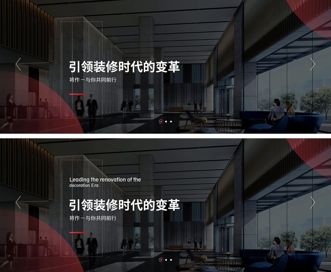
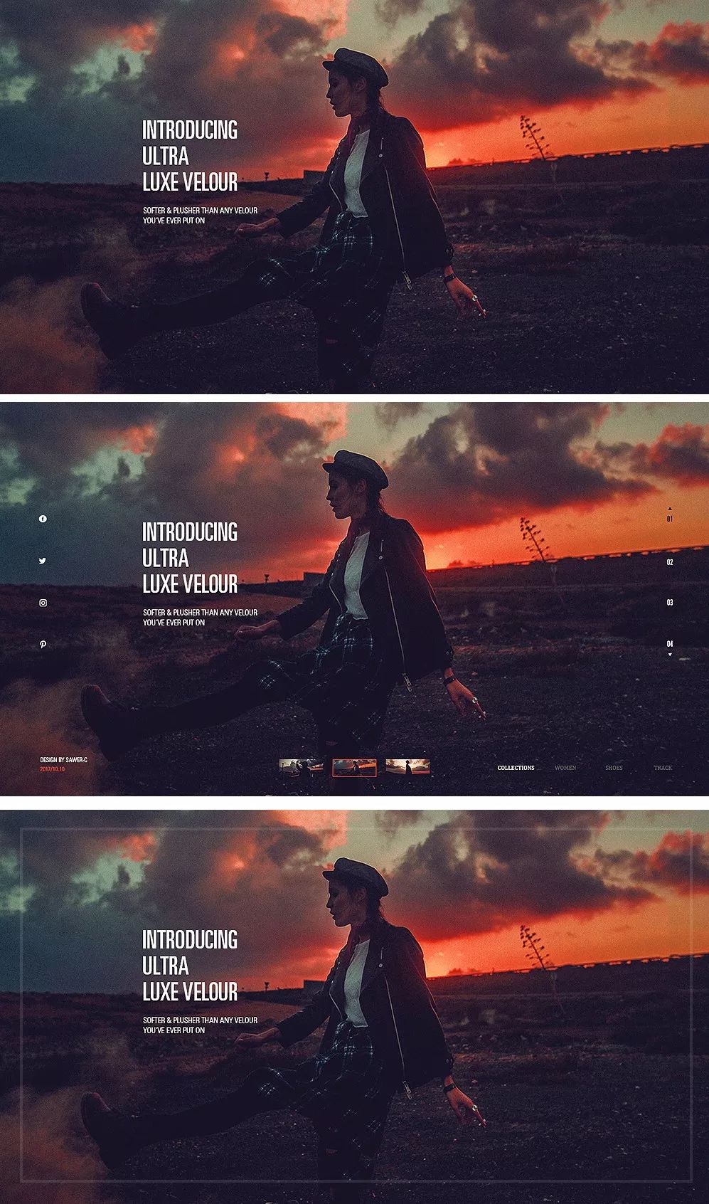
There is another situation (non-text layout), can also use decorative English to increase the layering of the picture, such as :
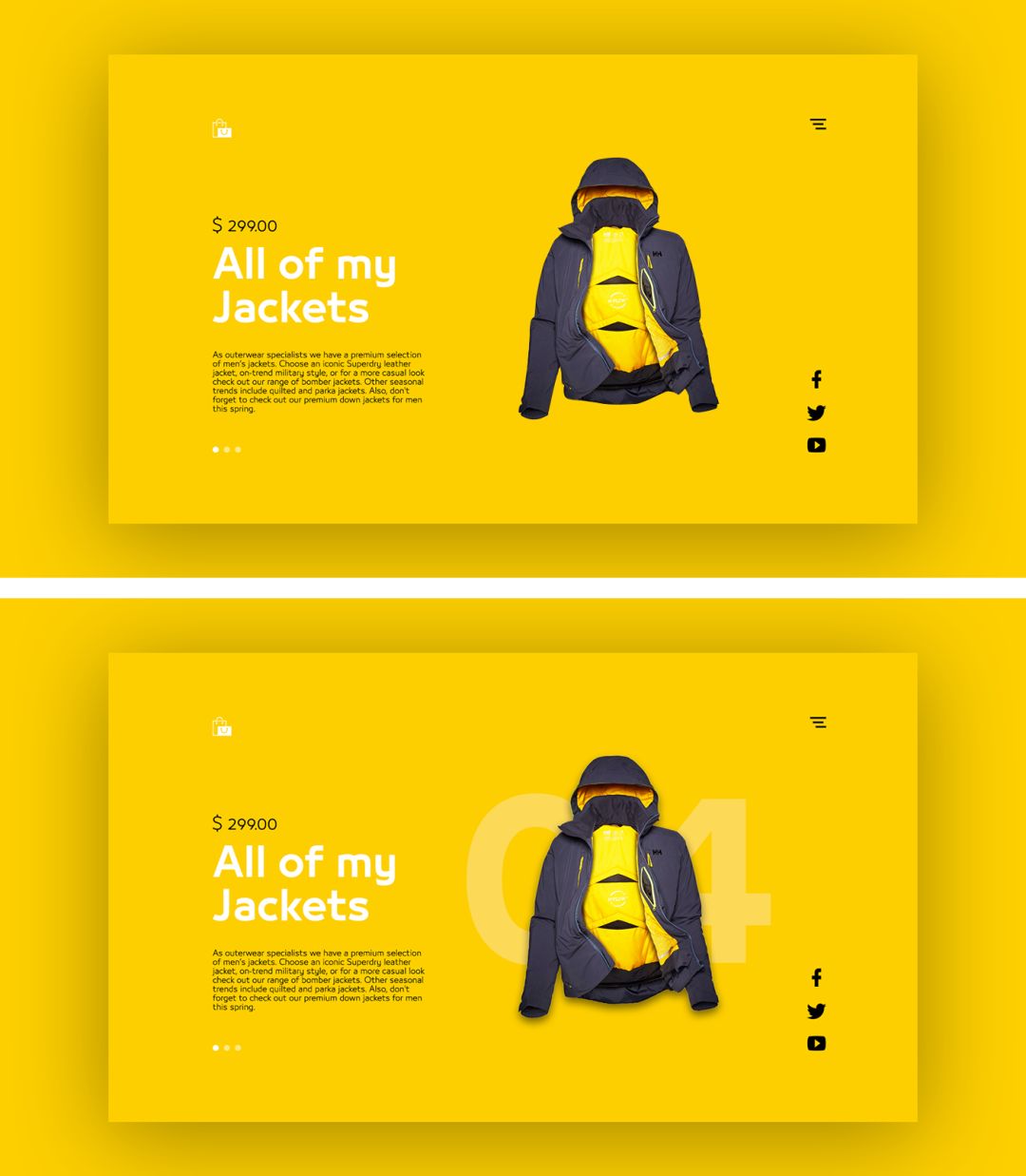
For us, English is more graphic than text, and has a certain sense of form, so we might as well try to increase or enlarge English, or even use English as the focus of text layout, so as to improve the overall design sense, such as: span>
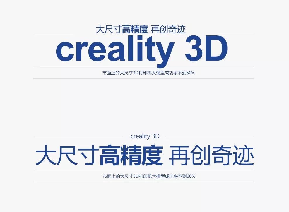

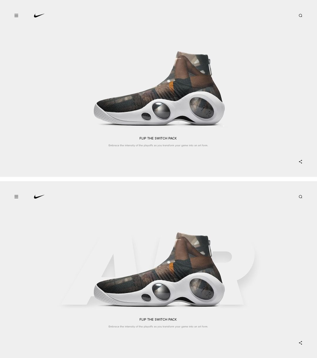
However, this type of form is suitable for relatively small copy information. If the amount of copy information is large and this form is used, it is easy for users to ignore the main copy information, which hinders the normal information transmission. The focus is very important, see the following case~
The same copy, different typesetting forms, two different visual experiences: the first one uses English as the entry point, which gives people a stronger sense of form and is more visually novel, and the second one uses the main copy The information is the entry point, and the layout is more tidy, which is a common form. The two layouts are not completely good or bad, but there is a certain visual contrast. The specific form depends entirely on the designer!
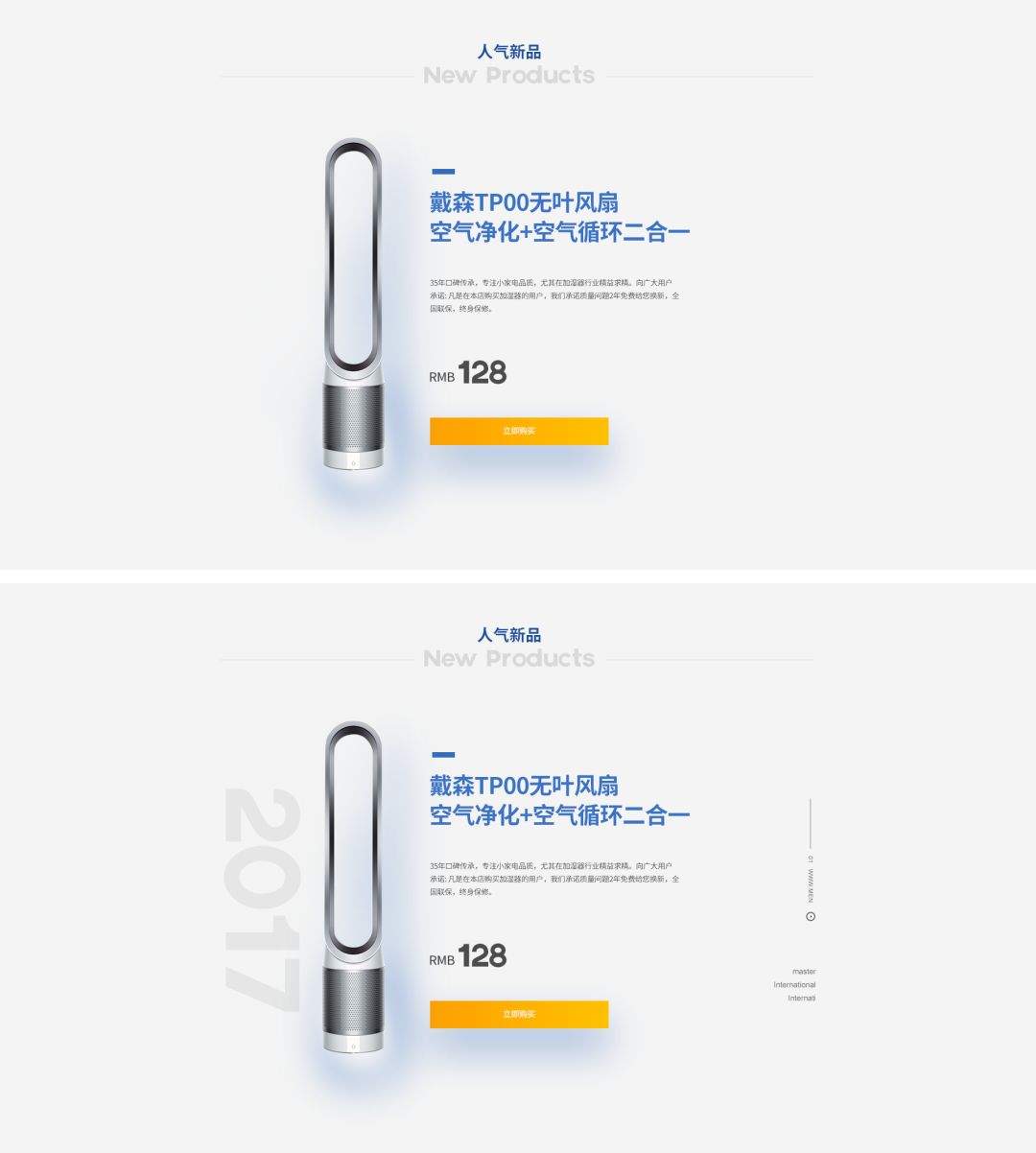
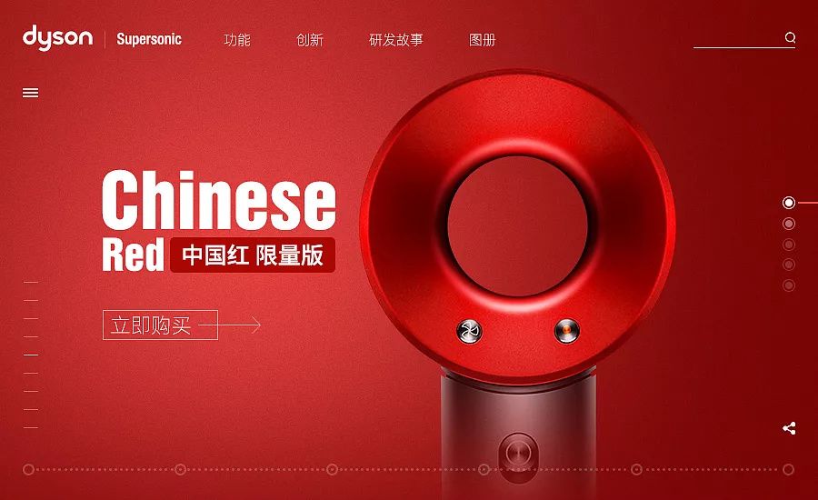
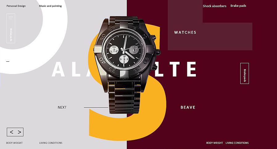
It should be the most logical for English to appear on the screen as graphics. You can combine products, materials, textures, and colors, and then through interspersed and superimposed methods, Increase overall richness, such as:


When our works have empty pictures, lack of sense of form, and insufficient contrast, we can properly use English, numbers, and shapes to fill in, according to different purpose, choose different forms of English, for example, if the screen is empty, it is suitable to use small font size English or large font size English in the form of transparency; when using English because the screen lacks a sense of form, you need to make the English a little bit It is more obvious, and can even be directly used as the visual focus and the form of graphics; of course, the commonly used English not only has these functions, but also has the function of fixing the visual range, such as:

Picture 2 uses the combination of English and graphics, which not only fills the blank, but also plays a role in fixing the visual range, compared with Fig. 3 which only uses Border constraints, the overall effect is better, so, you shoulduse English fonts according to your needs, get out of class!
I haven't watched it yet
Hurry up and say something
More dry goods are waiting for you


Previous Essence Recommendation
The big move is coming! The word is released by the whole network with two free commercial words
Commercial words, how to avoid pitfalls, you need this peace of mind guide
Today, I would like to reward you with a free commercial handwriting
If you want to make the font more attractive, you might as well start with the song title design
How possible is a "cosmetic" makeover? You can know the words from the new official website
If you have any questions, please send an email to
hello@hellofont.cn
Some pictures come from the Internet, if there is any infringement, please contact the background.
Articles are uploaded by users and are for non-commercial browsing only. Posted by: Lomu, please indicate the source: https://www.daogebangong.com/en/articles/detail/Your%20picture%20is%20empty%20and%20has%20no%20sense%20of%20hierarchy%20maybe%20it%20lacks%20English%20fonts.html
 支付宝扫一扫
评论列表(196条)
测试