Authorization transferred from: I am Design Wet ID: ziyou-design
Tutorial commentary: Wang Mengqi
Personal brief introduction: I love drawing late at night, and suffer from long-term hair loss, the hair is as sparse as weeds in late winter. Drink 500ml of goji berries, red dates, rock sugar and pear water, 500ml of black sesame paste, and a dozen oysters every day. The latest smoking cessation report: a failure. At present, I am urgently looking for a friend who quit smoking together, hoping to encourage and promote each other on the road of quitting smoking. Friends who have this willpower and willingness, please add me on WeChat, I have been waiting every night and dawn, thank you.
zcool link: https://www.zcool.com.cn/u/14679443

Many people are learning typography.
Many people still don't become a real designer.
font, many people think it is simple, we write from childhood, we learn Chinese from novels, and we can use many idioms at once when we curse people with dirty words.
But you didn't become a calligrapher because of it, and you didn't become a writer because of it.
But you consider yourself a typeface designer.
Type designer, in the field of design, you may, first of all, be a designer.
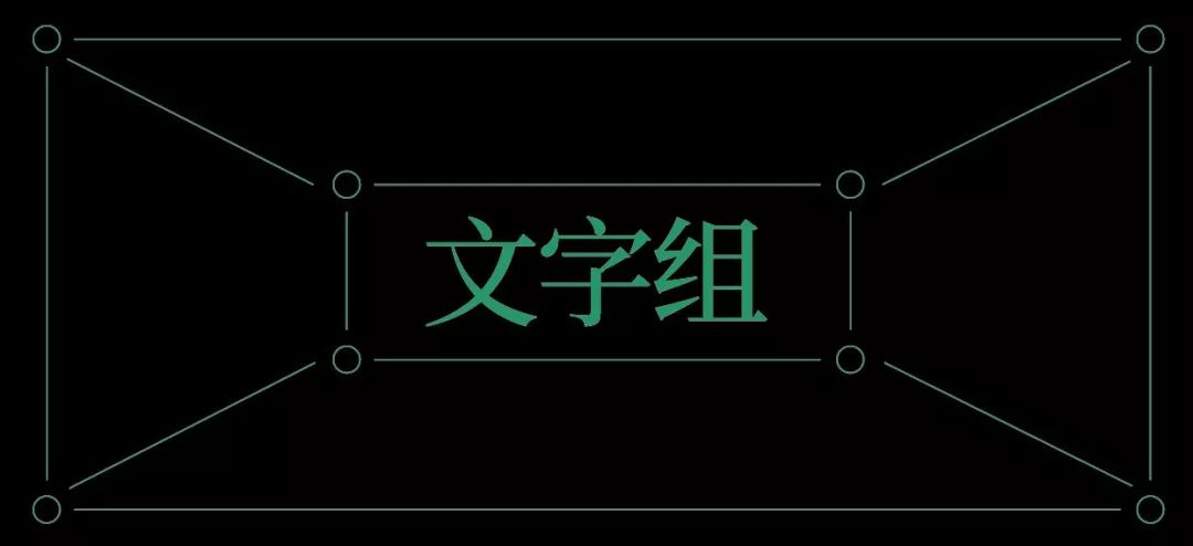
In this article, we start from the typesetting of the basic title text group, and talk about the process from completing a font design to completing a font design-based design screen.
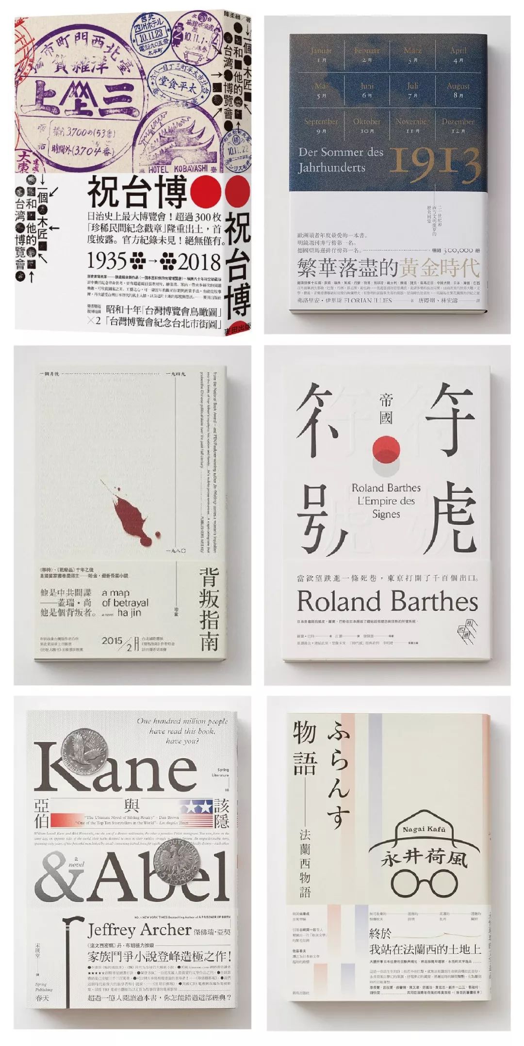
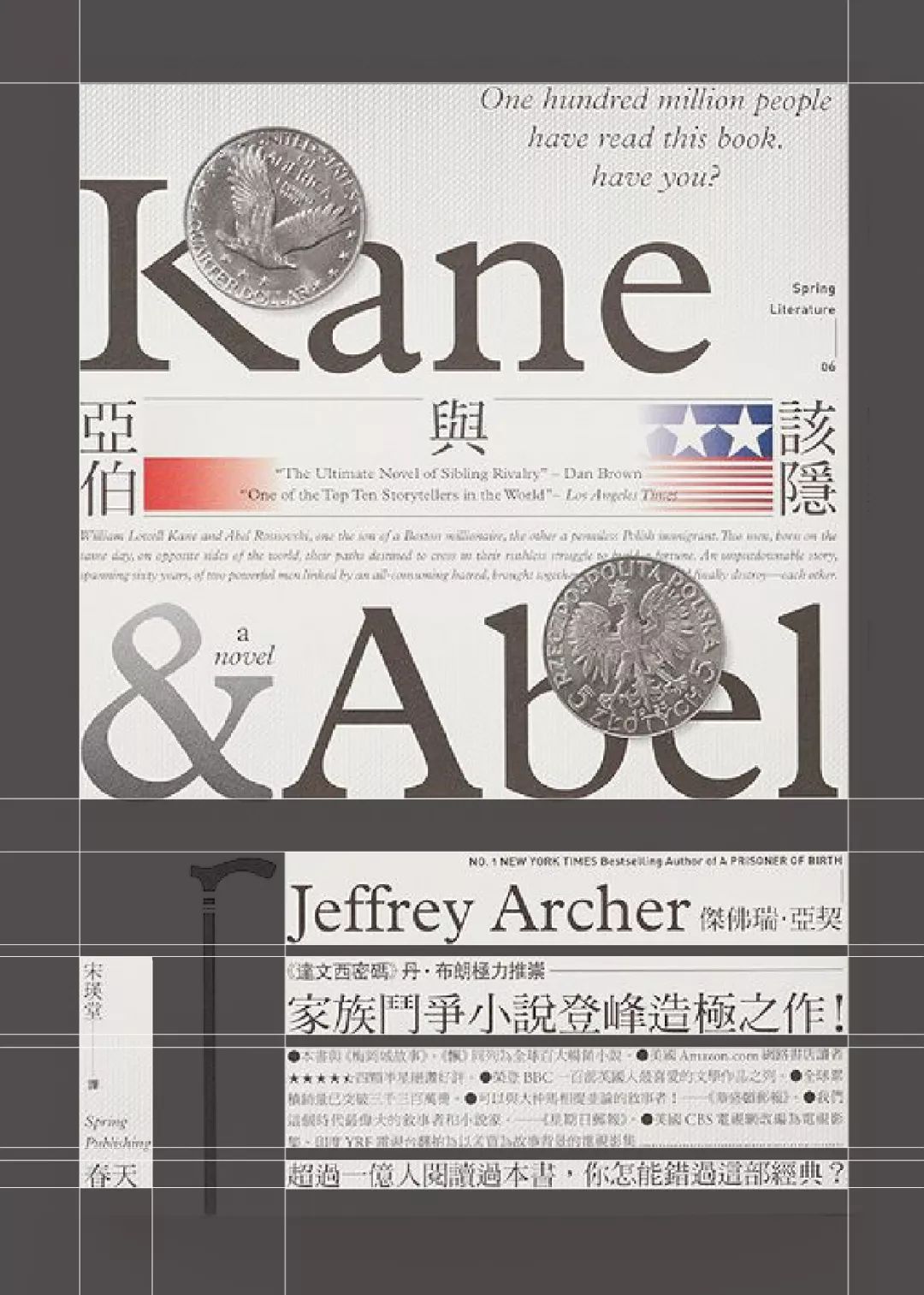
Let’s take a look at some excellent layout designs first. In the book cover below, there is no so-called "font design" part, but still, we perceive the beauty of fonts, which is what we need to think together question.
Is it really necessary to change the strokes? It is necessary to start from scratch stroke by stroke before counting as font design. If the layout of text and other design techniques can also achieve the performance of using fonts to attract attention, is it possible? It means that text layout can also be counted as the category of font design.
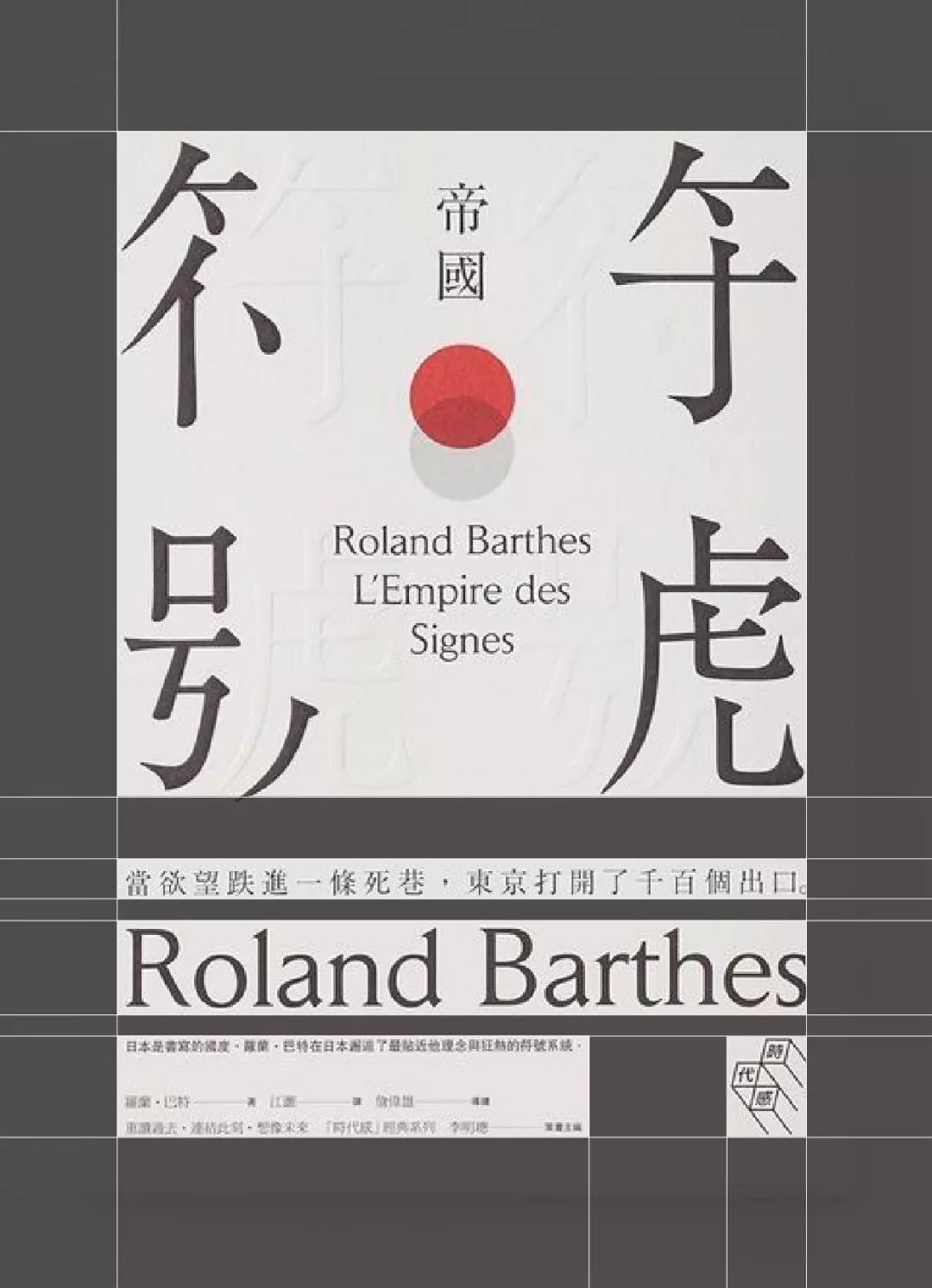
Seeing this, many students may still be confused. The layout is so chaotic, and there is no grouping of words.
It doesn't matter, let's use the auxiliary line to divide it.
Pay attention to observation, in the seemingly messy picture below, it is actually composed of one after another large or small text groups. In the large plate, it is mainly divided into two parts, which constitute the title text of the main body of the picture group, and other text groups that need to be read.
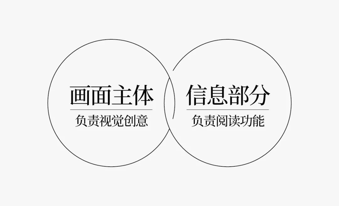
Functionally speaking, the title text group of the main body of the screen is responsible for attracting readers' attention. The small text group is responsible for the information transmission part.
The most conventional poster composition method is basically divided into these two areas.

Let's move on to the next one.
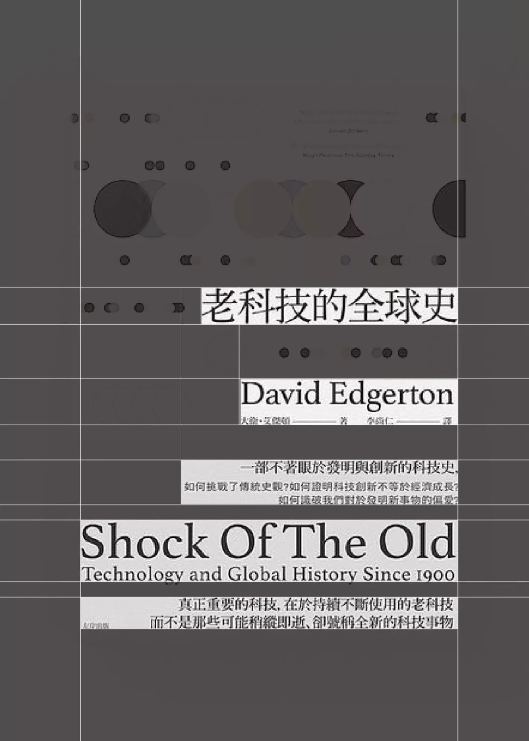
This group of layouts is somewhat similar to the first case.
The large level is also divided into two parts. The title text group of the main body of the screen is responsible for attracting readers' attention. The small text group is responsible for the information transmission part.
The difference is that in this group of layouts, the text information of the main title is combined with the image, and the sense of hierarchy is clearer and richer.
Let's look at the third panel.
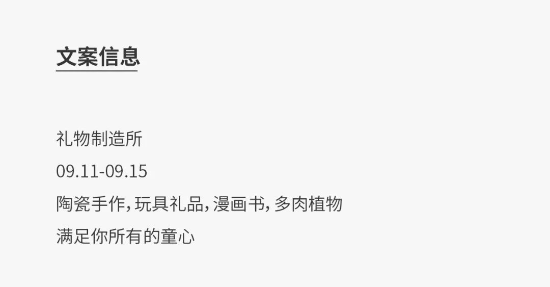
is different from the above two designs. In this group of designs, the main title is not integrated with graphic images, but appears in our sight simply and simply in the way of information transmission.
What is graphics is graphics, what is information is information.
This is also a very common form of layout.
Then let's just classify and give an example of the title text group.
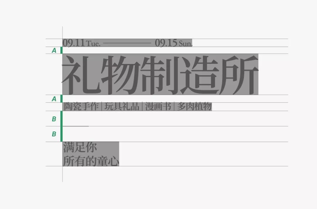
Let's look at the copy first.

Don’t be in a hurry to make the whole title text group, let’s talk about the commonly used date design techniques first, many students don’t care about the details, just blindly pursue the cool effect of hanging the sky, often the result is, It didn't hang on to the sky, but low on the sky.
As we often say, a design without details cannot withstand scrutiny, and a design without aesthetic details is like a strong man sitting in a wheelchair, which is always untenable.


Then we mainly introduce four alignment methods here.
Type 1: Horizontal left alignment.
Let's take a look at the finished effect first. I marked the line spacing between the small text below. Pay attention to the information arrangement under the same level. Generally speaking, the line spacing is basically equal.
The second part that needs attention is that the length of the text generally presents a "short length" arrangement rhythm, which is more comfortable visually.
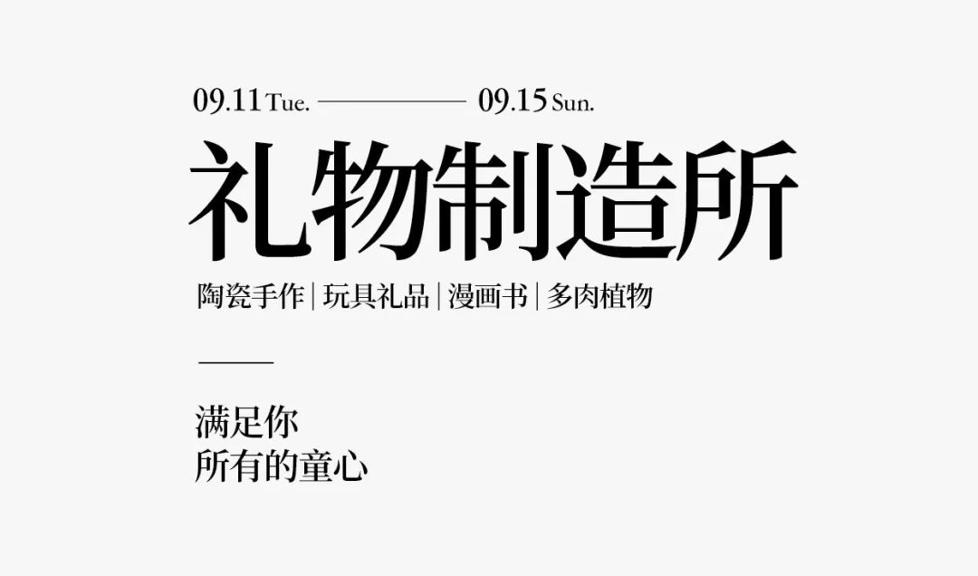
Look at the end result.
Although there is not much information, each small paragraph of text still needs to be arranged delicately, with clear primary and secondary, and a slow rhythm.


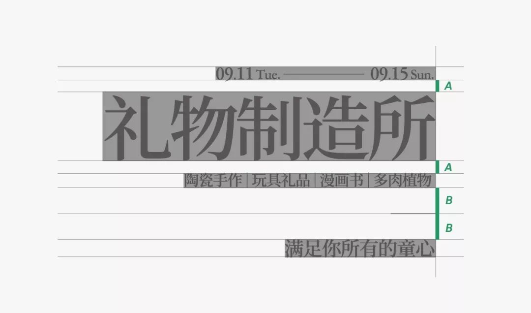
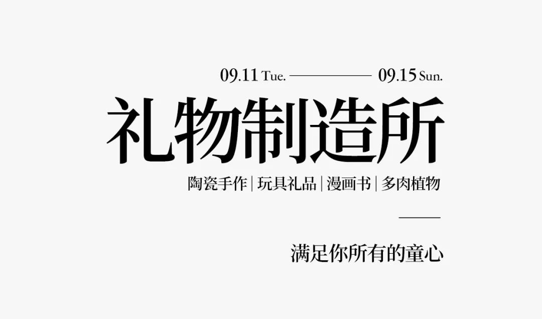
The second alignment method: Horizontal right alignment.
In any case, alignment is still the most important rule in design, no matter what kind of fancy design you want to do.
Then although the overall information and font have not changed, but after the right alignment, I still combine the last two lines of information into one line. The reason is that in right alignment, our visual center of gravity is shifted, so we need to change the rhythm of information arrangement according to the typesetting method.


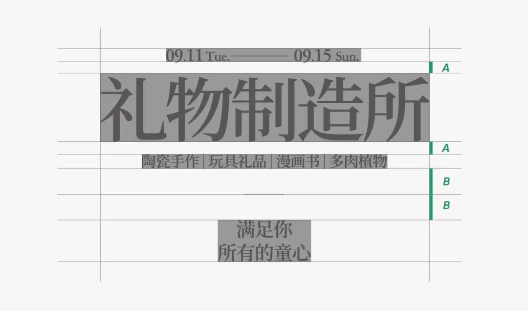
The third alignment method: horizontal center alignment.
Centered alignment has a stronger sense of rhythm. Its visual line is not as clear as the first or second alignment method, but it is more flexible.
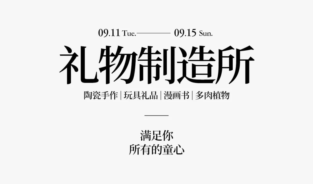


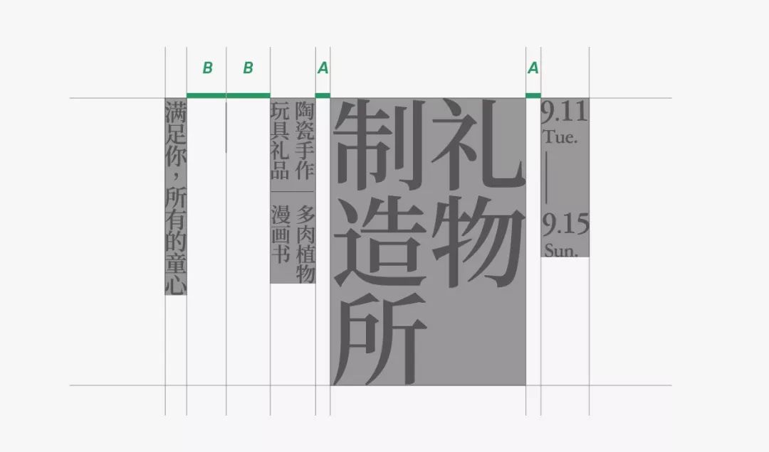
The fourth alignment method: vertical top alignment.
Generally speaking, after vertical arrangement, our reading line is from right to left, so I arranged the size from right to left in a hierarchical relationship of information.
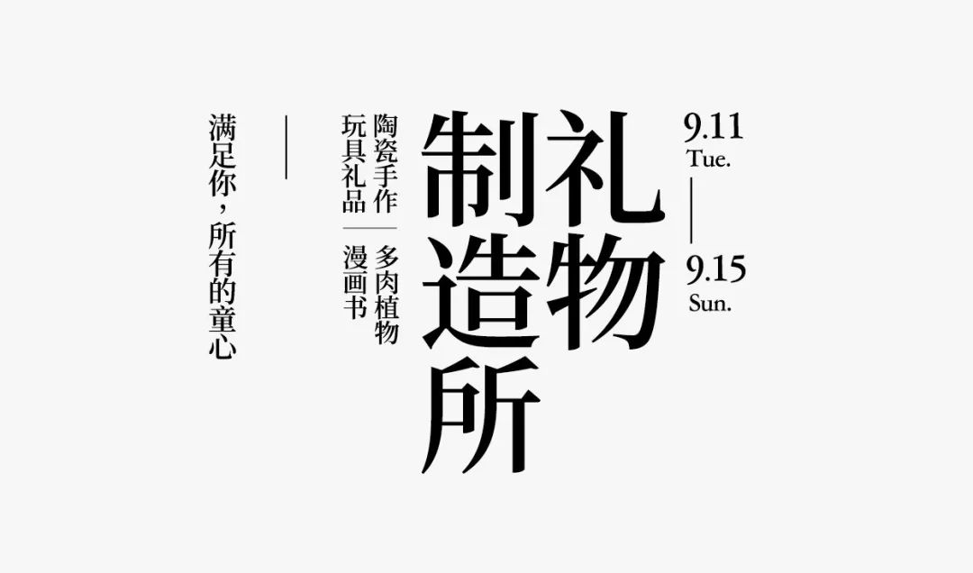

Then we will only introduce these four most basic alignment methods here. In fact, strictly speaking, there are still some typesetting methods in free typesetting that can be introduced, but in general, they are all combinations of the first four alignment methods, such as Left and right alignment for combined forms, wrapping typesetting (center alignment), etc. Let's stop here.
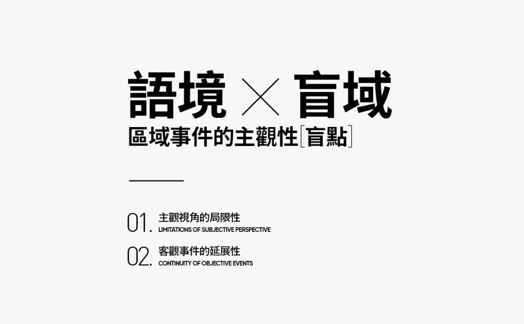
Then we come to the complete case demonstration part. In this part, we will combine font design and text group design.
Let's not do font design first, let's do simple text layout, and see how the information groups without font design (or without integrated graphics) should be arranged properly.
Let's look at the design part of the headline first.
In the text group below, I just use left-aligned processing. It is enough to arrange simple information clearly.
Then this group is a relatively conventional method.
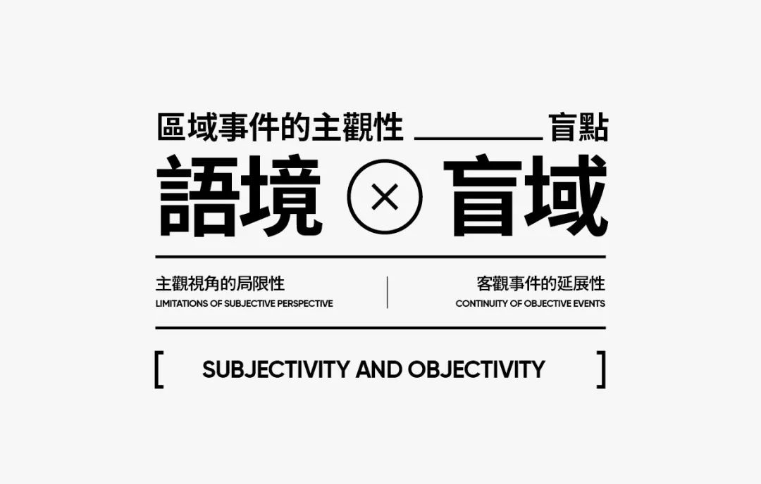
Let's look at the second type again.
The second type is richer in form. The reason is, I made some simple changes to make justification mandatory.
Why not introduce it in the basic alignment method, because in essence, this form cannot fully adapt to information processing in many cases, so it is not considered the most basic alignment method.
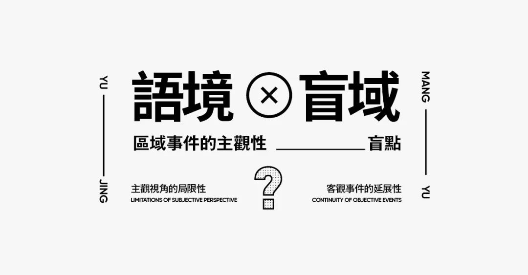
Let's look at the third one.
The third is somewhat more difficult.
Because it is difficult for you to judge directly from the whole, it specifically belongs to the category of that alignment.
From the perspective of small text groups, some of them use left alignment, and some of them are right aligned. On the whole, there are also center-aligned parts, and there are also parts that are forced to be aligned at both ends.

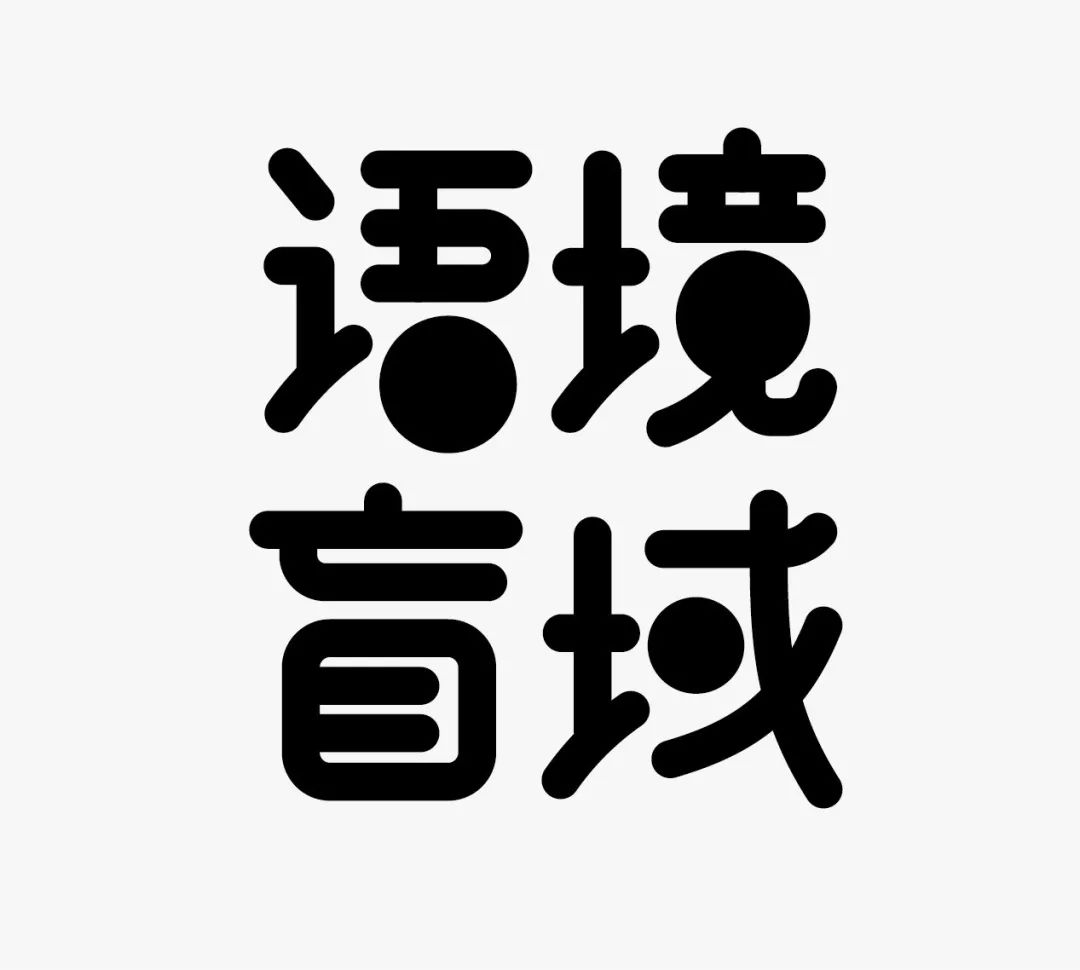
We have tried the basic title text group, now we start the font design part.
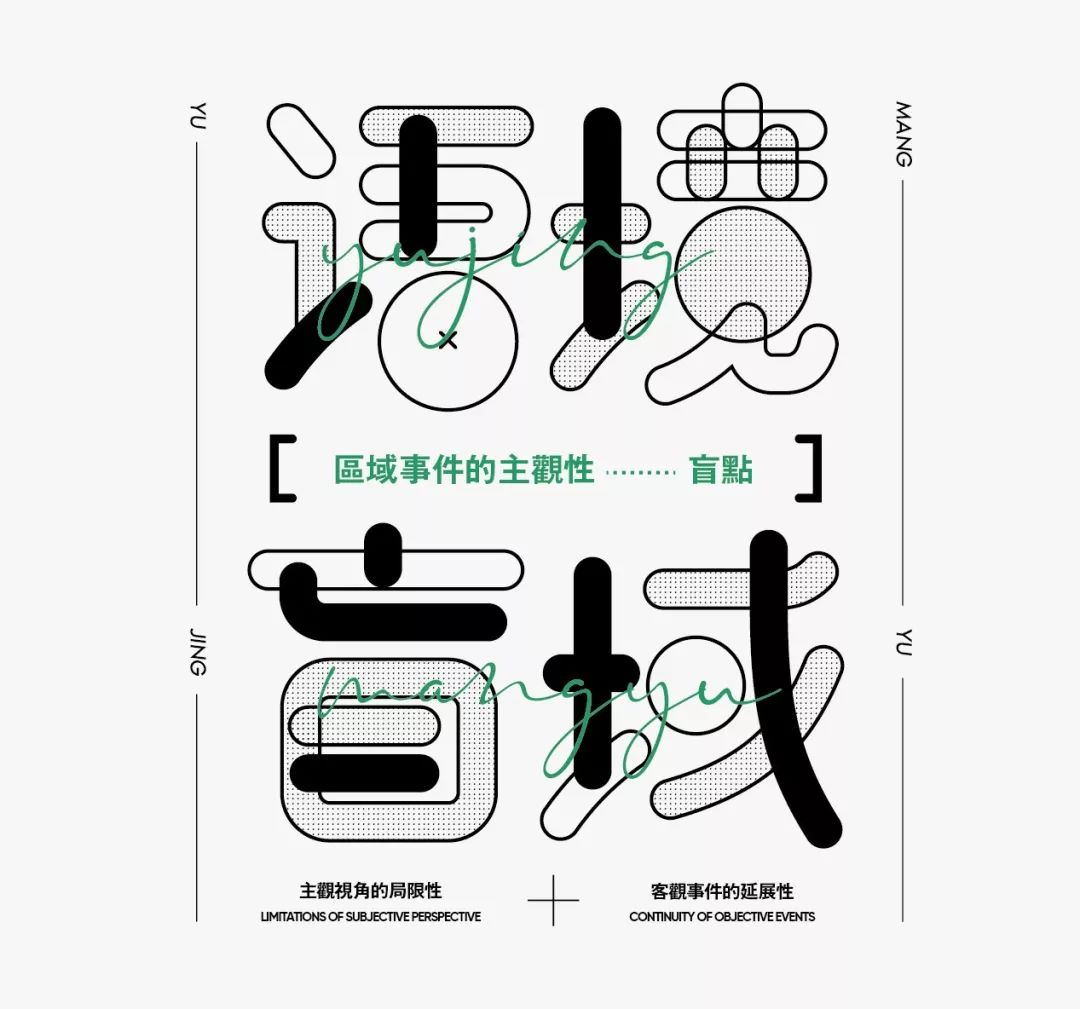
The first step is to simply make the font.This step is not complicated.
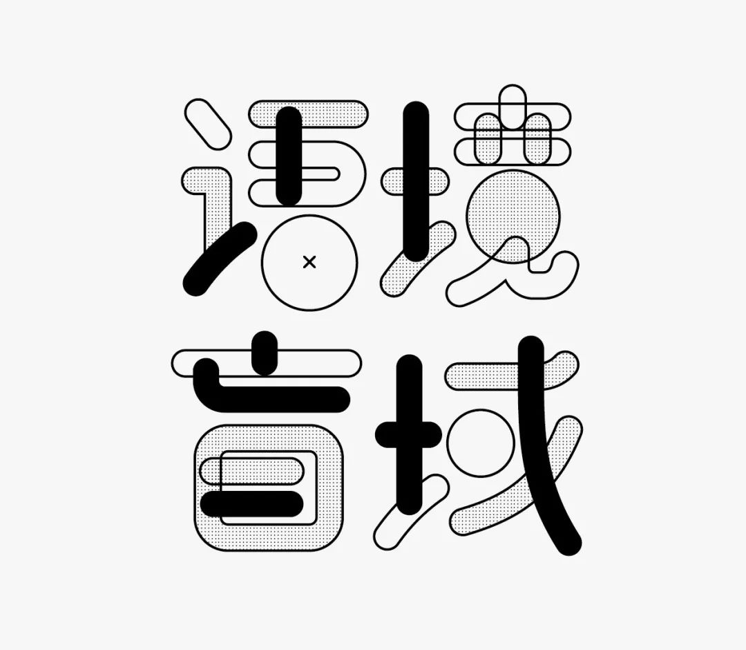
The second step, we have to start the graphical processing, because my previous idea was to make a font and picture, so this requires , the font design part should be attractive enough.
I chose texture fill here.
But there is more than one texture, but a disordered effect arrangement, which looks more flexible and less rigid.
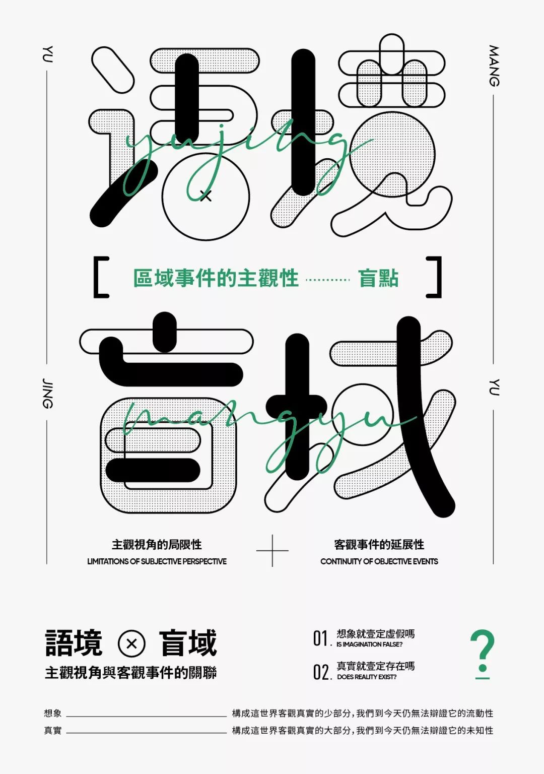
The third step is to make richer text group processing effects for the font design screen.
In this step, we need to know clearly that the large title group has been designed, and the rest is to perfect it, so as to become a picture with graphics and information.
The fourth step is to do other information and text layout in the poster.
Actually, I also control other text information in the form of small text groups, so from the perspective of the entire layout, it still has a strong sense of order.
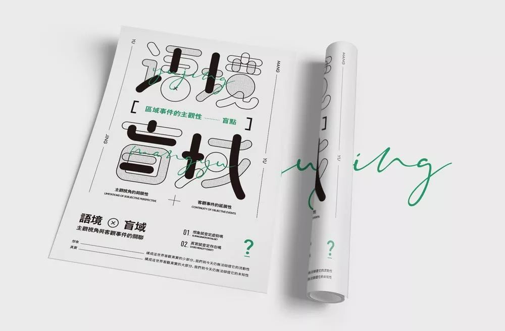
Let's take a look at the end result.
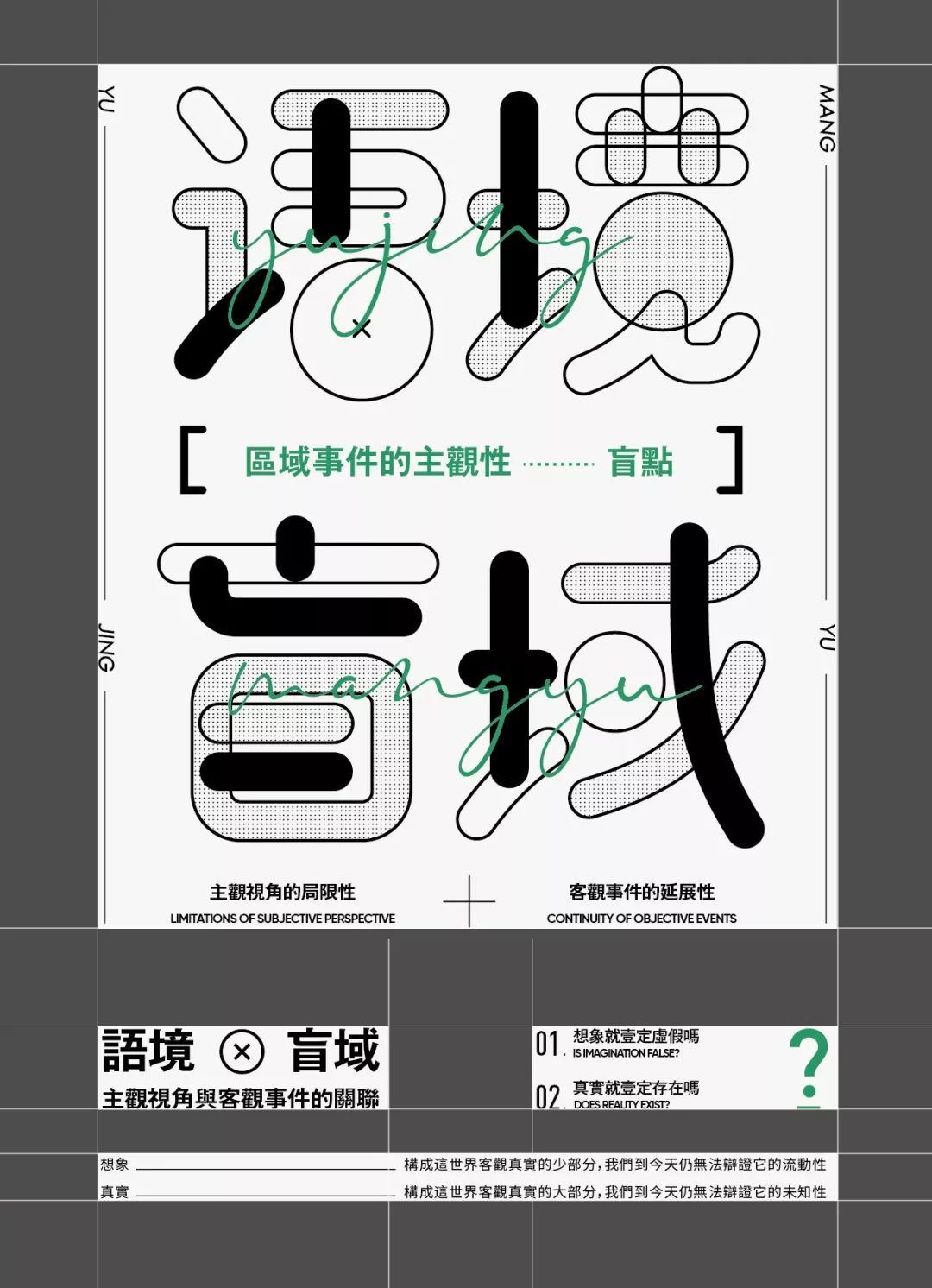
Let's deconstruct the specific information arrangement of this poster and the position and size relationship of text groups.
In the following information, I repeated the title of "Contextual Blindness" again, because the above font design is responsible for the graphic part, and the information transmission may not be satisfactory, so I repeat it again , for important emphasis.


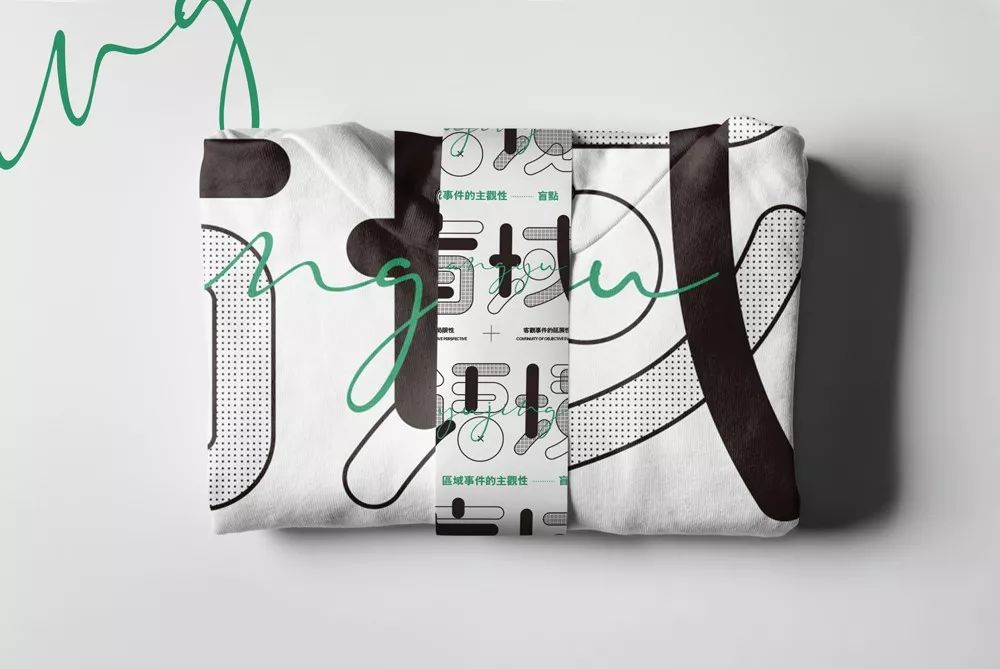
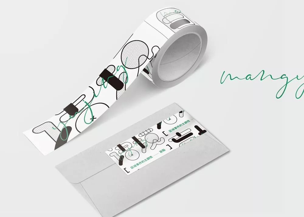
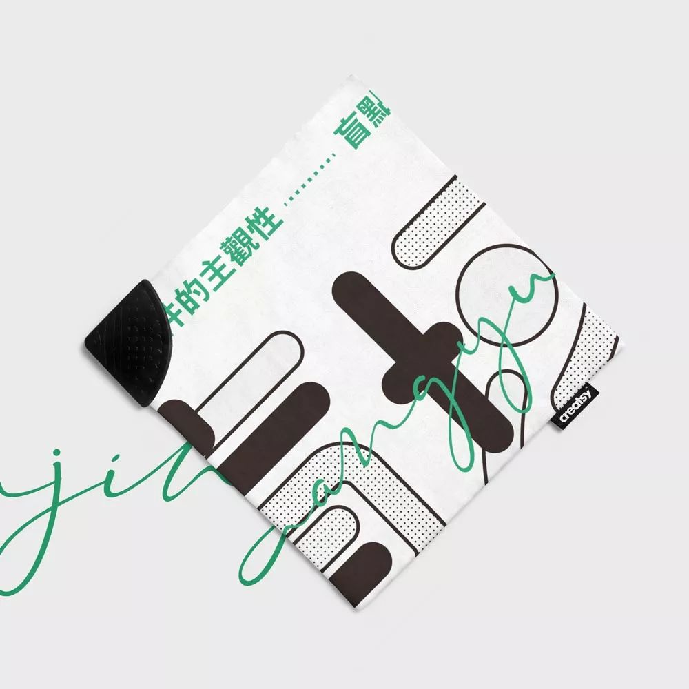
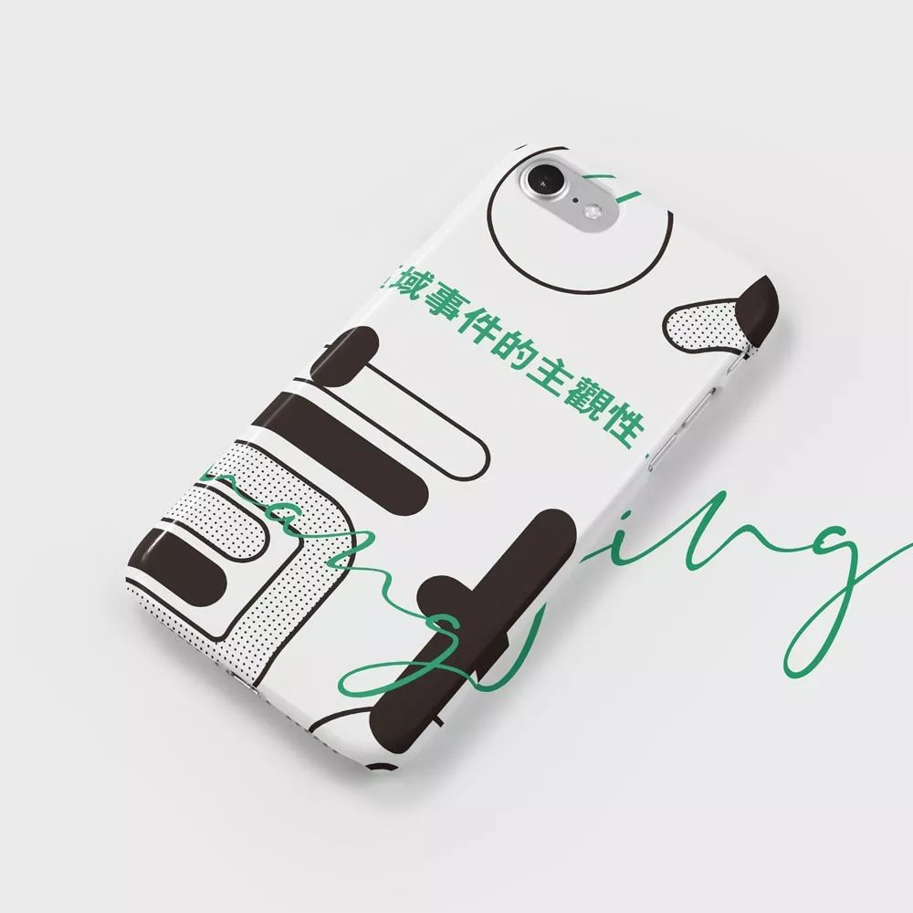
Below is a rendering of the poster.


Have you learned all about today?
Promise me to practice after reading it~
See you next time~
The harder you work, the luckier you get.
This is the right path of Pangmen.
Articles are uploaded by users and are for non-commercial browsing only. Posted by: Lomu, please indicate the source: https://www.daogebangong.com/en/articles/detail/Your%20font%20design%20is%20ugly%20because%20the%20typography%20is%20ugly.html

 支付宝扫一扫
评论列表(196条)
测试