Everyone is familiar with the four basic principles of alignment, repetition, contrast, and intimacy, but for a while, I was very confused about the principle of "alignment": alignment is to make the elements on the page look unified and connected, but usually However, the alignment of articles will bring tediousness and lack of sense of design. How to control it?
There are too many people talking about the theory of alignment. In this article, I want to talk about where we should "break" alignment; how misalignment and alignment should cooperate in the screen. If you have the same confusion as I once did, just read it.
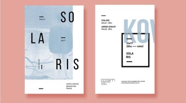
Center, Justify, Right (Left)
The alignment we often say refers to the alignment between text blocks, but it is also worth noting within the text block. First, let's take a look at these three alignment methods.
Center alignment is not commonly used for long sentences and long paragraphs, because it has a focusing effect. If a long paragraph of text is focused, it will be too annoying.
But center alignment is often used in poster titles, or even on the entire poster. You can often see a line of alignment, which looks good, but most of the time it lacks creativity, because you just use alignment without thinking about breaking text blocks. Re-layout the entire screen.
Two-end alignment is the neatest alignment. If a picture is too messy, you need to use two-end alignment to coordinate. Justified Because the fixed width of the paragraph does not change, the word spacing of each line is different. The change of word spacing may lead to the appearance of blank gaps (the space between words is too large), which can easily lead to line skipping and affect people's reading.
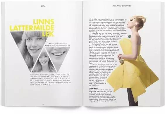
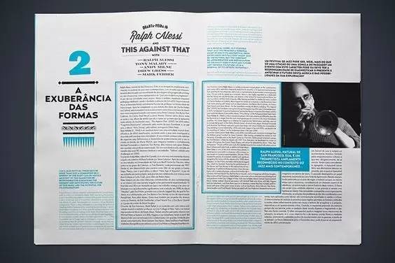
Left (right) alignment is the most commonly used. Its aligned end is used to distinguish spatial levels, and the unaligned end is used to increase texture. When you look at the text block as a graphic, you will find that the left (right) aligned irregular edge will form a natural wave shape, that is to say, the unaligned edge automatically generates a changing negative space. Note that numbers are often right-aligned.
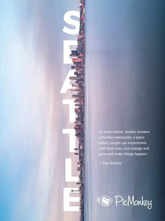
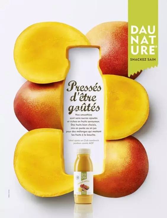
In addition to these three alignment methods, sometimes text blocks are aligned with the outline of the image to form a softer edge. But in any case, the purpose of doing this is still to form a changing negative space.
Standard: hierarchical relationship
How to comprehensively consider which text blocks need to be aligned, and which ones need to break the alignment?
The answer is to consider the hierarchical relationship first.
After distinguishing the first-level, second-level, and third-level important information, each text block is treated as a geometric figure to determine whether it should be aligned. For example, in the design of posters, three levels are needed, that is, the level of eye-catching information that the audience can see at a glance from a long distance, the level of information seen during the process of walking in, and the level of rich details seen after getting closer.
After we divide the hierarchy, what are the specific methods to "break" the original alignment?
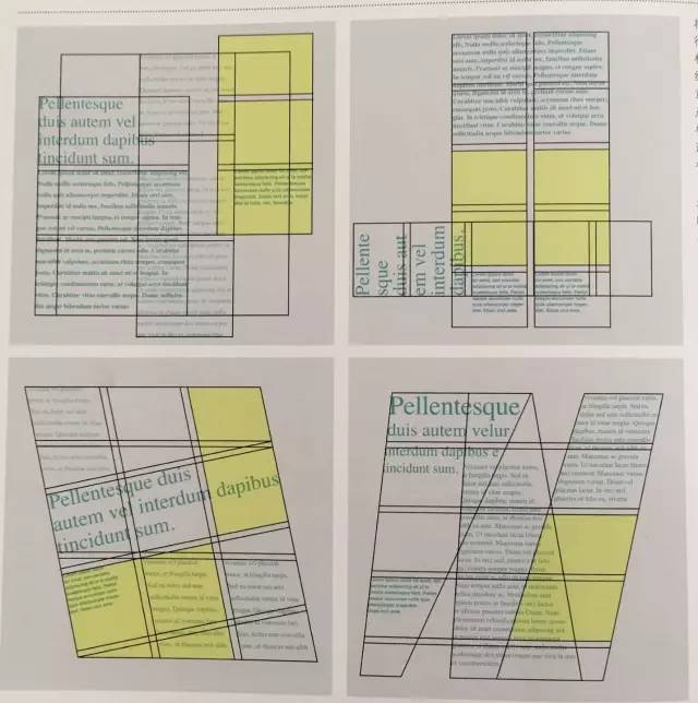
1. Multi-dimensional
We Open your mind again, can each text block also rotate along different dimensions? This makes the picture look richer.
2, interspersed and overlapping
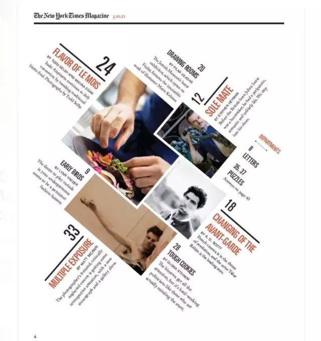
Images, text blocks, and text blocks can block each other like the Boolean operation on two shapes in PS (in Boolean operations, it is to merge shapes, subtract the top layer, and exclude overlapping areas). A text block and several other interspersed with each other can make the picture more closely connected than if they are separated by the same distance.
More importantly, the interspersed layout can carry more information. If Party A gives a whole page of copywriting, this method is not so good.
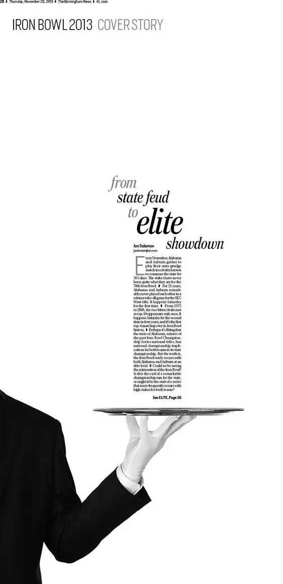
3. Extend
The image can be extended beyond the page, and the text can also be "collapsed" " out of the page. In painting, the objects that rush out of the picture are used to increase the sense of space of the picture, and this principle is also applicable to graphic design. Text that is cut off a bit to convey primary or secondary importance, or a lightened color to act as a background can break up monotonous alignment.
4. Grid deconstruction
In fact, this method is a comprehensive application of the above three methods. We usually use a grid system to set the position of each level of information in the screen. However, the deconstructed grid deliberately protrudes or indents the information compared with the original grid, or directly splits the grid to create a layered and mutually transparent effect. This method can more accurately predict the final result.
Articles are uploaded by users and are for non-commercial browsing only. Posted by: Lomu, please indicate the source: https://www.daogebangong.com/en/articles/detail/Your%20design%20is%20so%20random%20The%20copy%20is%20not%20aligned.html
 支付宝扫一扫
评论列表(196条)
测试