In PPT, font is the most important element in typography. Therefore, we first need to understand how to choose fonts and typesetting fonts, so that everyone can understand the classification of fonts, and beautify the text on the basis of font selection. By mastering and understanding PPT text layout, you can better display the content of PPT.
What are the classifications of fonts?
Can't use other fonts except Microsoft Yahei?
Don't know how to embed personalized fonts?
I don't know which fonts are free, and which fonts are commercially infringing?
Let us discuss the knowledge about fonts with questions
Summary of full text:
Basic knowledge of fonts, text layout and applied font copyright in PPT, how to embed fonts in PPT1/ Font basics
1.1/ Font classification
We use this It can be clearly seen from the picture that fonts can be divided into "serif body" and "serif body"

Simply put A serif font is a font with corner decorations, and a sans-serif font is a font with uniform thickness and no corner decorations.
1.2/ serif
Arial is comparison A typical serif body is characterized by additional decorations at the beginning and end of the strokes, and the thickness of the strokes is different.

serif The form is usually more obvious, vivid, and has a high degree of recognition, and is easy to be recognized by people, so it is very suitable for printed materials such as articles, books, and magazines with a lot of typesetting. Common serif fonts include Arial, Times New Roman, Georgia, etc.
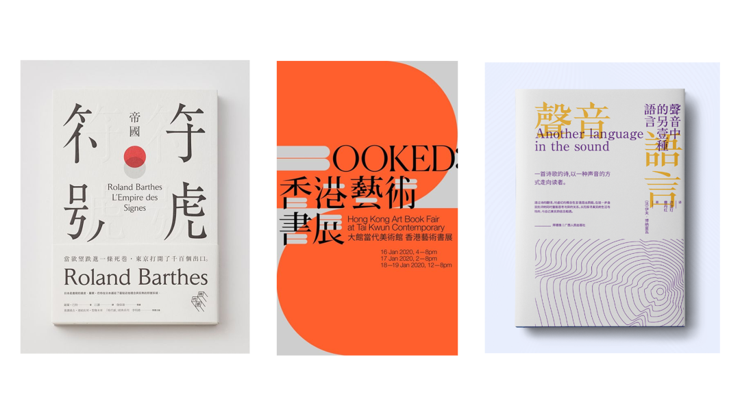
serif It is more suitable for formal and serious occasions. Generally, it is more common in the cover design of Chinese style. The retro Chinese style prefers this serif font, which is more elegant and retro.
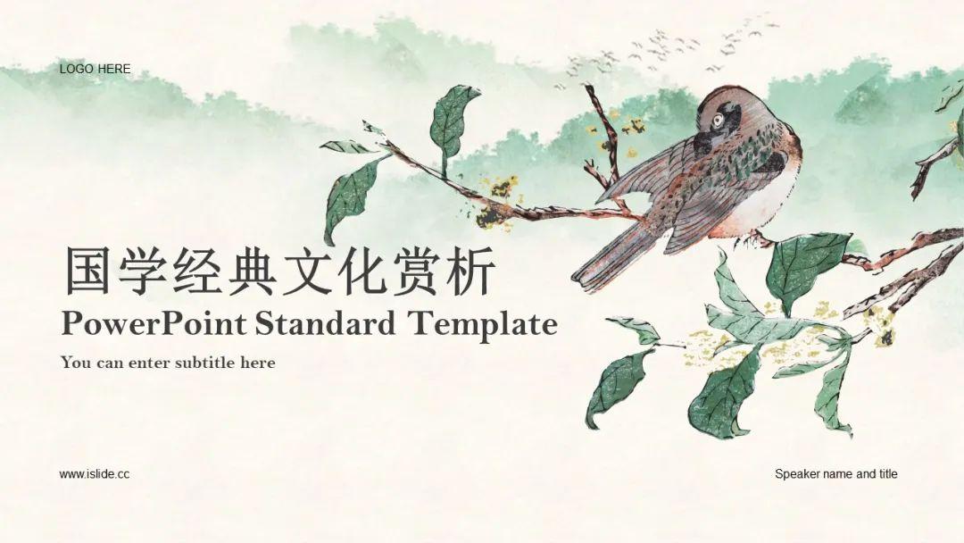
【Case Library】Search ID#867217
1.3/ sans-serif
sans serif The font is characterized by no additional decoration on the strokes, and the thickness of the strokes is similar.

Compared to serious The serif font, the simple and clean sans-serif font is simple and atmospheric, and its readability is very high. It is very suitable for text content, and it is also very suitable for formal occasions such as business reports and press conferences. Therefore, it is very popular. Most of the body text of the article will use a sans serif font, which is easy to read regardless of the font size.
Like Microsoft Ya Black, Holly Blackbody, Siyuan Blackbody, Myriad, etc.
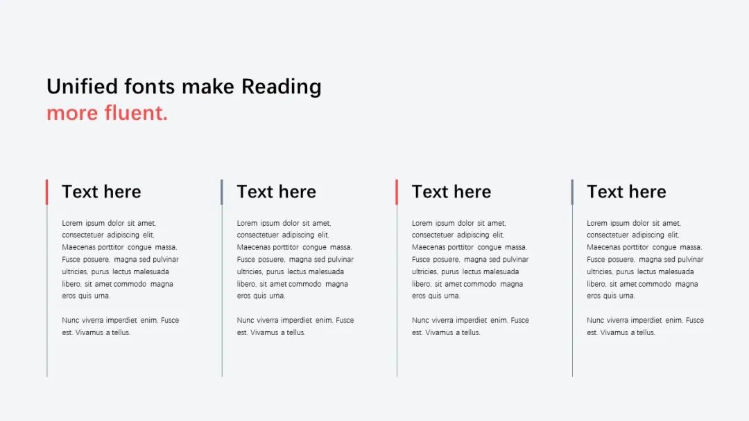
[Illustration Library] Search ID#940056

[Case Library] Search ID#995795
sans serif The body has a sense of technology and rationality. For example, the cover with a more technological sense in the above picture uses a sans-serif font, which is more stable and atmospheric, can catch the reader's sight, and is easy to identify.
2 font size Font-size
Designing PPT For inner pages, we usually use various types of text, such as titles, subtitles, body text, suggestive text, etc.
In order to allow users For a better viewing experience, we recommend setting the font size of the text between 14-18pt . If the font size is too small, it will cause reading barriers to users and affect user experience.
Also, reasonable An orderly font size setting can make the interface information clear and easy to read, with a clear hierarchy, while poor and disorderly font size usage will make the interface appear chaotic, further affecting the reading experience.
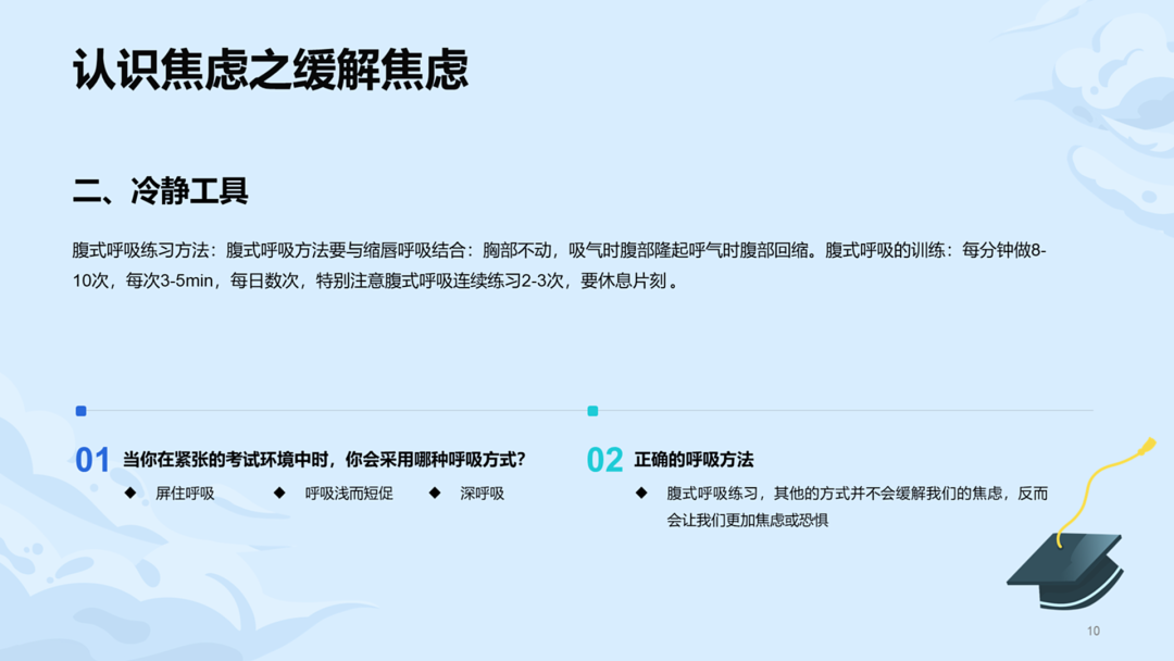
[Case Library] Search ID#998227
In our use When the text size is hierarchical, you can use the font size magnification to plan the text hierarchy. Assume that the red block is twice the font size of the blue block, and the other text font sizes are also expressed according to a certain magnification relationship according to the importance of the information.
These proportions can Make adjustments on a case-by-case basis for the best visual and user experience. At the same time, we can also use other visual elements such as font weight and color to further emphasize different levels of Information, so that readers can understand the content of the interface more clearly.
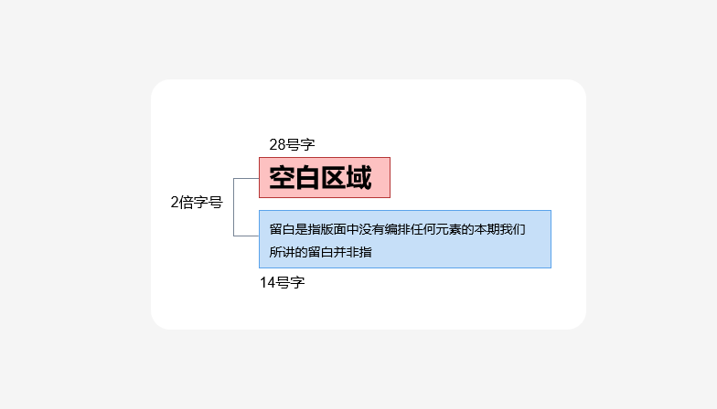
The font size ratio can be Make the hierarchy clearer for better visibility and readability.
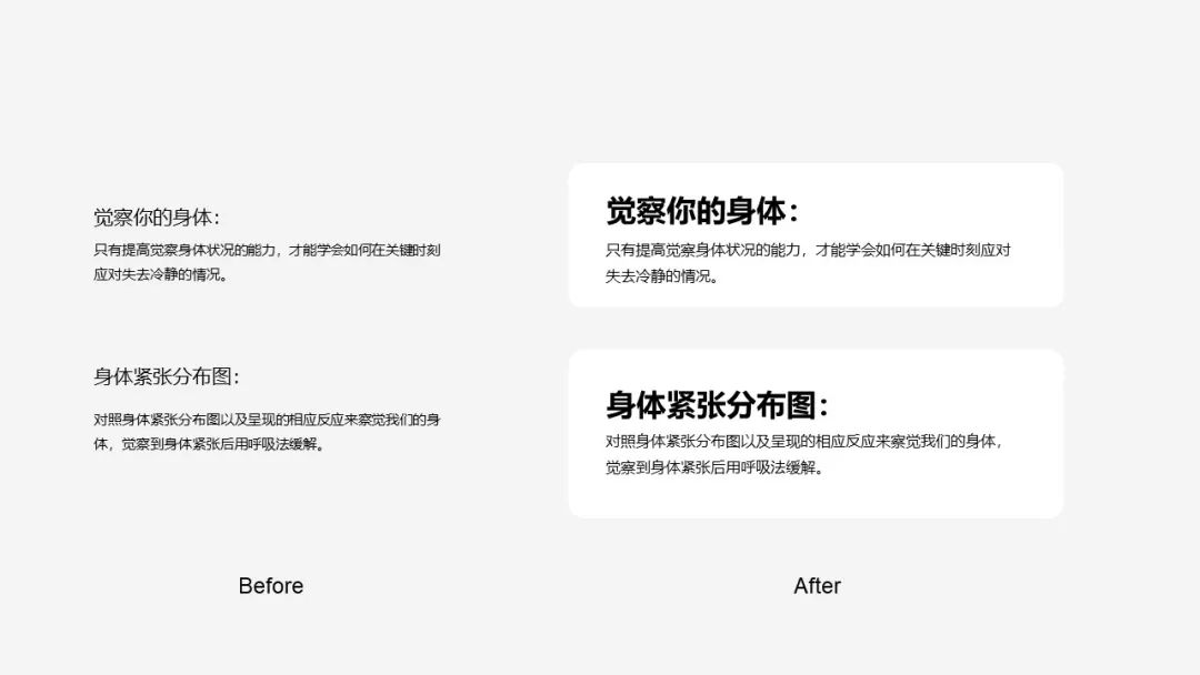
2/ Text layout and application in PPT
Before we learned about fonts, text layout is a very important part in PPT, which directly affects the presentation effect and audience perception content understanding. So in order to make our cover more outstanding, we use two actual cases to illustrate the application of text in PPT.
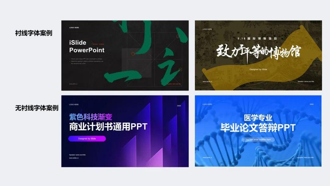
2.1/ Practical application of serif fonts
In practical application Among them, serif fonts are usually used in traditional, formal and professional occasions, such as traditional Chinese style posters, newspapers, magazines, etc.
in the following In the case, calligraphic fonts are used, and most of the calligraphic fonts are serifs. In order to create a more decorative picture effect, we can split the strokes of calligraphy fonts and use them as decorative elements in the picture. Next, we can follow the steps below to make a cover about the traditional festival of Dragon Boat Festival.

First step : Select a calligraphy font suitable for the theme. In this case, we can see that the overall background is a landscape-oriented Chinese style element.
If we use General sans serif fonts will appear too modern and dull. Therefore, we need to choose a Chinese-style calligraphy font and optimize it during the typesetting and design process to create a visual effect that is more in line with the theme.
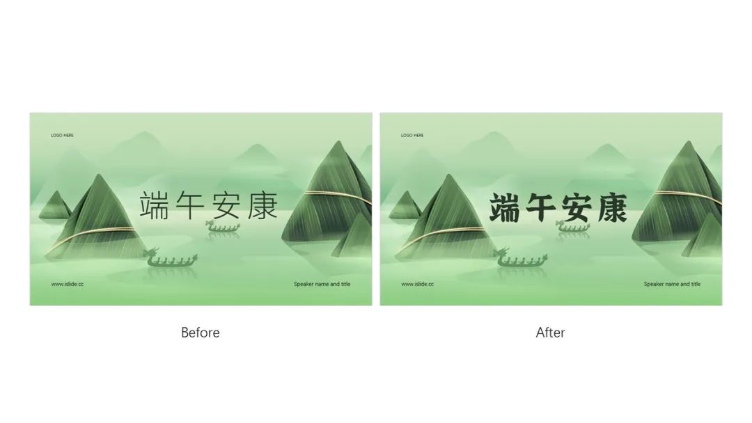
Step 2: After confirming the font, we canuse iSlide Splitting tools Split fonts, quickly split text into individual words with one click. This allows for more control over the placement and typography of typefaces, allowing text to blend into the background better.
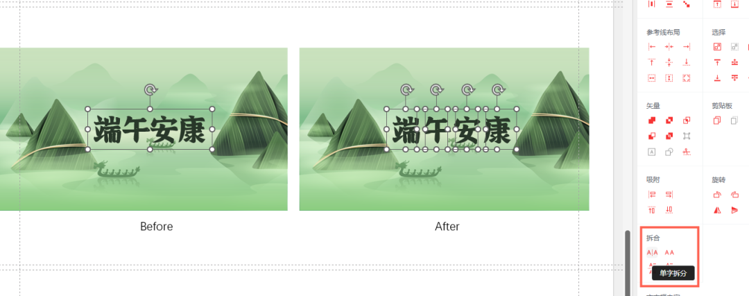
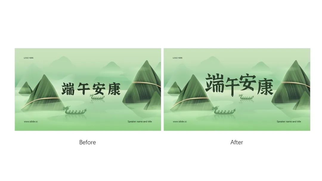
Step 3 : We staggered the size of the text to enhance the sense of staggering and space of the text. This allows the text to blend into the background more naturally, while also improving the overall visual effect and aesthetics. Through these three steps of optimization, we can create a more Chinese-style design effect and improve the overall visual effect and user experience.
Step 4 : In order to make the design more traditional, we can download a Chinese-style brush in the illustration library for embellishment, so as to enhance the overall antique atmosphere.
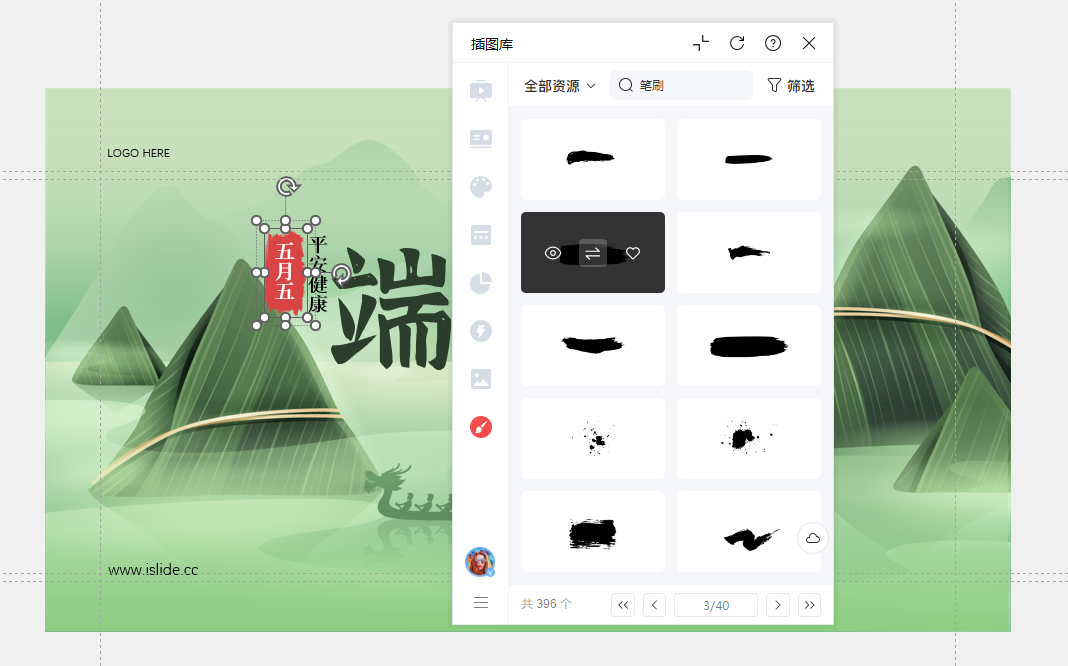
Step 5 : Finally, we can add some decorative text to make the overall picture more layered, so as to better highlight our theme.

Note: The font used in this case is already in the link at the end of the shared article
2.2/ Sans-serif fonts in action
After sharing the lining Line Fonts Next let's take a look at the use of sans serif fonts in our cover. Sans serif fonts are more commonly used in digital situations. In our cover design, the sans-serif font can make the title more eye-catching, clear and easy to read, and it also conforms to the modern and concise design style, which is more suitable for the reading habits of digital media.

First step : Add text. In order to ensure the recognition of the text, we can add a mask on the imported image to leave enough space for the text. Since the picture adopts the transparent glass style as a whole, you can consider using a gradient style to maintain the consistency of the overall design.
OK OK After designing the style, we need to adjust the direction of the mask gradient according to the typesetting method. If it is left-right typesetting, we can set the gradient angle to 0 degrees; if we want to make top-bottom centering typesetting, we can halve the mask gradient angle and set it to 90 degrees. In this way, the gradient direction of the mask can better meet the needs of the overall design and improve the visual effect.
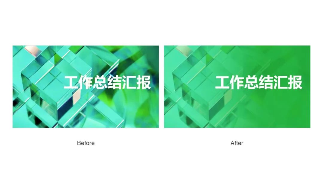
Second step : Let’s take the right alignment as an example. Because the text is right aligned, our mask angle is set to 0 degrees. In order to maintain the consistency of the overall style, the gradient effect of the text can be set to the same angle and color as the background , to achieve a better visual effect.
When using split When combining tools, you can split the text according to its different parts, and then set the gradient effect for each part separately to achieve a more detailed effect.
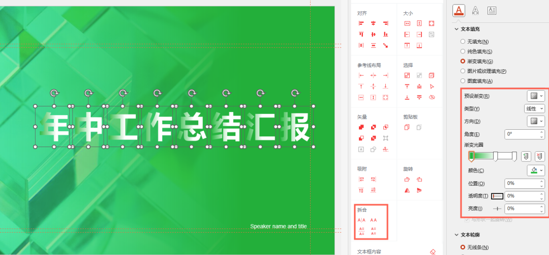
Step 3 : After adding the font style, arrange our secondary information to complete the final design.

After reading the text You must have a question about the typesetting and application of the fonts we use. Are there any copyrights for the fonts we use? Where can I download it again? Next, with doubts, let's talk about the copyright of fonts.
3/ Font copyright
In the process of our daily PPT, there is no doubt that "words" and "pictures" are the things we deal with the most. context, typeface copyrights are also gaining attention in our work.

But nevertheless There are still many people who don’t know how to search for fonts and how to obtain fonts. They often use a browser to search for font names, and then find a link on various “font download sites” to download and use. Through these channels The font files obtained are generally old versions and incomplete. Not to mention various problems in use often violate the original intention of font beautification design, and non-free fonts may also be downloaded.
So everyone must also be in the process of making PPTClear copyright problem, to avoid copyright disputes, if there are no special requirements, there are also very good free fonts Fonts, here I list several popular free fonts in design:Siyuan black body, Siyuan Song typeface, zhanku high-end black,word soul tonsil.

4/ How to embed fonts into PPT?
The last point is that the problem that everyone often encounters when doing PPT is how to solve the text deformation and dislocation when we send our PPT file to other computers
Here for everyone Share three small tips——
4.1/ Embed fonts into PPT files
How to operate: File > Options > Save > Embed Fonts in File > Embed only characters used in presentations
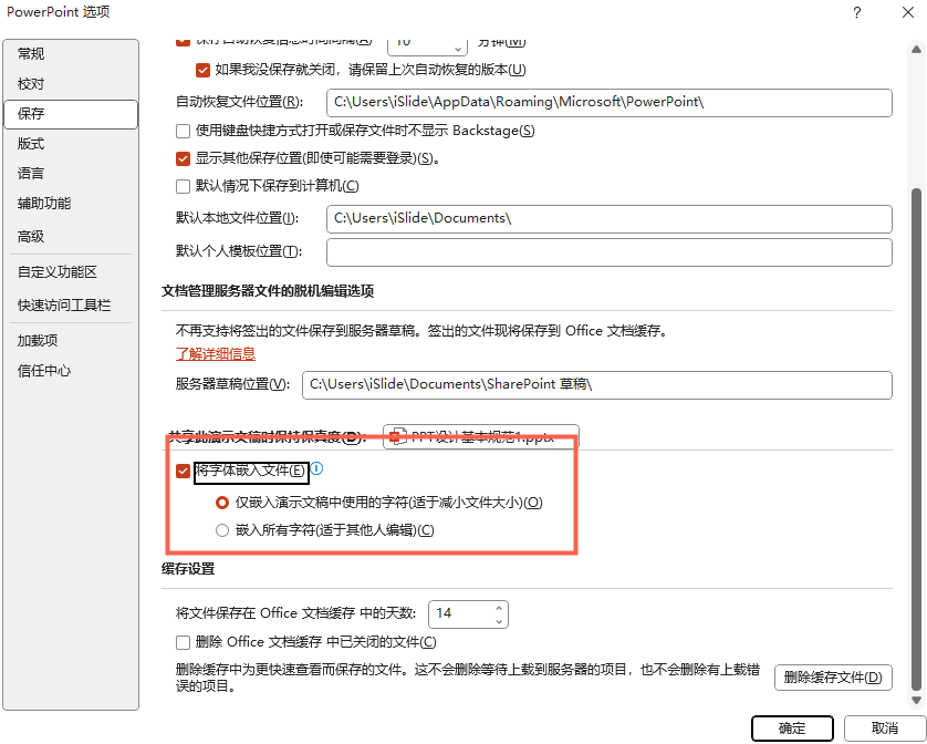
After doing this After we send the PPT to other computers, the set font will not be replaced with other fonts
4.2/ Install font package
We will use The font package and the PPT file are sent to another computer to install it, which can also ensure that our fonts will not change. This method is more troublesome than the first method, but it is safer.
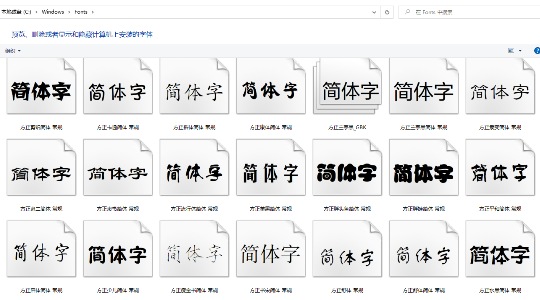
First step Find Windows on our disk Open
Second step Then find the Fonts folder
Step 3 Copy the fonts we need to a new folder and send them to another computer with PPT
Step 4 Install the font on another computer (select the font with the right mouse button to install)
4.3/ Converting fonts to images
Copy requires transformation Right-click the text and select the picture in the paste option, you can convert the text into a picture format, but this method has a drawback that you can no longer modify the properties of the text.
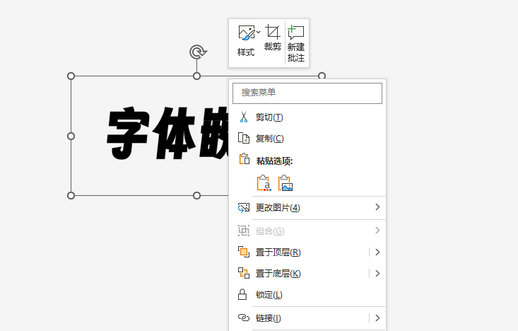
If you want To keep the modification of the text color, we can use the text vectorization under the design tool in ouriSlide plug-in Tool, convert our text into a shape, and you can edit the color

Conclusion
In the end, I hope today’s sharing will be helpful to you. Let’s discuss the copyright issue of fonts with you today. There may be Many people think that considering font copyright issues is just adding troubles. Even if most font companies use them in violation of the licensing agreement, they don't have so much energy and time to pursue them one by one.
But as a Famous design workers are well aware of the hardships and difficulties of font design, so I hope that through today’s discussion, everyone can understand how to use our fonts correctly. Of course, if you have more different opinions, you are welcome to leave a message in the comment area. We are very grateful Looking forward to interacting and communicating with you.
iSlide is a PPT-based plug-in tool
Contains 38 design assistance functions, 8 major online resource libraries over 300,000 professional PPT Template/Material
For more PPT templates, skills and courses, welcome to iSlide official website: https: //www.islide.cc/
Download and install the plugin now, register and log in to get a 7-day free trial Member~
Download URL:
https:// www.islide.cc/download
Articles are uploaded by users and are for non-commercial browsing only. Posted by: Lomu, please indicate the source: https://www.daogebangong.com/en/articles/detail/You%20wont%20be%20the%20only%20one%20who%20doesnt%20know%20right%20The%204%20knowledge%20points%20necessary%20for%20PPT%20fonts%20will%20be%20explained%20in%20one%20go.html

 支付宝扫一扫
评论列表(196条)
测试