Original: Qian Hao Hawking Word Game Workshop
We mentioned the importance of font skeleton (structure) above, and strokes are a simple and effective learning method for beginners, so this time we will still use this method to continue to exercise our learning ability .
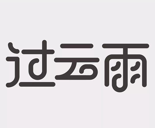
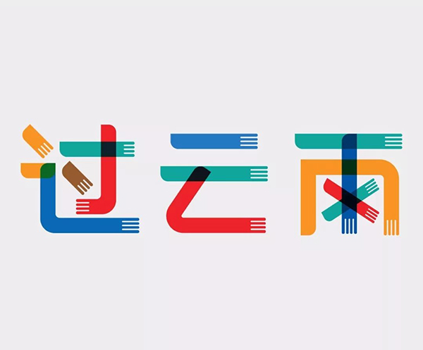
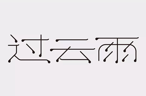
First of all, let’s find out what characters to make this time~ This time, we will take the proposition “Guoyunyu” in our “Character School—One Word a Week” activity as the topic, whether it is these open propositions or actual commercial projects, First of all, you have to get to know Ta in depth, so that you can know yourself, know the enemy and prescribe the right medicine, so that the works you make are suitable. "Guoyunyu" just looks at these three words, which are a bit poignant and beautiful, and they must be related to love. After listening to this song, it completely coincides with our previous intuitive feelings, so the taboo for this group of words in terms of font Don't be too tough.
For the determination of the stroke shape, either make Ta into a neutral font, similar to the corporate standard font or the indifferent shape of bold, as long as the structure is coordinated in this way, there will be no major problems. Or start from the meaning of the words to achieve the integration of form and meaning. Of course, this method will be more difficult, but the work will be full of vitality because it is unique to it.
Let's see how everyone does it~
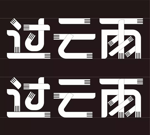
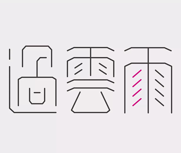
The main problem with this work is the wrong positioning, and the lack of understanding of the meaning of these three characters, which led to the biggest taboo. The strokes are too tough.
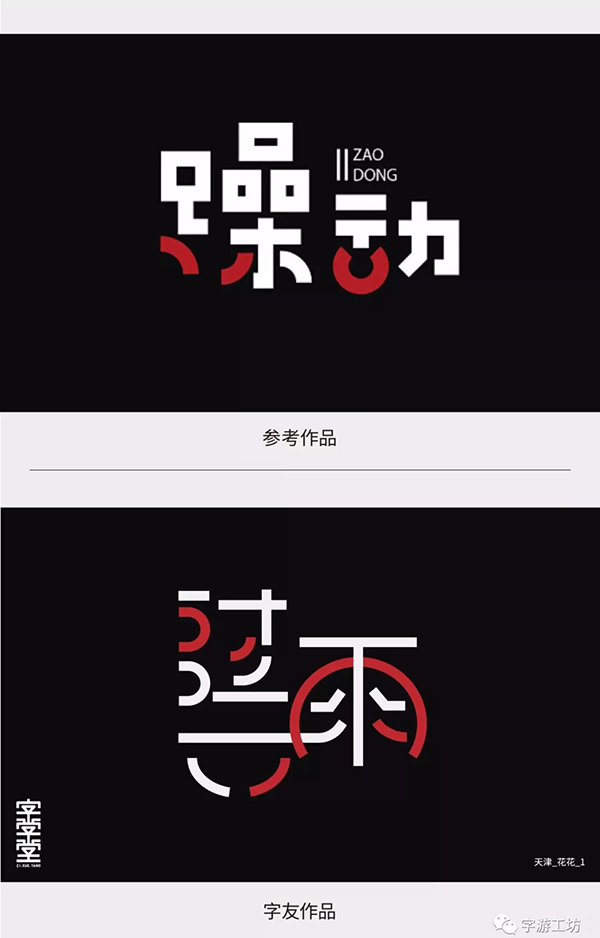
If we put aside the problem of positioning and just look at this group of glyphs, there are still many problems.
1. The strokes are too fragmented, resulting in structural imbalance
2. Connection confusion leads to recognition problems
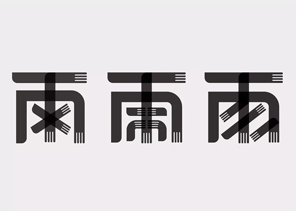
3. The arc shape and the character shape are not harmonious enough. For example, the outer contour of the word "雨" is omitted as a part of the circle.
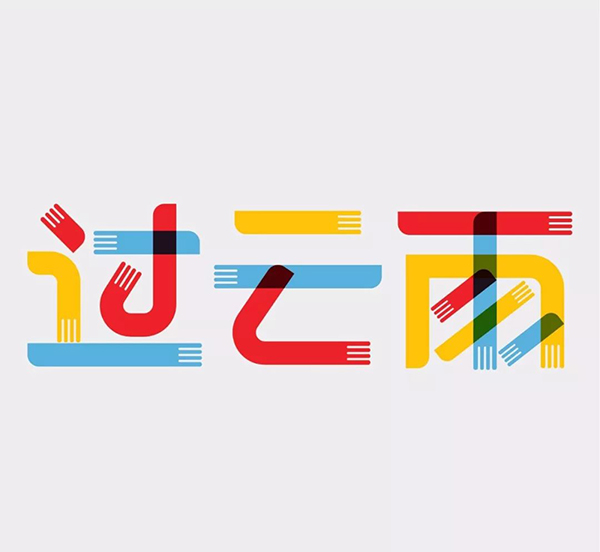
4. The color matching is too jumpy. If you want to copy some color matching, then ta must at least conform to the characteristics of the glyph, instead of copying it mindlessly
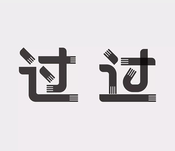
Because there are too many problems in the work, the modification has to be done again.
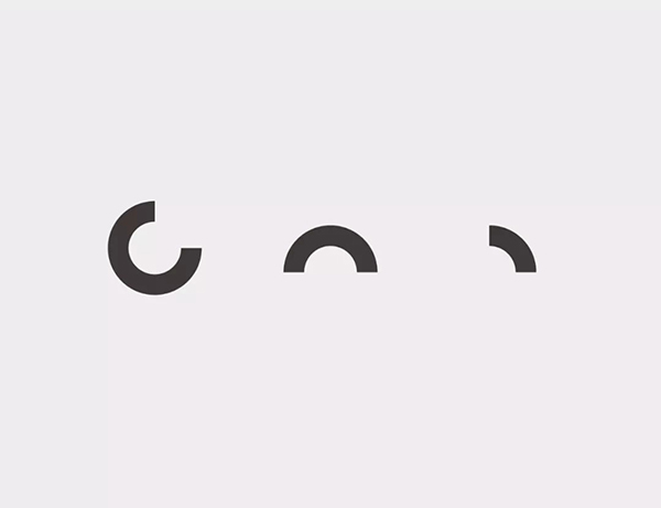
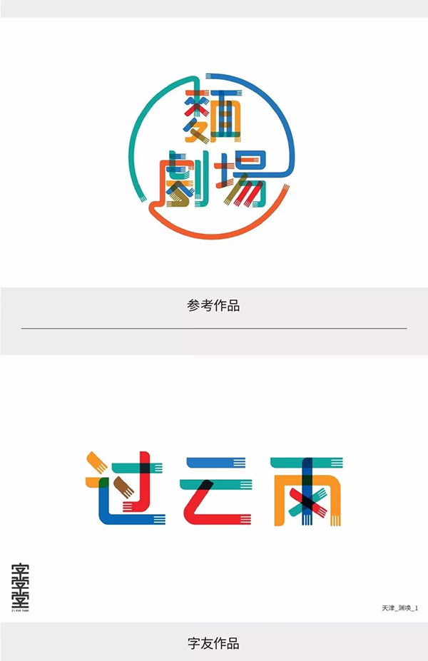
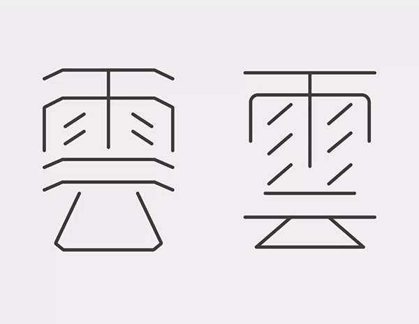
The circular arc shape in the reference works, that is, the structure of a certain part of the circle, is the most common way to make strokes, and it is enough to extract this point.
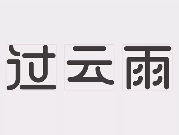
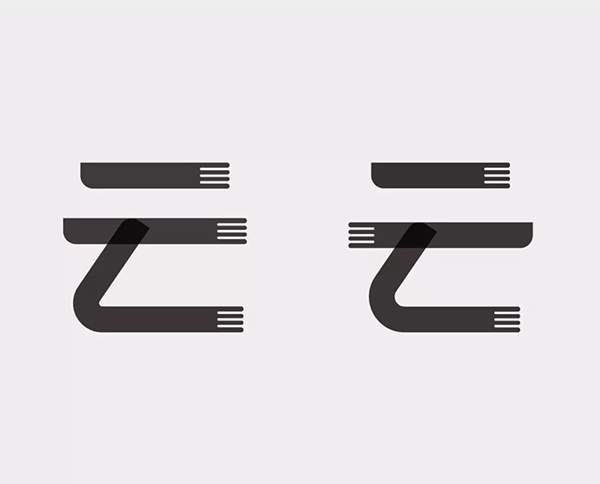
Here we start with the basic structure and add the arc shape to the text. Since the word "cloud" has relatively few strokes, I consider making it flat, so that the text has both size and shape. Change without losing fullness.
Reduce the text spacing, so that it will look more integrated, and pay attention to the complementary relationship between text strokes.
On the basis of ensuring the arc structure, some strokes are simplified to a structure similar to an umbrella handle, which not only strengthens the character of the font, but also matches the meaning of the character from one side.
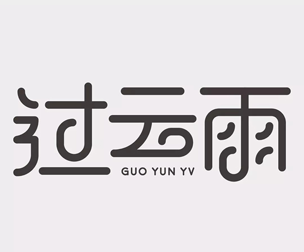
The stroke is a bit too thick, and the thickness has been adjusted. Finally, English is added at the pre-designed position.
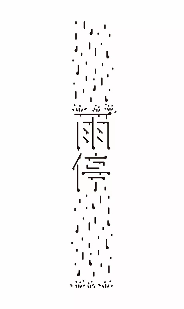
This work is full of fun, giving people a sense of happiness after the rain. These three words are interpreted from a relatively unique perspective.
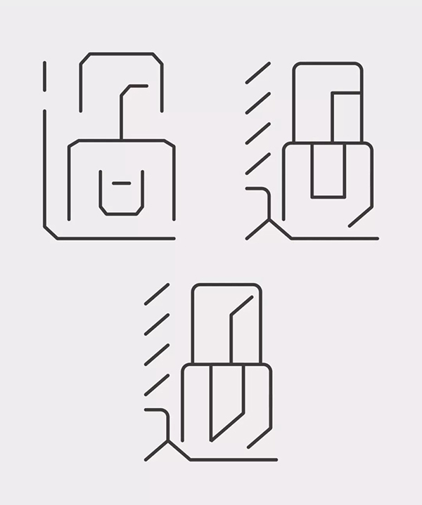
The idea is quite ingenious, but there are some problems with the structure of the font
1. The visual size of the three characters is inconsistent
2. The structure of the word "Guo" is unstable
3. The word "rain" is relatively low in recognition
4. The color is slightly dull
The visual size of these three characters is not very consistent. The word "Guo" appears wider, and the character "雨" appears narrower.
The character "Guo" is not very stable due to the omission of strokes in the lower left corner, and the structure is a little rigid.
I simplified the strokes and extended the horizontal strokes at the bottom to make the text more stable.
The smear at the end of the stroke, try not to let them face the same direction, and make some changes.
The word "cloud" has adjusted the direction of the tail, and the structure has been adjusted and stretched.
There is a problem with the recognition of the word "rain". I have made two attempts here. The second omission method is more flexible, so I chose it.
The visual size of the text has been adjusted. The word "cloud" has fewer strokes and more horizontal strokes, so the horizontal strokes are shortened. Since the last two characters start with horizontal strokes, if the horizontal strokes are placed on top, the latter two characters will be visually higher than the character "Guo", so the horizontal strokes of the last two characters are lowered. In this way, the combination of characters will be more harmonious, and this processing method is more commonly used in making characters.
The color is replaced with this bright color, and the color in the original work is slightly dull.
There are no referenced works for this work, but that's fine.
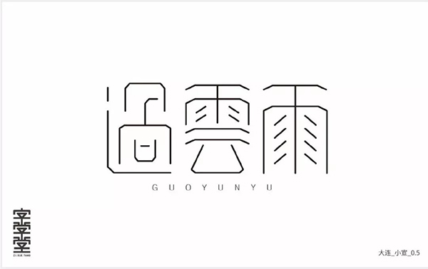
Problems with this piece:
1. Inconsistent center of gravity
2. The strokes of the word "Guo" are too scattered
3. The text is too full, which looks clumsy
Actually, this work has a particularly good feature. Don’t let the author make good use of it. It is the repeated slashes in the word "雨". This repeated line can increase the sense of form of the font.
My modification is to strengthen this point, making Ta more concise to highlight the sense of form. Straighten the dejected horizontal drawing, and the oblique line agrees with the inclination.

Use the literal size of the word "rain" to standardize other characters. The word "cloud" simplifies the strokes and increases the structure and details. Due to the repeated slashes, the center of gravity of the word "cloud" is caused On the low side.
Because there are too many straight lines in the right half of the word "Guo", it is not very harmonious with other characters, so some strokes have been adjusted to be inclined.
Finally, standardize the glyph and unify the slope of the slash
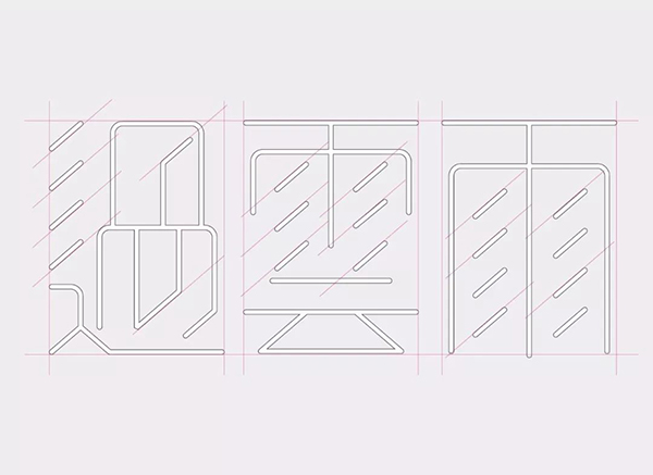
I found a glyph that looks like rain
Extract the characteristic strokes of ta and make some adjustments
Since the strokes of these three characters are relatively small, it is considered to make the literal flat, and the horizontal text will look better after being flattened. The slash is intentionally extended to reflect the rain texture.
Added English, but found that the strokes are a bit too thick, and the feeling of rain will be more intense after thinning.
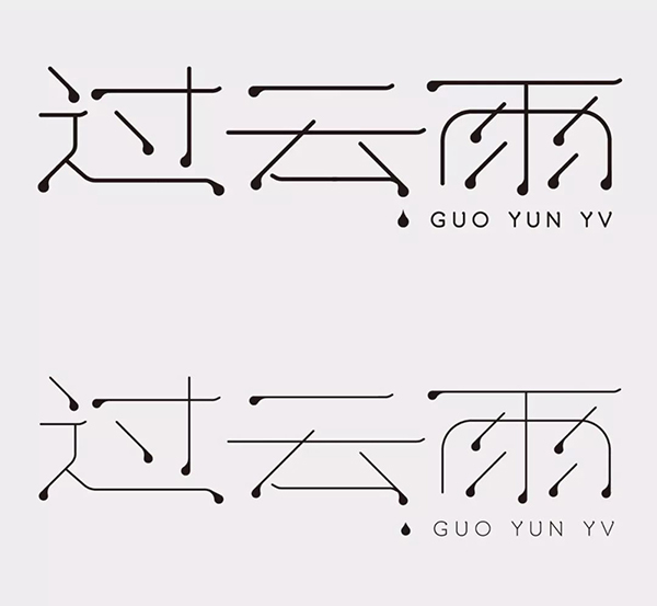
Final draft

Through the above exercises, I found that everyone has a different understanding of these three characters. This may also be the fun of making characters. It can be seen that everyone still has ideas in their minds. The ability is limited and the control is not good. In the process of "imitation", don't be greedy, just grasp one feature, so that the font will be well controlled, and it will not be too messy. You still need to keep learning and watching more good works, so that your ability will be improved.
That's all for this time~ I hope you like it!
Articles are uploaded by users and are for non-commercial browsing only. Posted by: Lomu, please indicate the source: https://www.daogebangong.com/en/articles/detail/You%20are%20only%20one%20ability%20away%20from%20a%20great%20god%202.html
 支付宝扫一扫
评论列表(196条)
测试