Original: Qian Hao Hawking Word Game Workshop
More and more friends are interested in fonts, but they are confused about how to learn font design? So hope this article can solve your confusion.
The essence of learning font design is to master the skeleton (structure) of fonts. You can’t help but ask which structure should be mastered for so many glyphs in the development history of Chinese characters? It is the most commonly used "universal font" structure at present. This structure has been seen more and more in the font library, from the earliest variety show font to the font library produced by most of the font companies (Zaozigongfang, Zakuou) A few sets of characters), in fact, you can fully grasp this structure by copying (copying should be exactly the same as the fonts in the font library), and you can use the simplest pen strokes, this process only requires you to spend some time will be able to master.
The next step is the addition of font body decoration. There are already a lot of tutorials on this aspect, ranging from teaching you how to make pen shapes to how to make various styles, so why do many friends understand it very well? Do it but can't do it? In fact, you do very little and your ability to learn is not high. You must know that these various methods are all collected by these designers from other people's design works. Have you found a problem? Anyone who everyone thinks is a great god has a strong learning ability! Some are self-taught, and some even have nothing to do with design in college, but they know how to steal other people's excellent things for their own use, which leads to the main body of this article: the cultivation of learning ability, which takes a period of time Only by practicing can you master it. Once you master it, you will get closer and closer to the great god!
The stroke method is the easiest way to make characters, but don’t underestimate it. Through it, you can master the basic structure and various transformation forms. It is simple and simple, but it is not simple if it is not simple ! Please see the excellent stroke type font design works in the picture below.
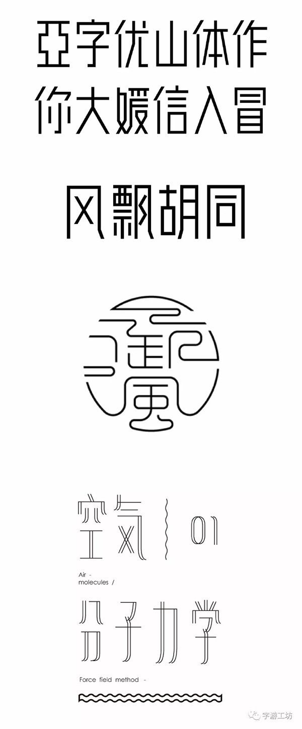
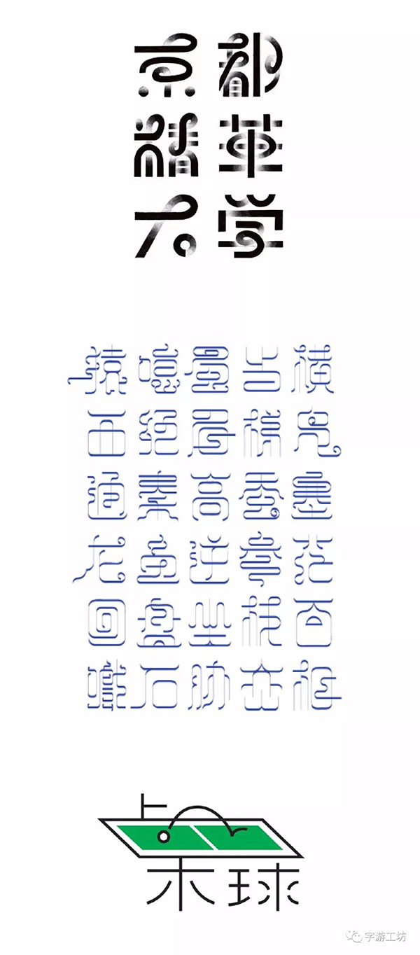
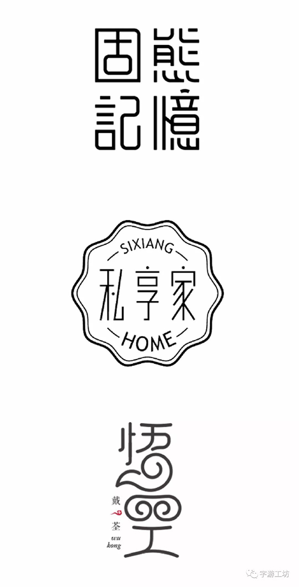
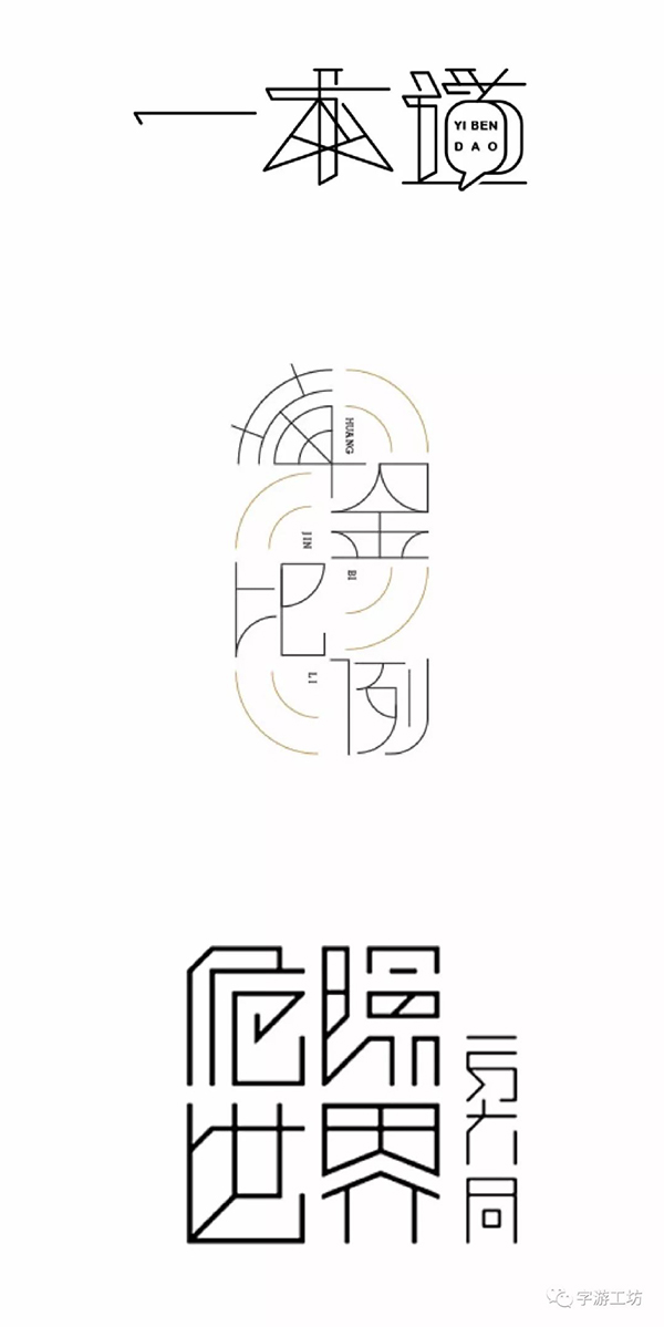
I have seen good things, so let’s start this exercise for learning ability. Draw the three characters "Ode to Pear Blossom" with a pen stroke, and find a picture that you think is excellent. Works learn it (it must conform to the temperament of these three characters), you will read a lot of works in the process of searching, this can cultivate your aesthetic ability, this is why many friends ask me why I can’t tell whether the works are good or bad Solution. It's a bit far away... Let's get back to the topic, first we need to understand the meaning of the three words "Ode to Pear Blossom". If you understand this group of words from the surface, it should be beautiful~~ If you understand it deeply, it should be more simple , then let’s take a look at how my friends are doing~
Case 1
The left side of the picture below is the reference work that Ziyou found, and the right side is the referenced work. It can be seen that he has not learned anything from the work~ he is only based on the structure of the "universal body" A circular arc is added to the horizontal drawing, and the strokes are extended and a string of English is added. The overall effect feels that the English is so weird...but the structure of the characters is very well-proportioned.
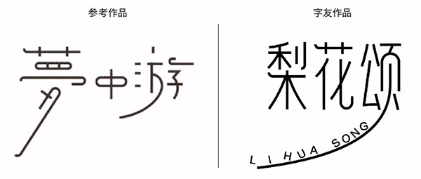
Next, let's analyze the excellent parts of other people's works, take the essence and discard the dross!
We can see intuitively
1. Font size contrast
2. Curved strokes are left-handed
3. Some arc shapes are added to the strokes,
Basically, that's all the information you get.
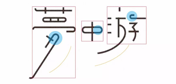
Let's take a look at the glyphs we are going to make, and which parts can be used for our own use. I made a new draft and did not make any changes on the basis of the original manuscript.
First of all, there are fewer "flower" strokes in the middle of the font size, and the effect will not be bad after the font is reduced. Then the main thing to do is to strengthen the left-handed character of the strokes. Due to its own structural reasons, the character "Hua" can only find a compromise method to solve it.
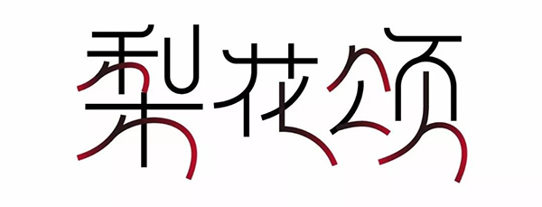
But the glyph still looks a bit uncomfortable, the connection next to the sharp knife is a bit weird and not very harmonious with the whole, it is better not to connect. After omitting a stroke next to the public character, it does not look very full, so it is better not to omit it.
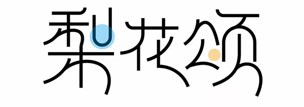
After the problem is solved, add some alignment specifications to it
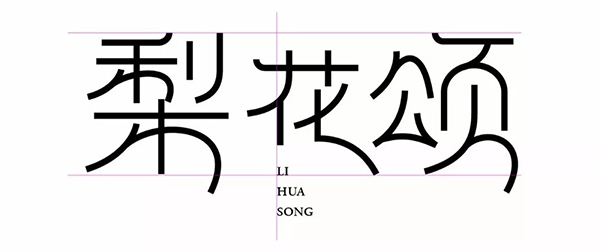
The final transformation effect
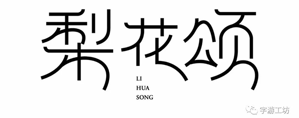
Case II
This friend started from "flowers", but the quality of the works he found is not so high, especially the way of adding images is a bit too far-fetched, and the shape of the strokes is not so good. Some are too hard, which runs counter to the soft and beautiful shape of the flower itself. Due to these problems in the reference works themselves, the fonts he made have more defects, so I still need to read more works at ordinary times.
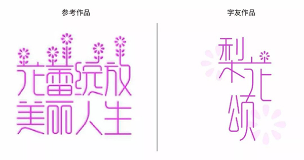
The problem with his work is:
1. The whole is a little loose due to the connection
2. The connection between "pear" and "flower" is not so visually effective, and the connection between "flower" and "song" is too far-fetched
3. The fusion of flowers is too far-fetched
4. The stroke shape is too hard
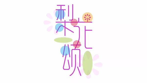
Because there are too many problems in the reference works, I mainly make some adjustments on the basis of his fonts, soften the strokes and remove all the connections. The principle of doing it is the same, but I have made some adjustments in the form to make it softer.
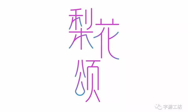
Next, images are integrated into the word "flower", and the fusion graphics are added to the words as much as possible, so that it will look very aura, not as dull as he added.

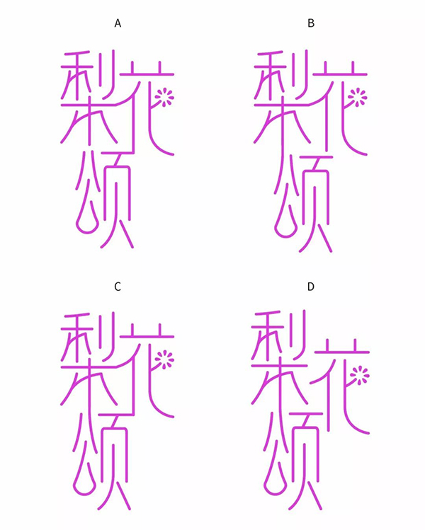
Focus on the connection problem! When making connections, remember the barbaric connection (that is, you must connect even if you are separated from each other, even if I disconnect the strokes), and then use as little connection as possible between characters. Many friends mistakenly believe that connection is the element of making characters, resulting in many works due to The interword connection is broken. Doesn’t this work have a living example~ To make a connection, you need to try some things, just choose the one with the best effect, and don’t connect for the sake of connection.
A. The connection between "flower" and "song" is far-fetched
B. The multiple connections of the word "pear" are too frequent, and the space between "pear" and "flower" is relatively large
C. The connections are too dense and appear airtight
D. Moderately connected, the font is more overall, and the effect is more understandable
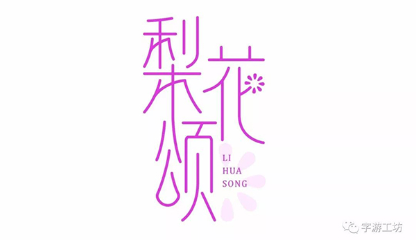
Finally, fill in the blank in the lower right corner with English and ornamentation
Case Three
This little friend chose a set of fonts with round heads and thick strokes. It looks QQ, and it is somewhat out of touch with the fonts and meanings we want to make, but it doesn’t matter. Maybe he didn’t do it when he was doing it. I didn't think about it so much, I hope I can pay attention to it next time. Let’s take a look at the works he was looking for. They are not so good. Apart from the curly tail of a monkey, there is no nutritional content...
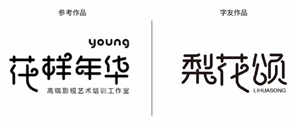
Let's take a look at the problems of his works first
1. The place where the "pear" and "flower" curls are added looks a bit unnatural
2. Some strokes are too hard
3. The "page" breaks too suddenly, which is not in harmony with the whole
4. The English is too detailed
But the basic structure is fine

Then, I adjusted the position of the curl pattern so that it can replace some strokes naturally, so that it will look more natural. Soften some strong strokes, especially next to the word "公", and finally remove the broken strokes, and choose an English font that is more consistent with the thickness of the font.

Case Four
This work...uh...this friend's character is a bit like the process of a person going from normal to crazy. The word "song" is completely crazy. Have you lost control of yourself? And the center of gravity of the word "pear" is a bit too high. But from the works he found, it can be seen that he wants to reflect the simple and simple feeling of this group of characters, and there is nothing wrong with this!
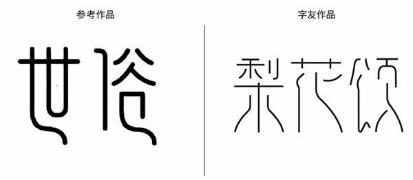
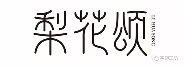
Because there are too many problems with his group of characters, I won’t list them one by one here. In fact, the effective content of the work he found is the low-end small tail-like processing method. The shape is easy to think of the stroke shape of the seal characters, so I found the seal characters of these three characters.

Follow the line of seal characters, and apply its stroke characteristics to these three characters. In order to ensure basic recognition, it is closer to the simplified characters, and only the " The center of gravity of the character "Pear" has been adjusted upwards, because the center of gravity of the latter two characters is naturally higher.
Case Five
I found a group of relatively simple fonts, the body decoration with raised corners is similar to the shape of an ancient building, and the curves and straight lines coexist.
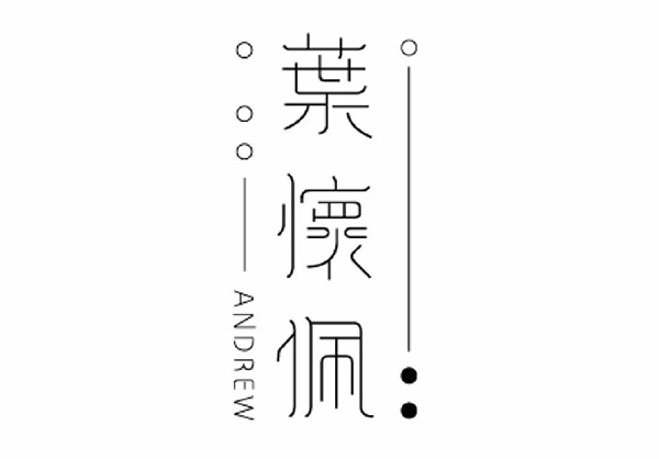
After the basic understanding is clear, draw the character frame and use the basic strokes to start spelling. In order to strengthen the upward body decoration, the lower end of the word "公" is protruded.

But there are too many straight strokes in the character "花", so one stroke is changed into a curved shape, so that the three characters will look more harmonious.
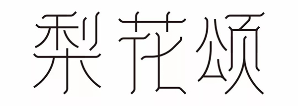
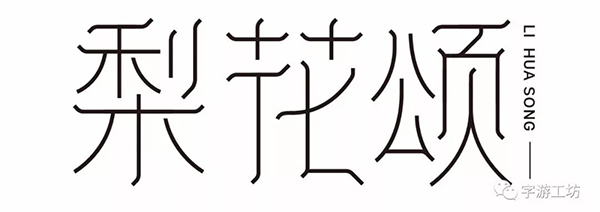
Then adjust the initials of the cursive character "Hua" based on the shape of the seal character. The character "Song" looks a bit narrow visually. English is done.
Summary
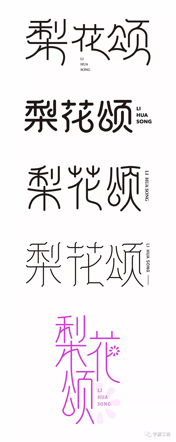
Through the above exercises, it can be seen that most of the works that the friends are looking for are not so good. It can be seen that you usually see too few things, and your hands-on ability is not too strong, and you have not Transforming the advantages of others into your own, this ability needs to be cultivated slowly, but the basic structure of the glyphs made by most of the small partners is no problem, the next step is to focus on training this learning ability, watching a large number of font works . You should know that design is nothing more than three stages of "imitation", "imitation" and "breaking". Learning ability refers to the stage of "imitation". When you have enough inventory, "breaking" will come naturally, and once you master If you have this kind of learning ability, you will not be far from the great god!
That's all for this time~ I hope you like it!
Articles are uploaded by users and are for non-commercial browsing only. Posted by: Lomu, please indicate the source: https://www.daogebangong.com/en/articles/detail/You%20are%20only%20one%20ability%20away%20from%20a%20great%20god%201.html

 支付宝扫一扫
评论列表(196条)
测试