The following articles are from iSlide, author yoyo

Simple, easy-to-use PPT plug-in (supports windows and macOS systems), effectively saving 90% of PPT design time!
The promotion will officially start tomorrow, so stay tuned~
yoyo
iSlide (ID: iSlidePPT)
Hello everyone, I am yoyo, today I will bring you some experience in making fonts on weekdays.
As the saying goes, without good fonts, how to make a good PPT. Sometimes in some special PPTs, fonts are a finishing touch, making an ordinary report shine instantly.
However, in the field of fonts, a little carelessness will touch minefields, such as font infringement. Even if you find free commercial fonts, there are only a few that you can use. If you want to change a style, you have to spend a lot of brains to collect them.
Rather than racking your brains every time, it is better to learn some font design once and for all, then please follow my ideas to learnTilt fonts, insert pictures, add auxiliary elements, use shadows skillfully, and create characters with pens< /strong>These five methods.
01
Italic font
◆ ◆ ◆
Difficulty factor: ★☆☆☆☆
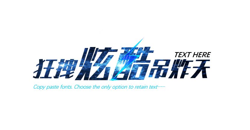
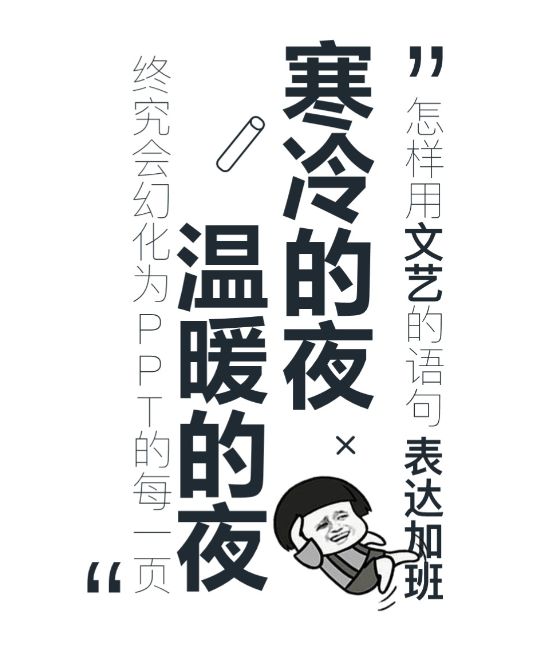
Design is the same as photography. Sometimes, try to change the angle to compose the picture, rotate or tilt the font, which can show a lively temperament and cure everyone's cervical spondylosis by the way.

#Operation Method#
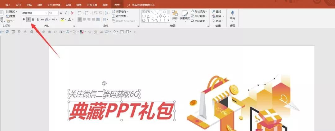
❶Italic font:
Use the skew tool below the font to skew it with one click.
❷Rotate font:
Drag the rotation tool to a suitable angle. Note here: don’t tilt too much to affect the recognition of the text.

After the theme word is rotated, other words can be placed under the theme in a regular manner, so that the picture can be combined with movement and stillness.
ps: This method can make the picture more dynamic and active, but it is not suitable for mature and stable PPT.
02
Insert picture
◆ ◆ ◆
Difficulty factor: ★☆☆☆☆
#Operation Method#
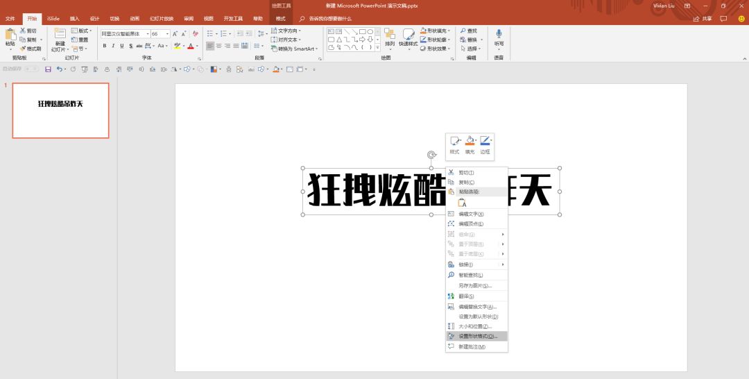
❶ Find a suitable picture, right click and copy. (Screenshots are also available)
❷Enter text in the PPT, right-click [Set Shape Format].
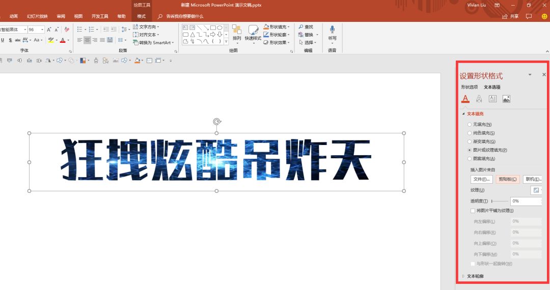
❸ In [Set Shape Format] - [Text Options] (be careful not to select [Shape Options span>]) select [Picture or Texture Fill], and click [Clipboard].

Upgraded version:You can also add some small elements outside the font filled with the picture, such as a light, a falling leaf, and other elements related to your theme.

03
Add auxiliary elements
◆ ◆ ◆
Difficulty factor: ★★★☆☆
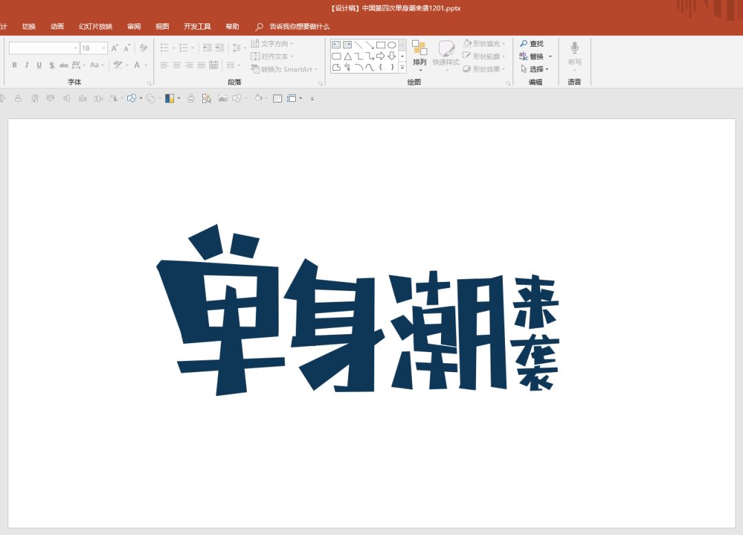
Adding auxiliary elements is to add element icons related to your content during design to enrich the screen and display the content. For example, add a cat tail to cat poop coffee, add a croissant to dried croissants, and so on.
#Operating Method#
❶For example, when I was doing the cover of the theme of single trend, I would first use the theme words to associate and think about what elements could be inserted... Finally, I started with emoticons and dog food...

❷After having an idea, start to create characters. Here I use the arbitrary polygon tool in the pen to create characters. It will be faster to use the font directly, but be careful to avoid copyrighted fonts.
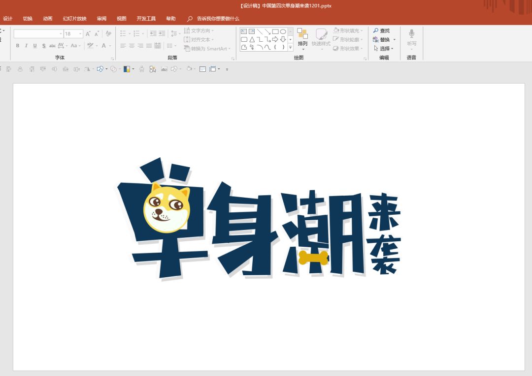
❸ Look for the elements you have thought about before, you can draw them yourself, or you can find them on the material website, here is a super easy-to-use vector material website https://www.flaticon.com/ , mainly some beautiful small icons, especially suitable for use with fonts.
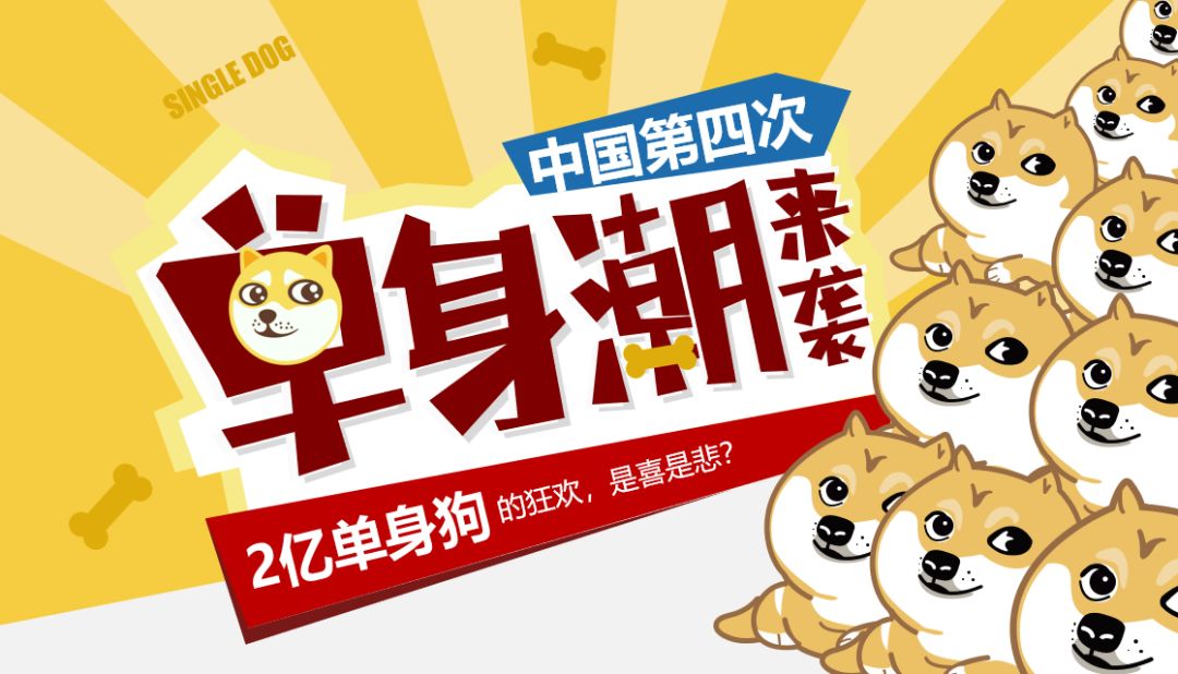
❹Emoji packs and dog food are here~~ Replaced the horizontal line of the word Tide with dog food, and the round emoticon packs can just fit in the single word frame, doesn’t it look more vivid?
❺Apply to the cover

When you really don't know what to add, it is also a good choice to add lines and emoticons to the text paragraph.

04
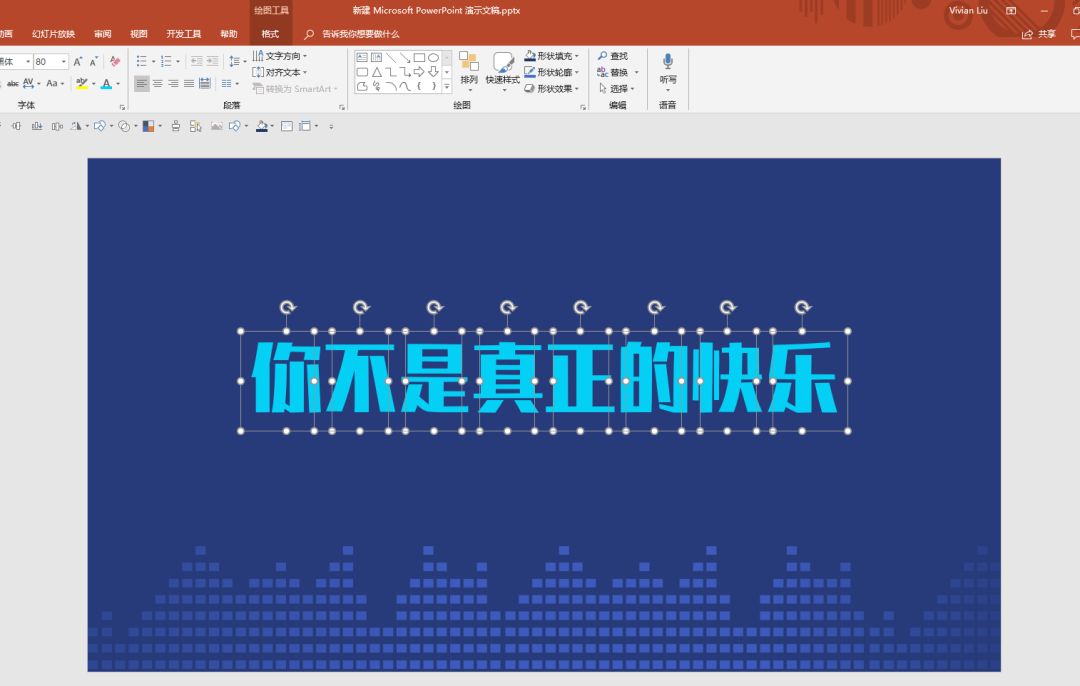
Using shadows wisely
◆ ◆ ◆
Difficulty factor: ★★★☆☆
This may be the most used method of making characters recently. It is simple, efficient and beautiful.
#Operation Method#
❶ Type out the words one by one, pay attention to one by one, not row by row, paragraph by paragraph.
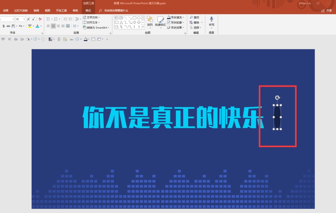
❷ Draw an ellipse about the height of the font, and fill it with a color slightly darker than the background color.
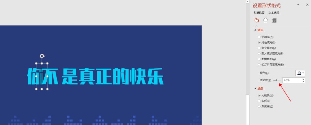
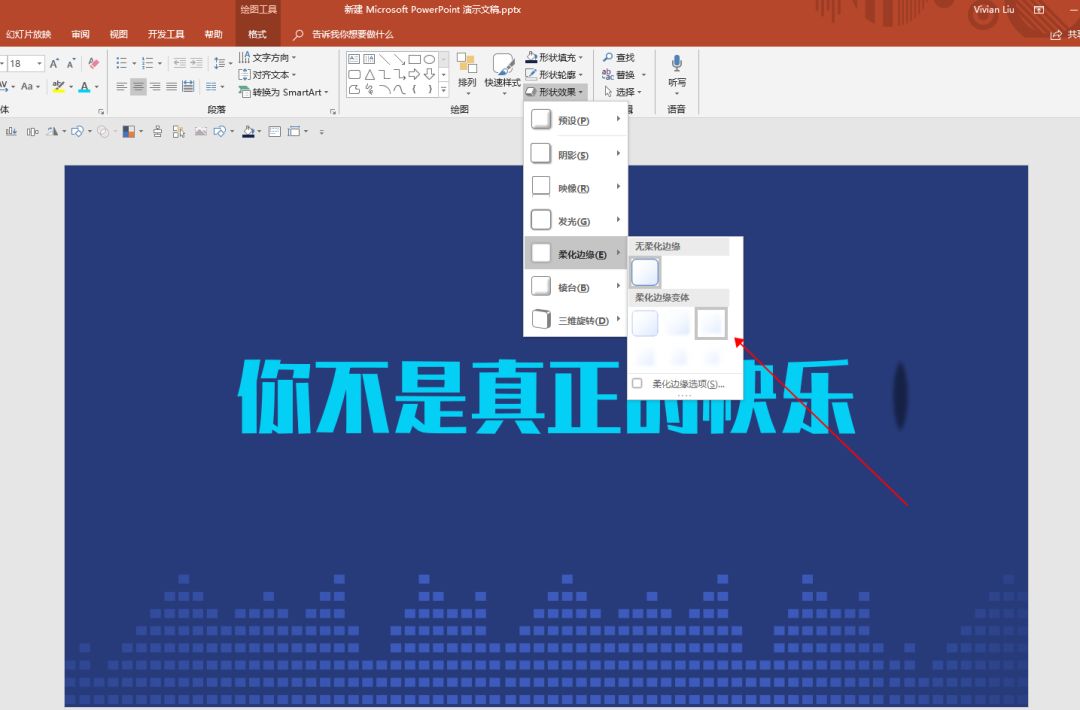
❸Click 【Soften Edge】under 【Shape Effect】, choose a suitable degree of softening.
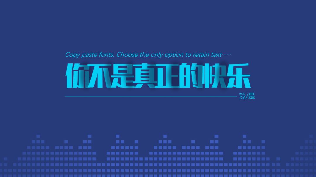
❹Put the softened shadow in the middle of each word and make it transparent.

❺ Put multiple copies of the shadow in between every two words, and call it a day.
05
pen writing method
◆ ◆ ◆
Difficulty factor: ★★★★☆

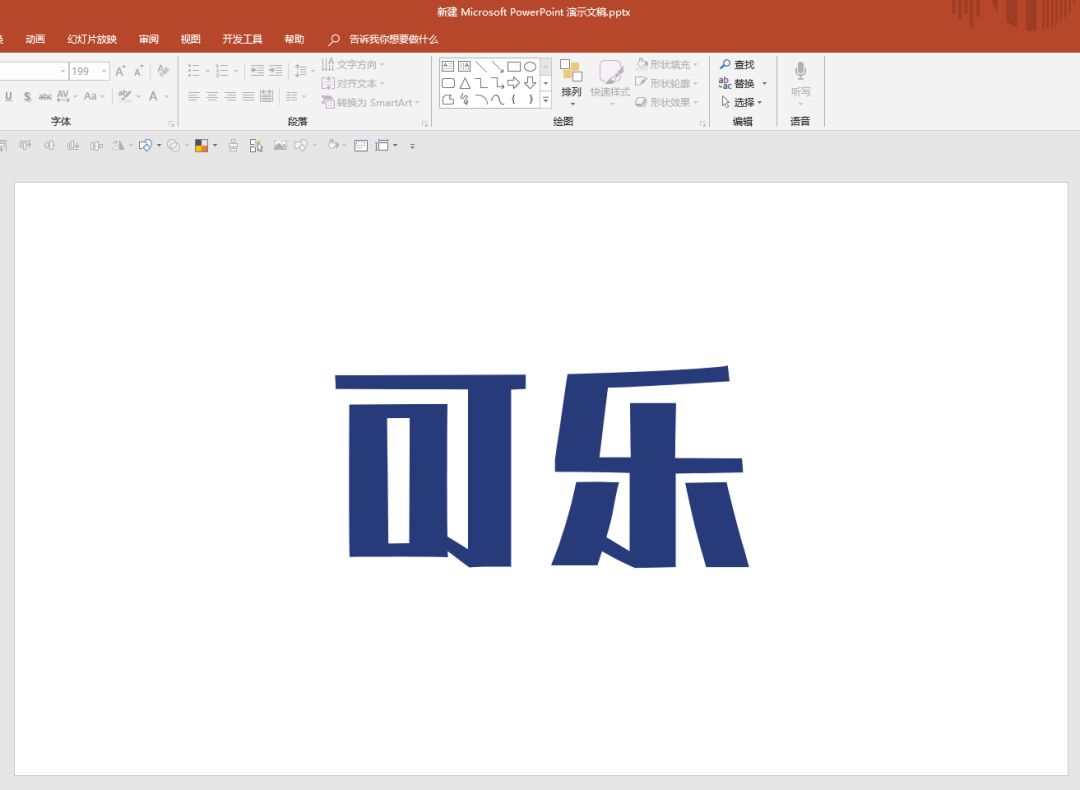
❶Type out the font to be made first, so that you can have a stroke reference when you tick off the characters.
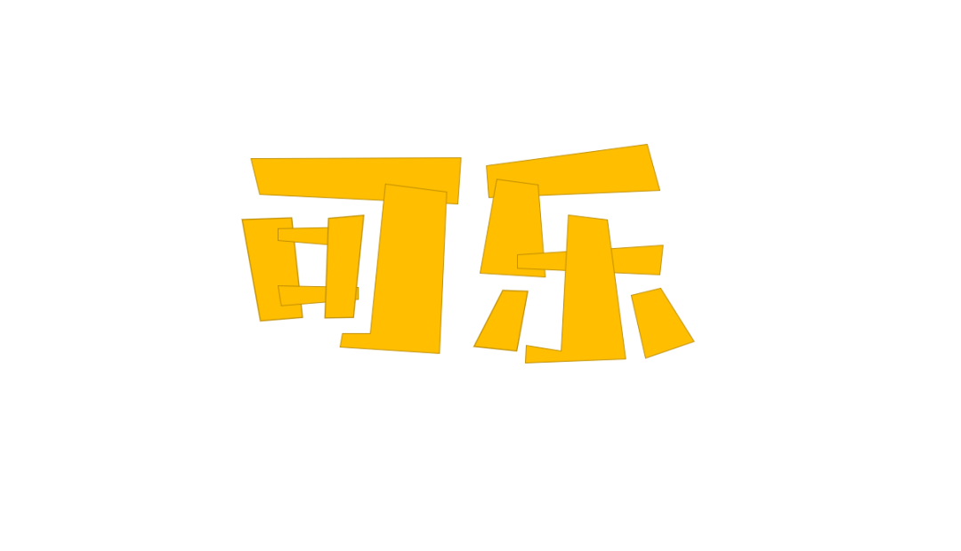
❸ Make the characters with reference strokes transparent, click the arbitrary polygon tool, and start creating characters.

When creating characters, you can follow the principle of thinner and thicker in the horizontal direction, or thicker in the horizontal direction and thinner in the vertical direction. In short, the structure should be roughly unified, so that the drawn characters will not appear messy.

That's all for today's sharing! Did you learn another trick? If you have any questions, please leave a message below~

A public account with a high value and a lot of dry goods
Hurry up and scan the codeFollow us?
Articles are uploaded by users and are for non-commercial browsing only. Posted by: Lomu, please indicate the source: https://www.daogebangong.com/en/articles/detail/Worried%20about%20not%20enough%20fonts%20These%205%20trendy%20font%20designs%20are%20enough%20for%20three%20years.html
 支付宝扫一扫
评论列表(196条)
测试