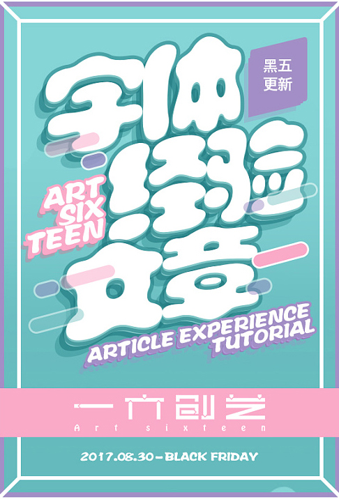
Author: Martin_K
Zcool homepage: http://chuqi.zcool.com.cn/
1. Doll body - Simplified (click to download)
Features: cute and immature, ignorant of nature
Application: graphic design, e-commerce design, poster design
Recommended index: 5 stars
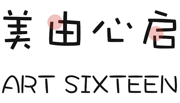
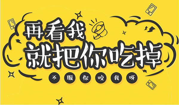
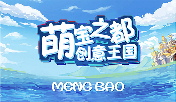
As the name suggests, doll body is a cute font for children, which was developed by Huakang; doll body is actually a form of presentation of text, just like when a child just learns to write, it looks like a font on the whole. It’s a natural feeling, it’s not like it’s been carefully designed, it’s more like an ignorant child writing with a pen, as long as the strokes are separated a little, crooked a little, it can also be straight, very good The characteristics of cute type fonts are illustrated. The doll font can be said to be a very classic and cute font. The overall structure and strokes are completely designed according to the children's writing rules, which is very in line with the child's immature and cute characteristics. It is often applied to the design of cartoons. This chapter This font is used for the title of ; the basic font is as follows:
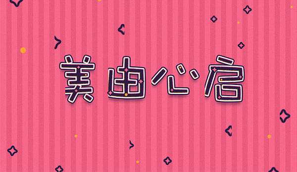
Through the basic font, it is not difficult to see that the font retains the characteristics of children's writing rules in both English and Chinese, and the whole clearly conveys the immature temperament of the font and children. The stroke structure of the font and the distance between characters are relatively loose and random, highlighting the innocence and cuteness of children; in addition, the middle parts of the vertical strokes and horizontal strokes have some arc-shaped transitions with the same thickness, which looks like long strokes At the same time, the starting pen and the ending pen have the same characteristics. From the perspective of visual presentation, the two ends of the strokes look like rounded corners. Using parallax to remove the sharp corners of the strokes adds some roundness to the font. This processing method is relatively rare in fonts, and it is a great benefit for font design. The closed strokes of each font and the word "口" are disconnected, so as not to make the font look rigid, otherwise it will not meet the child's temperament. This disconnected method is often used in font design of. The font has a high degree of overall recognition and a distinctive personality. In practical applications, it can well highlight the immaturity and innocence of children. At the same time, it can also add a lot of fun to the picture. I personally like this font. It is also a good choice to extract the characteristics of the font and apply it to the creative design of the font.
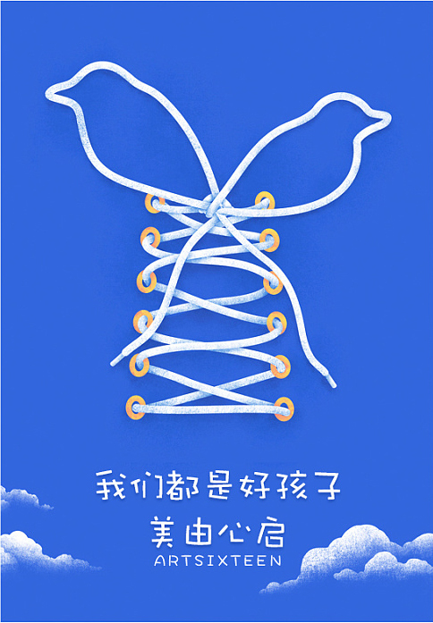
Through two sets of cases, it can be seen that this font can be used not only as a title word but also in the text. Since the spacing of the font itself is relatively loose, you can properly adjust the spacing of the font when using it , in order to achieve the best reading effect, the specific can be adjusted according to different application ranges.
Second, Hanyi Wheat Style
Features: hand-painted illustrations, easy flow
Application: graphic design, e-commerce design, poster design
Recommended index: 5 stars
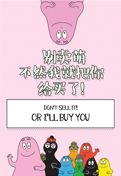
Hanyi Wheat Body is a cute font with a comic style. The stroke thickness of this font changes obviously, and it seems that the writing is more casual. It gives people a feeling of ease and flow like a comic, which makes people feel comfortable and happy; this font More hope to share with you the relaxed and casual feeling of tasting coffee. As the saying goes, calligraphy and painting are not separated, and the font expression is presented in the way of picture books and comics, which is more like humorous complaints in a comfortable chat, giving people a more comfortable feeling, and gradually forming a unique font design style ;In terms of application, it is relatively extensive. It can be used not only in comics, but also in posters, e-commerce and other distinctive themes, or in simple and humorous pictures when you can’t help but complain when you are spoofing. Look at the basic font:
From the basic font, we can see that the overall stroke structure of this font is composed of the characteristics of Song typeface, which are horizontal, thin, and vertical, but the strokes are not horizontal or vertical Straight straight lines will have some arcs or fluctuating twists and turns. In addition, the strokes have a whitening effect of deinking, which is the biggest feature of this font. This kind of treatment can highlight the characteristics of ease and comfort, more like The painting pen writes the same, and at the same time, it is in harmony with the child's lively and active temperament; what is more interesting is that there will be protruding irregular points at the end of the horizontal pen, and most of the points will be flooded. White, which looks like eyes, this treatment also adds a lot of interest to the font, while the thicker vertical pens and dots are irregular pot-shaped in terms of treatment, the starting pen is slightly thick, and the closing pen Slightly thinner and fat in the middle, this method can highlight the characteristics of writing, and at the same time express a leisurely and pleasant mood, and the overall look is cute and cute; in addition, the spacing between fonts is also slightly larger, It looks fearless and unconventional, and it looks more rhythmic when arranged in a regular way; it is recommended not to use a font size that is too small when applying it, otherwise it will completely cover up the unique characteristics and temperament of the font.
From the two cases, it can be seen that the font can have a good visual effect in the application, but due to the distinctive characteristics of the font, it is relatively specific, and its application range is not so wide , but it is handy in illustration style or flat style. In addition, there are quite a lot of features that can be extracted for font designers, so it is a font worth collecting.
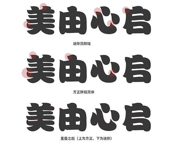
3. Simplified version of Founder Fathead Fish
Features: plump and round, strong personality
Application: e-commerce design, ui design, advertising design
Recommended index: 5 stars
Speaking of Founder’s font may be a bit heartbreaking for designers, but it is also advocating the improvement of Chinese people’s awareness of copyright; and this fat head fish font is also a relatively classic and cute font, with distinctive features, rounded fonts, and plump strokes , the style is very unique, and the overall look has a feeling of splashing paint, but it does not violate the structural rules of the font. It is a font that is difficult to design; although it cannot be used commercially without purchase, it is important for font design. For teachers, the distinctive features of this font can be extracted and applied to their own creations. Usually, when designing cute fonts, most of them will be biased towards this style, and fat head fish is also a synonym for this type of font, such as Mini The fat head fish fonts with other names such as Jane fat head fish, its natural roundness and plumpness endow the font with an indelible cuteness, which is loved by designers. The next impulse, although it is highly similar to the mini simple fat head fish, but at the same time has a strong sense of design, can be used as a headline or advertising slogan to highlight the key points, I also love this font very much and included it in my personal Among the fonts, if you are interested in fonts, it is recommended to collect them and study them, first look at the basic fonts.
From the basic font, it can be seen that the overall structure of "Fat Head Fish" is plump, round and soft, full in the bones, and conforms to the rules of font composition. Like being connected together naturally, the overall strokes are treated with rounded corners, and the intersection of horizontal strokes and vertical strokes is also rounded to avoid sharp corners. The blank space is reduced, and the connection with the horizontal pen is natural, while the blank space in the characters is more like a feeling of being hollowed out alone. The two ends of the horizontal pen are irregularly expanded, and there is a change in the middle, and the whole is full around Roundness and other features exaggerate the thicker vertical strokes in different ways, which can catch the viewer’s attention instantly; in addition, the font dots are treated with different continuous strokes, which is more like the overflow of the horizontal strokes. This feature is also often applied in font design. Secondly, due to the characteristics of the overall structure, other parts also have different degrees of continuous strokes. In terms of application, it is more suitable for arranging various titles and advertising designs. The plump font adds to the effect of the later stage. It has an excellent load-bearing function, and when it is used as a text or a small font size, it will greatly reduce the recognition of the font; as for the English font, I personally think it is quite distinctive. After retaining the plump and round features, a small corner is added. Handling, it looks not only individual but also playful, the case is as follows:
It can be seen from the case that this font can be used as a theme word or even as a logo to have a good effect. Its plump font is very suitable for adding effects. It will be better to arrange a single font or carry out secondary design. It is perfect for expressing cute style. As one of the fonts that designers must collect.
Fourth, Han Yi Mimi Simplified
Features: cute cartoon, hand-painted style
Application: e-commerce design, ui design, advertising design
Recommended index: 4 stars
This font can be said to be a cartoon font with its own effects. It is round and plump, and the chubby font looks like an advanced evolution of Fathead Fish. It is very playful. It is used in some e-commerce opening screens or promotional opening screens. We often see this type of font, which has a strong personality and is easy to catch people's attention. It can be a good choice when you don't know how to design fonts. Similar to it is a mini simple black font. Its characteristics are similar to those of Hanyi Mimi, but there will be obvious differences in the structure and handling of strokes. Personally, I think that Hanyi Mimi is more comfortable and delicate than the Mini Simple Black Mimi, and the application effect is better. In addition, the biggest highlight of this font is the stroke effect on the periphery. Whether it is font design or font library in the application, the simple way to deal with cute fonts is to add a thicker stroke, and this feature usually also As seen in the hand-painting, the plump font and both sides of the stroke effect are effectively integrated, and a little hand-painted feeling is added to the font to make the font distinctive. The basic font is as follows:
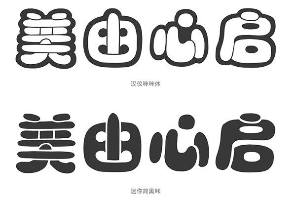
By observing the two fonts, we can clearly see the difference. Although the two fonts use the method of visual difference and visual psychology, the processing method of Hanyi Mimi font is to make the font The organization is hollowed out, and it feels like a thicker stroke is added to the periphery of the font. In the case of color selection, only the outer black stroke changes, while the inner hollow white is based on the background color Mini Jane Black Mimi is the opposite. In the case of the same color, Hanyi Mimi font looks fuller and rounder than Mini Jane Black Mi. There is basically little difference between the two fonts in terms of font structure , are all outlined with the characteristics of plump, round, and chubby, similar to the treatment of fat-headed fish, very cute, but there are still obvious differences in the treatment of strokes, such as the vertical pen in the middle of the word "you". , the starting pen of Hanyi Mimi body is more rounded, and the hollows on both sides are also smaller, while the black rice is sharper, and the hollows are also larger. The hollow at the intersection with the vertical pen is also relatively large. Although this is also the characteristic of the Mini Jane Black Mi, I personally feel that it is not delicate enough. The overall visual presentation is not as comfortable as the Hanyi Mimi body, and it will also cause greater effects for the later effects. The actual cases are as follows:
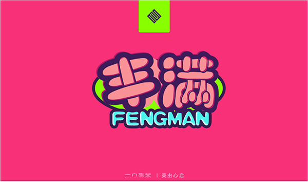
Through two sets of actual cases, it can be clearly seen that the actual effect of this font in the application, due to the hollowed out processing method of the font, you must pay attention to the hollowed out background color when adding effects Processing, the stroke effect as a solid part is very hand-painted. For cute cartoon fonts, strokes are usually added. This is also a style that I personally think is most suitable for strokes in design. At the same time, it can also be used In logo design.
Five, Mini Jane Fat Baby
Features: chubby, upright and full
Application: e-commerce design, ui design, advertising design
Recommended index: 5 stars
The reason why we recommend the Mini Jian Fat Baby is because Fangzheng also has a Simplified Fat Baby, which is exactly the same in terms of font structure and stroke processing. When you want to use this font, you can choose the mini font library. The characteristics of this font are also very distinctive, which is very suitable for application in cute designs, especially in advertising designs. The overall design of this font is generous and correct, and the recognition is also high. It is fat and round. It looks round and rumbling. It is very fun and has a cartoon and cute temperament. Although it is the same as the above fonts The full and round type, but relatively speaking, the mini body is more neat and tidy, and it is also loved by many designers. It is also widely used in other applications. Even the text can be well recognized. In addition, The strokes of this font are also very individual. For font design, it is very suitable for creative extraction. It is also suitable as a cute cartoon font collection. The basic fonts are as follows:
Based on the basic font, the structure of this font is full, and the thickness contrast between horizontal and vertical strokes is not so strong. It is worth noting that this font has individualized treatment at the beginning of the strokes , adding small sharp corners to the round and plump strokes, whether it is point, horizontal or vertical, it is a good fusion of the feeling of water droplets and strokes. This is also one of the characteristics of this font processing. In addition, it is In the processing of the hook, it is tightened from large to small, and the small corners are more prominent, and the corners of the horizontal strokes are also treated with small corners, while the closing strokes are round and full. The vertical strokes are handled in the same way as the horizontal The strokes are consistent, adding a little bit of playfulness to the original neat structure makes the font full of personality and rich in details. Another point is the starting point of the last horizontal stroke of the word "美", which is full of sense of design and artistic. This processing method is often used in artistic font design and is very popular with font designers.
From the two groups of cases, we can see the effect of this font applied in cartoon cute pictures. Its plump font is very suitable for adding effects, and it is also suitable for secondary design. Personalized small corner decorations are mostly extracted and used in font design, and are usually used in maternal and child products in e-commerce. They can be used as titles to carry information well and have a high degree of recognition.
6. Mini Jane Children
Features: cute, upright and generous
Application: e-commerce design, ui design, advertising design
Recommended index: 5 stars
As can be seen from the name, this font is a very cute font. Mini Jane and Founder Children Simplified are also almost the same font. At the same time, Founder has a traditional font library. This font is not only cute, but also has a correct character. , Atmospheric features, it is also unique among cute fonts, although it is not as round as the above fonts, and it lacks some hand-painted feeling, but the thickness of its strokes also retains its characteristics, while reducing the sense of design as much as possible It is more dignified and atmospheric, more like a child has grown up. Relatively speaking, it is also widely used. It can not only be used in headlines, but also has a high degree of recognition in texts. The font design is simple and simple. It can also highlight the cuteness of children. It is also one of the cute fonts that are often used by designers in design. Let’s look at the basic fonts first:
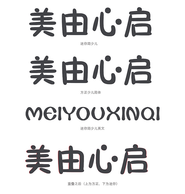
Through observation, it is difficult to see any changes from the font strokes. When overlapping, there will be subtle changes in the structure of the two fonts. Founder's body is smaller than Mini Jane's. There is no other difference. When the Founder font cannot be used, you can decisively choose the font of the mini font. From the strokes of the font, the thickness is basically the same. It is worth noting that the thickness of the beginning and end of the stroke is changed. It is thinner, and the pen ending point will appear more rounded, or the opposite treatment method, and the characteristics of this font run through the entire font, without too much modification and detail changes, the overall clean and correct, and at the same time greatly The recognition of the font is improved, and the point is replaced by an ellipse, which adds a lot of roundness and cuteness to the font. Compared with the above fonts, the writing method is more like a child who has grown up and learned some Rules, although the strokes are much thinner, but still can not stop the lovely temperament it exudes, and the English of this font is very individual, the overall expansion effect from the inside to the outside, the overall transition is natural, distinctive features, it looks very chubby I personally think that the English of this font is more expressive than Chinese, and the stroke characteristics of this font will also be often extracted and applied to font design. It is worthwhile for designers to use it as a reference and study for the first time in the font library. .
Through actual cases, we can see that whether it is in Haibo or in games, it can not only be used as a theme text, but also can be used in logo design with a high degree of recognition. In addition, the English font of this font is very individual. It can be used as a subtitle or headline to enhance the design sense of the screen. I personally like the English font of this font very much. I suggest you study it as a collection.
Seven, Huakang Poster Style
Features: calm and lively, strong sense of design
Application: e-commerce design, ui design, advertising design
Recommended index: 5 stars
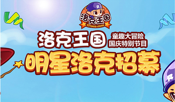
As can be seen from the name, this font is a font design specially designed for posters, and it is suitable for all fields. The font in the Rock Kingdom game is this font. It is worth mentioning that this font is a free version , and there is a traditional font library, (Huakang Poster W9-B5), the strokes of this font are vigorous, the structural shape looks like a round and slightly fat, calm and lively, showing unique vitality, the lively skeleton is integrated with the full body The strokes look more coordinated, while making this font look vibrant. Although this font design does not have rich details, the uniqueness of the font and structure is still loved by the majority of designers. It is often used in poster titles. It has a high degree of recognition. The thick and full font can make the picture more beautiful Rich, even in the style used to express cute cartoon types, there is no sense of disobedience. The variety of strokes makes it full of vitality. In font design, such processing methods are often used to enhance the design sense of fonts. First, Look at the basic font:
From the basic font, it can be seen that the strokes of this font do not have too many thickness changes horizontally and vertically, but they are not straight lines. The whole is basically consistent. Both horizontal and vertical strokes are thick and have a Powerful right angle, but there will be a small arc transition in the middle, and there will be a small arc at the beginning and end of the pen, and it will show an irregular shape, a bit like a classic bell mouth, the arc treatment of the strokes and the horn The treatment of the mouth makes the font look like an ellipse in structure as a whole, which is also a unique feature of the font. In addition, the most distinctive feature is the semi-enclosed or enclosed radicals, which are represented in the shape of an ellipse , at the same time, there will also be a small corner on the left side of the "mouth" as a decorative element, which makes the font more full and adds some lively temperament, while the design of the three-dot water is treated with continuous strokes. The smooth lines have a sense of design. In addition, the English font of this font also continues the characteristics of the Chinese font. It is slightly fat and full. In terms of application, the full strokes are more suitable for adding effects, which can ensure higher recognition. It also shows its unique sense of vitality. Its wide range of applications can present better visual effects in any industry. It can play an important role in expressing cartoon style or in logo. The actual effect is as follows:
Through the case study, it can be seen that the effect of this font in practical applications, whether it is application or English, has a sense of design in posters and games, and is also more suitable for secondary design of fonts Deformation, with its distinctive features and unique font characteristics, is very suitable for extraction and use in font design. As a designer, this font is also used as a personal font library for collection and research.
Summary:
Cartoon and cute fonts are mostly presented in a hand-painted style, and their characteristics are mainly thick strokes, full fonts, round and thick strokes, in order to highlight the lively and cute children, especially in the flat hand-painted style in the design It will be often seen, and most of them are used for title words to create a sense of intimacy. In addition, this type of font is mostly used to add character effects in the application. This article recommends 7 commonly used and characteristic fonts. You can download them Come down and do your own research, and you will find different new discoveries if you try more!
Articles are uploaded by users and are for non-commercial browsing only. Posted by: Lomu, please indicate the source: https://www.daogebangong.com/en/articles/detail/Word%20WordsRecommendation%20and%20summary%20of%20cute%20fonts%20commonly%20used%20in%20design.html
 支付宝扫一扫
评论列表(196条)
测试