How to grasp the standard word spacing of Western characters in logo design,
This question has troubled me for many years.
All answers are in this tutorial.

Although the graph structure of Western characters is much simpler than that of Chinese characters, it is precisely because of the simplicity that it becomes complicated when it is designed to achieve coordination, and it affects the whole body. It is extremely difficult to easily change a Western glyph without affecting its recognizability, so brand standard characters are basically adjusted and designed on the basis of existing glyphs with high recognizability.
Optical illusions and visual balance
Different glyphs have different volumes and shapes because of the different strokes and structures. If you want to unify the tonality and eliminate the differences between words, you must make visual adjustments to eliminate the influence of optical illusions.
Optical illusion is that when people observe objects, the brain will form some wrong judgments and perceptions. It is the judgment that the observer produces on the graphics that does not match the reality under the interference of objective factors or under the domination of his own psychological factors.
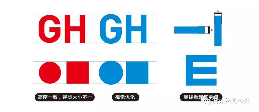
In the picture on the left side of the picture below, there is a lot of negative space outside the circle, while the square is full of space, so the circle looks relatively smaller. In the picture on the right, comparing the blue horizontal and vertical lines of the same size, it can be found that the horizontal line is more expanded, so it looks thicker. Therefore, in font design, to express the balance of horizontal and vertical lines, the horizontal lines are generally adjusted to be slightly thinner.
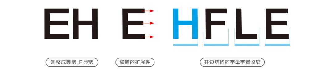
When E and H are adjusted to the same width, it can be clearly seen that E looks wider. This is because our reading order and letter arrangement are horizontal, so the line guides the horizontal pen, and finally leads to horizontal Optical illusion of longer lines. Letters such as F, L, and E that are open on one side will cause this optical illusion; while letters like Z and T have horizontal strokes extending to the side, but they have both sides, so they form a balance and cancel each other , so no relevant adjustments are required.
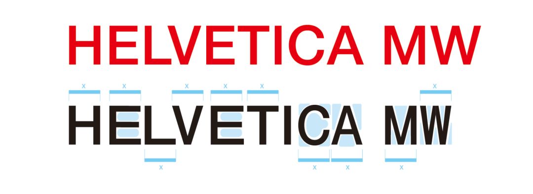
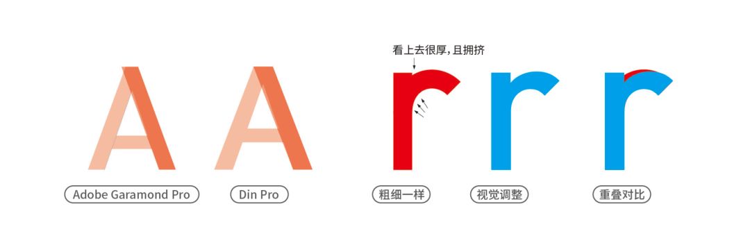
Take the font HelveticaNeue as an example. The black characters below mechanically adjust the width of each letter to equal width. We can clearly see that E looks very wide, while C, A, M, and W look thin. It looks uneven in width and extremely uncoordinated. The width of a glyph must take into account the negative space formed within it and on its sides. Therefore, in order to achieve visual balance, it is necessary to adjust the glyph structure and strokes accordingly, so as to form a harmonious and harmonious relationship between different letters.
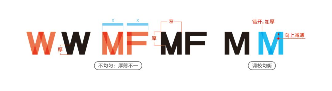
Let's take a look at W and M. If no research had been done, many designers would probably have done the same design as on the left, simply grouping the rectangles together. If we design this way, we will find that after the combination, the place where the shapes are interlaced will look particularly thick, and in the case of equal width, the lower part of M is much narrower than F, forming a serious imbalance. On the far right is the M that has been adjusted for balance. You can see in the blue M legend that the intersections of the strokes have been staggered to make them thinner. In this way, the character of M becomes even and reasonable, and the intersection becomes moderately thick and thin.
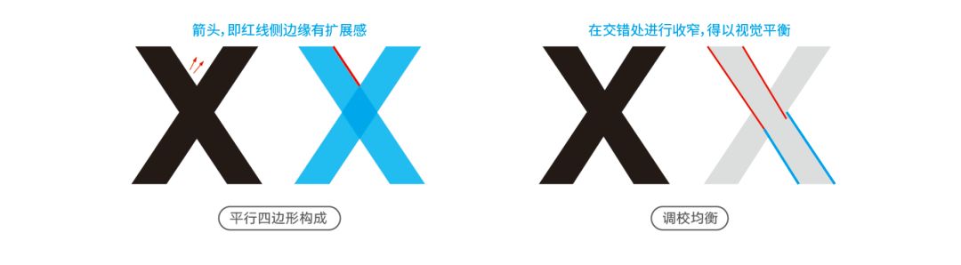
If you carefully zoom in on our commonly used classic serifs, you will find letters with cross strokes like V, W, X, and Y, and the places near the intersection of strokes will be gradually narrowed to achieve strokes The visual uniformity and harmony of thickness.
The intersection of the strokes of the X will also form an optical illusion. You can see that the red arrow of the black X has a sense of expansion, that is, the red line side of the blue X has the illusion of expansion. After the adjustment on the right side, the visual balance has been adjusted, and the red line has been gradually narrowed inward>
Such intersections of conventional fonts will be narrowed to achieve visual balance.
Negative space and word spacing
We know that the width of a Western glyph needs to be balanced with the negative space of the font and other characters, so how to control the spacing between characters? This question brought me great confusion when I was learning Western characters in my early years.
Unlike square Chinese characters,If you use equal spacing all over the place, Western characters will immediately show a very abrupt visual spacing problem. Because compared with Chinese glyphs that are closer to square outlines, the shape and outline of Western letters are very different and the word widths are not the same, and the distance between words cannot be handled rigidly with a distance of one size.
Negative Space: The Key to Word Width and Word Spacing
"Lao Tzu" has a saying: "Yuan thinks of a utensil, and treats it as if it is not there, and it can be used as a utensil." It means kneading clay to make utensils, because there is a hollow place in the utensils, so that the utensils can function. It is perfect to use this sentence to summarize the key points of glyph design. The crux of the problem of font width, internal space and spacing control of Western glyphs lies in the negative space (white space) of "nothing".
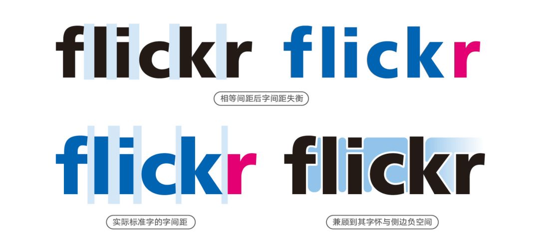
Take the standard characters of the flickr logo as an example. After equal spacing, you can see from the right side of the first row that the word spacing looks loose and tight. We see that the second row is to control the spacing between characters. This kind of control is the consideration of the characters, that is, the negative space formed between each other.
Word spacing in Western languages is particularly critical for glyph design. Uncoordinated spacing makes it difficult to read text due to chaotic rhythm, which greatly affects readability and aesthetics.
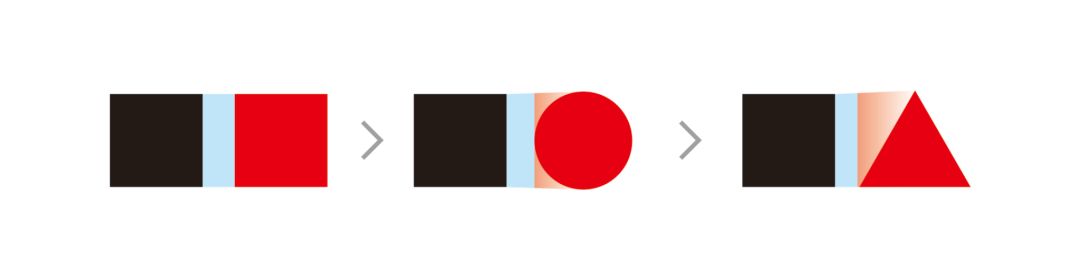
The uppercase and lowercase letters of the Latin alphabet can be roughly classified into three types: square, circle, and triangle, if the shape is generally classified. Based on these three distances from squares, we conclude that the distances in the above figure are arranged from large to small. It can be seen that triangles have more side space than circles, so closer distances are needed. The actual situation of the letter structure is more complicated. Many letters have an asymmetric structure, so the calculation of the spacing on both sides is different; moreover, the shape of the word pocket is also different, which also affects the size of the spacing.
The key to kerning: the balance of blue space between glyphs and red space within glyphs.
There are two points that have the greatest impact on word spacing: ①The shape of the negative space formed by the side of the letter. ②The effect of negative space in the left and right open structures of fonts. In the figure below, you can see the impact of letters with open structures on the left and right sides of the glyph on the word spacing (the open parts on the upper and lower sides are regarded as internal spaces as K and n in the figure).
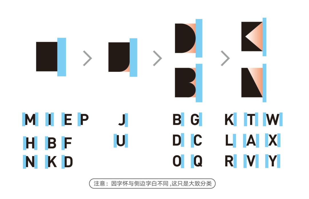
Taking uppercase letters as an example, the side types on one side of the letter can be divided into square, circle, and triangle. They can be subdivided into the six forms shown in the figure below, and the word spacing is arranged and classified from large to small.
The one-side contact surface of the first type of letters is closed, and the spacing space is relatively the largest. The second type is letters with rounded edges on the lower or upper side (also applies to lowercase m, n, h) because of such small gaps in the spacing, so that the spacing is smaller than that of the absolute vertical edges of the square shape of the first type. The letter spacing is slightly smaller. The third type is typified by D and B. They all belong to the round side type, but the specific distance needs to be fine-tuned depending on the space actually occupied by the glyphs. The fourth type is the triangle side type, which is the smallest type of spacing, because the negative space formed by the sides is the largest, so the spacing is tighter.
Through this figure, we can roughly understand the relationship between the spacing, and then look at the impact of the positive and negative spaces of the characters on the spacing.
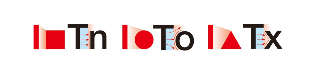
The figure below is a schematic diagram of the guidance of visual spacing by the side open space of three shapes.
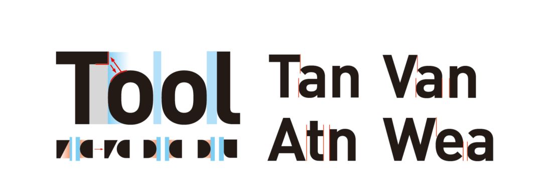
Uppercase letters with triangular side type, such as T, V, A, W, sometimes form a more complex relationship with lowercase letters, because they have open space on one or both sides, so the word spacing with some lowercase letters Even negative values, lowercase letters go inside them. Take the following picture as an example, pay attention to the processing of the red arrow and the open space below T for visual balance.
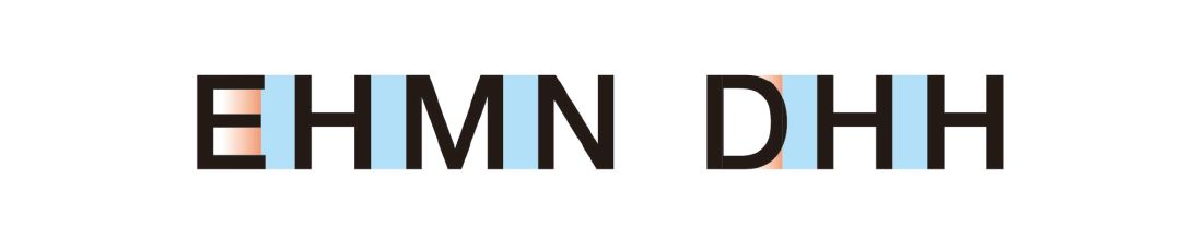
When designing the spacing, it is usually based on the letter whose side type is square, set a required spacing value, and then adjust the spacing of other glyphs based on this. As can be seen from the example in the figure below, the side types of H, M, and N are all square, and the word spacing is the same. E and D are the open edges on the right, and the red and white parts of the open characters have a reduced impact on the spacing.
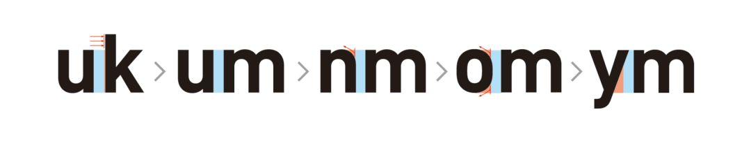
It is worth mentioning that many lowercase letters have ascending parts (b, d, k, h, etc.) and descending parts (g, j, p, q, etc.). Take the following picture as an example. Although the left side of k belongs to the square side structure like m, the rising part of k strengthens its sense of thickness, so the spacing needs to be fine-tuned to be larger.
Glyph design and spacing is actually a very profound subject, and here we can only offer a basic introduction and divergence.
The above content is selected from my new book "Rules of Brand Design", which is sold on JD.com and Dangdang.com

☆Recommended reading ☆
"How can LOGO design not understand these rules"
"Design Book List丨Reading Makes Your Life More Possible"
"The Taiwan designer I want to blow up - Wang Zhihong"
-end-
Articles are uploaded by users and are for non-commercial browsing only. Posted by: Lomu, please indicate the source: https://www.daogebangong.com/en/articles/detail/Word%20Spacing%20Mysteries%20in%20English%20Typeface%20Design.html
 支付宝扫一扫
评论列表(196条)
测试